Pokemon Art Advice!
-
Hi everyone!
I’ve been an artist for awhile and I’m a preservice art teacher, but most of my experience is in “traditional fine art” and realism. I’ve been taking SVS classes and working on illustration on and off for awhile, but usually get stuck somewhere between sketches and color studies. Someone posted on here that the Pokemon Company is hosting a card design contest and I’ve been on a real Pokémon nostalgia kick with the video games and shows lately so I thought it would be the perfect project to push me to creat a finished piece. I’m mostly happy with it at this point, but something doesn’t feel quite finished about it to me and I can’t tell if it needs something or I’ve just been starting at it to long.
Any feedback or advice would be greatly appreciated! Thank you so much! -
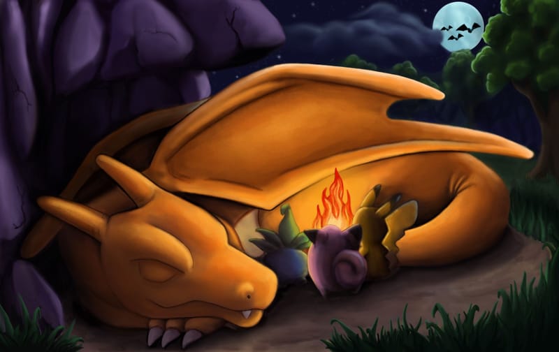
I think the only thing I would say is that the characters are getting lost because they are to dark. If you squint, Pikachu is very hard to see cuz he' s lost in too much shadow. If that much light is hitting the dragons nose then there should/could be more on the three pokemon characters. Cute idea using Charzard's fire as tale as a camp fire.
-
Not sure if you're entering this piece for the competition, but I'll crtique it as though you were.
- Because the artwork would be printed in small deminsions, one only really sees charizard's head, wing shape and moon.
- It's too dark. Instead of black, perhaps use darker, blue-ish hues for the background elements. It'll help make the orange pop out.
- The contest asks to see pokemon living its daily life routine. Because the charizard is asleep, the narrative becomes more about the resourceful basic pokemon. This is a problem if the aim is to create an artwork for a charizard card. If charizard were awake, it's more about it being generous towards others. Maybe the wing can be lifted up to act as a canopy?
- While the contest rules didn't ban adding additional figures in the competition, it wasn't supportive of the idea. However, the winning piece from the last competition had both a pokemon and trainer in a piece. Would you be interested in swapping out the wild pokemon for a trainer?
- I would reexamine the (gol)bats + moon in the background. The moon takes one eyes away from the scene.
Hope these suggestions are of help. Good luck with the contest.