Value feedback
-
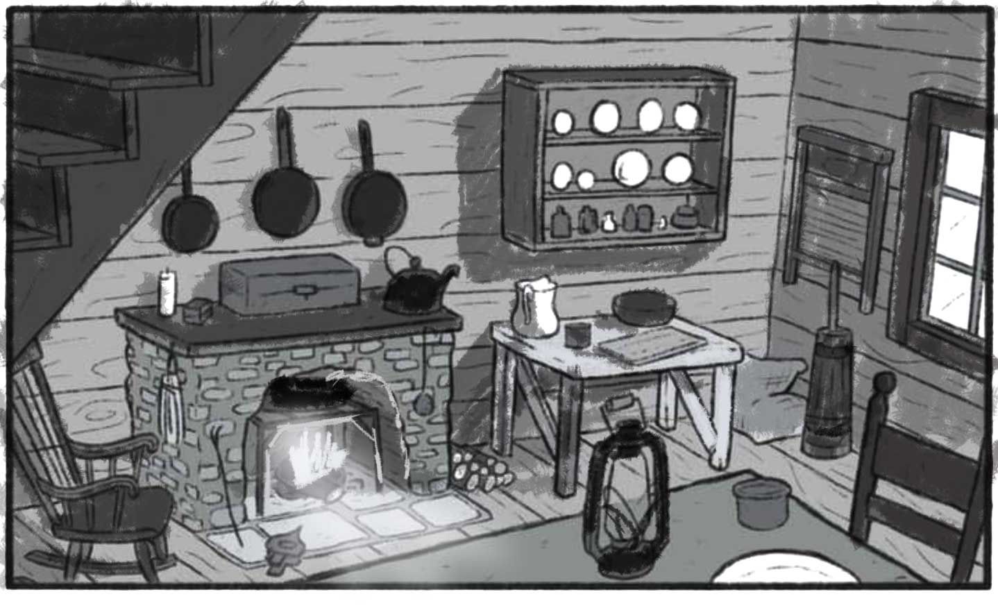
@heather-boyd thanks, Heather! The rocking chair is meant to be cut off because the stairs protrude out into the room. Some people have said it’s confusing and other have said it seems totally fine so I’m just gonna stick with it I think. I feel like it’s often tricky to make lighter objects in the image that aren’t the focal point because sometimes they just naturally have to be that tone or it will look weird but at the same time you don’t want them to be a focal point. Very tricky! I don’t think I really want too much of a focal point in this because it’s not exactly meant to be an illustration you would see in a book but more of a showcase of my ability to illustrate interiors, at least that’s how I’ve understood the assignment. On a similar note there won’t be any characters added to this scene since it’s just about the environment.
-
@griffin both of these are too mid-value to be effective value studies in my opinion. Try using only 5 values and see if you can break it up a little more. SOmething like this maybe.
The big thing about a shot like this is that you really need to figure out your focal point and then design around that. Mine may be a little "bright" I think, but stick to the 5 values while you work out the details.
SVS Faculty Instructor
www.leewhiteillustration.com -
@lee-white awesome, I’ll try doing some 5 value studies! I’d like to be able to create scenes where there isn’t a set focal point exactly and viewers are more free to explore the whole scene. Here’s an example of what I’m thinking
But you’ve made me realize I can’t afford to do that with my piece because it’s not totally packed with things to look at like this one is. Thanks for the advice, it’s a big help! -
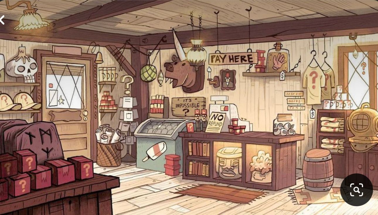
@griffin And don't overlook the benefits of altering the value/color of your linework. As you do a value study, and even take this image to finish you can color the linework to control the viewer eye. It's pretty subtle too. In the image of the shop above the illustrator make the linework of the back wall, the ceiling boards, the glowing light etc a value other than black.
It's super effective!
-
@davidhohn great point! I actually love coloring my linework but I hadnt been thinking of it in terms of value control. Thanks!
-
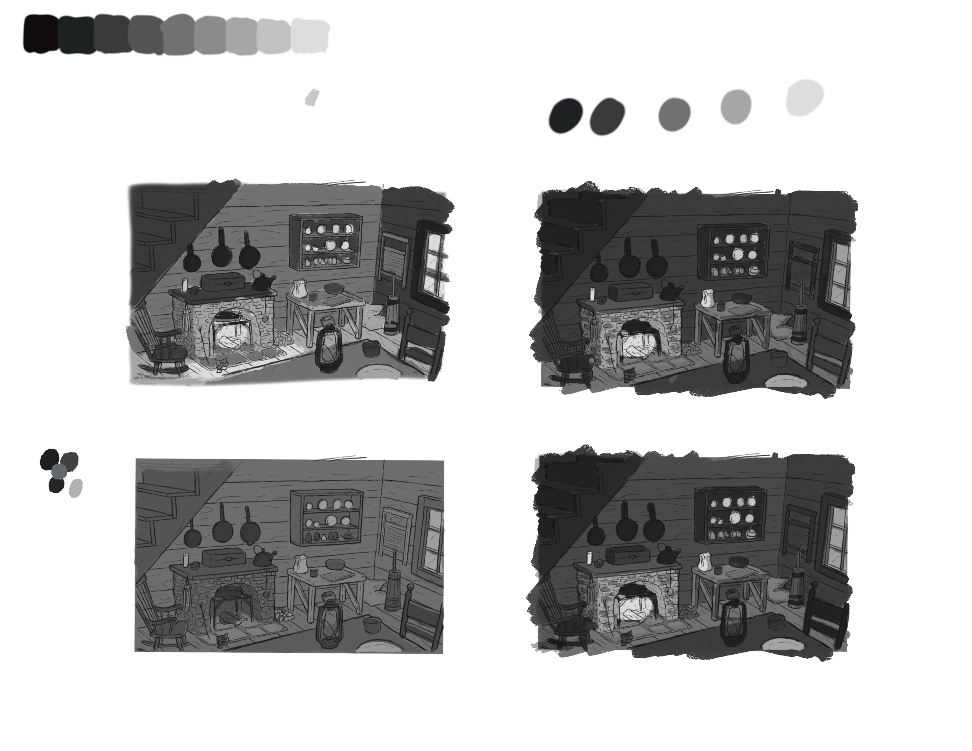
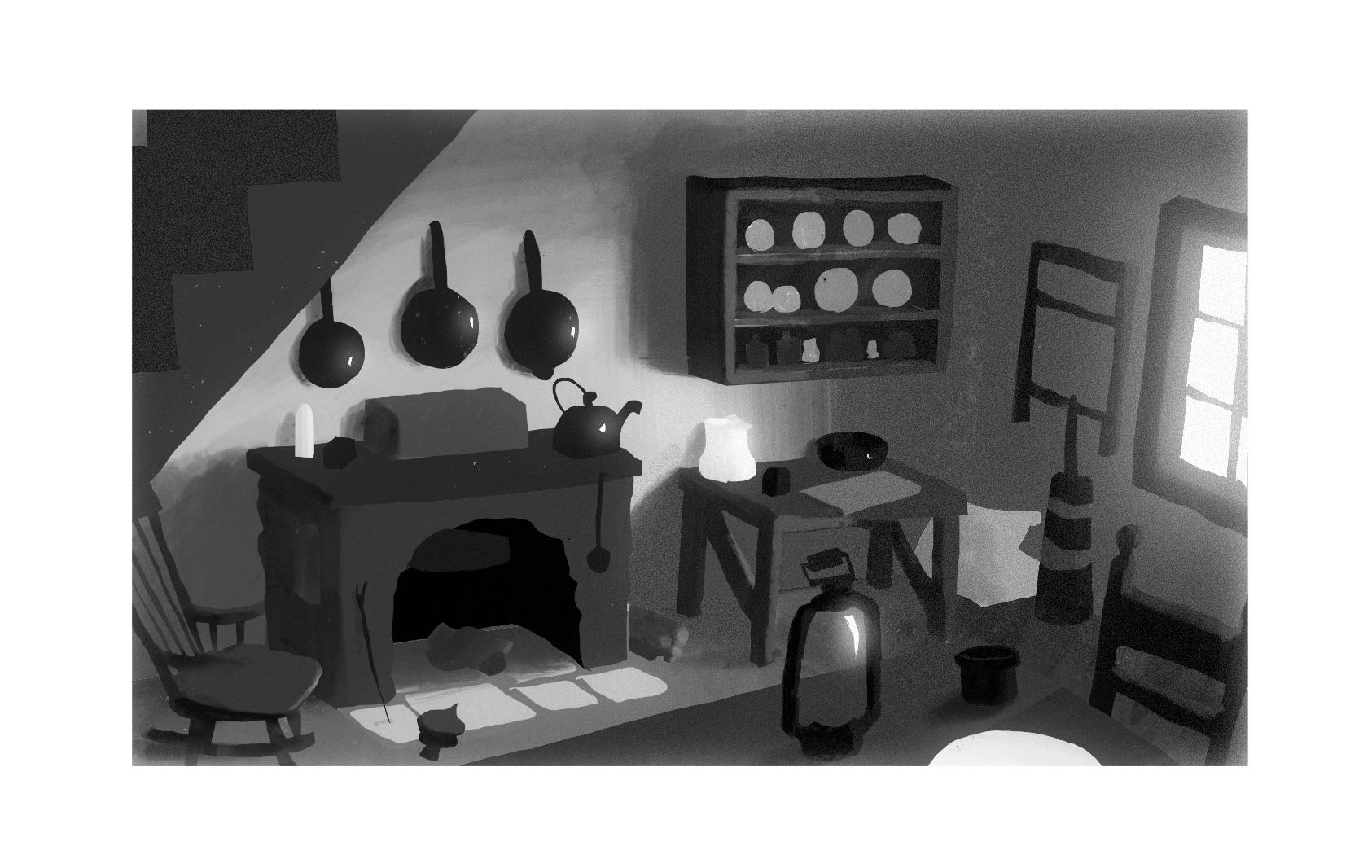
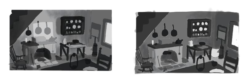
Did some value studies as @Lee-White suggested though I did find using 5 values a bit problematic at times. Still a huge improvement from the original in the lower left. I think I’ll be using the lower right one now. Let me know if I’m still missing/ should change something
-
@griffin I think you can push the lower right one further apart still. The top left one I think of the 4 is the most successful in terms of splitting the ranges. That one reads the clearest by far.
-
@jdubz Making the treads on the stairs lighter than the side might help set them off and make their position more clear.
-
@griffin Hi Griffin,
the new studies are an improvement, but i think you have to define your light source clearer and work more on using light and shadow.
Maybe set up your local flat colors, define your light source, see which objects/which planes are being hit by light, which are in shadows, see how the local value interact with light and what the endproduct-values are.See how you can design around your focal points. Design with 3 to 5 values for clearer image.
maybe something similar to this for overcast lighting?
1.flats
2.ambient lighting from window on top of flats
-
@marek-halko wow, thanks for doing this! I’m not entirely sure I know how to go about doing a value study honestly. The approach I was taking was to do small, quick studies and once I got something that felt right I would go from there and adjust finer details as I go.
-
@griffin i also think, quick small studies are way to go! For me, it is good to experiment with a lighting set up, that would fit story of the picture, and design with that. It doesnt have to be super realistic, it is enough, if it is communicating the idea clearly. For me, it is usually a lot of fails, till i have something, that, i think, could work. Using just few values is hard... but it presses to make bolder decisions and making a clearer picture.
-
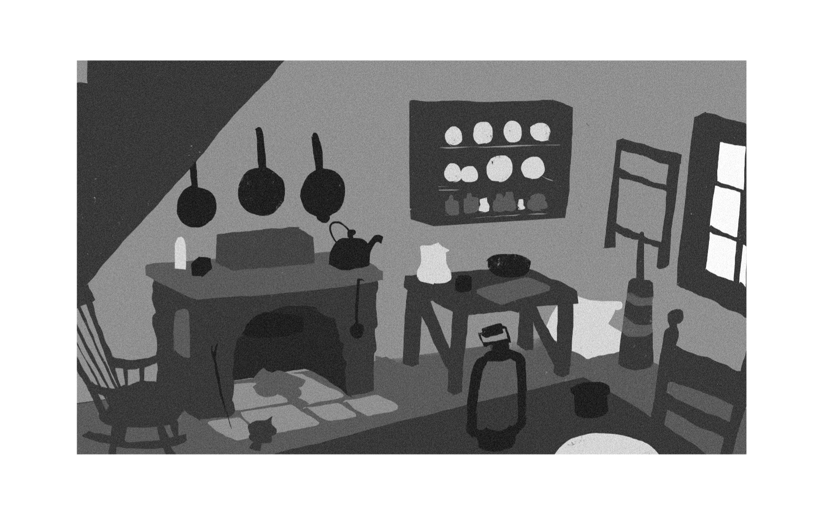
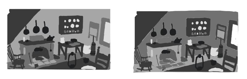
Here’s a few more studies with strictly 5 values not including the shadow and light layers. These feel like an improvement but honestly the way that @marek-halko did it is exactly what I was looking for even with the lighting because the fireplace lighting is too warm and cozy and I’m going for a dreary look. I don’t want to rip off what someone else did but Marek pretty much nailed what I was going for so I feel like I can’t avoid it.
-
@griffin Don't be reluctant to use the help here, such as the example that @marek-halko did. That is why we post and crit, to be able to help each piece get to be the best it can be. I have students who say "I like your example, but now I can't use it because you did it" all the time. I always say "Use as much of it or as little of it as you like". We are all in it together. We don't have to work in isolation, we can all work together.
SVS Faculty Instructor
www.leewhiteillustration.com -
Thanks @lee-white! Your advice and encouragement goes a long way. I’m glad I get to be a part of this community.
-
@marek-halko just curious, do you keep all your flats on separate layers to maintain the sharp edges while you're adding light?
-
@Griffin Glad it helped! I also think, it is good to collect different opinions and advises and use that, what you like about them.
@Matthew-Oberdier i dont usually, but here i thought, it would be faster overall to use lasso tool ( not to destroy Griffin's nice drawing )and keep overlaping objects on separate layers. -
@marek-halko it's working well. It seems like a fast way to keep those sharp edges. Faster than going over everything with a tiny brush, which is what I tend to do.