March 3rd Thurs. WIP
-
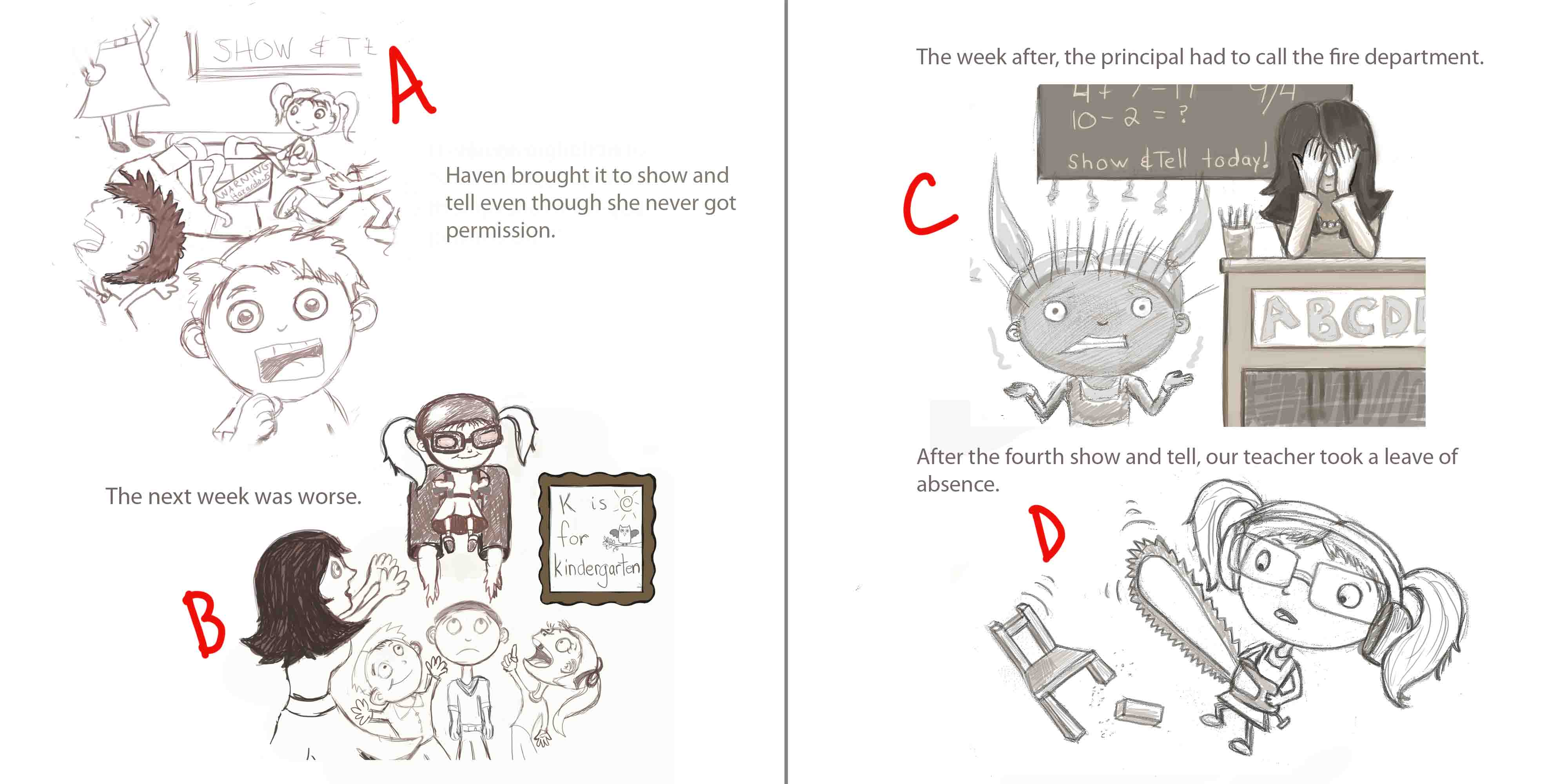
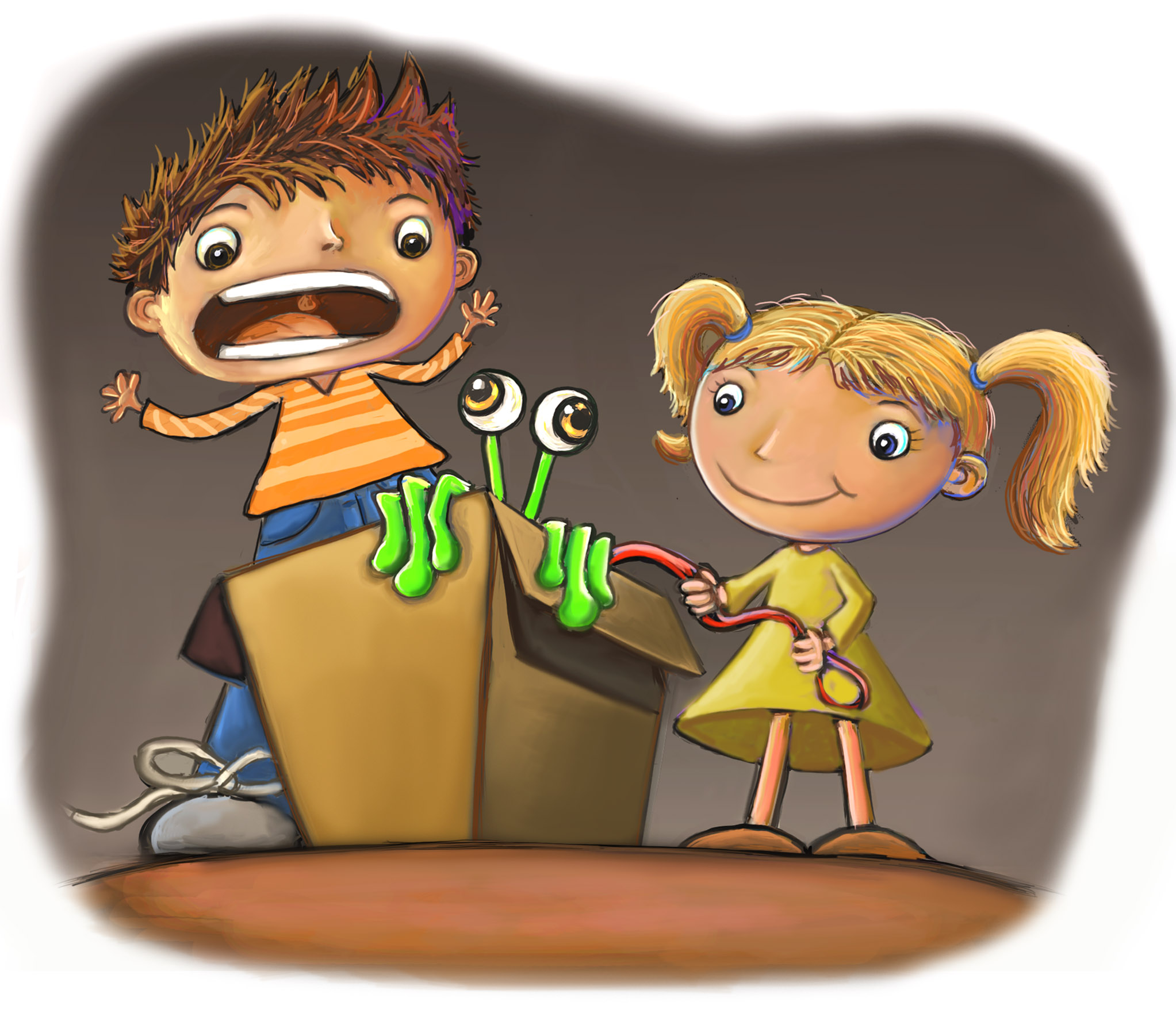
I'd really appreciate any input/critique for any of the following. Do you have a preference for one I should submit for the March submission? I'm not sure C and D read well without the context on the page. Forgive my ineptitude at page layout design. I would also love any suggestions on increasing consistency in a character. Thanks in advance!
-
Hehe, i really like them all! I think you are off to a great start. It is hard to tell what is in the box in A, and all of them are from the exact same point of view. PoV is the hardest thing for me to switch around as well. I can see it from all angles in my head, but it never gets to paper that way heh. It is easy to tell it's the same little girl in all 4. I love the story!!
-
@Carrie Thanks for the comment and I like how you've weaved it into a story. If your going for just one out of the 4 I would say that "A" with the snakes coming out of the box has the most appeal to me. The feedback I received for mine was to make it more dynamic and you can probably take the same approach with maybe making the snake larger like an anaconda wrapping around something or trying to swallow a globe etc. I hope that helps a little.
-
I like A for the composition and playfulness. Nice one!
-
@Lynn-Larson Thank you so much for your input! I totally agree with you about point of view. I feel like the ideas in my head are much better than my actual drawing ability. I'm going to see how I can push this a little further. Thanks!
-
@HaHernandez Thanks for your advice! I agree with you about making things more dynamic in my drawings. This really goes along with Lynn's thoughts on point of view. I really appreciate your feedback and the specific suggestions, thank you!
-
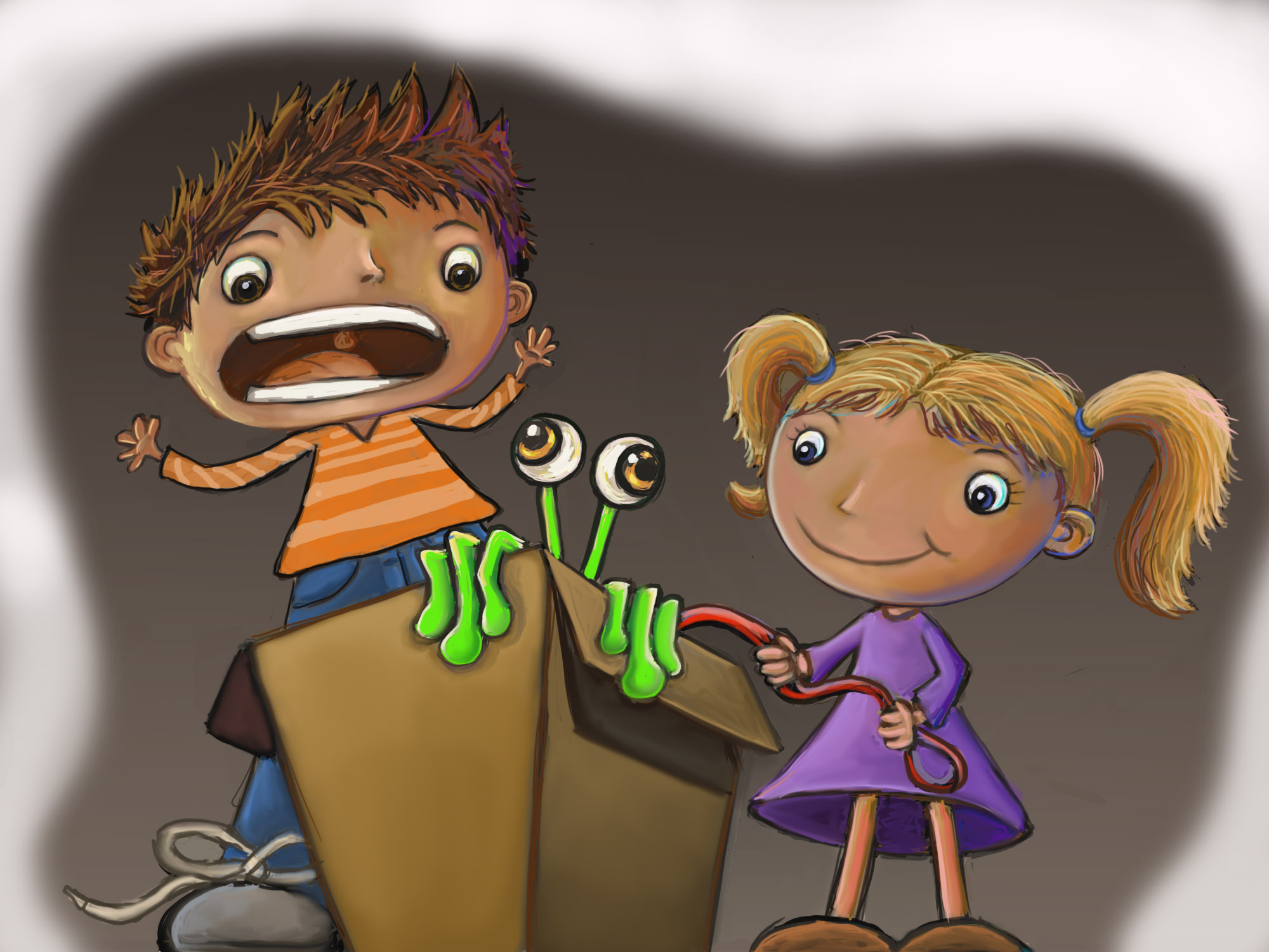 I am wondering if this needs more of a background. If so, I think it would have to be reformatted in a portrait canvas. Any ideas?
 -
This is actually pretty interesting and I'm liking it!
I wonder what if you can show the floor? I think that will help a bit. Also, maybe you can make the girl's purple dress into a more earthy/muted color like you did with the rest of the picture? It might make the alien's green pop out a bit more in this way and draw attention. If not, then you could explore the possibility of lowering the tone of everything but the alien/box to make it pop out. Also, perhaps add a light source/shadow too.
")
All in all, I think this illustration is headed in the right direction!
-
@KelvinBurnett3 Thanks for your suggestions; they are good ones. It helps me so much to hear the ideas of others because after I time, I feel like I can't see things in my own drawing. I'm going to test out the dress color and addition of part of the floor. Thanks!!
-
I think this is an improvement. Thank you again for your suggestions.