Composition and Value - Help!
-
Hey guys!
I started the follow painting this week, but after I started painted , I realised i was unhappy with something about the composition. I thought the background was competing with the character and the reading wasn´t good. Though I was enjoying the idea, pose and painting.
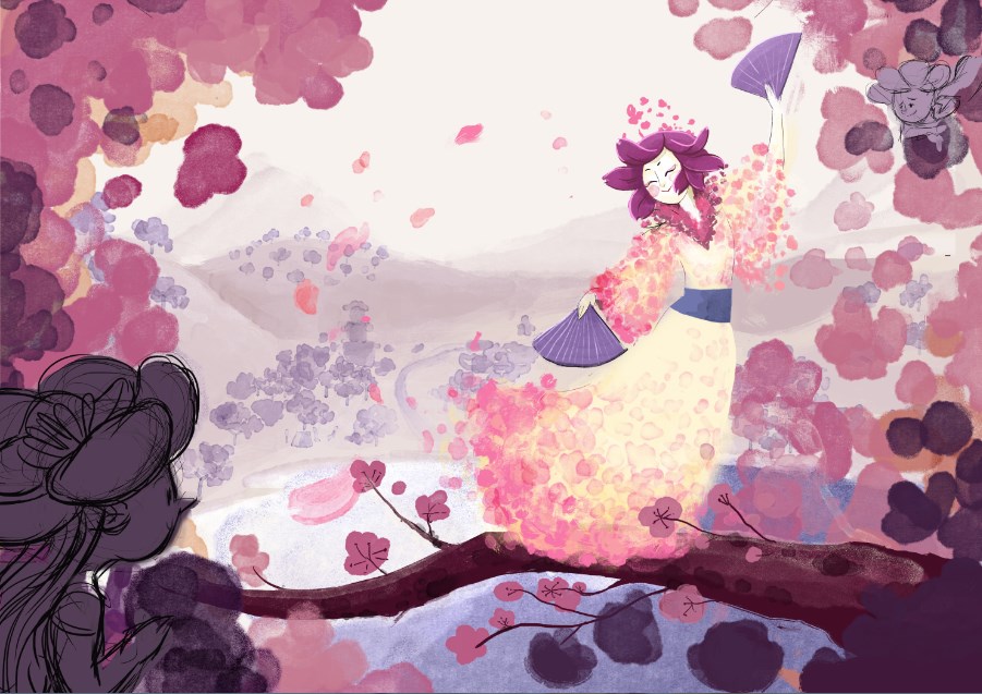
Today I started Will Terry´s creative composition class, and I tried some modifications based on that to give more rythm to my painting, but I´m still not very happy with it and with a sensation that there´s something wrong.
Here is the modified version. Can you help me with it?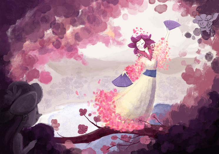
-
Firstly, I think your work is gorgeous - with this piece I love the colours, the pose, and your painting style is really so nice, painterly yet defined.
The only thing I can say maybe to help, is to think about how clearly your main figure comes across against the background - the cream colour + purple shadows of the dress are pretty similar in tone and value to those in the background. Perhaps it is this which is making your image less striking than it should be - because her pose and the design of the dress is beautiful.
Normally things in the foreground are darker in value than those in the background, I know your dress is pale cream and you won't want to muddy that with a darker colour, so it's trickier to find a solution..maybe work on the crispness of the purple on the shadow side. The other thing, your colour scheme is lovely but one way to differentiate the dress would be to add in some very pale jade green tones into the background, would go with the pink nicely and fit with the cherry blossom theme. Then go with the brightest cream/white highlights onto the dress on the 'light' side, to make sure there's good contrast at the focal point. (these are just ideas though!)
Anyway sorry can't think of better solutions but it is really nice as it is! ...and looking forward to the next version
")
-
@Dulcie Actually, You made a lot of good observation that I hadn´t thought about before. Thank you!:D
I´ll try to work it based on what you said. -
I agree--you have some nice stuff going on here, but we really need your character's silhouette to pop! Value is the best way to achieve that, color can also help. Generally in a scene like this where the background has atmospheric perspective, I like to have the foreground darker and the background lighter, but you need to figure out how you want it to work. I'm excited to see where this goes!
-
This is really beautiful! You've gotten some great advice already and I agree that changing the background color could help pop her out.
-
@kamiqueiroz Your work is very beautiful! - I had a go at trying to make the figure pop - my thought was possibly just a bit more saturation in the focal point - and to fade the background slightly away from the purples -
 I liked your first composition best so I worked with that - really nice piece!
 -
@kamiqueiroz Lovely! What a nice illustration. is it digitally? If you think you have to play around with the values, why not try and make the background mountains darker, and keep your character light? Sometimes when you really try something new, it helps. If you need any help, just let me know.
-
@leontine
@Kevin-Longueil
@Sarah-LuAnn
@bharris
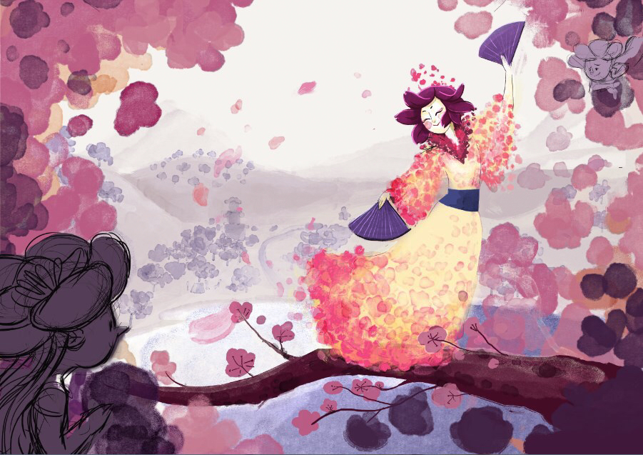
Thank you , guys! I´m working on it based on yours observation. Rising the saturation has showed a great way to pop out the geisha. These values surelly need to have more work and the jade green background, has helped a lot to pop her too. I´ll work a little more on it and post when I´m finished! -
Did some color adjustmens and darkened the color value of her dress
What do you think?

-
@kamiqueiroz I agree with everyone else : your work is gorgeous! I lot of awesome things going on!
I really liked the yellow/cream dress in your first version... I think it was more "happy" than the darker version you just posted. I really like what @kevin-longueil did to increase the contrast and the focal point without changing your original color palette which was very pretty! I think the idea of adding some green in the background is good as well, but I would try a more desaturated pale green.
Please keep us updated! This is a gorgeous piece!
-
I agree with that I liked her dress the cream-yellow. This looks just a little too dark and lost some of the 'feeling' of the fist versions. The jade is a really nice touch to the color scheme though!
-
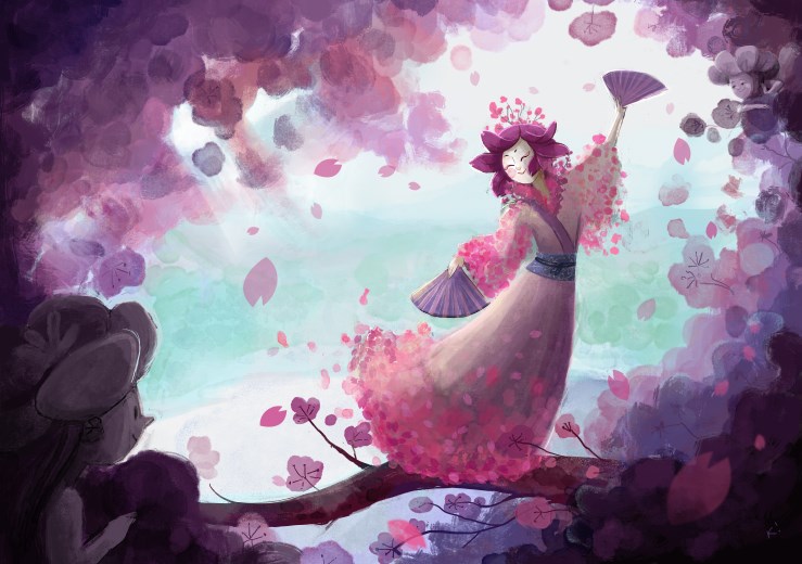
@kamiqueiroz Hey Kami - i like your first version still the best - she seems to have lost her luminosity with the addition of the grayer tones to her dress - i think your image is Really nice though - what i did to darken the figure a bit and increase the saturation was to just copy the figure and paste it back in place on a multiply layer - i think it really did the trick - you could also duplicate the layer as a multiply layer and erase back into the image with a low opacity eraser until you are happy with things - after that you could adjust the background with the Hue, Saturation, Lightness sliders until you get the contrast you are looking for (i love those sliders) - if the background is not on its own layer you could select it onto its own layer (thats what i did ..but not very carefully) ..... anyways i hope all of this is not annoying.....basically i really love your first image and feel it just needs a little tweak to be its very best
-
@Kevin-Longueil actually, I´ve posted the version without the hue saturation adjustments and was waiting for more feedback before post the next version. These sliders are really awesome and helped me a lot!!
Before read your feedback, I put some details and thought it was doing great. I think that´s maybe because I´m doing this piece for a long time and I´m wanting to move on. ><@bharris
@NoWayMe I really loved that cream kimono too, but when I´ve darkened it, the color became very muddy and I couldn´t see which color could mantain the same effect. I added some cream highlights to see if it solve this problem of her lack of luminosity.
@Leontine Yes!! It´s totally digital!After the contrast changes using "Hue/Luminosity" sliders, I´m getting pleased with this results.
You´re helping me a lot, guys!You´re awesooome!
Thank you again.