I got a little gig! Posting spooky project updates.
-
@lizardillo I don't know any of this at all, Liz. I'm just swatching from that palette and abstaining from transparent layering.
-
@Valerie-Light Ok. I would ask if they need to be exported as separate Pantone spot print plates before you get too far. I would ask how they have printed in the past too just in case they have a way of doing it you can use as reference.
As far as I know Procreate will export to CMYK. So even if you use the spot colour refs in the file you will only have the four colours channels to make the print plates out of so no matter what colours you use it will only export to Cyan, Mag, Yellow and Black.
If it's 7 different Pantone print plates (which is a lot!) then thats quite a technical file to set up. If it's just use the colours and print as CMYK then that's fine.
The only way you would be able to get around this in Procreate, off the top of my head, is to use each colour on a separate layer and export that layer one at a time so they can make the separate spot colour plates. (Imagine it as if you were making separate screen printing screens.)
You would need to specify the order of your layers (which Pantone is the top layer, which is next etc.) make sure the colours are printed in the right order on the press (i.e the right colour is printed on top of the correct colour).
The best thing to do is let us know what they say.
Website: lizardillo.co.uk
IG: instagram.com/lizardillo -
@lizardillo woof, ok thank you for the thorough information. I'll bring this to my art director at our next check-in, but honestly I think we're way more low budget that all this, and I'm not certain their team is all on the same page.

-
Still testing rendering. What do you think of this one?
(there will be a chapter title in white over top of the right side, and text below)
-
@Valerie-Light Yes I imagine printing in 7 spots would cost a small fortune! It was just the "printing in 7 colours" that triggered my studio artworker mode. I've worked at a printers and in print design for too many years so I automatically think in print specs

The latest image is good. I rely so heavily on layer modes and masks nowadays I don't think I could just use mark-making like you are here. Great work!
Website: lizardillo.co.uk
IG: instagram.com/lizardillo -
@lizardillo Thanks, Liz! I'm learning lessons about working outside my style, but I'm getting there. It's HARD, but I'm enjoying the challenge.
I'm digging the Goosebumps/ Hardy Boys adventure vibe, though. -
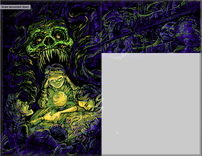
@Valerie-Light Hmm interesting colors. If you're forced to stick to just 7 of these I might choose the duller tones. But I suppose it depends on the effect you're trying to create also. Those seafoam greens on the bottom right and that really bright light blue screams luminescence to me, which could be really cool if that's the lighting in a particular scene. I love that image with the crystal ball on the table and maybe that's a place where you could use those colors I just mentioned to make it seem like the ball is glowing a bit. Keep up the great work!

-
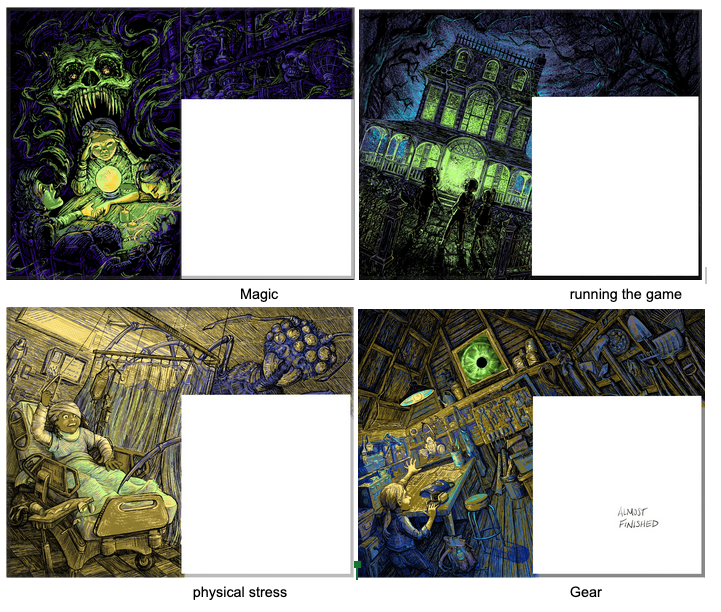
Project update! These 4 spreads are just about finished. I'm just adjusting the last details on each. I'd love to hear constructive critiques if you see something that's not working.
(In all 4 of them, the right side of the page with have bold white text superimposed on top of the image, with a chapter number and a chapter heading.)
-
@Valerie-Light Looking absolutely amazing. How you've worked with that limited colour palette as wonderful!
Website: lizardillo.co.uk
IG: instagram.com/lizardillo -
@lizardillo Thanks! It had me stumped for a while, but now I'm actually really liking working within those palette constraints!