Society of Visual Storytelling

    SVSLearn Forums

    • Register
    • Login
    • Search
    • Recent
    • Tags
    • Popular
    • Users
    • Groups
    • Search

    I got a little gig! Posting spooky project updates.

    Projects
    10
    38
    1811
    Loading More Posts
    • Oldest to Newest
    • Newest to Oldest
    • Most Votes
    Reply
    • Reply as topic
    Log in to reply
    This topic has been deleted. Only users with topic management privileges can see it.
    • Valerie Light
      Valerie Light @Kristen Lango last edited by

      @Kristen-Lango Thank you so much! I just got the go ahead to start rendering, and also they've asked for another spread!

      www.valerielightillustration.com
      www.instagram.com/valerie_light_illustration

      1 Reply Last reply Reply Quote 1
      • Jeremiahbrown
        Jeremiahbrown last edited by

        @Valerie-Light I love your sketches!! Keep 'em comin'!

        Jeremiah Brown
        www.jeremiahbrownillustration.com
        https://www.instagram.com/jeremiah.brownillustration/

        Valerie Light 1 Reply Last reply Reply Quote 2
        • Valerie Light
          Valerie Light @Jeremiahbrown last edited by

          @Jeremiahbrown Thank you! Same to you!

          www.valerielightillustration.com
          www.instagram.com/valerie_light_illustration

          1 Reply Last reply Reply Quote 0
          • Valerie Light
            Valerie Light last edited by

            I psyched myself out a little bit this week. After getting the clean line drawings finished and cleared with the art director, I realized a hiccup in my plan.

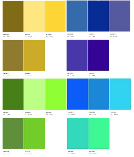
            This project will be printed in only 7 colors, and I need to stick to the palette they provided. No blending, no multiply layers, no fiddling with opacity or the bright/dark sliders and curves. Yikes! I do those things all the time! For this, I can only stipple, crosshatch, and build textural layers of opaque color.
            And! The team loved the scratchy, gouache-y, colored pencil scribbles from my color thumbnails. But, my Fat Pencil brush in Procreate doesn't scale up to the size of mark I'll need in the finished piece. oops.

            So I kind of went back to the drawing board on exploring some new Procreate brushes from Bardot, looking for brushes that would scale up scratchy textural marks without getting blendy. So far I've done one test rendering, following Lee's advice of starting with the spread that you're most excited and confident about painting.

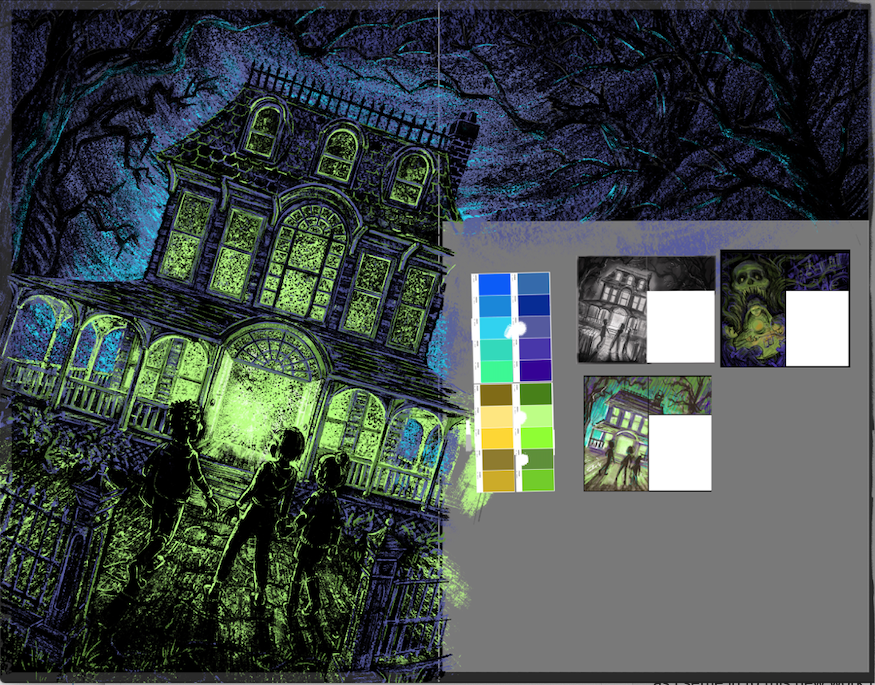
            Looking at it this morning, I think I need to make the kids's silhouettes a bit more clear, and I think I've got a little too much texture, especially in the foreground. I'm going to leave this one alone for now and move on to another spread as I settle in to this new work method. I welcome feedback on it!
            Screen Shot 2022-04-13 at 9.01.38 AM.png

            www.valerielightillustration.com
            www.instagram.com/valerie_light_illustration

            Asyas_illos lizardillo 3 Replies Last reply Reply Quote 2
            • Asyas_illos
              Asyas_illos @Valerie Light last edited by Asyas_illos

              @Valerie-Light only 7 colors?! That’s rough, I generally give my self around that many but l always use shades that are lighter and darker than those 7 too, so it ends up being like 26 colors lol. But I do agree there is too much texture going on it looks a bit grainy, and yah trying to make those silhouettes clear is really going to make this illustration pop is that the palette they gave you to work with or is it modified by you?

              Asyasewardillos@gmail.com
              www.Instagram.com/asyas_illos/
              https://asyasewardillos.wixsite.com/mysite

              Valerie Light 1 Reply Last reply Reply Quote 0
              • Asyas_illos
                Asyas_illos @Valerie Light last edited by

                @Valerie-Light I think that version on the bottom right looks good with the light background you can see the trees clearer too as well as those kids and their shadows

                Asyasewardillos@gmail.com
                www.Instagram.com/asyas_illos/
                https://asyasewardillos.wixsite.com/mysite

                1 Reply Last reply Reply Quote 0
                • lizardillo
                  lizardillo @Valerie Light last edited by

                  @Valerie-Light when they say it's going to printed in 7 colours do they mean 7 spot colours? As in 7 separate spot colour plates on the press? Or just use the 7 colours in the art and its printed 4 colour process CMYK?

                  I don't think Procreate supports spot colour channels for printing but then again 7 spots does seem a bit excessive so I'm guessing they are not using 7 separate Pantone inks.

                  Website: lizardillo.co.uk
                  IG: instagram.com/lizardillo

                  Valerie Light 1 Reply Last reply Reply Quote 0
                  • Valerie Light
                    Valerie Light @Asyas_illos last edited by

                    @Asyas_illos I do want to use and control that grainy feel, because I can't blend I can only use speckles or crosshatching for gradients. I've taken it too far right now.
                    They liked that bottom thumbnail but said it was too bright overall, and should be more in the world of the skull/seance thumbnail. But you're right, I do need some lighter values in the middle ground to make the characters silhouettes pop more.

                    Confusingly, this is the palette of pantone swatches they gave me. Clearly more than 7 colors, but 🤷

                    Screen Shot 2022-04-13 at 10.55.47 AM.png

                    www.valerielightillustration.com
                    www.instagram.com/valerie_light_illustration

                    Kristen Lango 1 Reply Last reply Reply Quote 0
                    • Valerie Light
                      Valerie Light @lizardillo last edited by

                      @lizardillo I don't know any of this at all, Liz. I'm just swatching from that palette and abstaining from transparent layering.

                      www.valerielightillustration.com
                      www.instagram.com/valerie_light_illustration

                      lizardillo 1 Reply Last reply Reply Quote 0
                      • lizardillo
                        lizardillo @Valerie Light last edited by lizardillo

                        @Valerie-Light Ok. I would ask if they need to be exported as separate Pantone spot print plates before you get too far. I would ask how they have printed in the past too just in case they have a way of doing it you can use as reference.

                        As far as I know Procreate will export to CMYK. So even if you use the spot colour refs in the file you will only have the four colours channels to make the print plates out of so no matter what colours you use it will only export to Cyan, Mag, Yellow and Black.

                        If it's 7 different Pantone print plates (which is a lot!) then thats quite a technical file to set up. If it's just use the colours and print as CMYK then that's fine.

                        The only way you would be able to get around this in Procreate, off the top of my head, is to use each colour on a separate layer and export that layer one at a time so they can make the separate spot colour plates. (Imagine it as if you were making separate screen printing screens.)

                        You would need to specify the order of your layers (which Pantone is the top layer, which is next etc.) make sure the colours are printed in the right order on the press (i.e the right colour is printed on top of the correct colour).

                        The best thing to do is let us know what they say.

                        Website: lizardillo.co.uk
                        IG: instagram.com/lizardillo

                        Valerie Light 1 Reply Last reply Reply Quote 0
                        • Valerie Light
                          Valerie Light @lizardillo last edited by

                          @lizardillo woof, ok thank you for the thorough information. I'll bring this to my art director at our next check-in, but honestly I think we're way more low budget that all this, and I'm not certain their team is all on the same page. 😞

                          www.valerielightillustration.com
                          www.instagram.com/valerie_light_illustration

                          lizardillo 1 Reply Last reply Reply Quote 0
                          • Valerie Light
                            Valerie Light last edited by

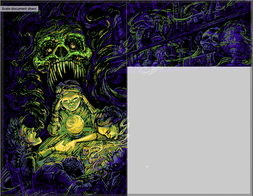
                            Still testing rendering. What do you think of this one?
                            (there will be a chapter title in white over top of the right side, and text below)
                            Screen Shot 2022-04-14 at 11.11.20 AM.png

                            www.valerielightillustration.com
                            www.instagram.com/valerie_light_illustration

                            1 Reply Last reply Reply Quote 1
                            • lizardillo
                              lizardillo @Valerie Light last edited by

                              @Valerie-Light Yes I imagine printing in 7 spots would cost a small fortune! It was just the "printing in 7 colours" that triggered my studio artworker mode. I've worked at a printers and in print design for too many years so I automatically think in print specs 😂

                              The latest image is good. I rely so heavily on layer modes and masks nowadays I don't think I could just use mark-making like you are here. Great work!

                              Website: lizardillo.co.uk
                              IG: instagram.com/lizardillo

                              Valerie Light 1 Reply Last reply Reply Quote 1
                              • Valerie Light
                                Valerie Light @lizardillo last edited by

                                @lizardillo Thanks, Liz! I'm learning lessons about working outside my style, but I'm getting there. It's HARD, but I'm enjoying the challenge.
                                I'm digging the Goosebumps/ Hardy Boys adventure vibe, though.

                                www.valerielightillustration.com
                                www.instagram.com/valerie_light_illustration

                                1 Reply Last reply Reply Quote 0
                                • Kristen Lango
                                  Kristen Lango @Valerie Light last edited by

                                  @Valerie-Light Hmm interesting colors. If you're forced to stick to just 7 of these I might choose the duller tones. But I suppose it depends on the effect you're trying to create also. Those seafoam greens on the bottom right and that really bright light blue screams luminescence to me, which could be really cool if that's the lighting in a particular scene. I love that image with the crystal ball on the table and maybe that's a place where you could use those colors I just mentioned to make it seem like the ball is glowing a bit. Keep up the great work!😀

                                  https://www.kristenlango.com/
                                  https://www.instagram.com/kristendraws/

                                  1 Reply Last reply Reply Quote 1
                                  • Valerie Light
                                    Valerie Light last edited by

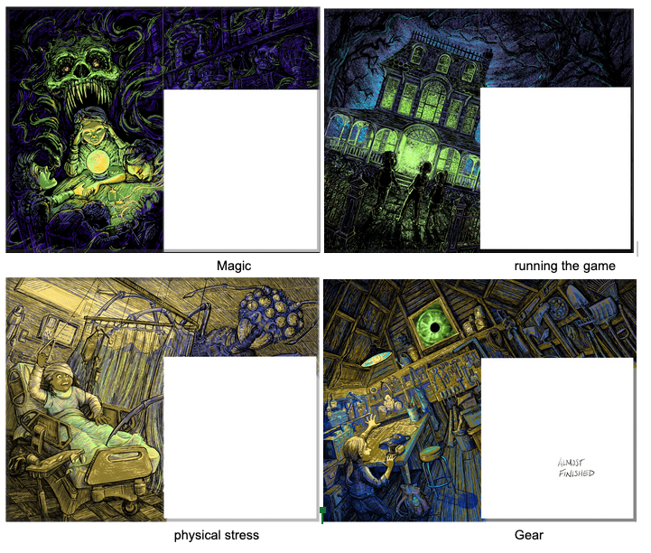
                                    Project update! These 4 spreads are just about finished. I'm just adjusting the last details on each. I'd love to hear constructive critiques if you see something that's not working.
                                    (In all 4 of them, the right side of the page with have bold white text superimposed on top of the image, with a chapter number and a chapter heading.)
                                    Screen Shot 2022-05-11 at 9.40.32 AM.png

                                    www.valerielightillustration.com
                                    www.instagram.com/valerie_light_illustration

                                    lizardillo 1 Reply Last reply Reply Quote 5
                                    • lizardillo
                                      lizardillo @Valerie Light last edited by

                                      @Valerie-Light Looking absolutely amazing. How you've worked with that limited colour palette as wonderful!

                                      Website: lizardillo.co.uk
                                      IG: instagram.com/lizardillo

                                      Valerie Light 1 Reply Last reply Reply Quote 1
                                      • Valerie Light
                                        Valerie Light @lizardillo last edited by

                                        @lizardillo Thanks! It had me stumped for a while, but now I'm actually really liking working within those palette constraints!

                                        www.valerielightillustration.com
                                        www.instagram.com/valerie_light_illustration

                                        1 Reply Last reply Reply Quote 0
                                        • First post
                                          Last post