I got a little gig! Posting spooky project updates.
-
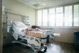
@lizardillo The hospital equipment looks very detailed & accurate.

I agree that the hospital bed rails could be adjusted.
In my experience, the rails don't tilt outward. They are straight up & down (vertical), or against the bed in the down position. (They pop straight outward a little, then push down against the side of the bed, so even when it's being moved, it doesn't lean out at an angle. It's always perpendicular to the bed.)
I would bring the upper rail in front of the elbow (on the side closest to the viewer, with the handle above), but I don't think you'd need to change the arm. If you feel like it needs it, you could add a pillow under it. (I think it'd be fine either way, so maybe don't bother with a pillow.) (I agree with the comment about the hand facing the other way around, so we would see the palm side & fingertips coming over the bar.)
You also might want to make the rails taller, since it looks like they're only a few inches higher than the edge of the mattress (and maybe longer - I've seen different lengths, though).
If she's supposed to be leaning back against the upper part of the bed, I'd add a pillow behind her head. (Hospital pillows are usually flatter than regular pillows.)
If you want really minute details:
- I see the IV bag hanging behind her, but I don't see the line or insertion point. It looks they'd have to use her hand.

(When it's inserted in the hand, the line is looped around and taped down to prevent the needle from moving or getting tugged on.) - The hospitals I've been in usually have a solid sheet of linoleum flooring. Not as often, but I've also seen larger tiled linoleum. (Yours looks like maybe 12" tiles, where I've seen maybe 18" tiles. Linoleum tiles have thinner seams than tiled floors, since there's no grout in between the tiles.) Or if it's a newer or remodeled & a nicer hospital, it might have artificial wood flooring.


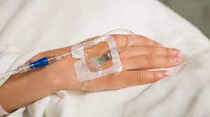
- I see the IV bag hanging behind her, but I don't see the line or insertion point. It looks they'd have to use her hand.
-
@Miriam Thank you, this has explained a lot better than my attempt.

-
@Miriam Wow, thank you for the thorough research! I'll post again here once I've fixed a few things. The IV line, especially, is a great detail I didn't mean to leave out!
-
I really like the feeling you have created here, the colour schemes and the different perspectives that you have used. I look forward to seeing more of your work. Steve.
-
I'm having a meeting tomorrow to check in with my art director about the line drawings. Hopefully I'll be able to start rendering soon!
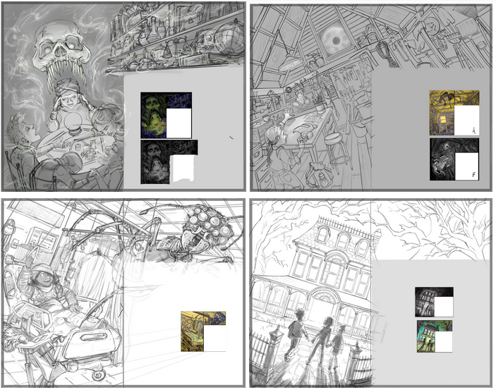
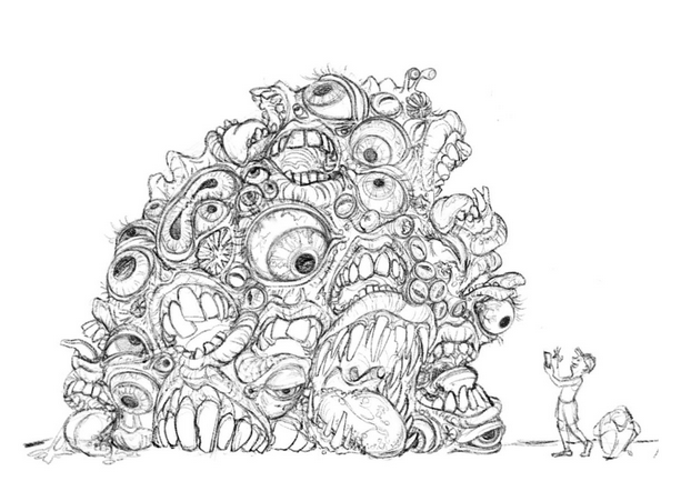
Here are the 4 chapter heading spreads (Magic, Gear, Physical Stress, and Running the Game) and one piece of incidental art (the Gibbering Mass of Orifices)I'm loving this assignment, way more than I thought I would. Gonna have to figure out how to market for this type of work in the future.
-
@Valerie-Light Will these be card designs?
-
@PenAndrew No, they're 2-page spreads to open each chapter of an RPG rules book.
-
@Valerie-Light Sorry Valerie, I wasn't communicating very well, I meant I see these drawings as a kind of card set, like playing cards. They sparked this idea in my mind.
-
@Valerie-Light These sketches are incredible! I cannot wait to see them rendered!
-
@Kristen-Lango Thank you so much! I just got the go ahead to start rendering, and also they've asked for another spread!
-
@Valerie-Light I love your sketches!! Keep 'em comin'!
-
@Jeremiahbrown Thank you! Same to you!
-
I psyched myself out a little bit this week. After getting the clean line drawings finished and cleared with the art director, I realized a hiccup in my plan.
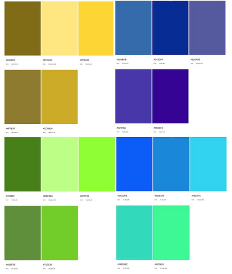
This project will be printed in only 7 colors, and I need to stick to the palette they provided. No blending, no multiply layers, no fiddling with opacity or the bright/dark sliders and curves. Yikes! I do those things all the time! For this, I can only stipple, crosshatch, and build textural layers of opaque color.
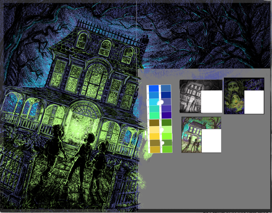
And! The team loved the scratchy, gouache-y, colored pencil scribbles from my color thumbnails. But, my Fat Pencil brush in Procreate doesn't scale up to the size of mark I'll need in the finished piece. oops.So I kind of went back to the drawing board on exploring some new Procreate brushes from Bardot, looking for brushes that would scale up scratchy textural marks without getting blendy. So far I've done one test rendering, following Lee's advice of starting with the spread that you're most excited and confident about painting.
Looking at it this morning, I think I need to make the kids's silhouettes a bit more clear, and I think I've got a little too much texture, especially in the foreground. I'm going to leave this one alone for now and move on to another spread as I settle in to this new work method. I welcome feedback on it!
-
@Valerie-Light only 7 colors?! That’s rough, I generally give my self around that many but l always use shades that are lighter and darker than those 7 too, so it ends up being like 26 colors lol. But I do agree there is too much texture going on it looks a bit grainy, and yah trying to make those silhouettes clear is really going to make this illustration pop is that the palette they gave you to work with or is it modified by you?
-
@Valerie-Light I think that version on the bottom right looks good with the light background you can see the trees clearer too as well as those kids and their shadows
-
@Valerie-Light when they say it's going to printed in 7 colours do they mean 7 spot colours? As in 7 separate spot colour plates on the press? Or just use the 7 colours in the art and its printed 4 colour process CMYK?
I don't think Procreate supports spot colour channels for printing but then again 7 spots does seem a bit excessive so I'm guessing they are not using 7 separate Pantone inks.
Website: lizardillo.co.uk
IG: instagram.com/lizardillo -
@Asyas_illos I do want to use and control that grainy feel, because I can't blend I can only use speckles or crosshatching for gradients. I've taken it too far right now.
They liked that bottom thumbnail but said it was too bright overall, and should be more in the world of the skull/seance thumbnail. But you're right, I do need some lighter values in the middle ground to make the characters silhouettes pop more.Confusingly, this is the palette of pantone swatches they gave me. Clearly more than 7 colors, but

-
@lizardillo I don't know any of this at all, Liz. I'm just swatching from that palette and abstaining from transparent layering.
-
@Valerie-Light Ok. I would ask if they need to be exported as separate Pantone spot print plates before you get too far. I would ask how they have printed in the past too just in case they have a way of doing it you can use as reference.
As far as I know Procreate will export to CMYK. So even if you use the spot colour refs in the file you will only have the four colours channels to make the print plates out of so no matter what colours you use it will only export to Cyan, Mag, Yellow and Black.
If it's 7 different Pantone print plates (which is a lot!) then thats quite a technical file to set up. If it's just use the colours and print as CMYK then that's fine.
The only way you would be able to get around this in Procreate, off the top of my head, is to use each colour on a separate layer and export that layer one at a time so they can make the separate spot colour plates. (Imagine it as if you were making separate screen printing screens.)
You would need to specify the order of your layers (which Pantone is the top layer, which is next etc.) make sure the colours are printed in the right order on the press (i.e the right colour is printed on top of the correct colour).
The best thing to do is let us know what they say.
Website: lizardillo.co.uk
IG: instagram.com/lizardillo -
@lizardillo woof, ok thank you for the thorough information. I'll bring this to my art director at our next check-in, but honestly I think we're way more low budget that all this, and I'm not certain their team is all on the same page.