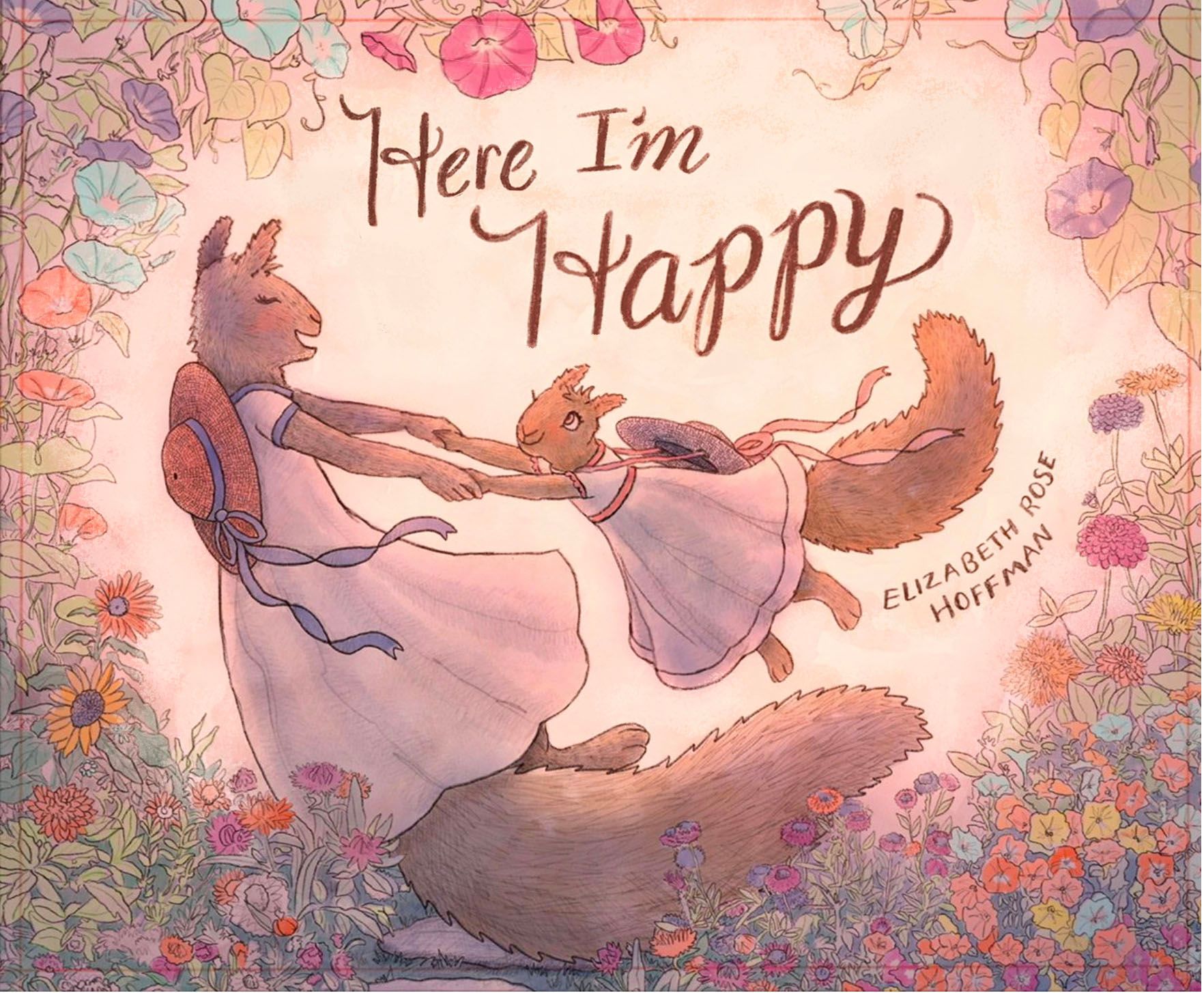
Need Fresh Eyes Please! Staring at this book cover for too long!
-
@Elizabeth-Rose beautiful cover! It perfectly captures the warmth of your heartfelt story.
There are a few tweaks you can make that will make this beautiful cover even stronger. I hope you don't mind, I took a screenshot to visually show my suggestions.
-
Lighten the background. This will give you more contrast and make the characters and title stand out. On a cover, you want to make sure that it's readable and grabs attention, both full size and as a thumbnail. You might even want to go even lighter on the background to increase the contrast for greater readability.
-
Adjust the title. Since this is handlettered, you have so much freedom to make adjustments! Reducing the angle will, again, aid in readability. Create visual hierarchy by making "Happy" larger than "Here I'm". Creating a slight arc (which I didn't take the time to do) will make a more pleasing composition as the title will flow with the lines of the characters.
-
Watch your bleed. It looks like the mom's tail will touch the edge when the cover is trimmed. It's better to either have some of her tail trimmed off (i.e. it extends beyond the bleed) or move her tail so that it stays well away from the trimmed edge.
I'm assuming, with the crop lines, that you're printing a softcover book? Because IngramSpark offers limited trim sizes, you may want to confirm that they will print a landscape book in the trim size that you created the artwork in. Some of their print options are not available for all trim sizes, and I believe that they only offer one landscape (horizontal) trim size.
One other thing you may want to consider if this is your first book and you aren't comfortable with hand lettering (because it's not easy!) -- use a font for your title and author name. Or a combination of font and hand lettering. For the sake of example, here is your cover using a font for the title. I used the Goodlife font family, which is included in a Creative Cloud subscription (and can be used commercially too). To give it a little extra something, I rasterized "Happy" and added some texture. Your cover is beautiful -- sometimes trying out a few different options leads you down unexpected paths and you end up finding a solution that works even better for a cover.
Hope you didn't mind the draw-over and design suggestions. Please let me know if you have any questions -- I've been designing books for 12 years and have formatted several that were printed by Ingram Spark. Feel free to pick my brain!
illustrator - author - smiley person
mbaileyart.com
instagram.com/mbaileyart/ -
-
@patricialamas Oh my goodness! You are right! Thank you!
-
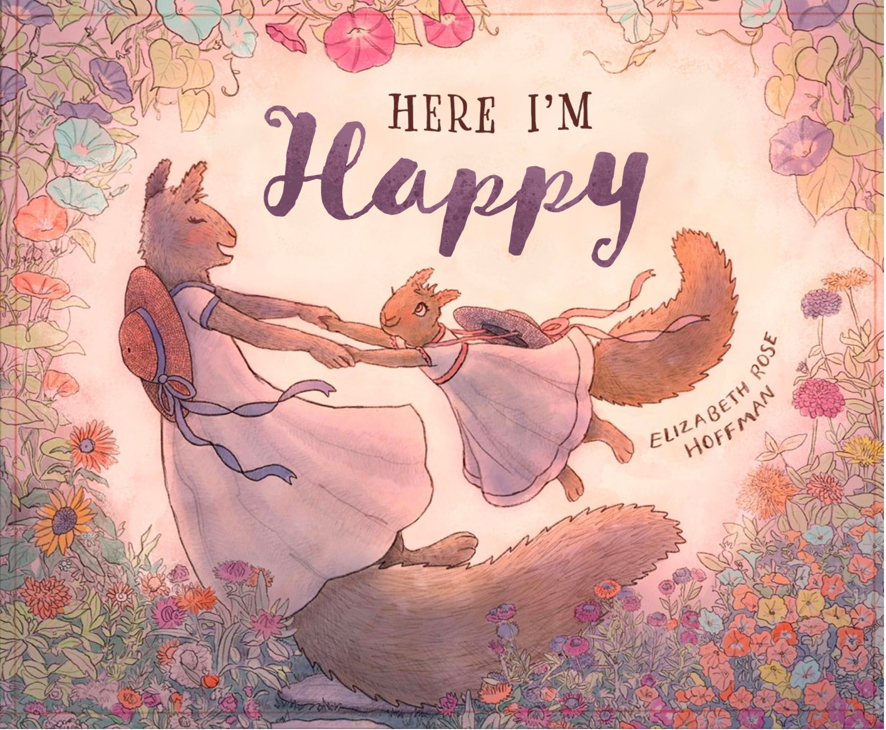
@Melissa_Bailey Oh my goodness! What wonderful suggestions! I really appreciate the time you put into your post and the visuals you made. I totally agree, the background needs to be lighter. I can see that now. Contrast is key for catching ones eye right? And I agree with the mama's squirrel's tail. I had been going back and forth about that. Adding more breath-room for mama squirrel's tail is probably the better option in the long run. Oh boy! I get to make more art in the expanded section under Mama's tail.
I especially appreciate the title suggestions. I did some fiddling around with the title and arching the "Here I'm" over the "Happy" and making "Happy" larger than the others words.
Yeah, this is my 10th self-published book. I've only used Ingram Sparks once so far, so I still have some things to learn with it. And yes, I checked the trim sizes a while back. They have 11 x 8.5 landscape style! Thank goodness! -
Okay, this is what I ended up with:
Thanks so much to the suggestions! They helped so much!
I will probably do small edits and adjusting before the Release date in September. But so nice to have the Cover Release done and out! -
@Elizabeth-Rose so glad I could help! Looking forward to seeing your book -- please let us know when it is in print.
 ️
️ -
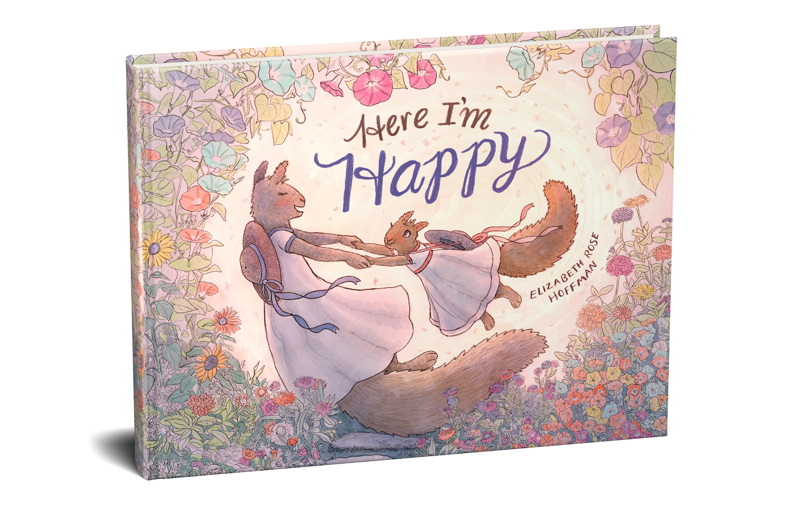
@Elizabeth-Rose beautiful.
️Seeing this mockup, though ... are you printing a hardcover through Ingram Spark? It looks like, from what you showed us, that you used a softcover template from Ingram Spark. Just checking because hardcover books have 0.625 inch wrap that needs to be incorporated into the design, otherwise you may not have the room you think you have. Just wanted to mention it. You may want to double-check your cover template and make sure that it is for the correct binding.

illustrator - author - smiley person
mbaileyart.com
instagram.com/mbaileyart/ -
All the changes look great!
-
@Larue Thanks!
-
@Melissa_Bailey Oh yes! I have the extra trimming along the edges for the hard cover. Thanks for mentioning it!
Now though, I think I’m going to try to add a bit more to the edges cause I’ve found I love having more of the flowers visible in the final trim.Interesting thing about the 11 x 8.5 inch landscape trim size from Ingram Spark, they actually don’t show hard cover available in their hardcover trim size menu, but if I go to the cover template generator, it offers hard cover in the settings. I tried a few other trim sizes that don’t mention hard cover available and some did and some didn’t. Seems like they need to update their hardcover trim menu.
I’m curious, Melissa I’m assuming you’ve worked with Ingram Spark before? Do you have experience doing a preorder period before the book is officially released? This is my first time doing preorder. Just trying to figure out all the things to put on my Book Launch Calendar before and after the preorders open.
-
@Elizabeth-Rose oh good! You already knew about and designed for the wrap! I've made the mistake of designing a cover first for paperback and then trying to adjust to include wrap on the hardcover.
To answer your questions, yes, I've worked with Ingram Spark before. I haven't specifically done preorders with Ingram, though. But I know it is possible. Usually, it's something that is coordinated with Amazon, as most preorders go through Amazon, I believe. At least, that's what authors I've worked with have done.
Since Ingram Spark and KDP are PODs, most authors just jump into publishing because of the immediacy. It's great that you're being deliberate and have a book launch plan in place. In my experience, a strong marketing strategy makes all the difference!
illustrator - author - smiley person
mbaileyart.com
instagram.com/mbaileyart/ -
@Melissa_Bailey Yeah, from what I've found Ingram Spark posts to Amazon and yeah, seems like it counts for the preorders too. I've been doing a lot of Self-Publishing podcast and Youtube binges about preorders and marketing. I feel like my brain might explode! so much good info, but I'm gonna take a break from all that this weekend and hopefully get my brain back.
And I totally agree about the marketing plan. That's stuff that I've never really dug into until now. I feel like in the past I've thought marketing was super complicated, but I don't think its as bad as I had previously thought.
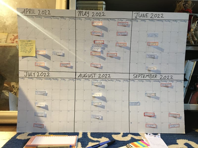
P.S. Here is my Book Launch Calendar I just made this week:
(I might be slightly proud of it)")
-
@Elizabeth-Rose It is beautiful! Congratulations!
-
@Elizabeth-Rose well done, you! Beautiful book launch calendar! There's something so completely satisfying about a colorfully organized calendar/planner, isn't there?
Please let us know when your book preorders are open. I definitely want a copy!
illustrator - author - smiley person
mbaileyart.com
instagram.com/mbaileyart/ -
@Melissa_Bailey Oh my yes! There sure is something satisfying indeed about organizing a ToDo list! Also helps to unclog the mind with all the things one is trying to remember. Thanks! And yes, I will post when the pre-orders open!