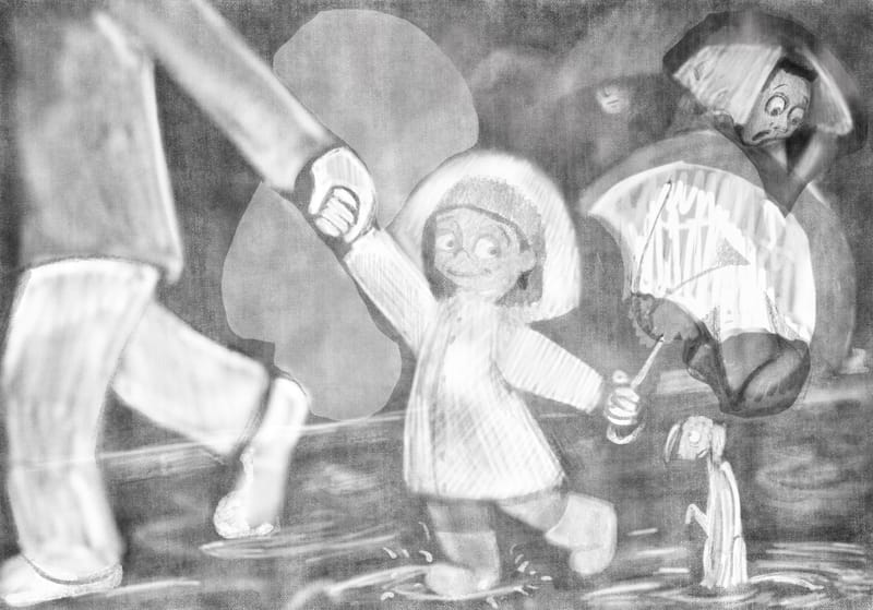
Starting on Storm WIP.
-
@AngelinaKizz ok that’s what I thought but wasn’t 100%
-
@Asyas_illos I tried moving the dude around, and nothing quite feels cohesive. But I think if I drop him into shadow, that will take away the draw to him.
-
Maybe it does make the eye travel better? He’ll still be dropped into the background more as I flesh out the values. What do you think of this placement instead?
-
@AngelinaKizz no I think he’s still taking up too much attention. The focal point is the girl and her dog right? Right now he is competing for the focal point. Maybe just fade him back more like the rest of the background?
-
@AngelinaKizz I would take him out and maybe give him his own illustration cuz I do like him as a stand alone character, I love the classic newspaper over the head gag.
-
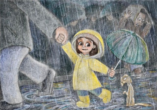
I tried David’s technique of using mask layers to lay out the values first, and then color over. I’m not sure how I feel about where it’s at.
-
@AngelinaKizz Lovely colors in the puddles and I like your depiction of rain a lot. One thing that stands out at me is the size of the dog - he's awfully small in comparison to the girl who I can only assume is also a short/small child.
-
@Kristen-Lango ooooh greatpoint! I made him small because a wet dog usually ends up looking rather rat like but you’re right, in comparison to the girl and her parents shoe, he’s much too small. I’ll have to work on that. Thanks!
-
@AngelinaKizz It seems like in that situation she would be looking at the dog but it looks like she is looking off into the distance. I think more interaction between the two characters would be nice.
-
@Lisa-Clark thankyou! It can only get better with a rework!
-
@AngelinaKizz hi! Hope I'm not too late to reply and mess up your flow.
To answer your questions: yes, the story is clear. The girl's expression is so sweet! The pup does indeed look forlorn.
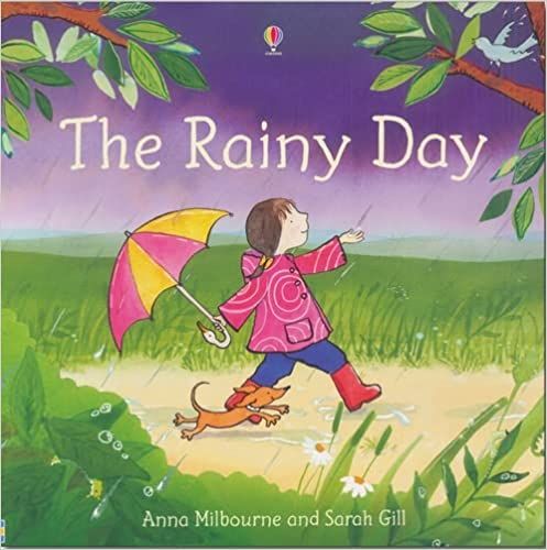
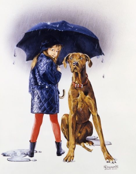
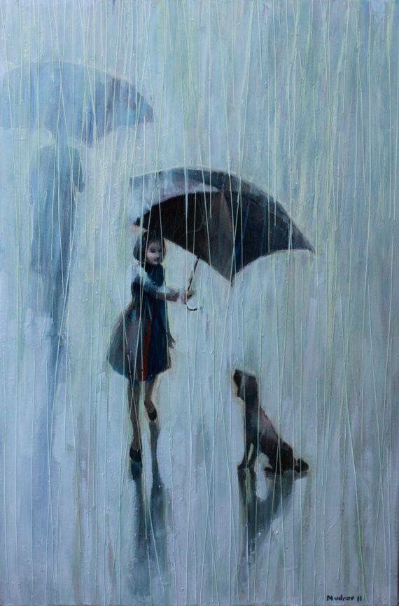
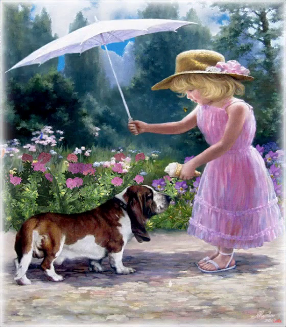
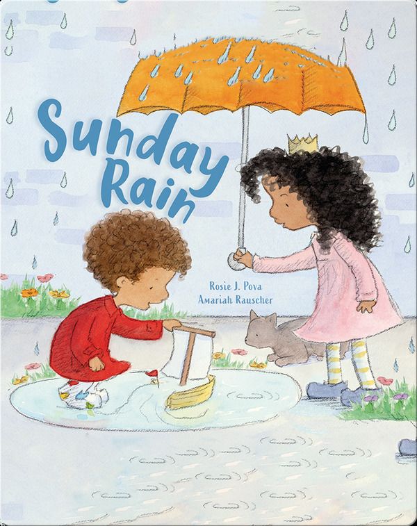
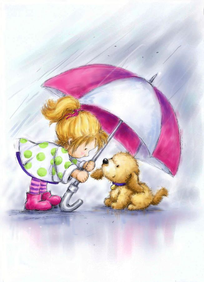
Is it too cliche? To be completely honest, this is an illustration concept I've seen before. Even in this forum, @Asyas_illos posted a similar composition and illustration (but the dog was substituted with an old lady).
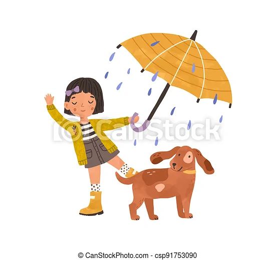
Here are a few illustrations to compare (and one stock image). If you're looking to steer away from cliche, you may want to explore unique spins on this concept.
-
This post is deleted! -
@Melissa-Bailey yep I lost steam with that one I really loved my background but wasn’t feeling the story.
-
Thankyou so much! Never too late! I love all of the references you sent, but yes I can see the too cliche for sure! I’m going to keep thumb nailing and trying to decide on a story. Something good will come from lots of trial and error :). Thanks for such a thoughtful reply!
-
@AngelinaKizz you’re so welcome! Glad you found it helpful. Looking forward to seeing what you come up with…it’s a deceptively challenging prompt!
-
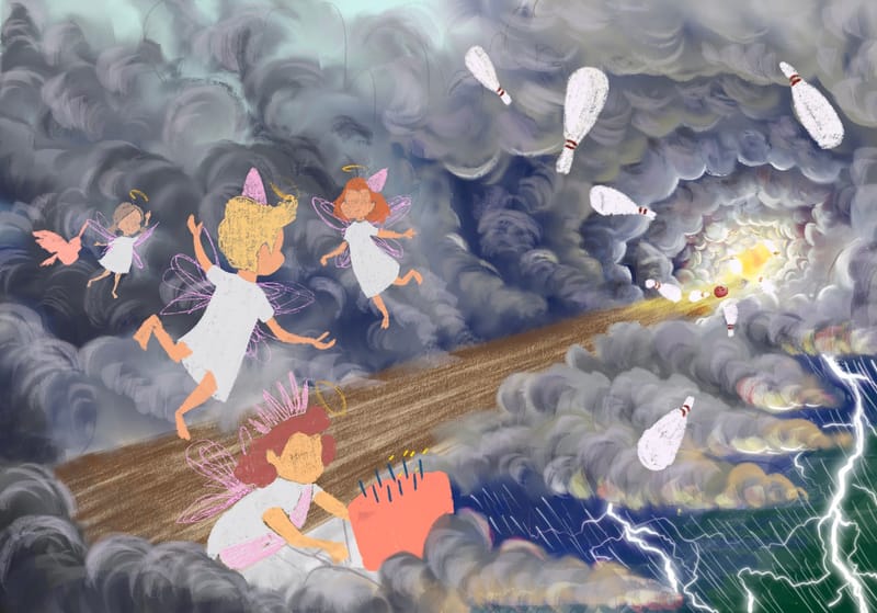
New start to storm. Super super rough, but I’d love some thoughts. You guys are so great to bounce ideas with.
-
@AngelinaKizz The storm looks super cool. Really strong and turbulent, I can really feel it!
I am not sure if I get the story, angels or fairies bowling in the sky at a birthday event? So if they hit the pins they create storm by that? Sorry if i get it wrong.I think the composition and atmosphere already workso well. -
@Holumpa
Thankyou!As little kids, we were terrified of thunderstorms. My dad used to tell us there was nothing to be afraid of, because the angels were just having a bowling party. Thunder was just pins being knocked over, and lightening was a full out strike. I’m hoping once it’s fully rendered that I can make that story clearer. Does it look proportionally balanced? Should anything be moved?
-
@AngelinaKizz I love those clouds!
-
@AngelinaKizz Is that a family story or is this a tale for children that is generally known in your area? Maybe it'sjust me not knowing about it. But I love the tale and I think it's a super cool idea for the prompt!
In case it is just a personal story I am thinking if there is a way to make it more obvious that the bowling is the actual cause for all the storm.
And to me personally it would be easier to read if the angels had feathers. The wings you drew remind me subjectively more of fairies. And to me angels are in the sky and therefore more likely connected to weather if you know what I mean.
The composition works in my opinion. I would just maybe work on the cake, right now the cake and the angel seem separated from the rest and it is not clear to me what the angel is doing.
