Developing Visual Stories - My Assignments
-
Hello! Nice to meet everyone in the community. I am new to SVS. I just started this awesome class and I am posting my first assignment "A Dog Hides". Would like to get your honest feedback on the storytelling and design aspect for this rough, before I give it another pass. Thanks in advance
")
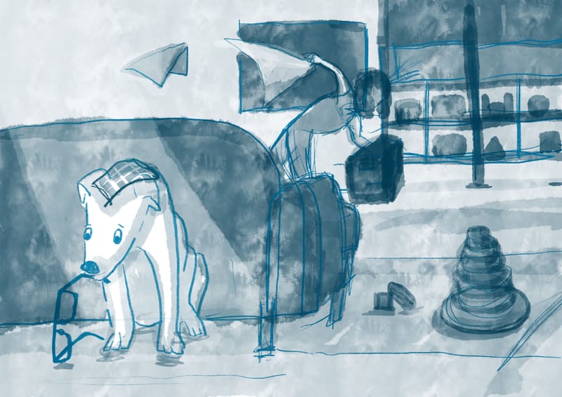
1. Is it easy to tell the story?
2.Are the focal point(s) clear?
3.Anything else I should take note of or fix?
Looking forward to learning and improving together with everyone here. So many cool works and constructive feedbacks being posted
www.instagram.com/art.melc.illo/
www.artmelc.com
I write weekly on mondayblues.substack.com -
@Melissa-Candrasaputra hello and welcome to svs! That is a great class. I don’t see an image though, did you add one? You’ll need to select the upload image icon with the folded corner to add your illustrations
-
@Asyas_illos Ah of course. What a classic newbie blunder
 thank you for replying. I have now edited the post to include the image.
www.instagram.com/art.melc.illo/
www.artmelc.com
I write weekly on mondayblues.substack.com -
@Melissa-Candrasaputra we’ve all done it
 I like the story and it is clear what’s going on. I think if you want the person to be a secondary focal point you could move the tv towards the left more . Doing this would give a clearer silhouette the the person as well as the things that are being thrown, as they will both get better contrast with the background.
 -
@Melissa-Candrasaputra Welcome to the forum, good luck with all the classes.
-
@Melissa-Candrasaputra Hello!
What a lovely illustration! Okay, here are my answers:
-
Is it easy to tell the story?
Mostly yes. I can tell that the dog is hiding because it stole the glasses, but I'm not sure how the dog and human are feeling. Is the dog afraid because it knows it will get in trouble? Or is the dog being playful? Or mischievous? Is the human angry? Or panicking? Or confused? I'm assuming the story will clear up once you add more details. -
Are the focal points clear?
Yep! It's very clear to me that the dog is the focal point
-
Anything else I should take note of or fix?
Perspective might be an issue, then again I'm not sure what style you're going for, sometimes perspective doesn't matter.
Hope this is helpful!
-
-
@Daisy Thank you for the feedback! I will keep those in mind when I take it to finish
 ️ I am planning to take environment/perspective class next haha it's never my strong suite. Everything here is so good.
 -
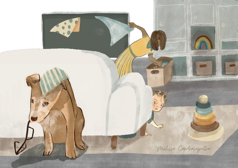
Okay, this is the finished image. I am learning a lot from doing this. Working on Procreate seems to be giving me style confusion/mixup -.- any way to combat that?
www.instagram.com/art.melc.illo/
www.artmelc.com
I write weekly on mondayblues.substack.com -
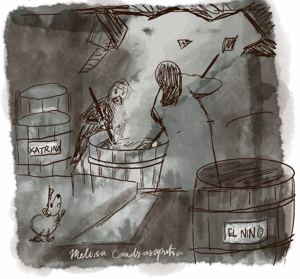
Assignment 2 concept thumbnail which I intend to use for May storm submission when I hit the right one. I think I need to try a couple more… Any thoughts?
www.instagram.com/art.melc.illo/
www.artmelc.com
I write weekly on mondayblues.substack.com -
@Melissa-Candrasaputra So the people are cooking the dogs and the dogs are all named after storms? Aside from the names, it's not very storm-y. Maybe if you highlight the emotions of the piece you can make it fit the theme better (it's an emotional storm, get it?).
Or are they releasing or capturing storms? That's a cool idea. You'd have to change some stuff, though.
-
@Patricia-Dishmon Thanks. I feel the same way. Looked better in my head than on paper. I’m gonna try a higher point of view to show the storm escaping through the roof or might go with something else altogether
-
@Melissa-Candrasaputra Really nice! I love the inclusion of the baby, it really works. I work on Procreate 50% of the time and really enjoy it. Why does it confuse your style?
-
@Daisy I enjoy Procreate too. What I mean is I started out wanting to do a semi-realistic style but when I work on Procreate I became "automatically" drawn to a flat style. For this painting: dog vs baby vs mom they look like 3 different styles to me, and only mom seems to fit with the background
I used to do traditional media, mainly watercolour and gouache and did not have this problem. Maybe I am just too new at it and need to get comfy with the medium by doing more paintings.
www.instagram.com/art.melc.illo/
www.artmelc.com
I write weekly on mondayblues.substack.com -
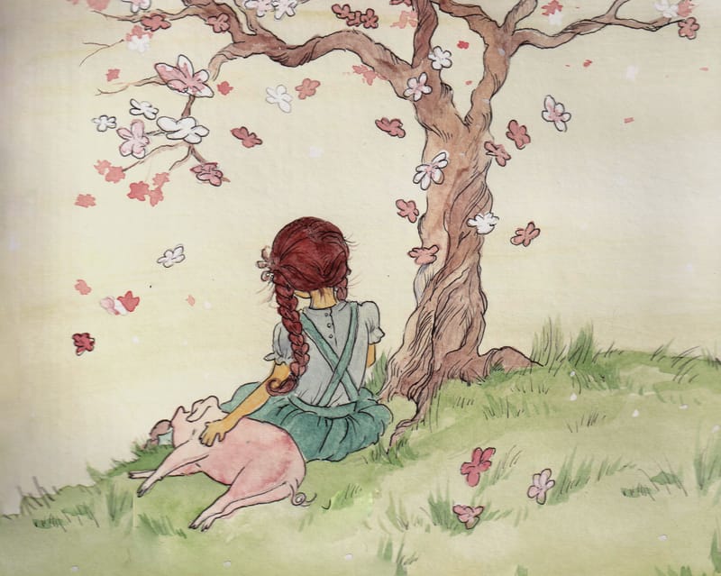
@Melissa-Candrasaputra I looked at an iPad with Procreate to see if I want to add it to my wide array of tools I like to use, in an effort to achieve more texture and the "organic" look of natural mediums. I currently use Photoshop, on my Cintiq. It's so helpful to see others working through their process. I've played with traditional media, for example watercolor, colored pencil, and then scanning, and cleaning up the image digitally. This is an ongoing effort for me to find that look, staying consistent so I am not all over the place style wise! This is just watercolor on cold press paper, and ink, didn't touch it digitally yet so not sure what do with it yet. Any suggestions?
So do you like Procreate enough to stick with finding the brushes you like or have you played with traditional media THEN scanning and digitally adjusting things? Just wondering what direction you're taking.
Thank you
Erin Richardson
instagram.com/erinrichardsondesigns21
www.erinrichardsondesigns.com -
@ArtistErin thank you for joining in the convo! I definitely love Procreate enough to want to master it in due time!
Regarding your image, it's a lovely peaceful scene. The first thing I would tweak digitally is always the brightness. Scanned watercolour often look muddier / grayer / paler or any combination of those. In your case, it seems to take on a bit of a gray/muddy quality so it will take a bit of work digitally to freshen it up. I can't tell you the exact process cos I am not very good at cleaning up scanned image in digital as well
what I have also tried is paint individual element in watercolour on white background and then collage the scanned pieces digitally, which seems to give me a higher success rate with colour but man it was labour intensive... -
@Melissa-Candrasaputra Good job coming up with a concept for this assignment! Some things that jump out at me are: your characters aren't reading well in terms of gesture and expression - the baby looks almost mad to me which doesn't seem natural and overall I'd encourage you to revisit figure drawing on the whole. I hope this helps, and keep up the good work in studying!
-
Jumping in on the conversation about getting traditional media into digital --
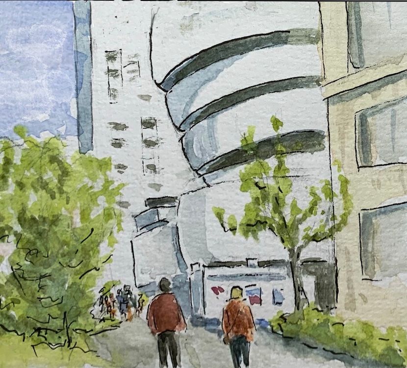
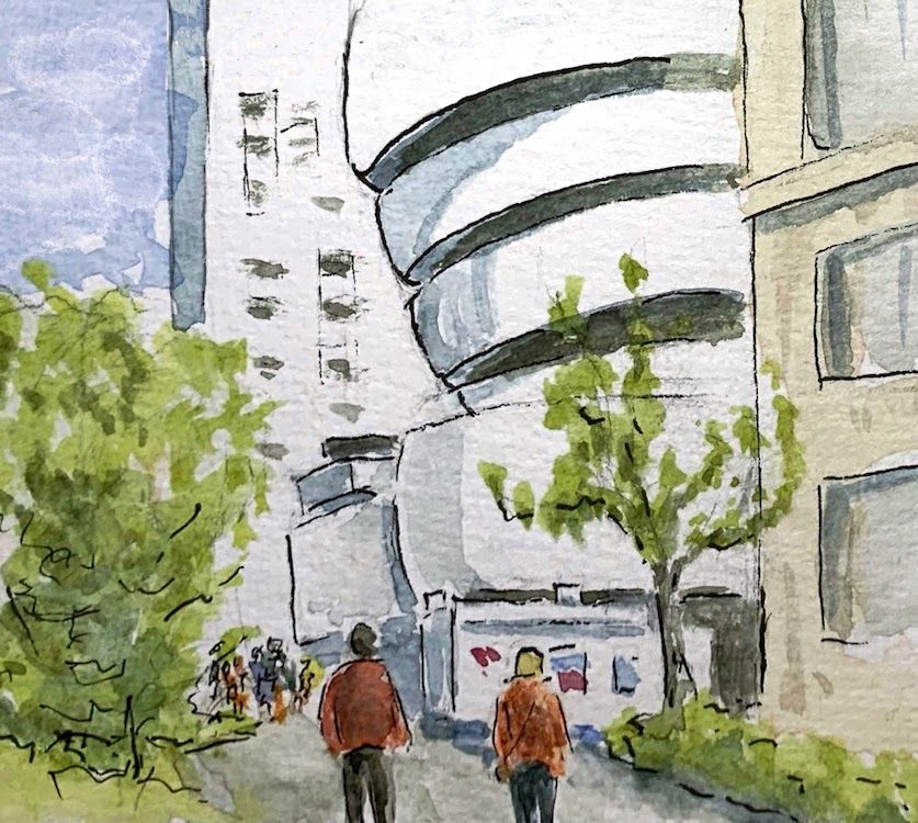
I do traditional watercolors and have done a lot of experimenting with trying to get the best digital copy. I've tried good cameras with studio lights, scanners, my iPhone, and various digital means to get the inevitable gray out. If it's on hot press, scanning seems to work the best (if you have a decent scanner) but cold press is hard because of the texture.
Currently, I get the best results using my iPhone and photographing it in the most neutral light I can find. (Inside my house with indirect light around noon seems often to be the most neutral temperature light.) I then adjust the white balance, contrast, etc. with several different apps. You can do a lot in Snapseed, a free app for the iPhone, because it allows you to select individual colors on the painting and adjust the brightness/contrast etc of just that one color. I also sometimes take it into Procreate and select the white sections of the paper (which is often too gray) using the autoselect and threshold adjustment and replace it with white.
Here, for example, are a before and after of a quick watercolor sketch I did of the Guggenheim when I went to NYC. This was all with my iPhone camera and Snapseed. I could have messed with it even more but it was just a sketch and I mainly wanted the white of the Guggenheim to show up.
By the way, Alicia Armadilla, a wonderful line and wash professional artist, does all of her scans with just an iPhone and Snapseed.
Hope that helps.