Failed Treehouse Critique Please!
-
Hi folks! Would anyone be so kind as to critique my tree house, which didn't make it into the top 16?
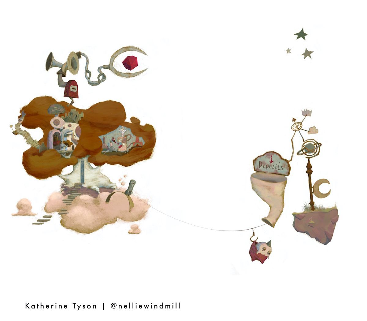
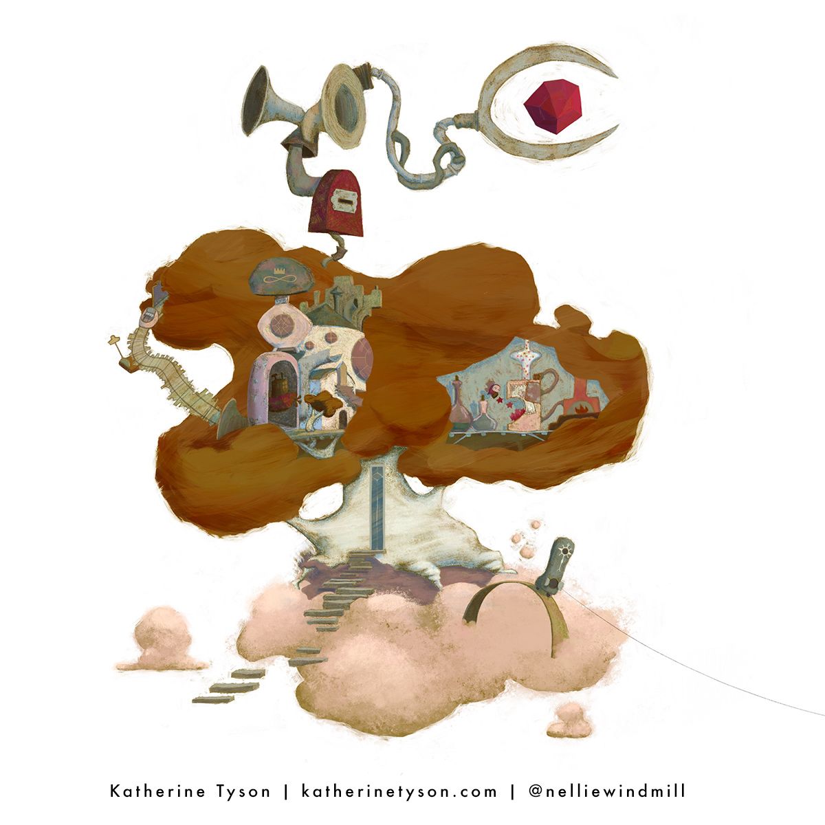
The first image is the one I submitted to Critique Arena and I'm sharing the second zoomed in one so you can see the treehouse itself a bit better. I won't describe the concept because the judges didn't know what that was either so I'll wait until I have your critiques and then I'll elaborate if anyone wants to know
")
Thank you!!!
the site: katherinetyson.com
instagram: instagram.com/katherinetysonart -
@Katherine I really love this it’s so wild, and beautifully done. I have to admit the concept is a bit fuzzy, but I think it’s maybe a tooth fairy tree house? Or perhaps something with burnt out stars?
-
@Katherine I think this image is really stylish and original and I think the only thing that needs working on is the scale, and the spacing between the treehouse and the figure. I think because of the image being so small it was harder to read the concept and story.
-
I've got to admit, I'm a bit confused as to the concept. It's a super cool design though! I love the floating crystal on top and all the horns and tubes, even though I don't know what they're for. Design wise they are very interesting to look at. Maybe do a little brainstorming, and see if there's a way to help your concept come across clearer? Also, the foliage of the tree isn't really reading "tree leaves" to me. Maybe find some artists who do trees in a way you like and study how they do that. Looking at the way other people paint things always helps me when I'm stuck! Oh, and I also like the floating steps, and how they are uneven. Very cool! Hope this helps a little.
Instagram: https://www.instagram.com/kirsten.mcgonigal.art/
Portfolio Site: www.kirstenmcgonigalart.com -
@Asyas_illos Thank you Aysa! Yes, the concept is so off the wall that I must admit I gave up on trying to convey it through illustration alone at some point. It is a rehabilitation centre for lost and forgotten small gods. And because the gods I want to illustrate for this story are ones that I'm making up, like "Pastiche", the god of out-of-fashion moustaches, I didn't want to rely on iconic cliche's like Poseidon holding a trident etc. That's probably a cop out though and in hindsight I'm sure I could have used more iconography for health and shown more "treatments" being performed on characters.
Aside from the concept though is there anything composition, design, or rendering wise that needs improvement?
-
@PenAndrew Thank you,Andrew. Yeah the smallness of the architecture and interior detail in the treehouse was problematic. The tricky thing is I designed it as a double page spread and I printed it at that size to make sure that everything was readable and it was. But it didn't translate into a 1200 pixel wide image at all. With that in mind do you think I still need to embiggen the treehouse elements? It probably couldn't hurt to exaggerate them. Also is there anything else composition, design, or rendering wise you think needs improvement?
the site: katherinetyson.com
instagram: instagram.com/katherinetysonart -
@Katherine I think anything you can make clearer the better- were these clouds? I didn't really get that if they were. I think cliches and icons are ok, anything that helps tell a story. As long as the whole image isn't a cliche- which this clearly isn't. Did the judges mention your work then?
-
@Katherine I think your images on your website and I recognise your winning illustration(congratulations- for inktober character design win) I think they have more of a singular concept- maybe this can be broken down into one main idea. I think rehabilitation for the gods is tricky and the gods being alternative. Sounds like a whole story in itself. Plus this is a treehouse so also what is the relationship between treehouse and rehabilitation centre.
-
I have a hard time identified a lot of what’s in this image. It all feels a bit abstract. Something you could do to make it more readable is adding contrast in value and shape. I’d recommend focusing on shape first, have lots of variation in sizes and check how the silhouette of the treehouse looks
-
I'm sorry you didn't make the top 16, but please do keep trying. I read all the notes so far from others and am pretty much aligned with everything that's been said. I really like the care you put in various parts of your treehouse. It definitely feels like you have a story in mind. In terms of trying to make the top 16, I've found that it's challenging when you compare a spread with a page, size-wise. The page, or 8x10" thereabouts, will read much better because it tends to be simpler and easier to compare to most others. Very intricate designs are tricky because of the need to zoom in and we can't submit hi-res images so that's a problem; so try to choose a simple design. In terms of competing, again, simpler shapes and concepts tend to perform better. But simple doesn't have to be boring. Concepts that are heartwarming, funny, surprising, suspenseful, scary, anything that will spark some emotion or make me curious, will rise to the top. Lead with a strong a concept, then work on expressing that really well in your illustration. I hope some of this is helpful. Good luck and thanks for sharing your work with us:)
-
@kirsten-mcg Thank you Kirsten — I'm adding the foliage to the list of things I'm going to re-work
-
@PenAndrew Thank you, Andrew — yep they are meant to be clouds so I'm going to take a day to re-work All the Things, including the clouds
-
@PenAndrew Yeah it is a whole story in itself — the plan is to make a book dummy out of the idea. That is such great feedback about using recognisable iconography and I'm going to incorporate some recognisable gods in amongst my made-up ones — thank you!
I have no reason for it being in a treehouse other than it's cool and whimsical and why not — do you think there needs to be a reason? I'm in two minds about this and I think it's a great discussion to be had. On the one hand I'm glad no-one told Terry Pratchett he needed to have a reason to put the Discworld on the back of a giant turtle in space. On the other hand I quite like the illustration school of thought that everything — shape language, colour, props etc should reinforce your keywords. So if a tree doesn't specifically speak to the story you're telling it should go. The other thought I have on the topic is that I like to use a bit of inductive logic when coming up with illustrations and stories. So something will show up in an illustration and I might not necessarily know why but I'll go with it and it'll end up as a story element. My favourite illustrations are ones that straddle the divide between illustration and fine art and invite a bit of subjective interpretation. So I guess my ultimate answer is I don't know why it's a treehouse yet
the site: katherinetyson.com
instagram: instagram.com/katherinetysonart -
@Griffin Thank you, Griffin — I am going to spend another day on it and do all of these things! I'll also make the architecture bigger like Andrew suggested
-
@Johanna-Kim Thank you, Johanna — yes I don't think a double-page spread is especially suited to being viewed at 1200px
 My main priority is getting portfolio pieces rather than winning Critique Arena so I'll just do whatever aspect ratio is right for the piece, knowing that it may mean I don't get in the top 16. Yeah that's a great point about the emotions — I was going for wonder, delight, and curiosity with the treehouse, which will hopefully be more successful once I attend to all the technical problems!
the site: katherinetyson.com
instagram: instagram.com/katherinetysonart -
@Katherine just chiming in on the double page spread for portfolio, you need to think how you are going to format and print it.
-
If it is on your website, it is likely to not be super hi-res either, and on most portfolio site layout, your image gallery is thumbnailed so a really complicated image may not get an art director clicking if it doesn't have a strong first impression when small.
-
If you will print a portfolio book, the standard sizes seems to be A4/8x10 or similar. Which means your double page spread is probably going to need to be resized smaller to fit the print pages. In this case, point 1 still stands.
Or you could print it oversized and accordion fold it, but that means you only have space for 1 at most 2 of such spreads or your book may fall apart. This is the only way I see it working to guarantee a double page spread viewed at full size.
Sorry if it is only marginally relevant to your image but I've been hit this way too having to size down double spread and it not looking the way I want it on my portfolio so just want to share!
www.instagram.com/art.melc.illo/
www.artmelc.com
I write weekly on mondayblues.substack.com -
-
You know Kathrine, I would just eliminate that word failure from your vocabulary. I think your work, which is incredibly interesting, is a strong step in the direction that you desire to move toward as an artist. Do you study Fine Art? This piece has that whimsical complexity modern fine artist love. Therefore if becoming a children’s storybook illustrator is your ultimate desire, think of viewing your work from a child’s point of view.
What did you love to look at and read as a very young person?
I hope this helps a little, but keep at it, your work is really interesting, I sure you will find that sweet spot soon and you lots of great input and support at this gold mine of a school.
-
@Robert-Henderson said in Failed Treehouse Critique Please!:
You know Kathrine, I would just eliminate that word failure from your vocabulary. I think your work, which is incredibly interesting, is a strong step in the direction that you desire to move toward as an artist.
I actually had the same thought.
I mean, it was around 100 treehouses... sometimes we just don't make it, and it doesn't meand we "failed". It just mean we still have to improve. And thats a nice journey
Website: www.von-Nimmermehr.com
Instagram: https://www.instagram.com/von_nimmermehr_illustration/ -
@Katherine I love your work! This is a wonderfully creative mashup of magic and Rube Goldberg. I think it's a readability issue, both the story and the fact that everything had to be so small to fit into a spread. The shapes were complex and irregular to be so small. But even if the elements were larger, I'm still not sure I'd get the story except that it's some kind of magical factory. And dangit, I want to know!
The only specific drawing/rendering critique I have is that the leaf mass almost reads more as rock forms and could use a bit more of a careful design. And something about the way the two masses balance out could use more design. I sort of want to see the deposits area smaller in comparison to the tree. As for readability, maybe a bit more contrast, especially in the room with the conveyor belt, would help. But basically, you could take what you have, play with size, shape and contrast, and give us some more story elements. But don't ditch it!
Those wacky silhouettes of the contraptions in both areas are great. There's so much going on there that looks interesting that I want to know more about it, and that's no small order. In fact, it's the most valuable part. So keep up the good work and don't let not making the Top 16 get you down. Hey, you already won once, and that's better than I've done, so kudos to you! (In fact, come to think of it, if I remember correctly your winning piece eliminated mine early on
 ! Hahaha! )
 -
@Katherine I/m glad the feedback helped and yes I do not think you have to justify the use of a treehouse, but maybe there's an undiscovered link there, I think a tree in the clouds suggests the heavens and small gods. Yes, I am a fan of Terry Pratchett, read most of his books.