SVS Coursework
-
I thought I'd start a thread to share my SVS coursework as I work through them. First here's the first assignment from Light and Shadow for Illustrators, an analysis of the usage of local tone in some artworks I like:
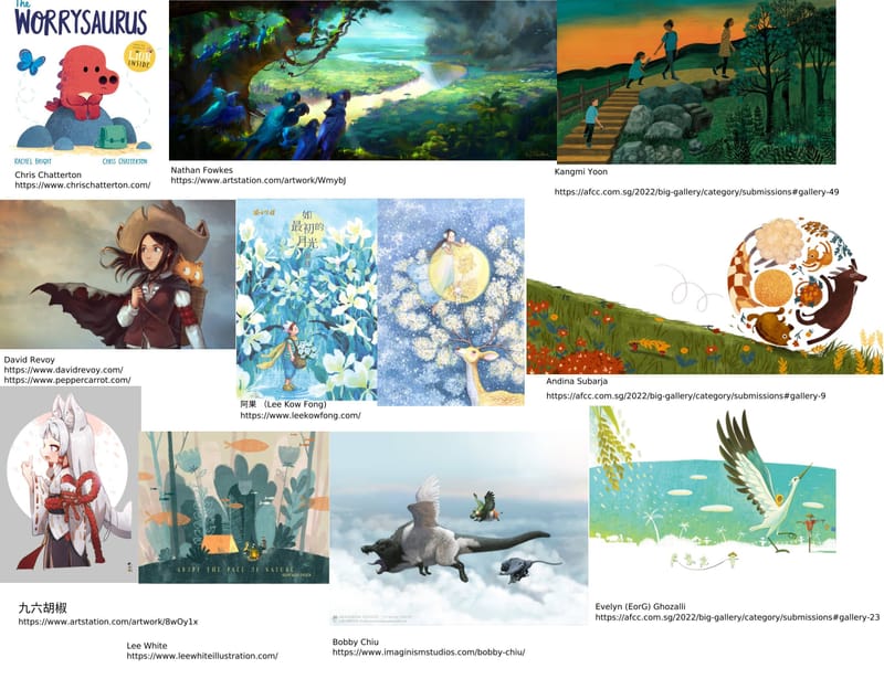
I'm quite a scattered artist, the type who will probably fluctuate over a wide range of styles over time, and I admire many different styles too, from the more graphic and stylized to the more realistic, as you can tell from the selected works.
So here are the few artists that I picked out, go check them out!
Chris Chatterton
https://www.chrischatterton.com/Nathan Fowkes
https://www.artstation.com/artwork/WmybJKangmi Yoon
https://afcc.com.sg/2022/big-gallery/category/submissions#gallery-49David Revoy (of course!)
@davidrevoy
https://www.davidrevoy.com/
https://www.peppercarrot.com/阿果 (Lee Kow Fong)
https://www.leekowfong.com/Andina Subarja
https://afcc.com.sg/2022/big-gallery/category/submissions#gallery-9九六胡椒
https://www.artstation.com/artwork/8wOy1xLee White
https://www.leewhiteillustration.com/Bobby Chiu
https://www.imaginismstudios.com/bobby-chiu/Evelyn (EorG) Ghozalli
https://afcc.com.sg/2022/big-gallery/category/submissions#gallery-23(artworks in color and grayscale to see value more clearly)
In terms of how they use local tone, most tend to have a very clear value contrast between character and background, and also frame key parts of the character (eg. face) with value contrast in local tone.
Chris mostly uses colors to contrast character and surrounding props, as their value is mostly the same.
Whereas Nathan Fowkes really draws the viewer's eye along the river towards the plume of smoke by having a very light river, surrounded by mid-value foliage, contrasted against the dark tones of the foreground and smoke.
Kangmi's characters are more backlit by the dusk glow, though I do feel the characters could stand out even more by lightening them up a bit against the mountain foliage.
David's character is mostly dark against the sky, but her face is nicely framed by her dark hair. Carrot is about the same value as the sky so the color plays an important role in contrast here.
Kow Fong's pieces actually have quite a limited value range, and contrast is achieved more from complementary colors. It would be interesting to see how the piece would look if the value contrast were accentuated a bit more.
Andina's piece has the characters, foreground, and props contrasted beautifully against a stark white background, with a very clean look. The effect is great.
九六胡椒 actually puts a light character against a light background. The darker bottom and red rope-sash help to anchor it, but they really depend on linework and shading to make the character stand out against the white moon. Also effective in a different way.
Lee clearly separates subject (tent, foreground), middleground (forest) and background (grey-brown sky) with value differences. Again very clean and nice.
Bobby is painting primarily dark creatures against a light background. The flying tapir wolf-thing (the largest creature) is a great example of using dark patches to outline a predominantly light character, as well as shading to produce value contrast even when local tone of creature and background are similar.
Evelyn is doing something similar to Bobby as well, outlining the crane's white wings with the black tips against a light background. But the crane's light is also contrasted sharply against a darkish blue-green sky, and it's dark legs sit on white ground. I really like this too!
-
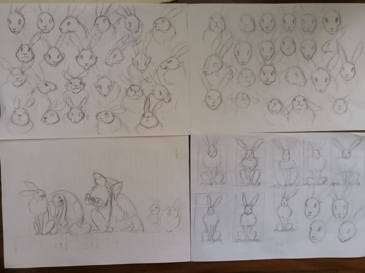
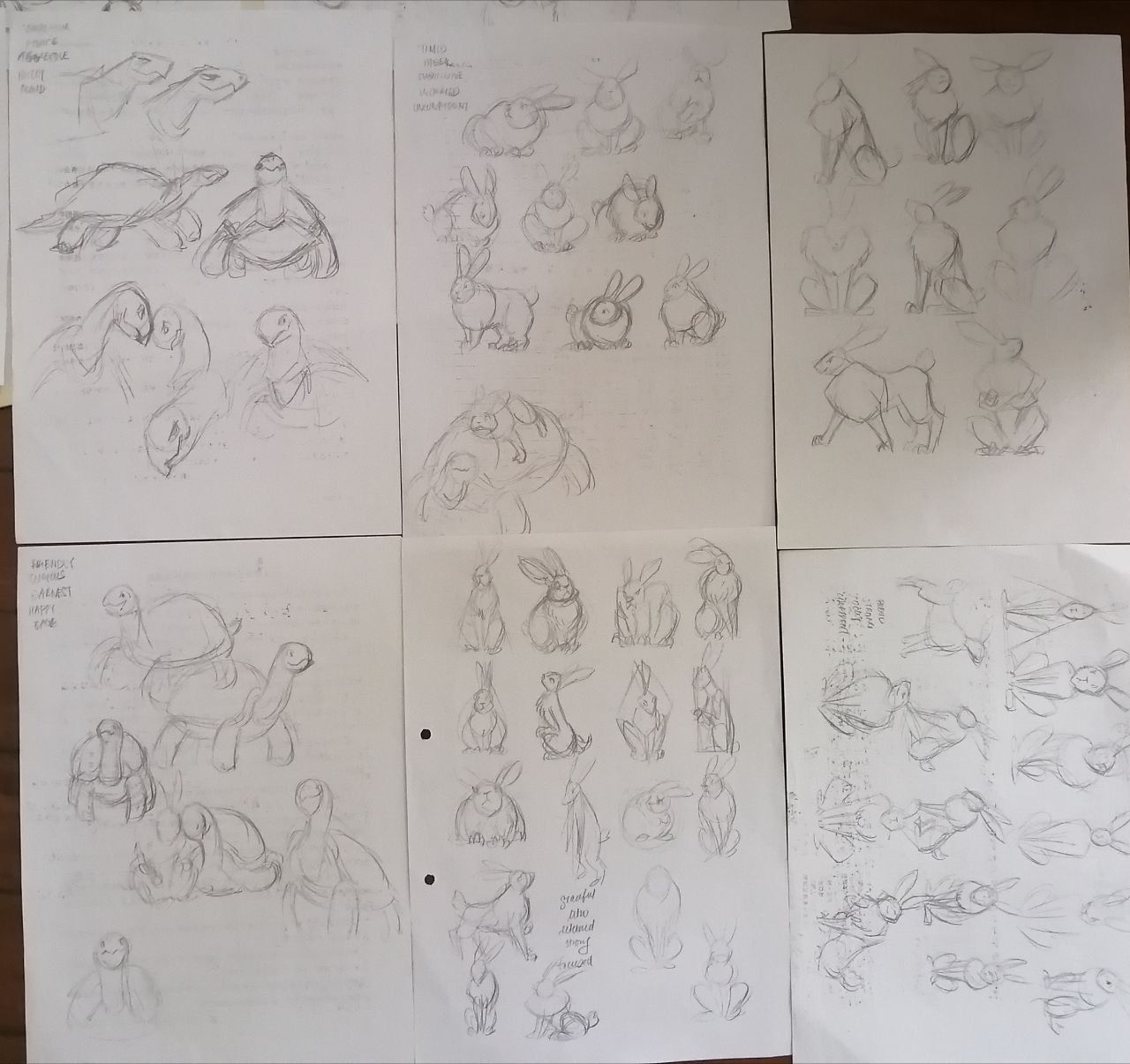
I've been doing some of the SVS courses in dribs and drabs in between my children's book work, and I've been waiting to get a more substantial amount of pieces together before sharing on the forum.
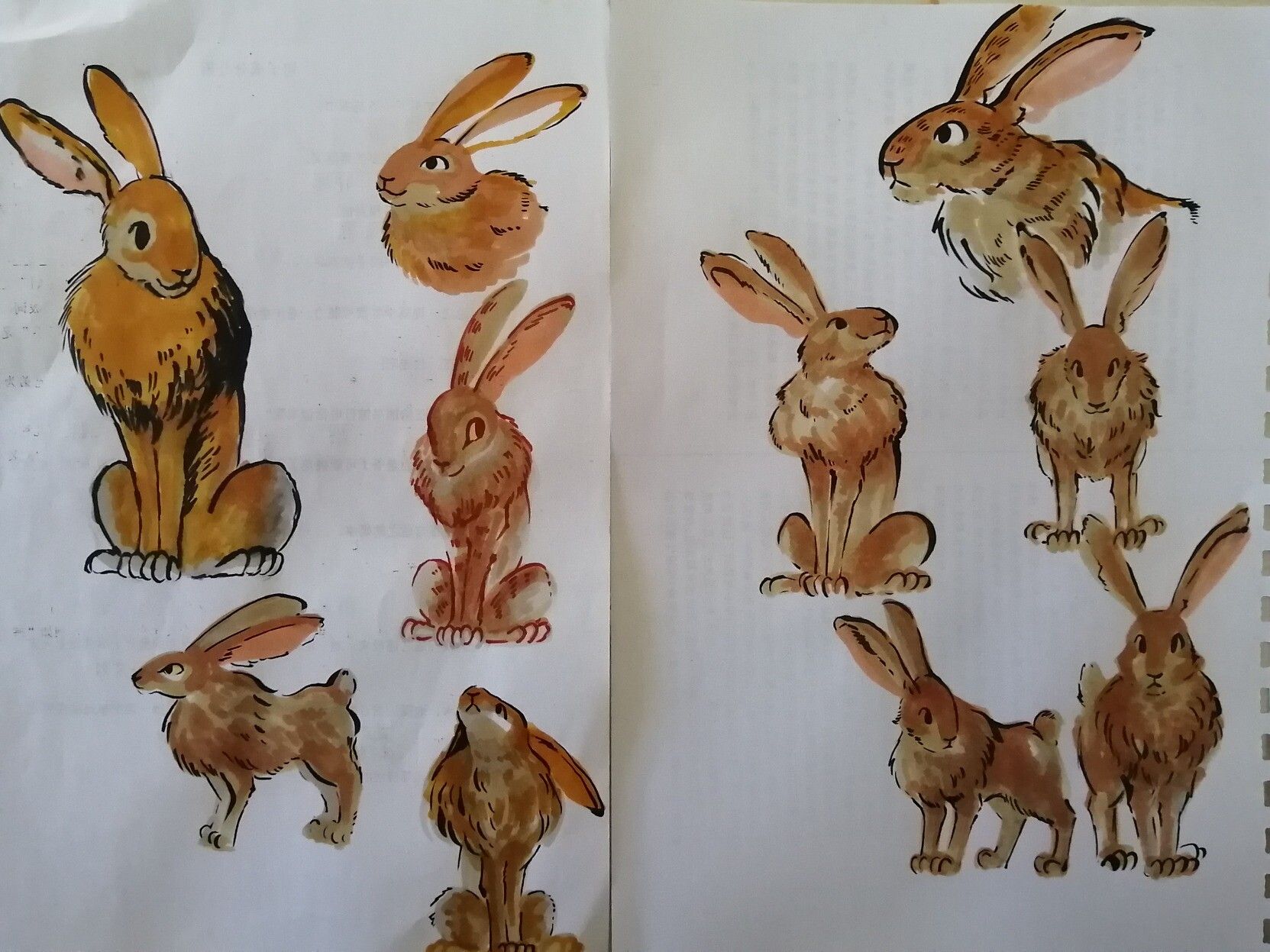
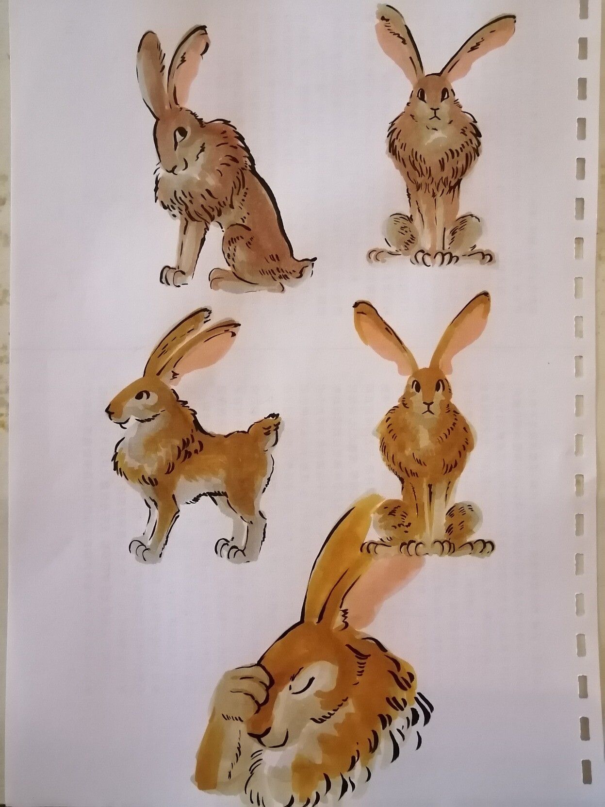
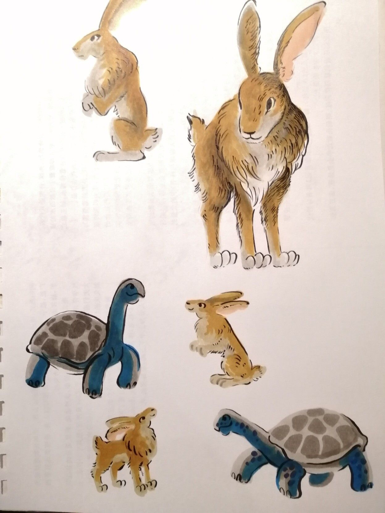
So I've been trying to use the July Rabbit Road Race prompt as the theme for practising developing characters from what I've learnt in the foundations character design course. It's definitely taught me to be more deliberate in my shape language and choice of proportions, and I hope that shows through with the final result.
In the process I also rediscovered my easel and copic markers, and had some fun playing around with more spontaneous drawing/paintings with the markers, in a much more simplified style. In the end I still copped out and did the final designs digitally though

Here are some pencil sketches exploring shape and proportion
Color sketches/paintings with copics (yeah, the detailed style doesn't work out. Also the colors look slightly off in the photo but oh well)
-
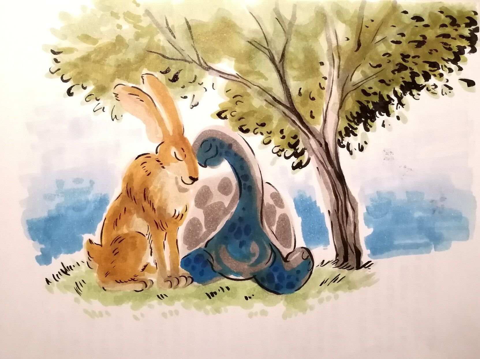
Aand here is the final character line-up.
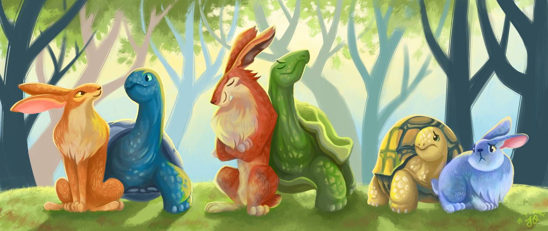
I was trying to go with a slightly more stylized look with this.
The background was somewhat of an afterthought since I was mainly focussed on featuring the characters side-by-side but I thought it would be good to force myself to think about a fitting background (setting, rendering style etc) at the same time. I think it worked out somewhat.
Let me know if I was successful in conveying my character's personalities in my design, from shape language to expressions to posing. Or any other feedback/critique really!
As for the story...to be revealed when I finish the actual piece for the prompt
