Could I get a Critique?
-
@Eliana-Bastidas You caught so many things that I didn't even notice, but now that you point them out they are screaming at me.
 Thanks so much! All helpful points for reworking this image.
Instagram: https://www.instagram.com/kirsten.mcgonigal.art/
Portfolio Site: www.kirstenmcgonigalart.com -
@Griffin Your inner Will Terry is very wise!
 Thanks for all the tips! You've given me a lot of pointers to go on when I rework this piece!
 -
@kirsten-mcg you are welcome! Hope to see the follow up soon

-
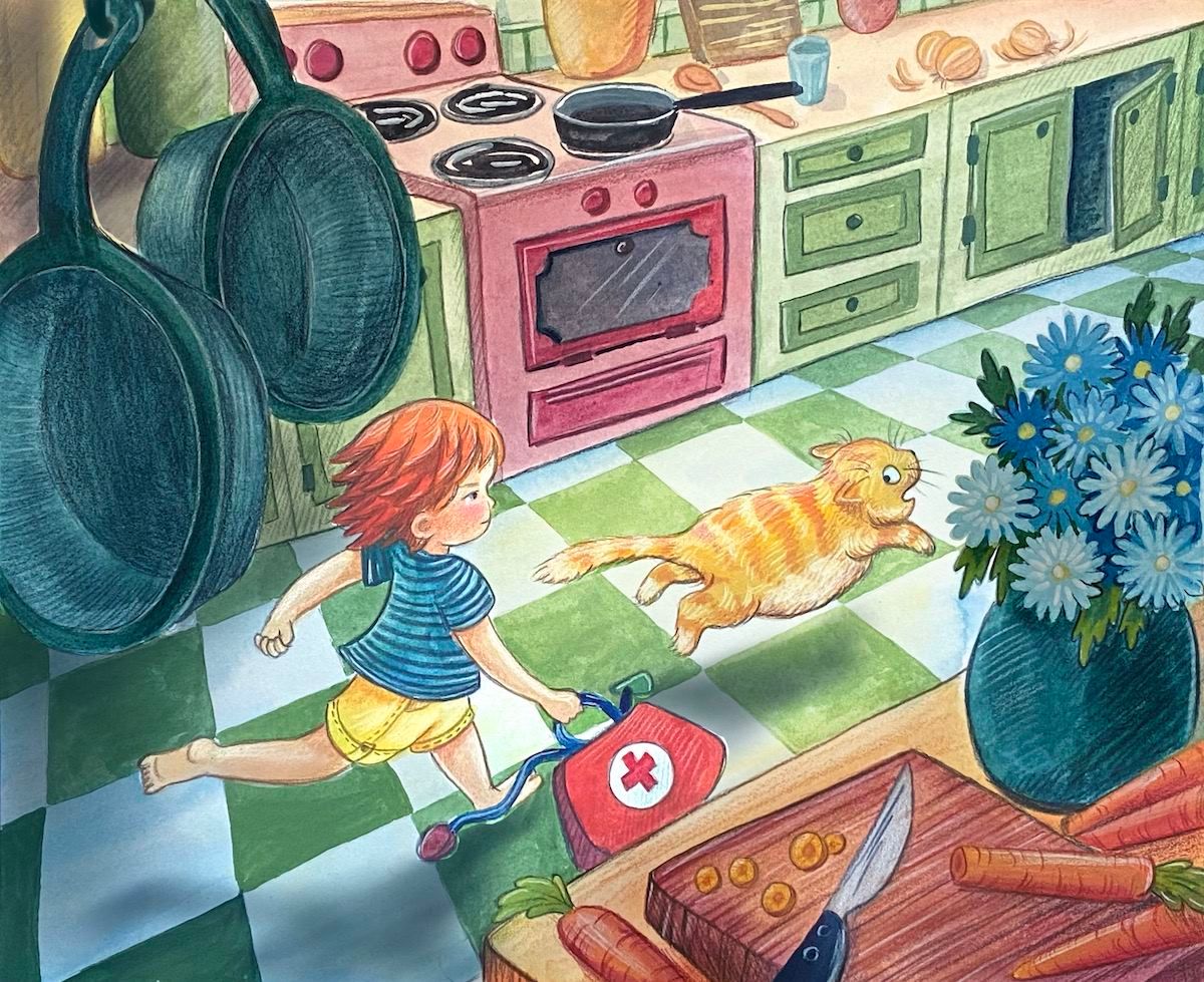
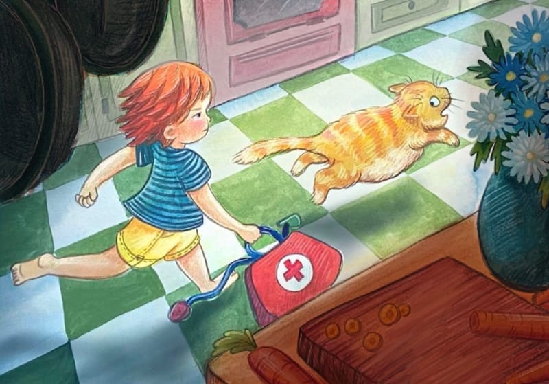
In regards to the second image, I think you’ve given too much prominence to the flowers on the counter. I think you could improve the image by pulling back on the flowers, and moving the child and the cat slightly out from the pots. Right now it’s a bit hard to read. The story is good, but I think a few tweaks would make it better.
-
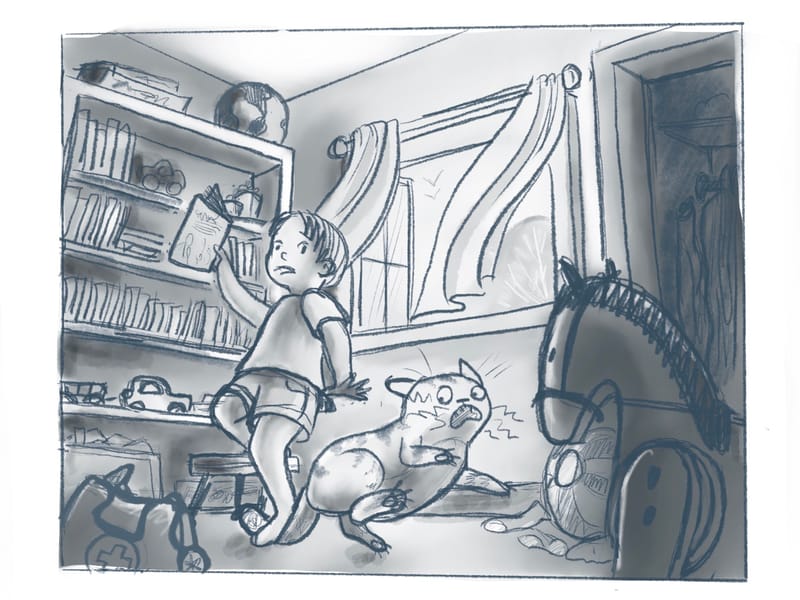
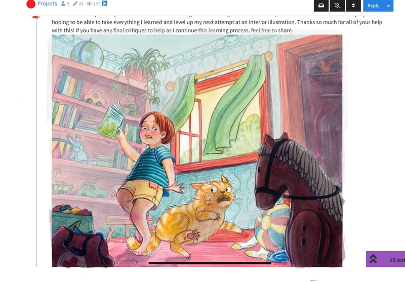
So here's a re-working of the first image. What do you think? Any more clear? I'm really struggling with the angle of the cat, and I don't think my cat would appreciate being the model for this one!
(please excuse the weird line in the ceiling. I'll be sure to edit that out!) Does the cat's pose look weird to anyone else? 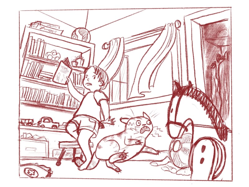
Instagram: https://www.instagram.com/kirsten.mcgonigal.art/
Portfolio Site: www.kirstenmcgonigalart.com -
@kirsten-mcg Kirsten, I'm glad you've received some feedback here on your illustrations!! This is great. First--I love how you're giving thought to interesting detail in your environments. Way to go on that. And I also love how you're moving forward and working on another rendition!! Your responsiveness and eagerness to learn is going to move you forward in your skills!! Keep up the good work.
The pose of the boy in this new rendition is a neat improvement on the original. It looks more fluid! It might take viewers a little bit of time to figure out what's happening, but that can be okay. You could draw more attention to the key moment by your values and colors if you were going to make it full color. For example, make everything but the boy and cat more monochromatic in color.
Keep an eye on the bookshelf's perspective. If you look at the top edge, you might want to have it follow the ceiling line (technically). However, it doesn't mean doing it the way you have it currently, couldn't be a stylistic choice.
")
And neat idea for a lead-in with the rocking horse. I could see that being a shadowed object in the foreground that helps to direct the attention to the middle ground. Maybe two or more foreground pieces would continue to draw the eye to the middle?
-
@kirsten-mcg On the second illustration you once again have a foreground element!
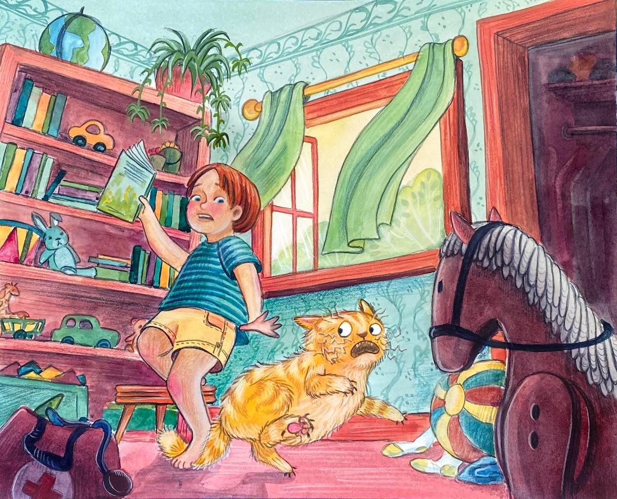
Have you thought about adding another element or two along the same plane as the pots? Also, the pots and the boys head could kind of "stick together" visually ...try making everything in the foreground darker as a whole than anything in the middle ground. Changing the values will begin to push the little boy further into the scene and help to separate him a bit from the pots. Also--some nice line work happening in those background elements--the stove, etc. You've truly got some good skills showing up in your work. Totally keep at it!On the third illustration, the boy and the cat can feel a bit flat against the 3D-ish carpet and furniture. One quick way that might help to bring more depth is to change the direction of the stripes on the boy's shirt. Instead of humping them, make them dip. This will fit the perspective of the carpet better. (I hope that line description makes sense.
) You could do something similar for the cat. Give slight "circle lines" on him to give a more 3D feel. Maybe try moving his back feet, further back. They're sitting rather close to his forepaws which may be helping to flatten him.If you tilt the boy's head towards us a little more it could bring more of a 3D look as well and less of a profile.
Truly, way to go on all this work! This has taken time, thought and energy for you and you should be pleased with what you've accomplished!
Melissa Jacie Art
melissajacie@gmail.com
melissajacie.com -
Hi @kirsten-mcg, lots of action happening here; good stuff!
Few thoughts for your consideration:
- Is the bookshelf falling? It feels like it. Suggest you check perspective.
- The cat feels too big compared to the kid, especially if they are near each other with stepping of the tail.
- My first interpretation was the cat is afraid of the rocking chair horse.
- The dark closet catches my eye due to the contrast; however, I don’t think you want the audience looking in the closet?
It’s definitely a fun piece!
-
@kirsten-mcg really great improvement! This pose is so much clearer and omgeee so cute!
-
@MelissaJacie Thanks so much for taking the time to do these detailed and thorough critiques! I found them so helpful, and I think they will really help me with my final revisions and as I do more value and color. I'm trying to make a nice series for my portfolio, so I'm more than willing to put in the work to get good pieces!
-
Thanks so much for your help so far everyone! I'll post updated pics as I work through the rest of revisions and adding color.
-
Just a quick color study of the picture above. Color coming soon!Instagram: https://www.instagram.com/kirsten.mcgonigal.art/
Portfolio Site: www.kirstenmcgonigalart.com -
@kirsten-mcg I think it could help if you turned the kids body more girds the camera so we can see more of the back leg. It would help to clarify the form. Other than that this is looking great! You’ve added a ton more visual interest and context. The story is much stronger now.
-
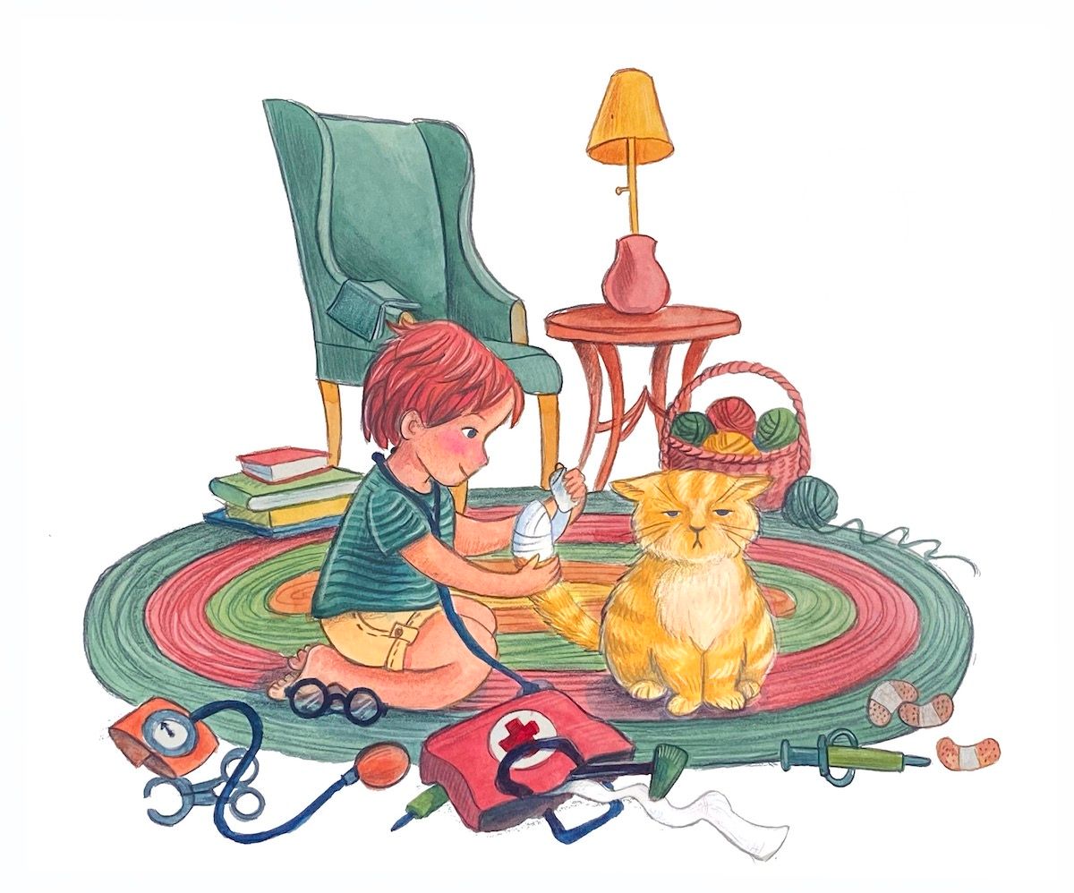
Here are the final pieces I painted in color. There are things I would change about all of them, but I learned so much from this project! I'm hoping to be able to take everything I learned and level up my next attempt at an interior illustration. Thanks so much for all of your help with this! If you have any final critiques to help as I continue this learning process, feel free to share.
-
@kirsten-mcg These look gorgeous and full of energy! I would say that the second illustration is the strongest as the lighting and values help the viewer distinguish between foreground, middleground and background the best.
I still think it would be worth seeing how to further bring out your characters in the rendering. Especially in the first and third drawings, since the backgrounds are so colorful, and the values are similar to the characters, they kind of steal the spotlight away, so I think you need to improve on the contrast there. Even for the second piece I'd like to see the characters accentuated even more although the large foreground objects already help in this case.
TLDR do a value check and increase your contrast to help the main characters stand out. Other than that, great work!
-
@JQ Thanks so much! I see what you mean about continuing to push the value to help the characters stand out more. I tend to have a hard time with values once I transition to color, so that's something I'll continue to work on.
-
@kirsten-mcg These look great! It was mentioned earlier, but I'd like to see more emphasis put on the moment the cat is getting its tail stepped on. It still isn't clear to me. It reads more like both of the characters are reacting to something surprising offscreen. Maybe exaggerate the bend, use old school cartoon excitement lines, or give the cat a more over-the-top reaction with the fulcrum of the reaction being the tail bend. I almost didn't mention this but the illustrations are so beautifully done it seems a shame for the story not to read as well as it could. Beautiful work!
-
My favorite is the spot illustration. It’s story is clear and it could work well as a stand alone piece. As it’s been said, the backgrounds are quite loud and almost work against you. Can I ask if you’re working traditionally or digitally? This can be an easy fix with digital. Lightening the backgrounds and darkening things in the foreground even more. On a different note the second image to me, causes a bit of anxiety with all the dangerous items around the kitchen. The pan on the edge of the stove, the knife on the counter and the heavy pots hanging over head. Meanwhile the kid dashing through, it just makes this one a little unsettling. That being said they are beautifully done the compositions, concept and story have been nicely rendered. I did a couple draw overs for you I hope you don’t mind. The second I cropped out a little of your beautiful kitchen to focus more on the characters.
-
@Asyas_illos Thanks so much for your input! I'm working traditionally, but I'm not against finishing them digitally. I already did some value and color adjustments in Procreate. I really like how you cropped the 2nd image. I might go back in later and play around with them some more. Right now I'm a little sick of looking at them!

-
@Jeremiahbrown Thanks so much for your thoughts! This series has definitely been a huge learning opportunity for me. I'm hoping to be able to use everything I've learned, and the feed back I've gotten to do another series soon. I think part of what I struggled with on this was that my concept wasn't super well thought out and planned. Hoping to fix that next time!