Book Dummy Project (Critique Please!)
-
Hello!
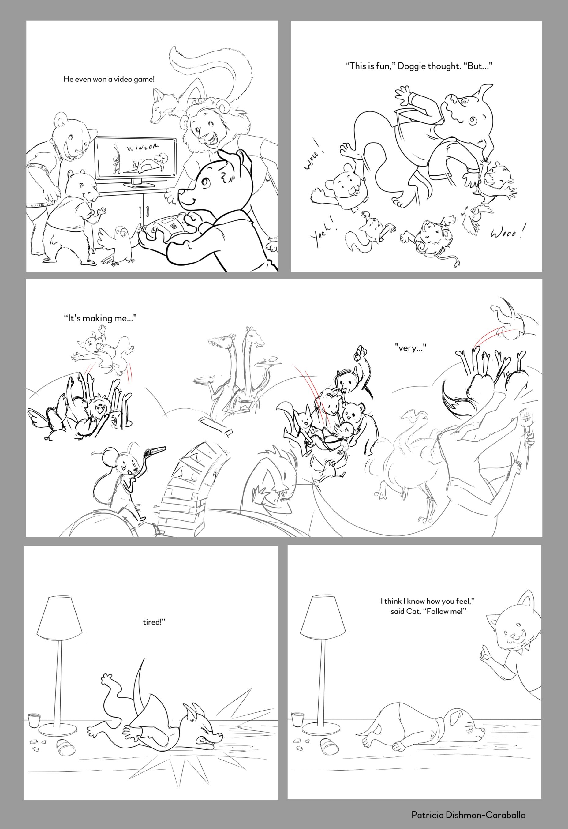
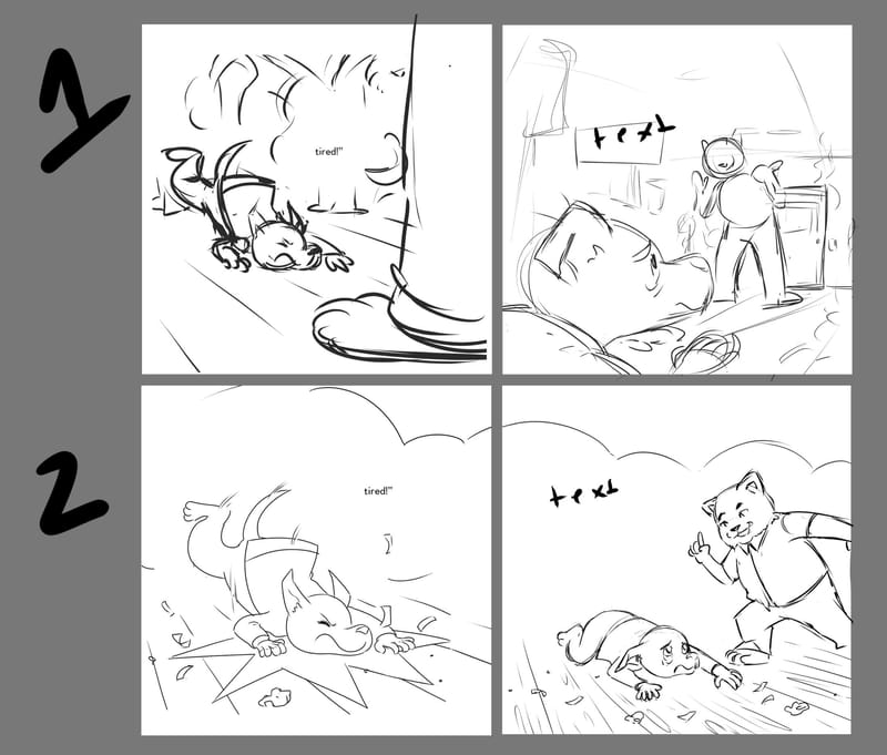
I've been working on a book dummy and decided to select a sequence to finish for my portfolio. I'm missing some storytelling pieces in my portfolio, which is why I'm doing this.For a bit of context, the story is about an introverted dog who gets invited to a party and forces himself to enjoy it. In this sequence, the partying has caught up to him.
My main concerns are:
-
Composition: I'm getting in my head a little about the composition. I'm fine with the first three images, but am concerned with the last two. I wanted the MC hitting the ground to be the focus. I also like that they're practically identical. Honestly, I feel like the reader can clearly see what they're supposed to see, but I'm also caught up on feeling like I have to have exciting camera angles and stuff.... What do you think?
-
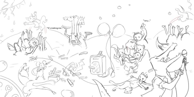
The spread is meant to be a transition. His friends are throwing him in the air, which is how I get the reader from one end of the page to the other. I'm not sure I really captured that he's being thrown and caught repeatedly. I also wanted to add more depth by having characters in the foreground, but I think they distract from the MC. Thoughts?
Thanks for reading!
-
-
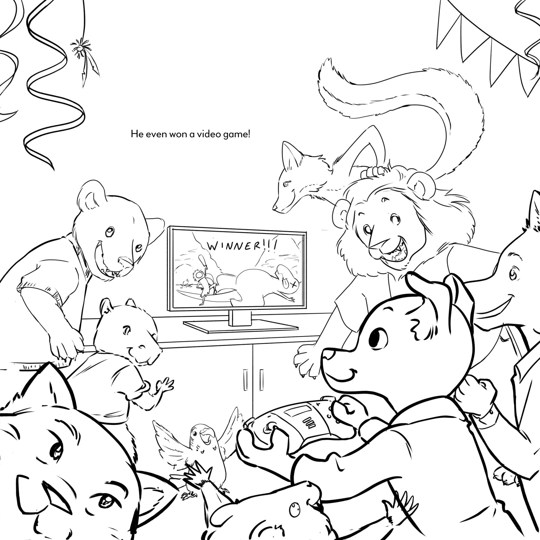
Thanks for sharing these pieces with us, @Patricia-Dishmon! The first three pieces do have some nice dynamics going on here. In the first piece, I really like how you were sensitive to the depth that heavier linework can provide--it does bring the main character forward! Have you thought about maybe putting another animal closer to the same plane as Doggie? Right now he could almost be too separated from the others. If you're aiming for a sense of "crowdedness", putting someone near him could give more of that triggering "this is too much" feeling for an introvert. Right now Doggie is more separated and still on his own in a way, with everyone looking at him. A thought--no pressure at all with any of these notes!!
Way to go on doing a tossing upwards scene. Those more extreme angles are not necessarily for the faint hearted!! So huge kudos with that! Maybe darken the line work around Doggie like you did in the first piece to separate the overlap a bit?
Creative thinking on the third scene!! Like how it has a sense of "overwhelming-ishness". Please do keep us updated on these as you continue working on them.
")
With these last two, maybe you could put the camera angle on the floor several feet away from his face? Something where it's like we're looking up as he's coming down. And for the last one, perhaps you could do a camera angle looking up from his back towards the kitty? Or, keep it similar to what you have, maybe just bring a little more 3D to the background? For example, you could put a long hallway near where his head is. Have you seen the compositional "trick" of placing the vanishing point where the highest interest should be? The hallway could create leading lines down towards his head.
Hope these get you started and that others will chime in too! Way to go working on a spread like this, Patricia!! I hope you can keep us posted on your progress!
Melissa Jacie Art
melissajacie@gmail.com
melissajacie.com -
@MelissaJacie Thank you so much for the feedback!!!
I was freaking out a bit about posting these, but your enthusiasm made me feel much better!Your advice for the last two images was great. I'll do some thumbnails and post those. Now that I think about it, I'm not sure that I did any thumbnails for those last two images since I was "so sure" about my idea


-
@Patricia-Dishmon on the double spread be mindful of where the gutter will be it looks like quite a few characters will be caught in there. And like @MelissaJacie suggested, I’m wondering if there is another angle where cat appears? But other than that nice work

-
These are looking so good! I think the story you are trying to convey is reading clearly. I agree with everything @MelissaJacie pointed out. I would also add that you could think about if you want any more objects in the background of any of the images? Maybe party decorations or something that would help move the story along and add to the sense of chaos and "too much" that an introvert would experience at a party.
-
@Patricia-Dishmon I think your middle spread is great and has a lot of potential! It would definitely be the sample spread that I would choose to finish before sending in your dummy. The scene is fun and dynamic and I think could really be the highlight of the book if executed well. It reminds me a lot of this scene in Float by Daniel Miyares (had the good fortune of attending a workshop by him recently so it came to mind). Maybe it can give you some inspiration on how to inject dynamism into the final rendered piece.
Also I think you should definitely add the animals partying away in the background and foreground as it definitely adds to the chaotic atmosphere, and if you add your colours and values skillfully enough it shouldn't feel too cluttered - keep your foreground darker and your background more faded, and with less details and both, so that the spotlight is always on the sequence of Doggie being tossed, and it will be a great spread.
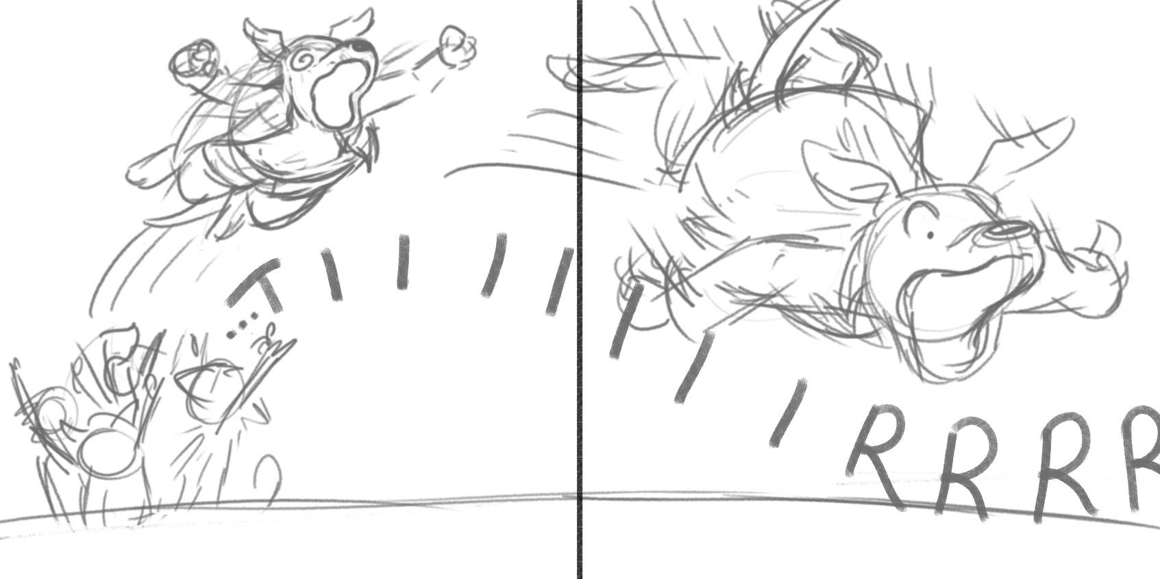
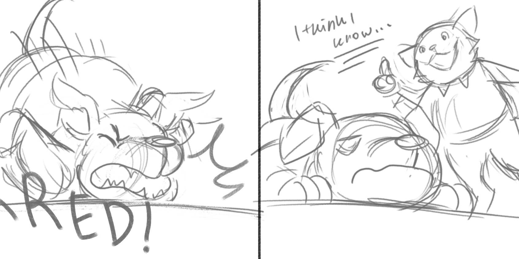
Concur with a lot of what Melissa said, and I definitely think a more exciting camera angle would enhance the last spread even though it is quite clear and comical as is. My brain was subconsciously mulling over this as I was painting and an idea flashed in my head, and I really wanted to sketch it out - if you have an extra spread to spare, perhaps you could try something similar to add and draw out the drama and comedy of Doggie being tossed XD
-
@JQ Yes! That image is the perfect example of what I'm going for. I have a background in animation, so motion is very near and dear to my heart. I'm so jealous of illustrators that can successfully pull something like this off!
Thanks so much for taking the time to do those sketches. The last panel is awesome! I'm not able to add in an extra spread, unfortunately, but I'll definitely implement your advice!
-
Here are the updated sketches!
I did two versions of that last spread. I like the first version the best since it also shows more of the background. In the next pages, the dog and cat end up going outside so maybe it's good that you can see the door in the second panel? I'll say though that this angle isn't my fave.
I've added more animals to both of these scenes! I managed to move the animals out of the gutter in the spread.
@MelissaJacie @JQ