My Rabbit Road Race WIP
-
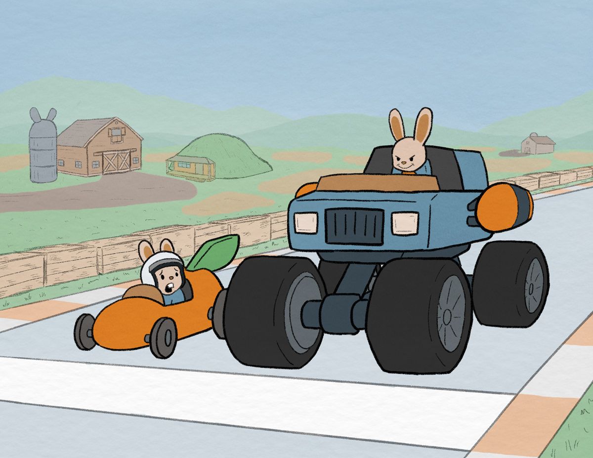
@KevinTreaccar I love this new concept you've come up with! The story is simple, and much more clear. Of your three ideas above, my vote would be for a bunny burrow home. You could have so much fun designing what a bunny's house would look like! But you might want to consider how your background would further the story you are trying to tell. For example: if you decide to make it a bunny home, maybe the story you are telling could be about a little bunny trying to race against his big brother. You could change up the racetrack a bit to give it more of a homemade feel. Just ask yourself lots of questions about these characters and why they are racing and see what you come up with!
-
@KevinTreaccar much better I think! I like carrot patch…
-
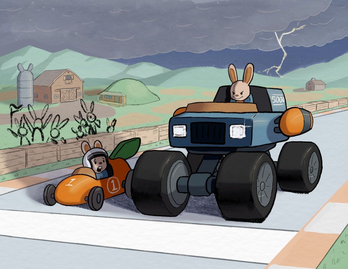
@KevinTreaccar I think the idea of small vs huge could work but the composition could be pushed. If you have a simple and straightforward idea you want to make sure you really push the composition. The truck is huge and intimidating and the car is small and feels weak in comparison. This is obvious to the viewer so how could you make it more interesting to the viewer? What is an angle that could emphasize those ideas?
-
Shading and lighting (hopefully) tonight. Then I try and see if I push it and finish it in time before my vacation that’s pushing up my deadline by a week.

-
@KevinTreaccar it’s coming along nicely!
-
@Griffin Thanks. That all makes perfect sense. When I switched concepts, I definitely did things way out of order – not a smooth transition – and I’m noticing issues due to that. Mostly in the composition space.
Still a good learning experience. If I can’t get your suggested pushed version done in time, I still plan to try to work on it in August.
-
@Asyas_illos Thank you!
-
-
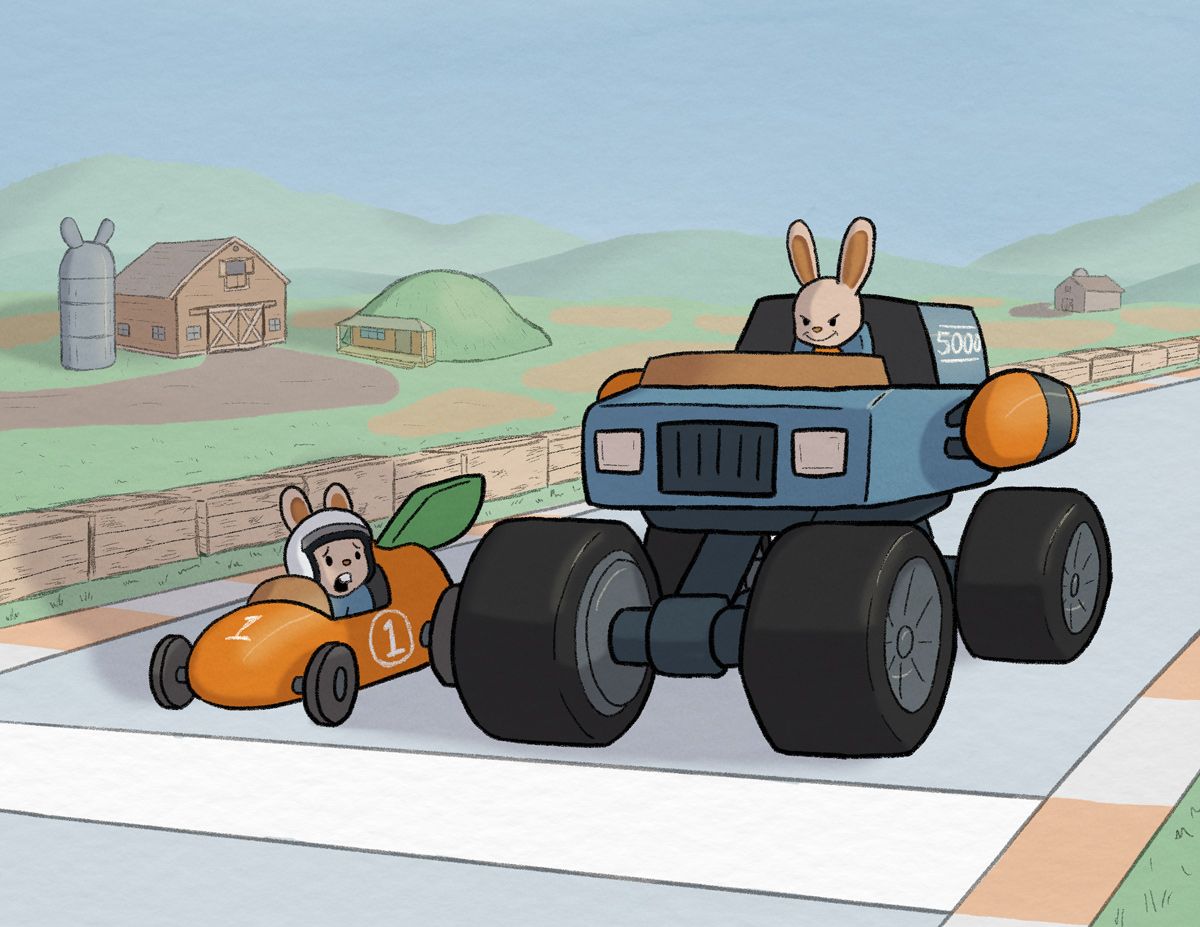
Which do you find most compelling? A, B or C?
A.

B.
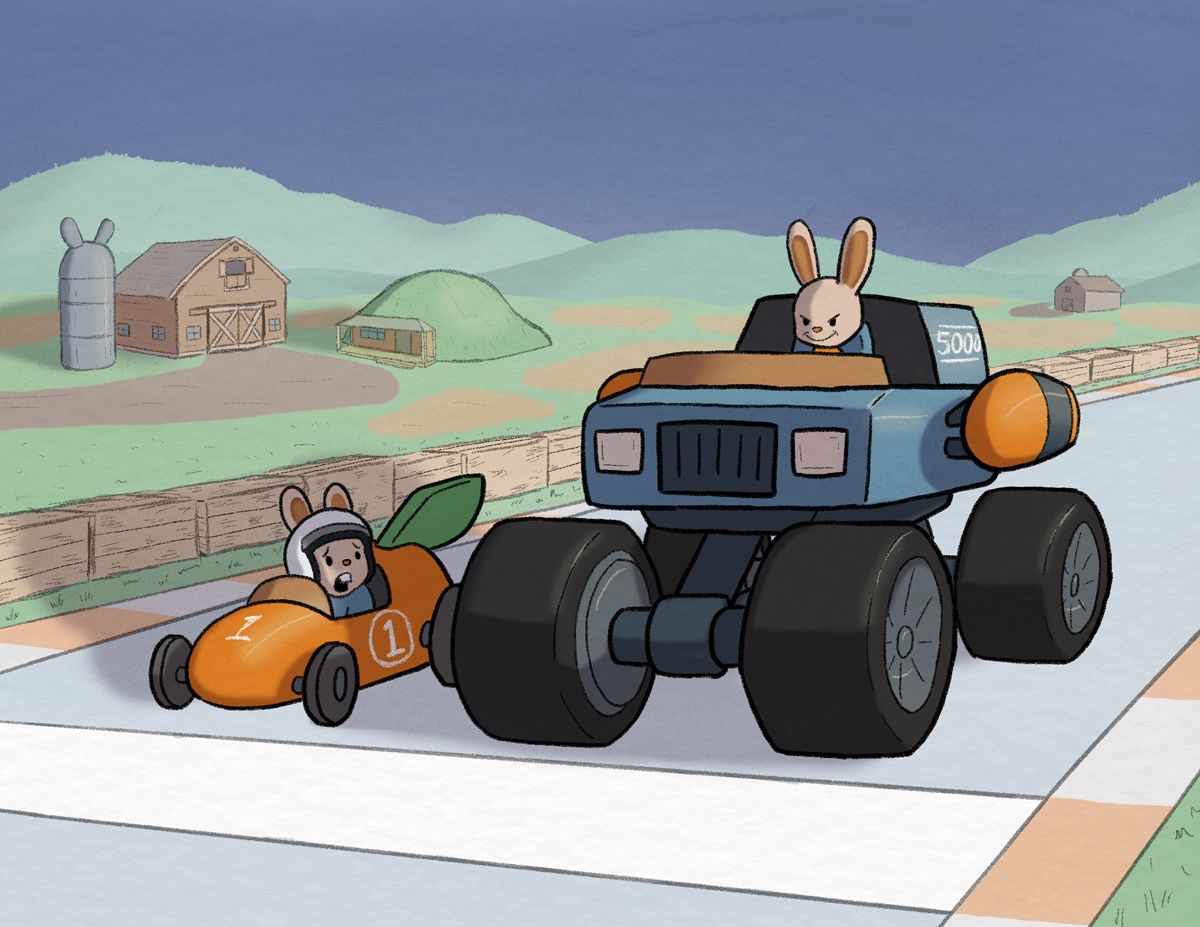
C.
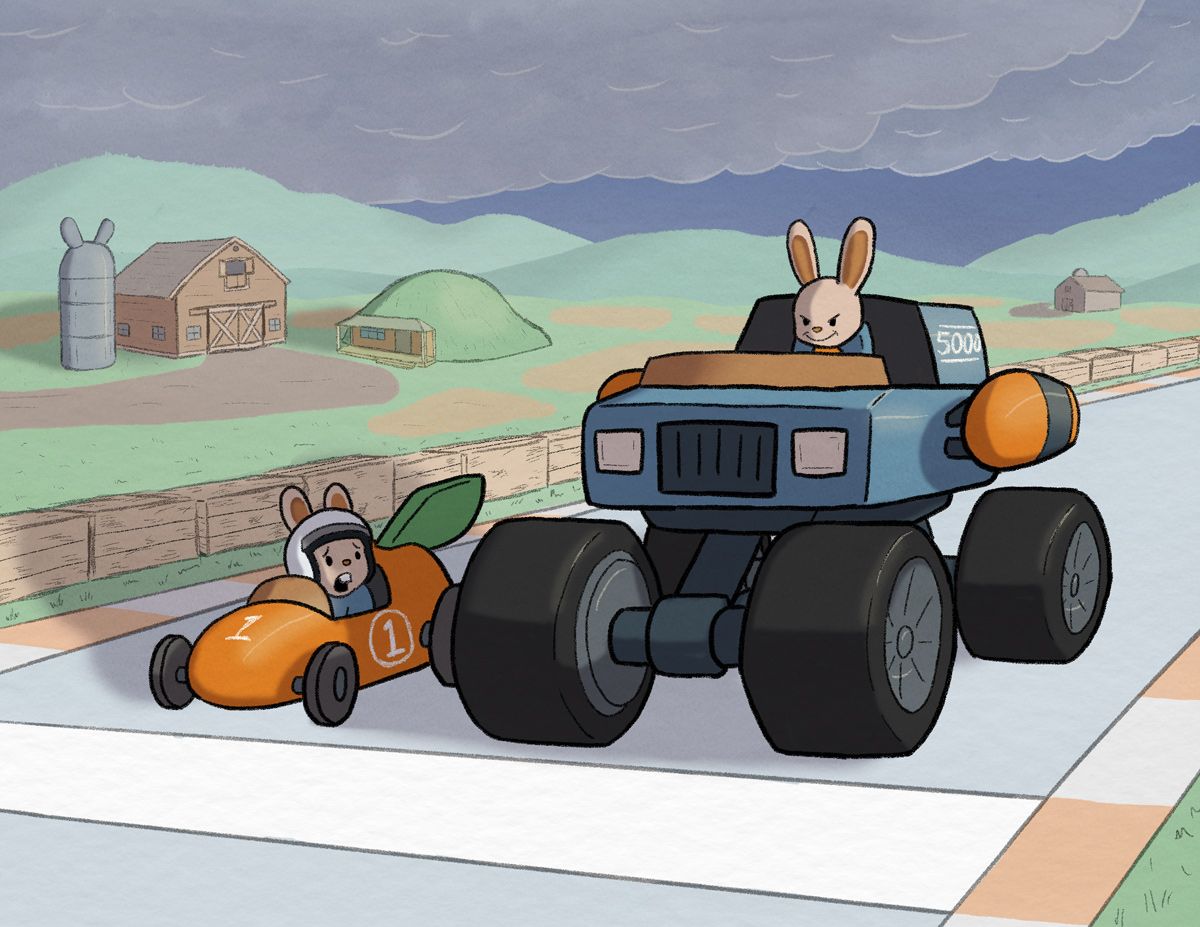
Or maybe some hybrid of A+C or B+C because I screwed up the clouds?
-
@KevinTreaccar I think the sunny day look with A is best though some clouds could add some interest and I would also recommend making the hills darker because they’re a similar value to the clouds
-
@KevinTreaccar The clouds definitely lend an ominous feel to the piece. I would go with them if that's what you're going for. The sunny day (A) feels lighter though, if you're wanting to keep the mood a little lighter.
Instagram: https://www.instagram.com/kirsten.mcgonigal.art/
Portfolio Site: www.kirstenmcgonigalart.com -
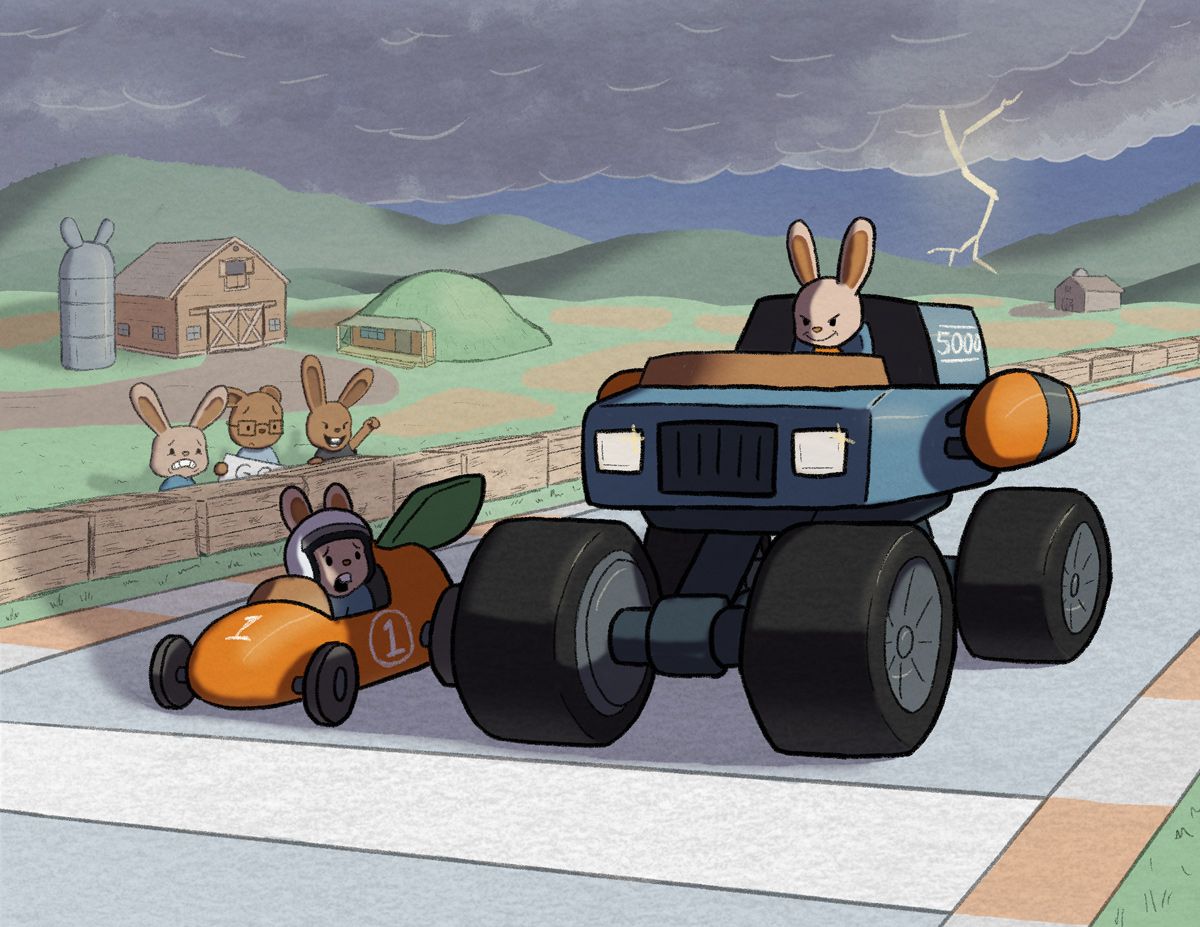
Hey, just read through all this. I like it! It’s a simple, clear concept. I have just a couple ideas in case you have time to implement them (I hope you have a great vacation!). One, I’d just darken some of the shadows, and sharpen the edges, at least towards the base of the objects they extend from, like the tires. Two, add lightning and glaring headlights? And three—if possible, add some onlookers, which can add more to the acting and the story. ![alt text]
https://sarahvandam.art/
Instagram: @sarahvandam.art and @artistsandbox.etsy -
@Griffin Thank you. And good catch on the hill/sky value. I darkened the hills along the way but never checked the black and white/value again.
-
@kirsten-mcg Yes, was going for some ominous-ness with the clouds. Glad that’s coming across. And thanks. Will play with the sky color to be ominous but not Mad Max Fury Road-ish.
-
@Sarah-VanDam Love this. Thank you. Definitely going to try to work this in.
Quick question about the shadow you added below the car. It has that colored pencil texture I’ve been trying to find. Are you using a standard Photoshop brush and single stroking that? Or are you using a specific brush or texture brush?
(Sorry, been playing with things to look like coloring with colored pencil or crayon, but haven’t figured it out yet)
-
Yeah—I was using the 6B pencil Procreate brush. I like using soft pencil textures.
https://sarahvandam.art/
Instagram: @sarahvandam.art and @artistsandbox.etsy -
@Sarah-VanDam Agreed. Cool. Good to know. Thanks.
-
Think I have this in a good place. Plan to post it in the morning unless someone sees something I have time to fix.
Thank you all for the amazing help.
-
This is soooo good! I really like it, very clear story and great prop design! You nailed the expression on point! Well Done!
visit my website: https://turnip.co/
-
@KevinTreaccar What a great story! I hope you have time for my 2 cents:
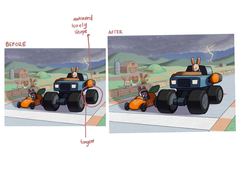
- Tangent on the back wheel is throwing me off an otherwise lovely composition. If you have time, pushing the back tire inwards a little will I think solidify the silhouette a bit more. See my quick drawover below
- I really want to give the enthusiastic spectator rabbit a race flag to wave. Just for some extra storytelling element.
Other than that, fantastic job!
- Tangent on the back wheel is throwing me off an otherwise lovely composition. If you have time, pushing the back tire inwards a little will I think solidify the silhouette a bit more. See my quick drawover below