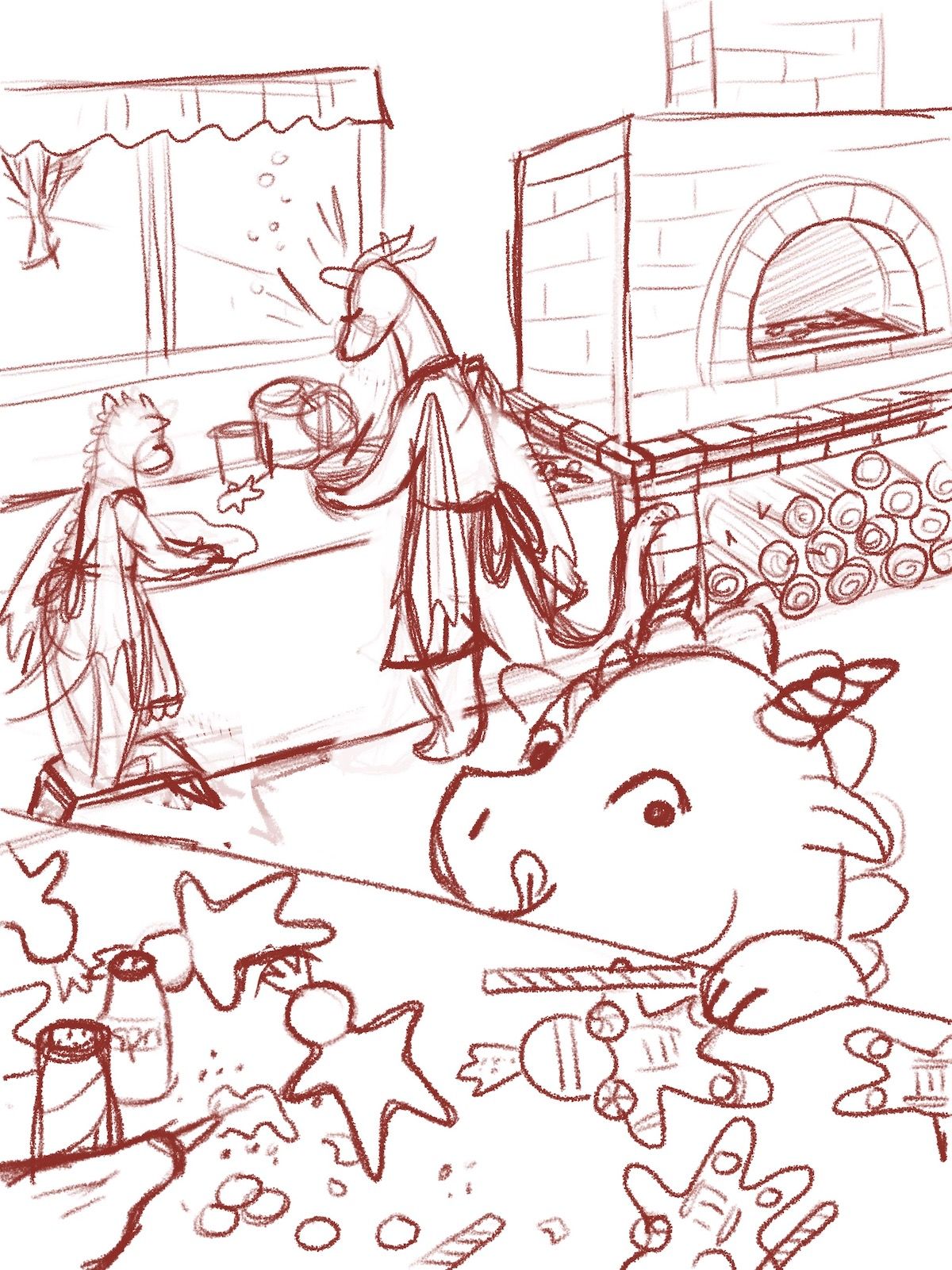
Thoughts on this composition?
-
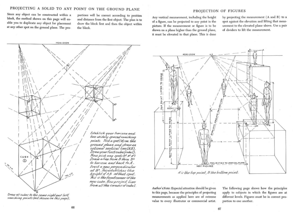
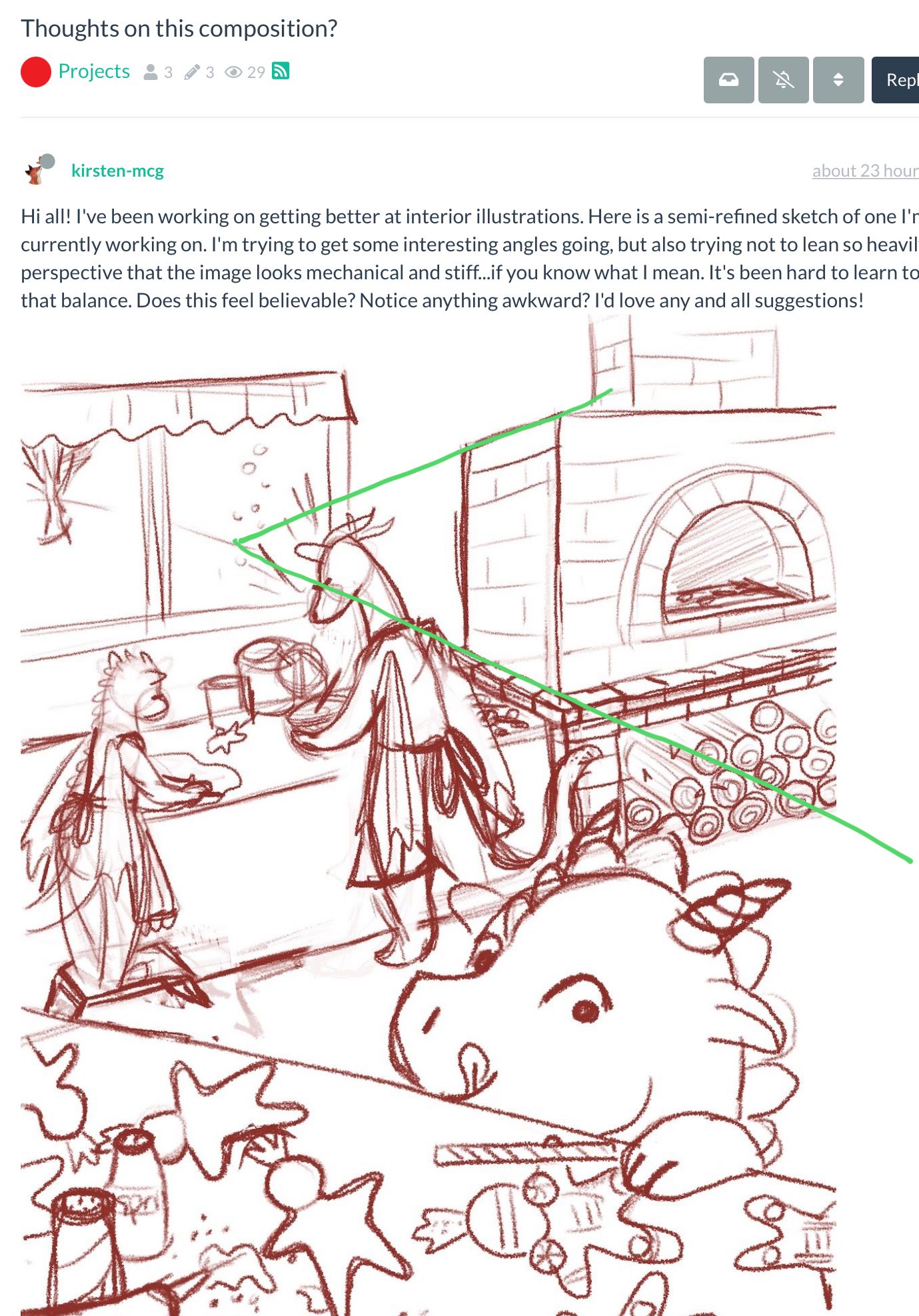
Hi all! I've been working on getting better at interior illustrations. Here is a semi-refined sketch of one I'm currently working on. I'm trying to get some interesting angles going, but also trying not to lean so heavily on perspective that the image looks mechanical and stiff...if you know what I mean. It's been hard to learn to strike that balance. Does this feel believable? Notice anything awkward? I'd love any and all suggestions!
-
This post is deleted! -
I totally know what you mean being me mechanical and stiff. I think this looks great so far I especially love the brick oven.
-
Very cute interior design.
The only thing that feels off to me is the upper angle on the brick oven. I drew over it to show the angles and how close your vanishing point would have to be to your subject, which tends to distort the view in an unrealistic way. I know you don’t want it to be stiff, and I don’t think your illustration is feeling stiff, but I would alter that one line slightly to feel more natural to the scene. With it being more birds eye view, I would lower it, and slightly show some of the top of the oven. I think that would also give it some depth.
-
@Stephanie-H Thanks so much! I for sure will!
-
@AngelinaKizz Yes, I see what you mean. Thanks so much for taking the time to look and do a draw over! It's super helpful.

-
@kirsten-mcg I think overall you have a really dynamic composition with a good use of foreground elements! However, there are some perspectival problems with the image that make things seem "odd" or "off" to the viewer, even if they may not be able to put their finger on it.
Firstly, I agree with Stephanie and Angelina about the stove being slightly warped and the vanishing point way too close to the stove. It should be moved further away, out of the scene to the left. Also contributing to it feeling warped is the fact that the bottom edge does not line up with the top edge of the table, probably because you were free-handing the line - I would still suggest using straight-edges to guide your initial sketch even if you make the line work more organic in the final rendering - I don't think you need to worry about correct perspective making a work look stiff if your render the finished piece well.
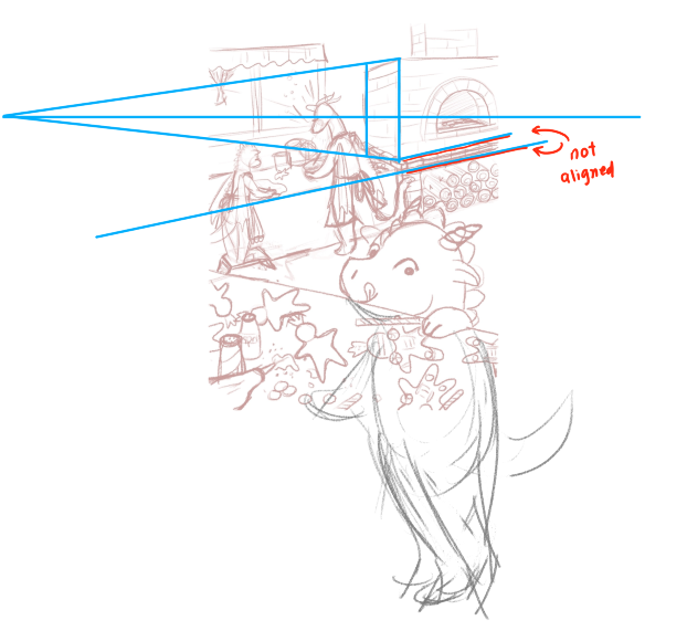
I'm not sure if you did this in the process of coming up with this sketch but I'd also highly recommend "drawing through" your canvas. This will allow you to more accurately judge whether your postures and perspective (eg. placement of the VPs) are correct. I have a lot of trouble too drawing scenes in correct perspective when characters are cropped and I don't draw through, and I usually find I can resolve my problems when I draw through and draw the characters fully, then establish correct perspectival relationships before cropping the sketch.
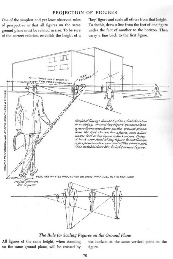
Which brings me to the more subtle but perhaps bigger perspectival problem of the piece - which is that the table at the front is really tall in relation to the table at the back and the giraffe characters! How can you tell? By projecting the height of the front table to the same plane as the back table:
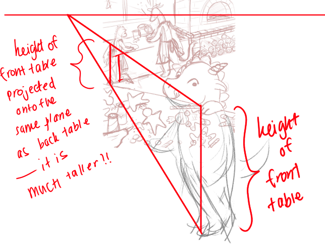
Now this seems odd to me, as intuitively I thought what you wanted to convey in this scene is that little Dino is a kid trying to steal cookies on the table while the adults (giraffes) are busy preparing food, and I'd expect little dino to be tiptoeing to reach up a table about the same height as the one the adults are using. (Of course if you were actually planning for the front table to be much taller, you can ignore this piece of critique)
If I project little Dino's height to the same plane as tall giraffe, it actually seems that he's not that much of a kid after all! - He's about the same height as the shorter giraffe and only slightly shorter than tall giraffe. Again, given the nature of the story as I intuitively grokked it, that seems odd to me. (Notice also that I "drew through" dino's entire body so I can project his full height to the horizon)
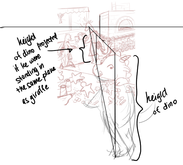
I do hope this makes sense!
-
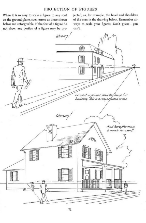
@kirsten-mcg Andrew Loomis has an excellent book with a few pages on how to project figures in perspective, which if understood can really help you tackle the problem of how to scale figures properly in perspective when they are standing in different planes. Otherwise you might inadvertently find yourself drawing a character much bigger or smaller than you intended in relation to another, or even floating above or sunken into the ground! - and a viewer might find things seem "off", even they can't put their finger on what exactly is "off".
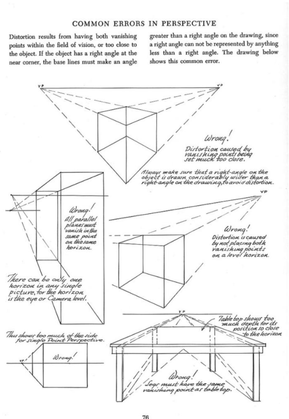
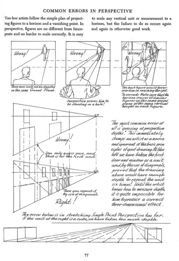
These two pages on common errors in perspective are also helpful:
-
@JQ Thats so much for taking the time to really explain all this! The draw over of the kid in the front really helped me to understand/remember how sizing characters in perspective works. And the pages below are helpful too. I'm saving them to refer to later.
One of my struggles with perspective, especially when drawing interiors, is that sometimes when I'm trying to come up with a composition, I have trouble making the perspective correct, but also making the composition work. I draw the perspective correctly, and it throws off my composition. Or vise versa. Is this just an experience thing? And I'll get better the more I do it? Or are there tricks?
-
This post is deleted! -
@kirsten-mcg Yeah it's not easy! I often find myself working on something from a compositional POV then realize that the perspective doesn't make sense and have to start reworking things.
I need to do this more too, but I feel one way is to build in your perspective grid from the start of your compositional thumbnailing, even if it's just really rough horizon and converging lines going to the VP.
And I do think doing perspective exercises and "perspective master copies" does help you build more intuition. In the Loomis book I linked above he has several drawing examples demonstrating the use of different perspective techniques. I spent some time before copying his compositions and studying/understanding how he builds them with perspective. It ingrains the principles much better than just reading and looking at the images passively. I'm sure you could find other artists' whose work and use of perspective you admire and practise master copies too!
-
I think this composition works but make sure to align the oven properly to it’s vanishing points. The non perfect perspective stuff is working elsewhere but the the oven is what breaks the believability for me.
Also, maybe you haven’t gotten this far yet but adding smaller objects in the background will create more appeal. Little things on the mantle, a clock on the wall. That sort of thing
-
Here is my finished piece with color. Thanks so much for your thoughts and suggestions everyone! As usual, they helped with this piece, and will continue to help me with future pieces as well!
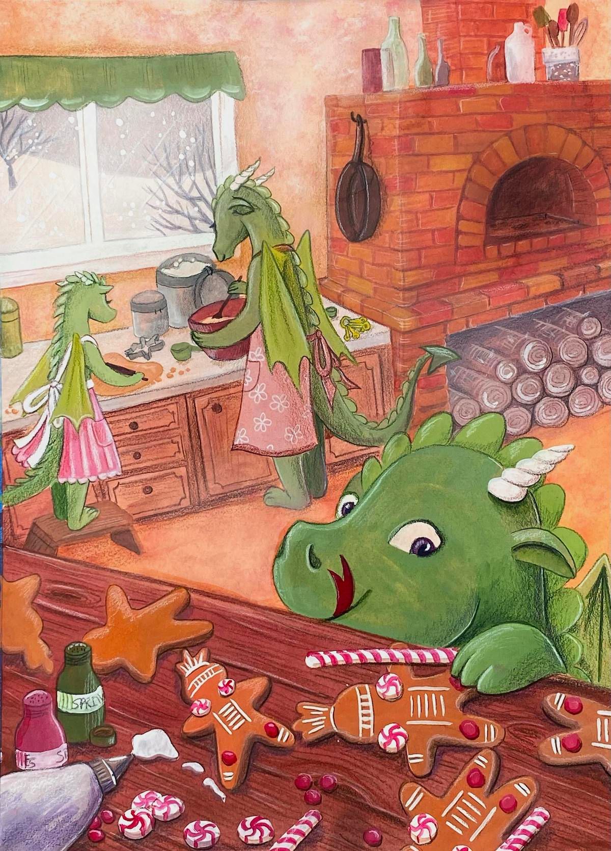
Instagram: https://www.instagram.com/kirsten.mcgonigal.art/
Portfolio Site: www.kirstenmcgonigalart.com -
@kirsten-mcg super cute, great job
-
This post is deleted! -
@kirsten-mcg Beautifully rendered!
(lol, now I realize they are all dragons, not giraffes. That makes sense XD)
-
@JQ In your defense, the sketch I posted was pretty rough lol! Your assumption that they were giraffes was completely valid!

-
Looks good but is he missing a horn?
-
This post is deleted! -
@Asyas_illos you're right! Thanks! Fresh eyes are invaluable.