Portfolio WIP Feedback Help
-
Hi everyone,
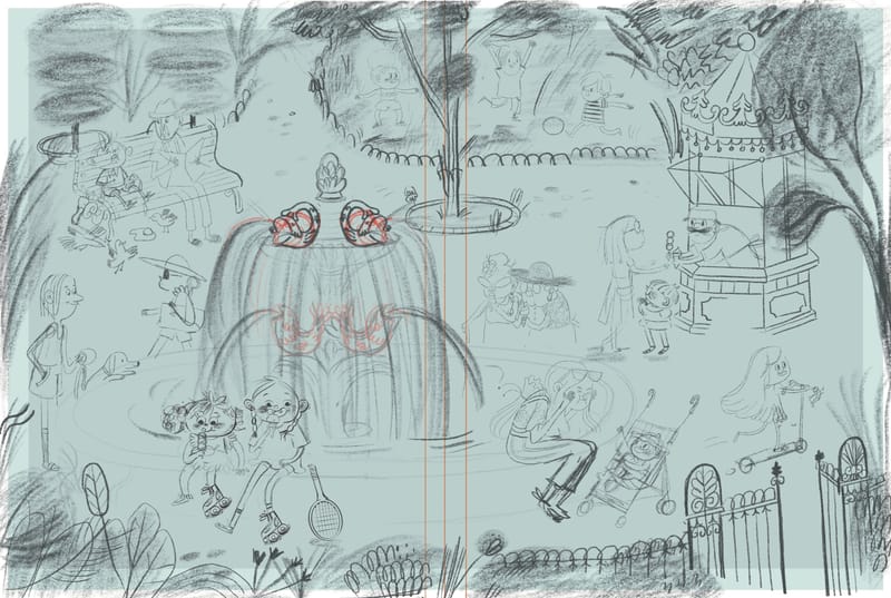
I’m in the process of making my childrens book portfolio. This is a full page spread for a story about two friends who find a lucky coin on the street while they are playing and use the money to buy an icream on a hot summers day.I would love some feedback on the composition and story telling of this piece before I start on colour .I’ve been looking at it for so long I can’t really see it for myself.
Much appreciated !

-
@Isabel-Reyes-Feeney Lots of fun characters and activity in this scene. I like the energy. My eye goes right to the fountain, the biggest, most interesting object. I found it tricky to identify the main two characters, other than their stronger outline. You can certainly use color and lighting to shine a light on them, but what if you used the fountain to frame them? For example, if you move the fountain left, we'd see the fountain, then the main kids below. You'd have to rearrange some of the left-most background people, of course.
-
I agree with @Johanna-Kim’s point about the characters being hard to identify but I think this could be easily addressed when you do the colors and lighting. Otherwise this piece is looking awesome. Keep us updated on the progress!
-
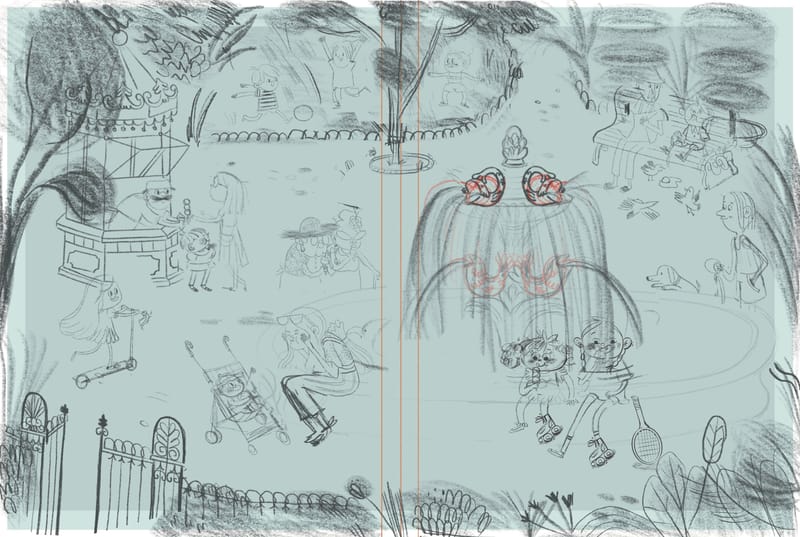
Hi @Johanna-Kim I just want to say first thanks so much for you’re feedback. So after I posted the piece yesterday I was mulling over it and I clicked that the readers eye goes from left to right so that I should have my main characters on the right side of the page and I centered them more and lifted them up a bit too on the right side of the page. Don’t know if this is any better? I’m also trying to keep in mind the fold in the middle. Love to know your thoughts.

-
@Isabel-Reyes-Feeney I hadn’t thought about this but I think this is a good choice. It makes more sense visually that the kids would go to the ice cream stand on the left and then make their way over to the fountain on the right.
-
Hi @Griffin-McPherson
It kinda clicked with me after looking at @will-terry-art compositions class info page and there you can see he mostly has his main characters to the right side of the page. So thought I’d flip it to see and it just felt right. But thinking about it. When your doing full page spreads should the main action/ character be to the right ? Or can it be either I’m confused to be honest……. -
@Isabel-Reyes-Feeney I think you can definitely still have your character on the left. It’s more about having the flow of action always moving from left to right.
-
@Isabel-Reyes-Feeney I think the move of the main characters works well for the sketch and definitely brings my eye to the main characters.
I do agree with the others that you could use lighting and color to bring them out if you like the original layout more.
-
@Isabel-Reyes-Feeney Ah, you're right. They look much better on the right side. Looking great so far.