Society of Visual Storytelling

    SVSLearn Forums

    • Register
    • Login
    • Search
    • Recent
    • Tags
    • Popular
    • Users
    • Groups
    • Search

    Kamari idea

    Artwork
    11
    40
    1763
    Loading More Posts
    • Oldest to Newest
    • Newest to Oldest
    • Most Votes
    Reply
    • Reply as topic
    Log in to reply
    This topic has been deleted. Only users with topic management privileges can see it.
    • Chantal Goetheer
      Chantal Goetheer @AngelinaKizz last edited by

      @AngelinaKizz I meant traveling bag. My autocorrect interferred

      AngelinaKizz 1 Reply Last reply Reply Quote 2
      • AngelinaKizz
        AngelinaKizz @Chantal Goetheer last edited by

        @Chantal-Goetheer oh ok! Sometimes I can’t tell which way the autocorrect took It. He does have a suitcase he’s dragging, but it’s also a very rough sketch 🙂

        www.evarartistry.com
        www.Instagram.com/evarartistry/

        1 Reply Last reply Reply Quote 0
        • kirsten-mcg
          kirsten-mcg @AngelinaKizz last edited by

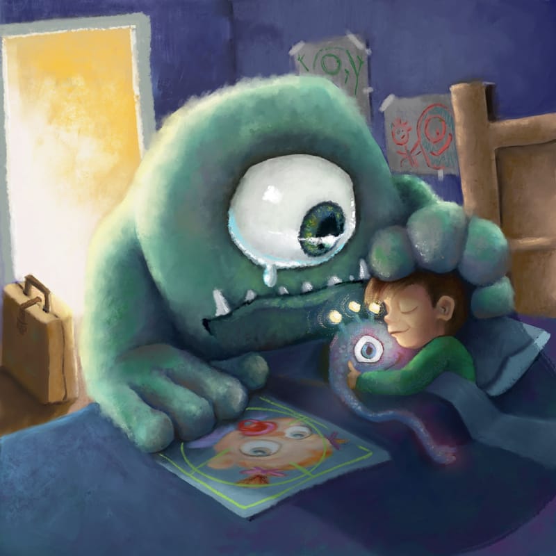
          @AngelinaKizz This is such a fun concept! It kind of has Monsters Inc vibes. I agree with @Chantal-Goetheer about giving the monster a traveling bag, suitcase, etc to indicate it's leaving. Also maybe changing up the pose a little? I think maybe having it standing up instead of sitting might help further the story. Like he's peaking in through the doorway for one last look at his child before he moves onto another.

          Instagram: https://www.instagram.com/kirsten.mcgonigal.art/
          Portfolio Site: www.kirstenmcgonigalart.com

          AngelinaKizz ArtistErin 2 Replies Last reply Reply Quote 1
          • L
            Ladmireaux last edited by

            i love this idea so much! great choice!!

            AngelinaKizz 1 Reply Last reply Reply Quote 1
            • AngelinaKizz
              AngelinaKizz @kirsten-mcg last edited by

              @kirsten-mcg thankyou! I'll play with his pose a bit, the idea was him slinking out from under the bed, which may show better when it's rendered, but maybe he needs legs and a sadder slump to his posture.

              www.evarartistry.com
              www.Instagram.com/evarartistry/

              1 Reply Last reply Reply Quote 1
              • AngelinaKizz
                AngelinaKizz @Ladmireaux last edited by

                @Ladmireaux thanks!

                www.evarartistry.com
                www.Instagram.com/evarartistry/

                L 1 Reply Last reply Reply Quote 0
                • AngelinaKizz
                  AngelinaKizz last edited by

                  Do you prefer the version where he’s oozing out from under the bed, or where he’s walking away? Walking away would obviously need work because he’s overlapping the kid, and I just cropped and moved him, as I was just trying the different
                  Pose…

                  F2B455E5-BB53-4F27-8D1C-04A8AC5C3BC7.jpeg A2DB5DCA-2522-4FAE-8308-9F3D1F40447F.jpeg

                  www.evarartistry.com
                  www.Instagram.com/evarartistry/

                  Chantal Goetheer 1 Reply Last reply Reply Quote 1
                  • Chantal Goetheer
                    Chantal Goetheer @AngelinaKizz last edited by

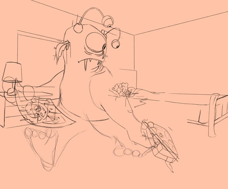
                    @AngelinaKizz the walking comes across stronger, but I like the oozing better because it makes it more obvious it came from under the bed

                    1 Reply Last reply Reply Quote 2
                    • AngelinaKizz
                      AngelinaKizz last edited by

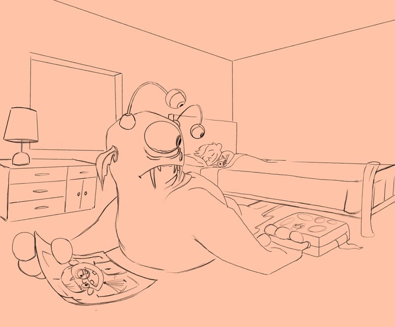
                      In doing some rendering I realized how centred the illustration is. Dang.

                      24314890-36F8-45BD-9217-CA607B3587CD.jpeg

                      How does this set up feel? Is it still clear that he has to move on as his kid is no longer afraid of him?
                      D17063A5-1F86-4156-9B7F-56BFB54279EC.jpeg

                      www.evarartistry.com
                      www.Instagram.com/evarartistry/

                      Asyas_illos 1 Reply Last reply Reply Quote 2
                      • Asyas_illos
                        Asyas_illos @AngelinaKizz last edited by Asyas_illos

                        @AngelinaKizz you could try to move the kid to the other end of the bed. The new comp looks good though, too.

                        Asyasewardillos@gmail.com
                        www.Instagram.com/asyas_illos/
                        https://asyasewardillos.wixsite.com/mysite

                        AngelinaKizz 1 Reply Last reply Reply Quote 2
                        • AngelinaKizz
                          AngelinaKizz @Asyas_illos last edited by

                          @Asyas_illos I feel like I’d need a wall for the kid to be at the other end of the bed. I’m kinda digging the new comp, so I’ll try fleshing that out and see if it ends up being better… or I’ll end up in a few totally different direction lol.

                          www.evarartistry.com
                          www.Instagram.com/evarartistry/

                          1 Reply Last reply Reply Quote 2
                          • L
                            Ladmireaux @AngelinaKizz last edited by

                            @AngelinaKizz You’re welcome!

                            …and… maybe because I feel no one can ever decipher my scribbles… i just wanted to let you know, I saw it all from the start. ☺️

                            Most definitely not that any of the constructive thoughts were negative in anyway, but, just cause sometimes it’s just nice to know ☺️

                            i cannot wait to see the finished product!

                            AngelinaKizz 1 Reply Last reply Reply Quote 0
                            • AngelinaKizz
                              AngelinaKizz @Ladmireaux last edited by

                              @Ladmireaux awe thanks!
                              I love critique, whether good or bad... honestly we grow more from the "negatives" than everyone doting, so I'm never offended even if it seems harsh (not that anyone was harsh, we have an awesome community here). I don't appreciate rude, but bring on the nitpicking... I prefer finding all the things that can be improved on.

                              www.evarartistry.com
                              www.Instagram.com/evarartistry/

                              1 Reply Last reply Reply Quote 0
                              • AngelinaKizz
                                AngelinaKizz last edited by

                                F99C7219-0617-424C-91AC-1878C97FAB36.jpeg

                                It needs something, I’m not sure what, gonna stare at it for a bit, but if you see something off I’d love to hear it.

                                www.evarartistry.com
                                www.Instagram.com/evarartistry/

                                Chantal Goetheer 1 Reply Last reply Reply Quote 1
                                • Chantal Goetheer
                                  Chantal Goetheer @AngelinaKizz last edited by

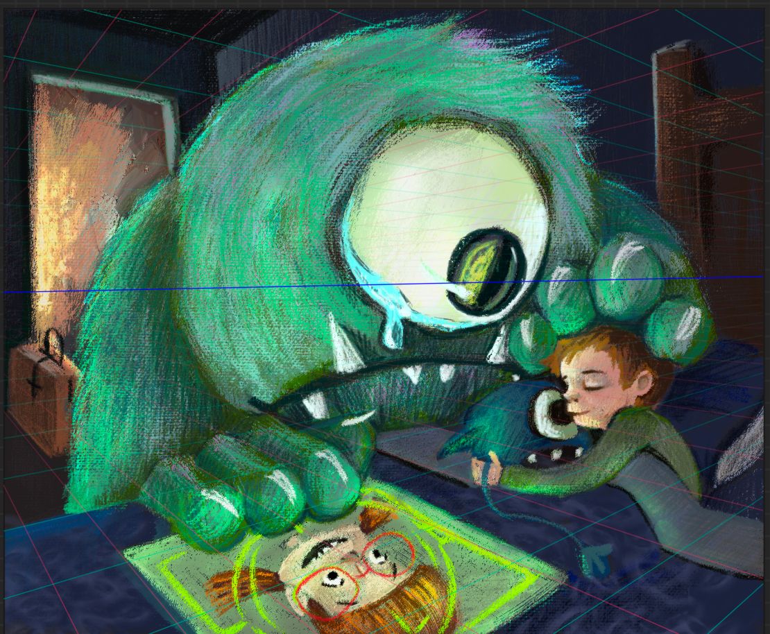
                                  @AngelinaKizz this composition is really nice too. The teary eye & the suitcase in the background clearly say goodbye. And the stuffed toy also conveys well that the kid is not afraid of the monster

                                  1 Reply Last reply Reply Quote 1
                                  • AngelinaKizz
                                    AngelinaKizz last edited by

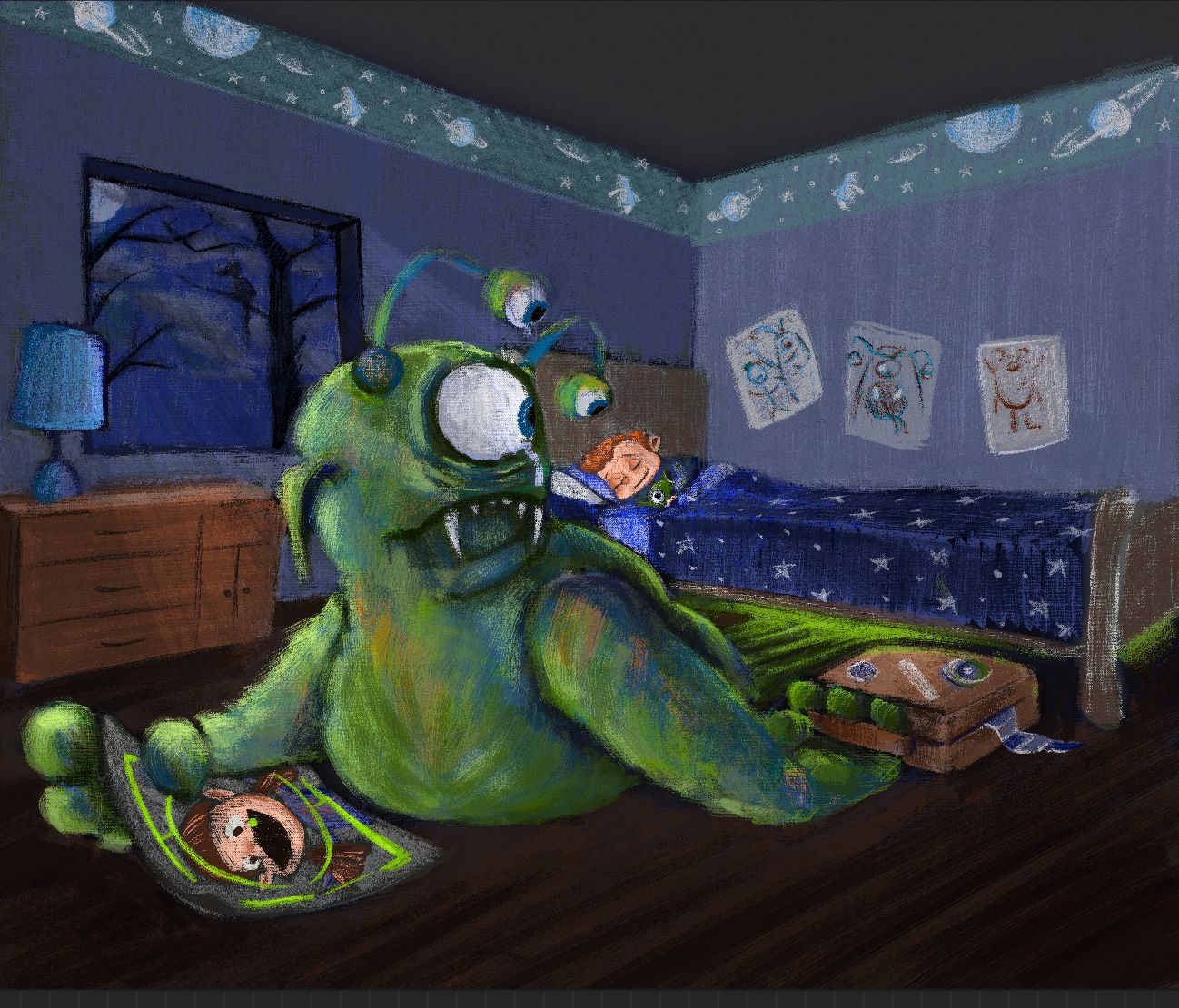
                                    So I’ve spent some time starting from scratch, and I’d love to have some feedback on comparison between this and the last version I posted, as well as if it feels too tight. I want that loose textured finish, but I also want that finished feel. Is the lighting ok? Does it feel like night time, without being too dark or muddy?

                                    1FD0BA14-7A05-4E77-B095-2EC6F1B4ADF3.jpeg

                                    www.evarartistry.com
                                    www.Instagram.com/evarartistry/

                                    Griffin McPherson 1 Reply Last reply Reply Quote 1
                                    • ArtistErin
                                      ArtistErin @kirsten-mcg last edited by

                                      @kirsten-mcg Yes I agree with this perspective, you know the look our parents gave us when we first moved out of the house, show that and show obvious evidence greater things are happening? The monster is about to go to Monster University LOL

                                      Erin Richardson
                                      instagram.com/erinrichardsondesigns21
                                      www.erinrichardsondesigns.com

                                      ArtistErin 1 Reply Last reply Reply Quote 0
                                      • ArtistErin
                                        ArtistErin @ArtistErin last edited by

                                        @ArtistErin That has to be the cutest one eyed monster OMG

                                        Erin Richardson
                                        instagram.com/erinrichardsondesigns21
                                        www.erinrichardsondesigns.com

                                        1 Reply Last reply Reply Quote 1
                                        • marek.halko
                                          marek.halko last edited by

                                          Hi Angelina, the new version feels much better, but also a bit overrended to me. It doesnt feel like night time to me, more like a bright day light coming in the room with darker blue walls and a blue blanket.

                                          Few ideas on color consistency and loose finish:
                                          Start with defining local colors of objects ( it will dictate how the end colors look like after interacting with light). Then for instance for night time, put a layer with blending mode or adjustment layer on top (multiply, darker color etc. ) to unify the colors to certain overall light (for instance darker blue). Then add some additional direct light on top (for instance direct blue moon light/ warm light from room).
                                          For rendering, start maybe with diffuse light setup coming from up, rendering just top planes, think also of areas where no light can come and creating occlusion shadows. Add direct light if needed on corresponding planes. Try maybe use less gradients and think which planes are lit by which light source and how reflective the surface is.
                                          Lot can be described with silhoulette surface and rendering of the texture on terminators (part of the object surface where planes/ light changes) (for instance the hair on the monster can be rendered that way, making it look more loose but still with enough information).
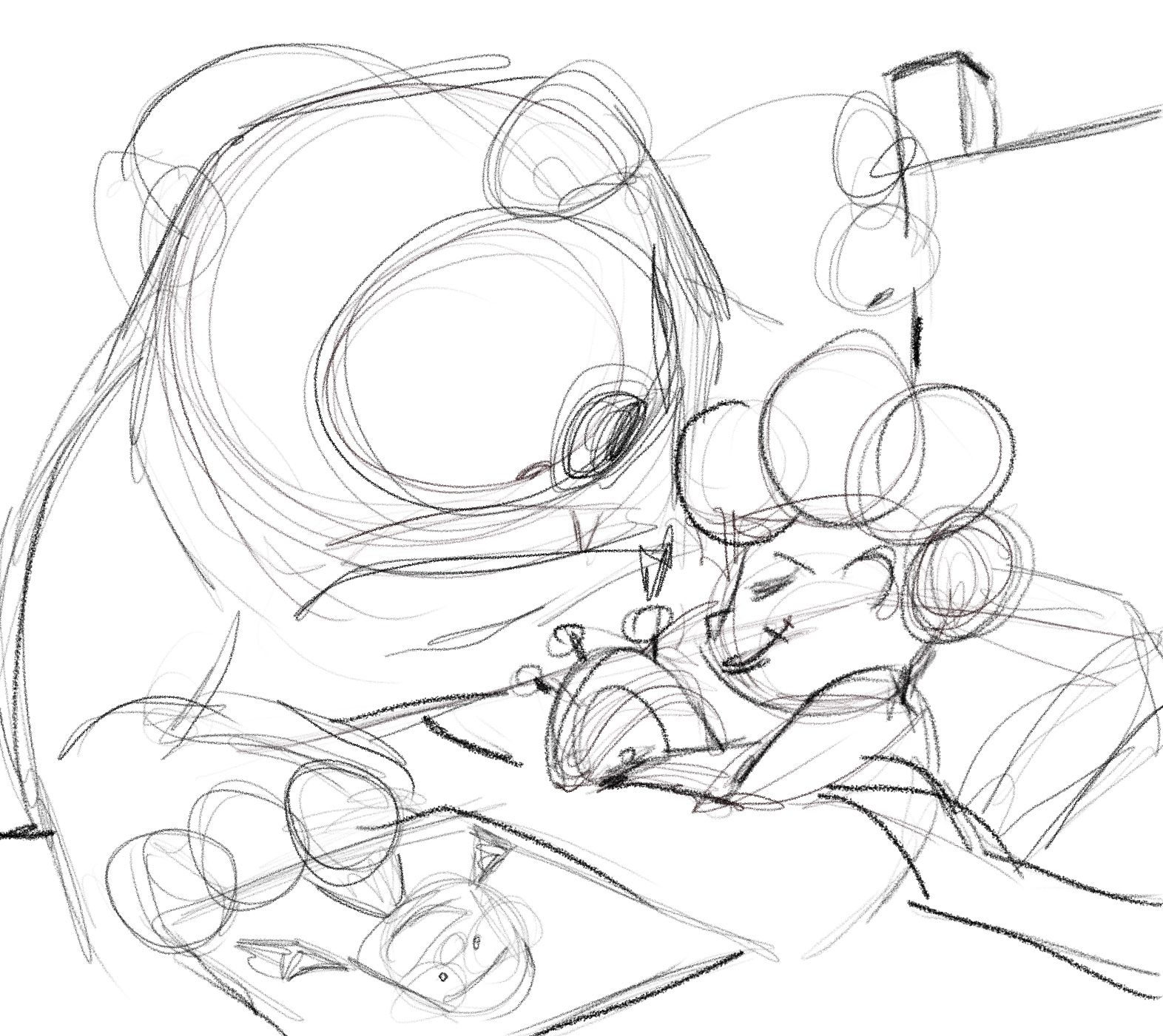
                                          I think you can stay quite loose on ares with are not really a focal point, it takes still a lot of training to know how much information to put where.

                                          I made a sketchy paint over your picture (changed a lot of things as going fast over it) to show what i meant with building of colors. Hope you dont mind. Sorry for a long text as well.

                                          B11AD082-85A3-4693-BF35-6510C2690B07.jpeg

                                          04725077-4B21-4E49-ACBF-BB83EDFA67CB.jpeg

                                          AngelinaKizz 1 Reply Last reply Reply Quote 1
                                          • Griffin McPherson
                                            Griffin McPherson @AngelinaKizz last edited by

                                            @AngelinaKizz I think this does feel a bit to tight right now. The door and the suitcase are squeezed right up against the edge of the image which feels a bit tense. Because this is a centered composition it doesn’t leave much room for the eye to wander around the image. I think a solution to this could be moving the boy and the monster down to the lower right and move the door and suitcase a bit more to the center just so there’s enough cushion space between them and the frame. Something you may want to try is flipping the image around so the door is on the right because typically the movement of picture book illustrations is left to right but I’m not sure it’s a big issue in this case, just something to think about.

                                            AngelinaKizz 1 Reply Last reply Reply Quote 0
                                            • First post
                                              Last post