Kamari idea
-
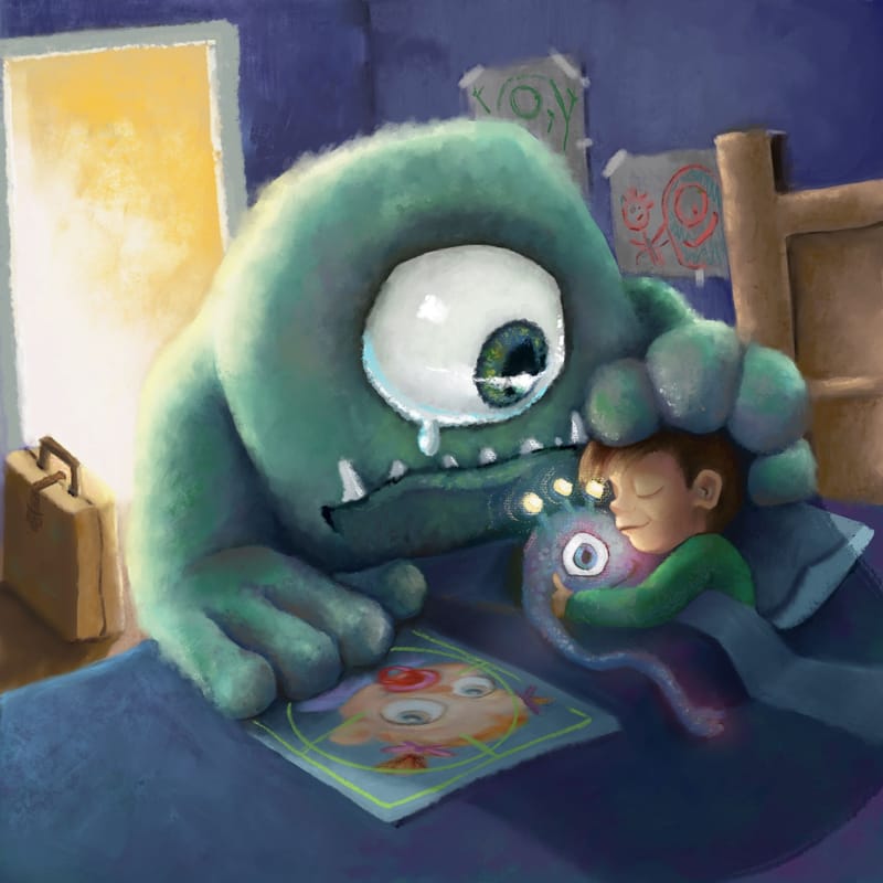
So I’ve spent some time starting from scratch, and I’d love to have some feedback on comparison between this and the last version I posted, as well as if it feels too tight. I want that loose textured finish, but I also want that finished feel. Is the lighting ok? Does it feel like night time, without being too dark or muddy?

-
@kirsten-mcg Yes I agree with this perspective, you know the look our parents gave us when we first moved out of the house, show that and show obvious evidence greater things are happening? The monster is about to go to Monster University LOL
-
@ArtistErin That has to be the cutest one eyed monster OMG
-
Hi Angelina, the new version feels much better, but also a bit overrended to me. It doesnt feel like night time to me, more like a bright day light coming in the room with darker blue walls and a blue blanket.
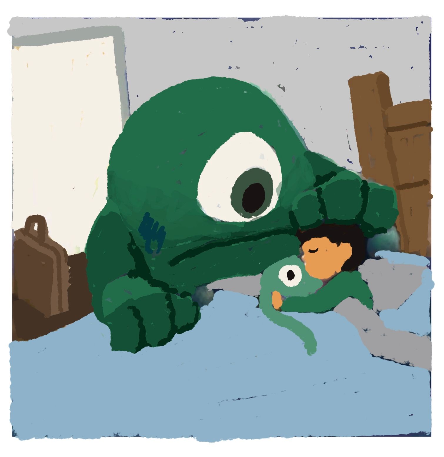
Few ideas on color consistency and loose finish:
Start with defining local colors of objects ( it will dictate how the end colors look like after interacting with light). Then for instance for night time, put a layer with blending mode or adjustment layer on top (multiply, darker color etc. ) to unify the colors to certain overall light (for instance darker blue). Then add some additional direct light on top (for instance direct blue moon light/ warm light from room).
For rendering, start maybe with diffuse light setup coming from up, rendering just top planes, think also of areas where no light can come and creating occlusion shadows. Add direct light if needed on corresponding planes. Try maybe use less gradients and think which planes are lit by which light source and how reflective the surface is.
Lot can be described with silhoulette surface and rendering of the texture on terminators (part of the object surface where planes/ light changes) (for instance the hair on the monster can be rendered that way, making it look more loose but still with enough information).
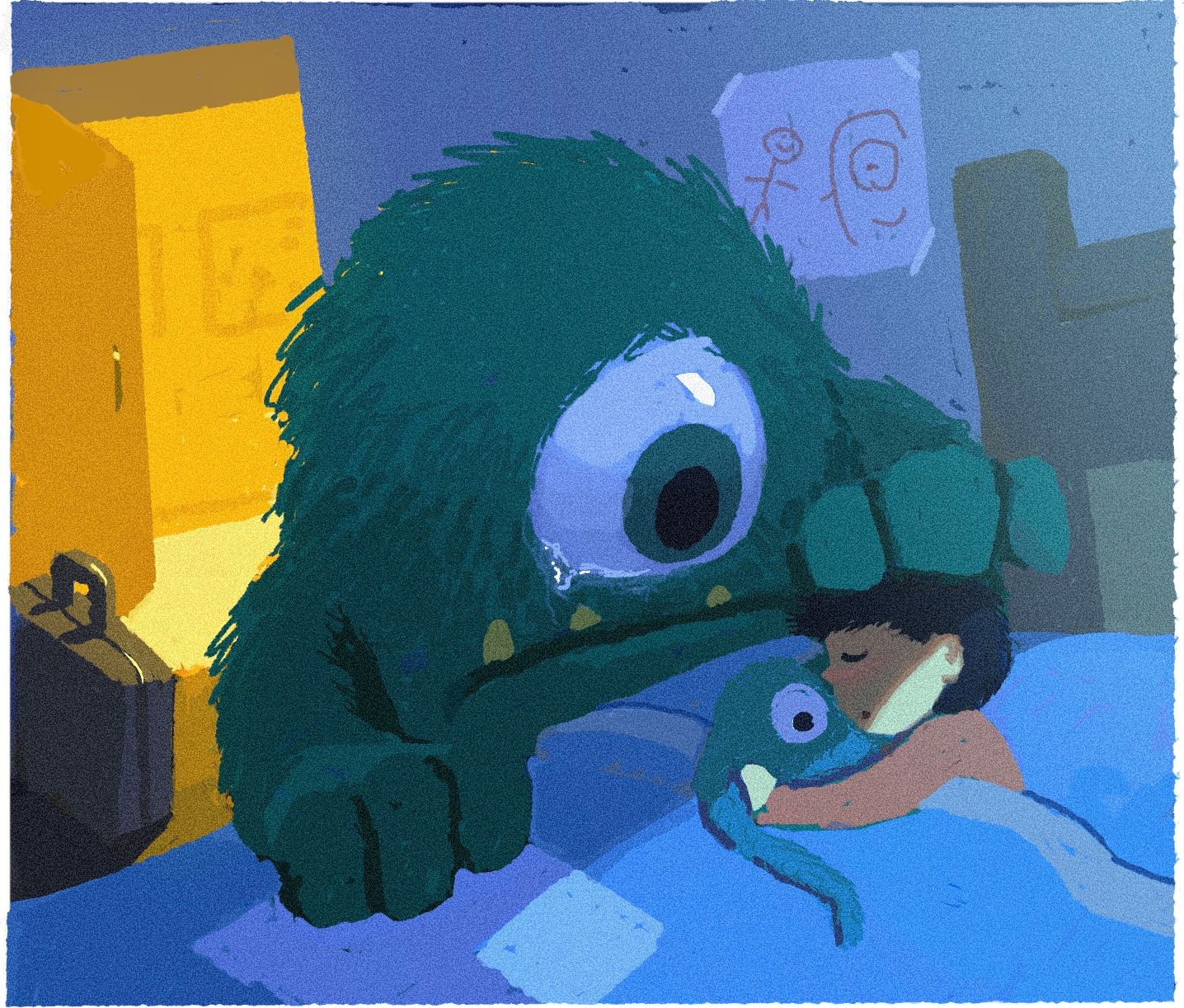
I think you can stay quite loose on ares with are not really a focal point, it takes still a lot of training to know how much information to put where.I made a sketchy paint over your picture (changed a lot of things as going fast over it) to show what i meant with building of colors. Hope you dont mind. Sorry for a long text as well.


-
@AngelinaKizz I think this does feel a bit to tight right now. The door and the suitcase are squeezed right up against the edge of the image which feels a bit tense. Because this is a centered composition it doesn’t leave much room for the eye to wander around the image. I think a solution to this could be moving the boy and the monster down to the lower right and move the door and suitcase a bit more to the center just so there’s enough cushion space between them and the frame. Something you may want to try is flipping the image around so the door is on the right because typically the movement of picture book illustrations is left to right but I’m not sure it’s a big issue in this case, just something to think about.
-
@marek-halko
Wow, thanks so much Marek.
I really appreciate the time you put in to redraw, and I love what you did. It definitely feels tighter than I would like it to be, and I do prefer your lighting and the doorway. I wanted to put a window in, and didn’t like the results. I didn’t think to put it where you did. That’s a really nice placement, and would cast some nice light on my Kamari monster. I finished the piece before seeing your post, but I’m at the point where I’m just done with it. I have a new idea that I’d like to get done before the deadline, so I’m going to start. I will take all of your advice into consideration on the monster piece, while I work on it.Thanks!
-
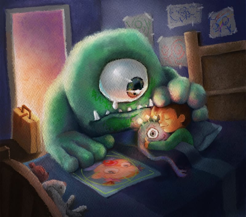
@Griffin-McPherson thanks for the input Griffin. I finished the piece before I saw any updated comments, and mentally, I’m just done with the piece. I did however expand the canvas and try to add in some smaller shapes to balance the image a bit more.
-

Here’s where I’ve left it. -
@AngelinaKizz I really like how this turned out! It doesn't feel over rendered to me...but then that's coming from someone who has a tendency to over render lol! I really like the sense of light.
-
@kirsten-mcg thanks Kirsten!