Is anyone doing folktale week?
-
@mzameckaart Thank you!!! Yeah I know I shouldn't take it so personally yet when it comes down to time investment it starts feeling like Ok, what am I doing here? It just sucks to put so much time in. I know learning is not wasted time or effort, I totally get that... I try to follow the tips and I usually am good with critiques, and feedback... and of course working constantly to get better yet I find myself wondering if I am even in the right "pond" so to speak, with Critique Arena, and maybe my work isn't suited for the format it is. Sorry for the rambling. AND... thank you for your kind words...
About your style: I am so in love with your little pig icon. I absolutely love how you draw, and your work truly inspires me to keep going... Capturing such adorable cuteness is my intention !!!
")
Erin Richardson
instagram.com/erinrichardsondesigns21
www.erinrichardsondesigns.com -
@mzameckaart Oh I am looking forward to seeing what you come up with!!
-
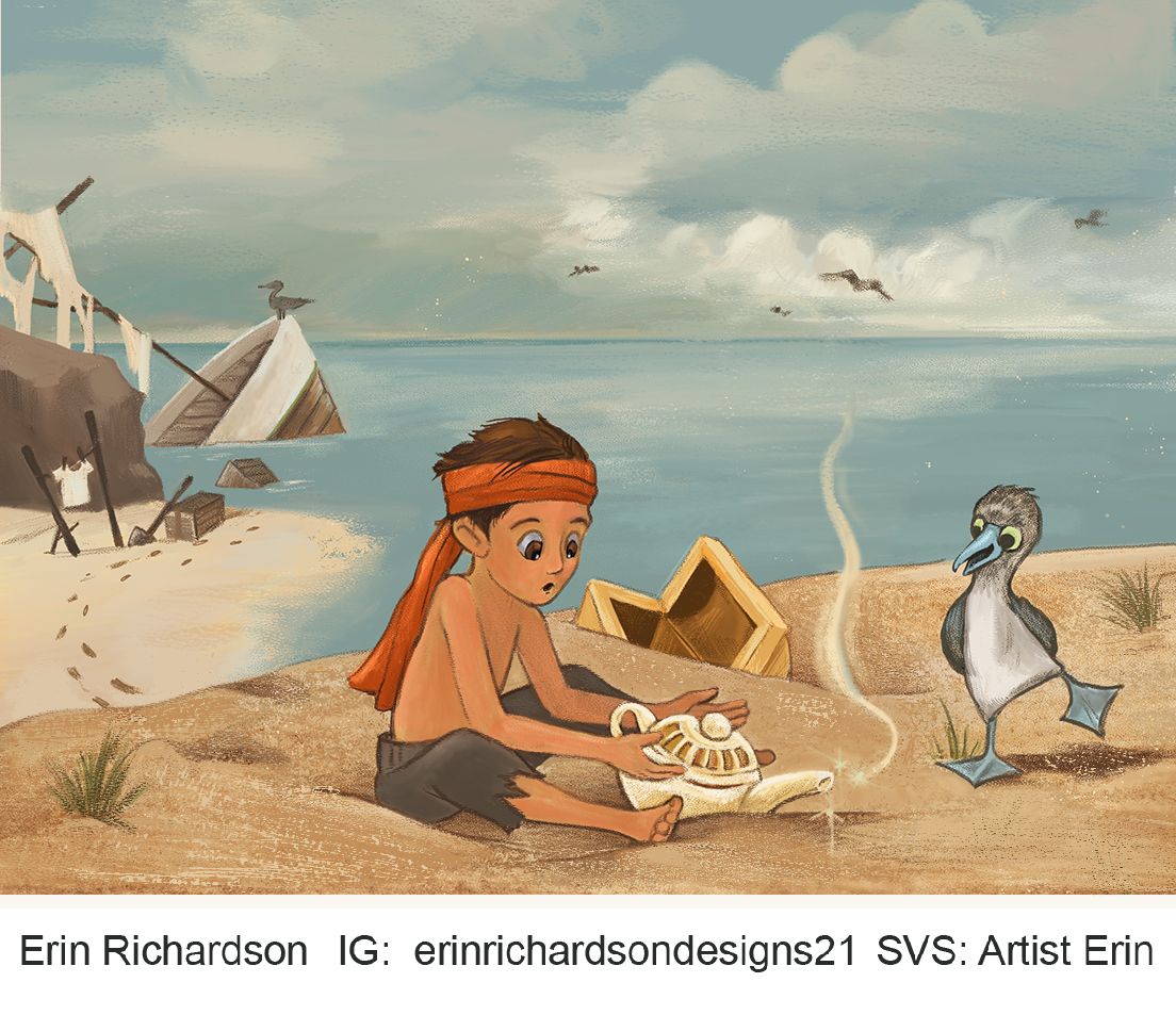
@ArtistErin Oh my goodness I saw this one earlier on the forum and didn't realize that it was yours! I really love the story! I got it immediately and thought "that's so cleaver." So my advice is yes, submit it! Even if you don't have time to fix anything! I think you are in the right space with Critique Arena. It just takes time and patience, and learning from the ones that do make it in, as well as the ones that don't.
If you do have time to do a couple edits, or even re-do in the ink style you used for Folktale Week, you could consider a couple of edits. You're right that his left hand is a little funny. I think it has more to do with the hand's position behind the lamp than being drawn wrong. Being right behind the ball at the top of the lamp makes it hard to avoid tangents. Maybe if you just raise it up a bit so that the silhouette is more clear.
You could also add a bit more shadow under the boy. He looks a little like he's floating right now. I'm also wondering if the pelican and blue footed boobie (that's what that bird is, right?
 ) are adding to the image or taking away from it? I think the pelican at least is an important part of the composition at this point, but I feel like you could easily take out the smaller bird and the composition wouldn't break, and the story might read a little clearer. If you do take out the smaller bird, maybe move the chest in the background over a little to kind of take his place visually.
But seriously you need to submit even if you can't make changes!
Instagram: https://www.instagram.com/kirsten.mcgonigal.art/
Portfolio Site: www.kirstenmcgonigalart.com -
@kirsten-mcg Thank you Kirsten!! I truly appreciate your insight here, I will take today to make those changes and will adjust... sometimes it's hard to see the path when you're eyes aren't seeing straight.
I love @Mia-Clarke and her needing to be roasted and change her illo cover, I love her straightforwardness regarding her work, and seeing myself here I suppose I need to thicken my skin...Many thanks!!!
Erin Richardson
instagram.com/erinrichardsondesigns21
www.erinrichardsondesigns.com -
@ArtistErin Awww, Erin!
 ️ That’s such a sweet thing to say!
 -
-
@kirsten-mcg My submission for November
Erin Richardson
instagram.com/erinrichardsondesigns21
www.erinrichardsondesigns.com -
@ArtistErin Ooh, I'm so flattered! But in fact I feel I still have a problem with drawing 'cute' things and generally making images tha appeal to more people, it's something I'm still figuring out. But hopefully I will get there.
I think your idea is great and in my opinion it's a very fitting answer to the prompt!
I felt like the pelican needed the most work, so it might be good that you cut it out. It also brings more attention to the boy, as the piece is less busy.
And I really like the way you drew the boy!
But I liked it better before with sunburns more visible and the sand lighter - the boy stood out more clearly from the background, now his skin color and the color of the sand are too similar. So I guess the only issue I can see now are the values -
@ArtistErin I love this! I think the changes you made make it that much better. Like I said before, your story is really clear, and that's half the battle. The value similarities between the boy's skin and the sand don't really bother me. The lifework helps the boys stand out. But you could play with it a little like @ArtistErin suggests and see what you think.
Instagram: https://www.instagram.com/kirsten.mcgonigal.art/
Portfolio Site: www.kirstenmcgonigalart.com -
@kirsten-mcg Thank you!! We shall find out how it goes, and just keep on keepin' on
@Mia-Clarke I like the deeper skin on Kamari, and changes I made, ultimately the reason for that is to deepen the values... I set a black and white layer and noticed most everything in the image was in the midtone and not enough darks, thank you so much for your feedback regardless!!
