Value spread suggestion?
-
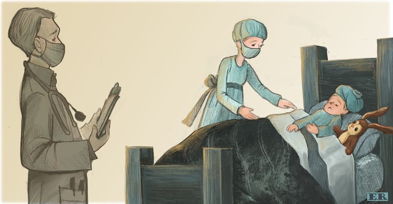
Spread for next image This image messed me up until I realized I had way too many people in the room, I took out another nurse who was stuffing animals in a bag, this little boy has scarlet fever and I was trying to show all kinds of details all at once. Hoping this reads clear! Learning value choices
")
Erin Richardson
instagram.com/erinrichardsondesigns21
www.erinrichardsondesigns.com -
@ArtistErin I like how concerned the bunny is looking at it's sick friend, with the Paw touching the kid. That draws my attention most. I'm also still in the learning phase, so certainly no expert opinion. The doctor looks great with the darker value on a light background. He's in the foreground and I clearly see a doctor but he's not the focal point. The bed is more complex because it is a mix of dark on light and light on dark within the middle ground. The pillow and kids pj's seem similar in value. And the bunny and the bed frame as well. Can't give you advice, don't know what I would do. But it seems harder to pull off.
The perspective of the bed seems a little off to me? Good luck with getting the hang of values. I'm with you -
@Chantal-Goetheer I totally agree! Even though you're still learning, as am I, you are so on point with your perspective. I knew as I posted this I had more adjusting to do on this piece, and I had to just get it out there and then continue to re-evaluate! It's interesting learning how value translates in color, and mood, maybe I'm overcomplicating this but I am struggling to understand.
I'd say you're further along than you give yourself credit for. A huge thanks for your feedback...
I tried playing with the levels adjustment tool etc... What I might do is scale the doctor back, adjust the bed and perspective, bring it forward more so the colors and saturation make more sense for the foreground.
Erin Richardson
instagram.com/erinrichardsondesigns21
www.erinrichardsondesigns.com -
@ArtistErin Something does feel a little off to me with this one. I think @Chantal-Goetheer is right about the perspective of the bed. Make sure you're drawing the whole thing outside of the frame to make sure you've got the perspective right, and then cropping. Also, the boy and rabbit feel like they're crowded onto one side of the bed and about to fall off. Looking at reference might help. For the values, maybe try making the doctor the darkest? Right now the bed has the darkest value.
Instagram: https://www.instagram.com/kirsten.mcgonigal.art/
Portfolio Site: www.kirstenmcgonigalart.com -
@ArtistErin I think the doctor is fine. It reminds me of the class of Will Terry on composition with the monster in the basement. There is basement stuff in the foreground but it's also dark on light. So it's more of a frame and context than a focal point. And it works well. I would maybe try to see how the bed might be lighter and a darker background. I think you work digitally so maybe it's easier to try different versions. It's very tricky to wrap your head around. I'm playing around with the colour picker thing in paint, just to try and understand value, colour, saturation, lightening things up and darkening things. Studying images.
-
@kirsten-mcg Yep! LOL I have moved things around so the perspective does feel off based on the new angle. So might have to start this one from scratch to no avail. I learned alot though so nothing's lost. I like the way Will Terry simply fades out some elements of his composition to show they are relevant to the scene yet they aren't the focus, and the focus is more saturated, and shouldn't be competed with. Yet, if the faded out part is larger it does sort of take over anyway.
I hear Will, Jake, and Lee all saying "Now Go Draw Something!"
I am going now to draw something.
-
@Chantal-Goetheer Yes! This is where I've been leaning. I am going to bounce over to that course today, thank you for this insight. I also love how Lane Smith drew simple lines to indicate "memories" or "thought paths" and filled in with great detail the focus he wanted your eye to be directed toward. Grandpa Green, phenomenal and simple in it's approach..

-
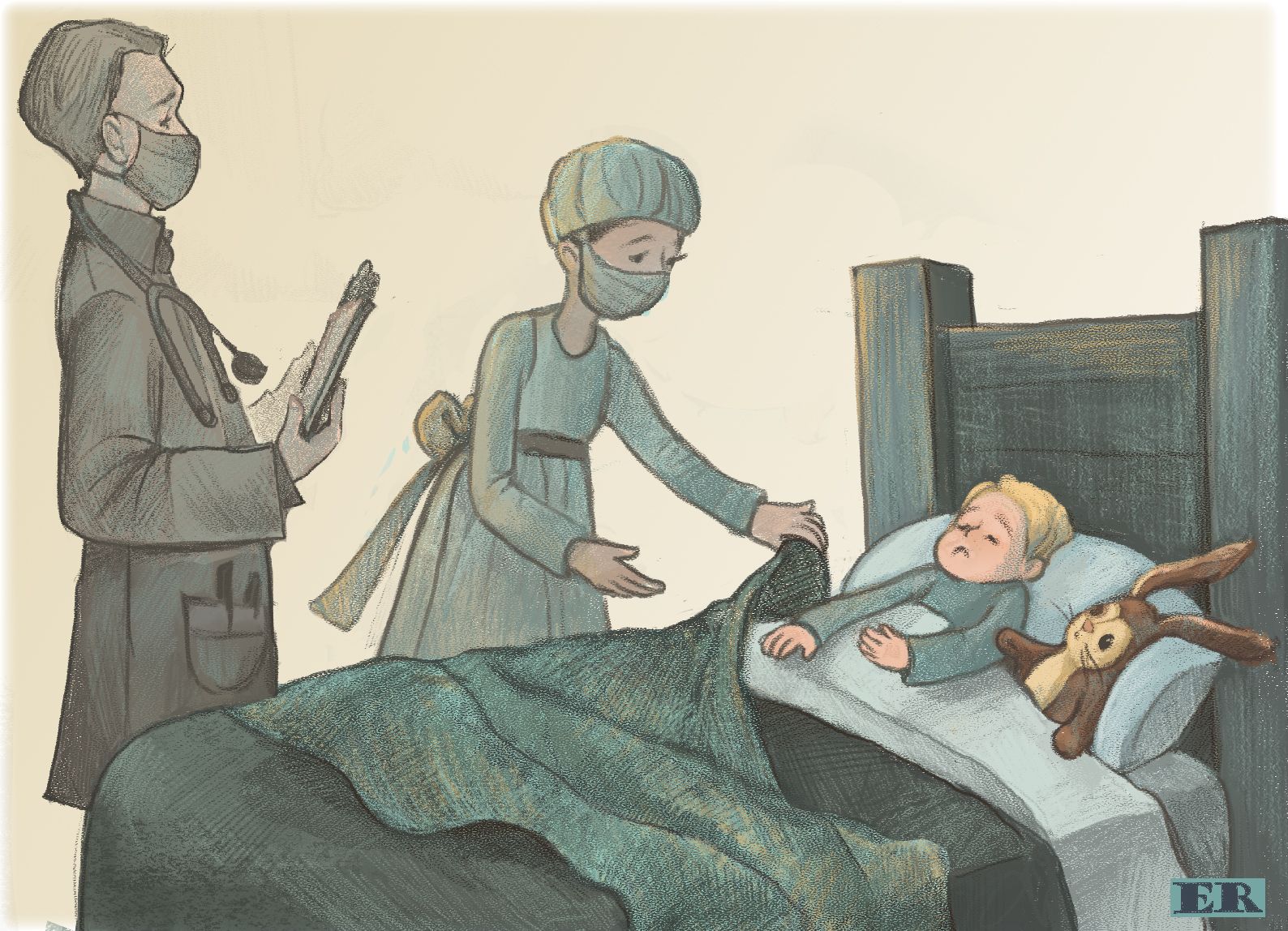
Update on this image... I wanted to keep the color palette and the image muted and somber like, I thought adding a blanket would break up the stark contrast of the dark bedspread and to tie in the nurse helping the boy, took off the icebag cause it looked like he was wearing a hair net too. LOL The rest of the images in this project are definitely more saturated and I know I need to lay everything out together and make that call then.
Erin Richardson
instagram.com/erinrichardsondesigns21
www.erinrichardsondesigns.com -
@ArtistErin This is so much better! I love the muted colors and somber mood. And I really like that you've moved the doctor up next to the nurse. Great job!
Instagram: https://www.instagram.com/kirsten.mcgonigal.art/
Portfolio Site: www.kirstenmcgonigalart.com -
@ArtistErin yes it reads much better now and the colours are great!
-
@kirsten-mcg Thank you!
Now working on creating time lapse short, in Photoshop... Fun!!!! -
@Chantal-Goetheer Thank you