Hello from Buffalo, NY! A bit of help please?
-
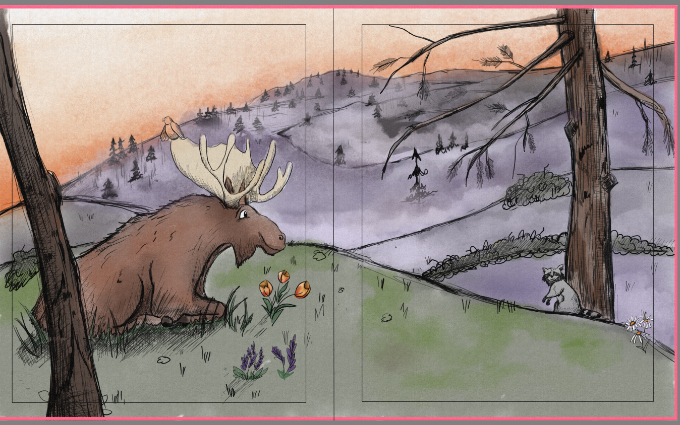
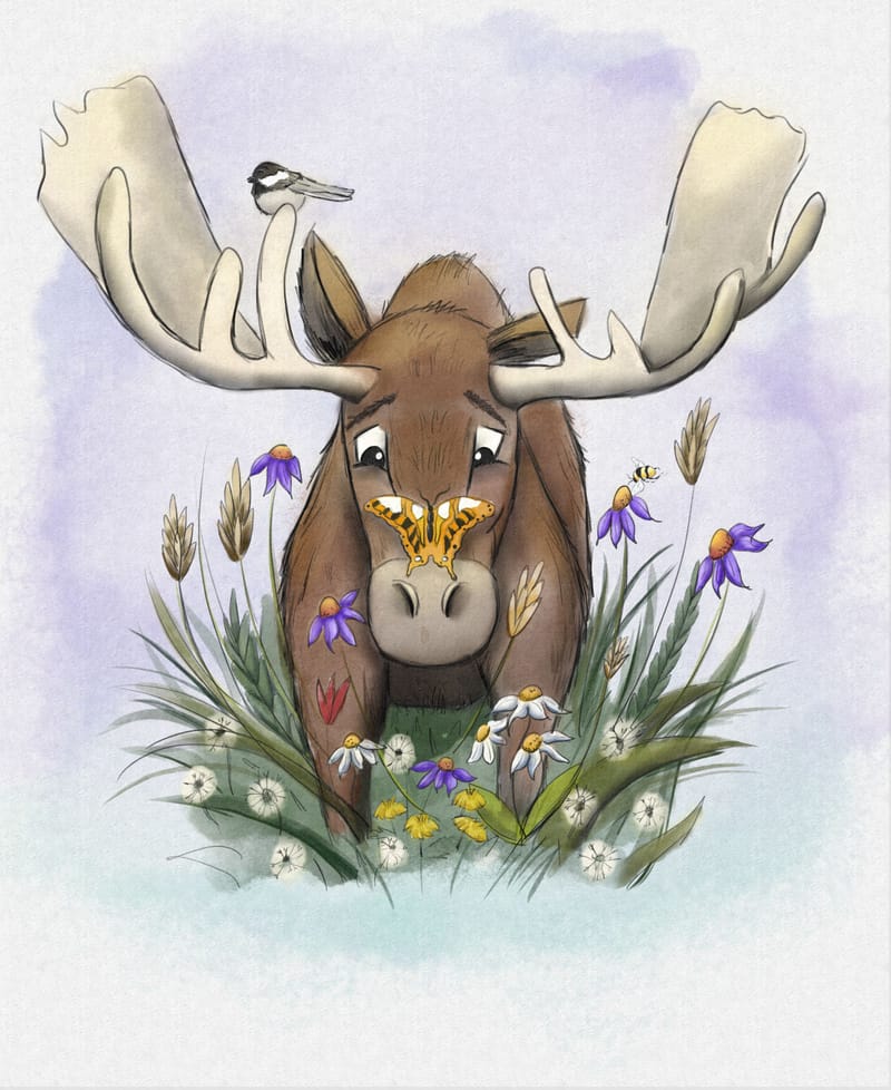
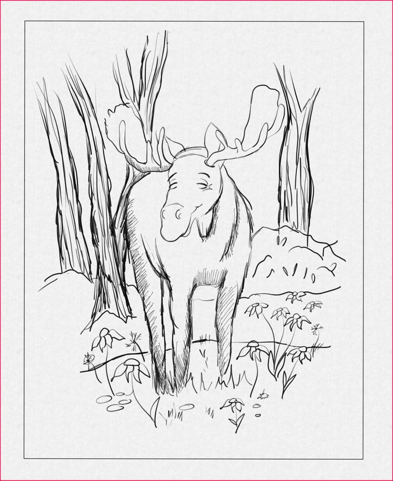
Hiya! I've always loved drawing, but really started getting serious about it in the last couple of years. In the last few months, I've been fortunate enough to get work on a few books, including this one. I love this character and am just having a really hard time figuring out the composition / background for this scene. This moose lives in Maine, and the forests are a big part of the story. I might have gotten too in the weeds thinking about color after listening to "how to fix your art" but I've basically gone tharn on this image. I've attached some of the completed and in progress pages as comparison. Should there be mountains? Should I just wash out the background? I've never had a critique of my art, so this is quite humbling. Any and all feedback is most welcome. Thank you so much

-
@Sonia-Merkel Hi! Your moose character looks lovely!
The mountains on the first spread don't bother me at all. I would still try to erase them and compare the two if you are not sure now. I would make sure to incorporate a bit of that same background on some of the other spreads too, so you are consistent with your style.
What bothers me a little bit though is the brightly colored flower, that's on the same plane as the moose. Is it important to the story? Because it kinda takes up all the attention on this spread. If it is supposed to be the focal point, then it's not a problem.
-
@mag Thank you so much! You are exactly right about the flower - it's way too bright and I see that now
 I will try a version with no mountains, and definitely incorporate more of a cohesive background in the other images. I really appreciate you taking the time to comment!
 -
Hello! Regarding the mountain background, if important to the story, it is ok to keep but you need some way to make the moose character stand out. As it is now, the midtone brown just blends into the midtone green and greys. As I see it, only the orange flowers and orange sky stood out in this spread.
The rest of the page sketches look okay but I am still not getting any interesting story going on in those. Is the moose going to do something/ meet someone and have a dramatic interaction somewhere?
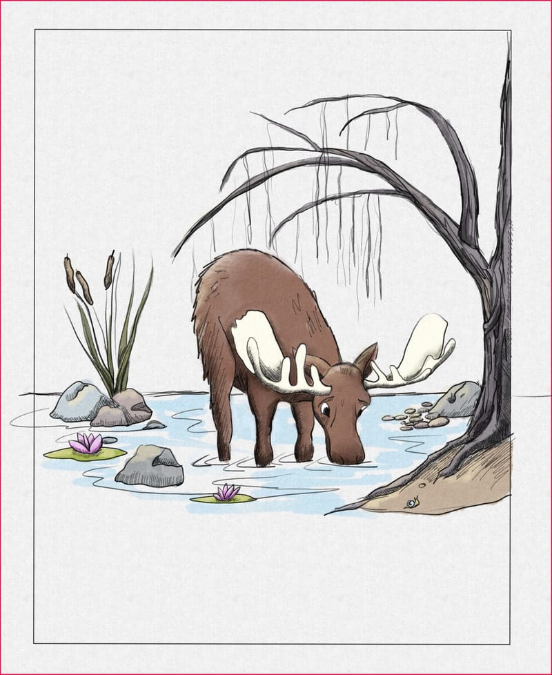
I like the drinking moose because it has super clear focus and silhouette, but I feel it needs more story to be interesting. Is someone watching him drink from afar?
-
@ArtMelC Thank you so much! Yes, there is definitely some conflict, but for the beginning of the story he's pretty much just being a happy guy in the woods. Thank you for your suggestions about the colors, I think you are exactly right. I really appreciate your suggestions!
-
@Sonia-Merkel congratulations on illustrating your first children's books! Your moose character is so appealing and you have a nice, natural color palette.
A few things to consider:
-
It's hard to give feedback on a picture book illustration with a missing element: text. Without knowing the amount of text that's supposed to go on the page and where it is intended to be placed, it's difficult to get a sense of how the composition and visual storytelling are working. Are you able to place text on the illustrations in your posts? Or, if the author hasn't given you that permission, could you put placeholder text or a box to show where the text would go?
-
Regarding your question about the mountains in the first illustration: are they a big part of the story? They are visually taking up a lot of room and because their value is so similar to the moose, they do want to dominate the scene. Could they be smaller, pushed back into the distance? Could they be a lighter value? Have you viewed this illustration in black & white to see the values?
If the main focus of the illustration is supposed to be on the characters, you may want to consider reducing the size and simplifying the background. You may also consider moving down the edge of the foreground (the hill that the characters are on) so that the line is below the moose's head instead of cutting across his nose.
These compositions are working, but they could also be improved. And again, your characters are so appealing! If this is a character-driven story, why not lean into your strengths and really put the focus on these adorable characters?
Thank you for being brave and sharing these with us! Please keep us updated on your progress!
-
-
@Melissa_Bailey Thank you so so much for your comments and suggestions! I will definitely include text place holders in the future and provide more context when seeking assistance. I am so grateful for all the wonderful advice. I have not done a value study on this image, thank you I will do that! And thank you for the encouragement - it's appreciated more than you know!
-
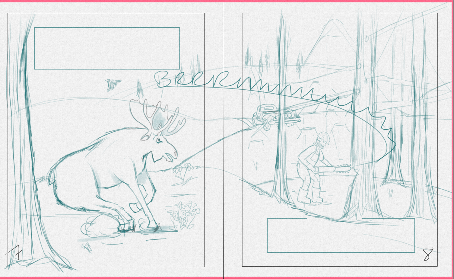
@Sonia-Merkel I like the idea of the chainsaw sound becoming the teeth of the saw. I think this can be pushed further; let the text dominate the entire spread, the sharp edges of the letters literally cutting through and felling the forest.
-
Love your moose character and your overall style. I like the mountains - gives a sense of place.
Is the mountain on the opposite hill is meant to be fire ravaged? (looks a bit ashy and dead) Or heavily logged so it's very sparsely populated with trees? Because that's a bit how it looks to me. Almost as if the moose is in danger of losing his environment which might well be part of the story! If that's the case, I'd say the mountain is an integral part of the story. It's just a question of when you choose to reveal it.
EDIT: I've since seen your chain saw sketch - so heavily logged it is! Perhaps need to make it clearer that it's logging that's taking place - eg show some tree stumps. At the moment the mountain looks fire ravaged to me. The rather sick looking tree closest to the moose - is that meant to be logged as well? Perhaps a healthy tree would be a better contrast?