Value Study
-
@Blitz55 @Melissa-Bailey Thanks for commenting! I added some more context in my post. I'm such a newbie!
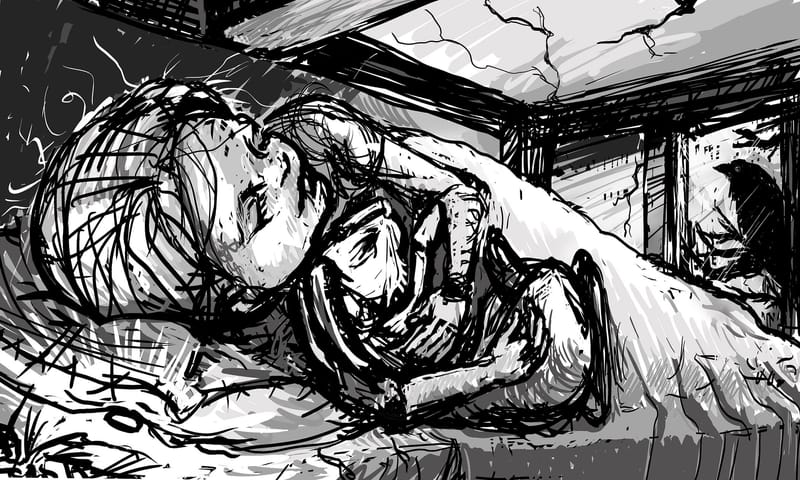
") Here's more info for you: At this point in the story the girl is sleeping with a (magical) button under her pillow that is causing her to dream. The raven is also important to the story. He looks a bit ominous, but he's actually good... almost a guardian. The main character is the girl though.
Here's more info for you: At this point in the story the girl is sleeping with a (magical) button under her pillow that is causing her to dream. The raven is also important to the story. He looks a bit ominous, but he's actually good... almost a guardian. The main character is the girl though. -
Thank you so much for the input! I made a couple of edits. Do you think this helps make the girl more important?
-
@JessicaLinnEvans I think you need to add more shadow back in.
Right now, there's a good chunk of realty given to the lightest value, and at an almost white, you're not going to give yourself room to add color to white.If it is night, you would be best to have an average shadow as your main value, and then add cast and occlusion shadow from there. Once you've done that, I would add in your average light values, your reflective light values and only small spots of your lightest value.
Also try to think of the plain changes as you work your values in. I can see that you have light coming from the bean under the pillow, but the light seems to go through the pillow rather than around it.
You could consider making the room taller, and have the raven sit perched higher in the window so that the light will project towards her face putting emphasis on a diagonal eye line from one focal story feature to the other.
-
@AngelinaKizz Wow!! Fantastic feedback! Thank you!
-
@JessicaLinnEvans looking forward to seeing where you take this one!
-
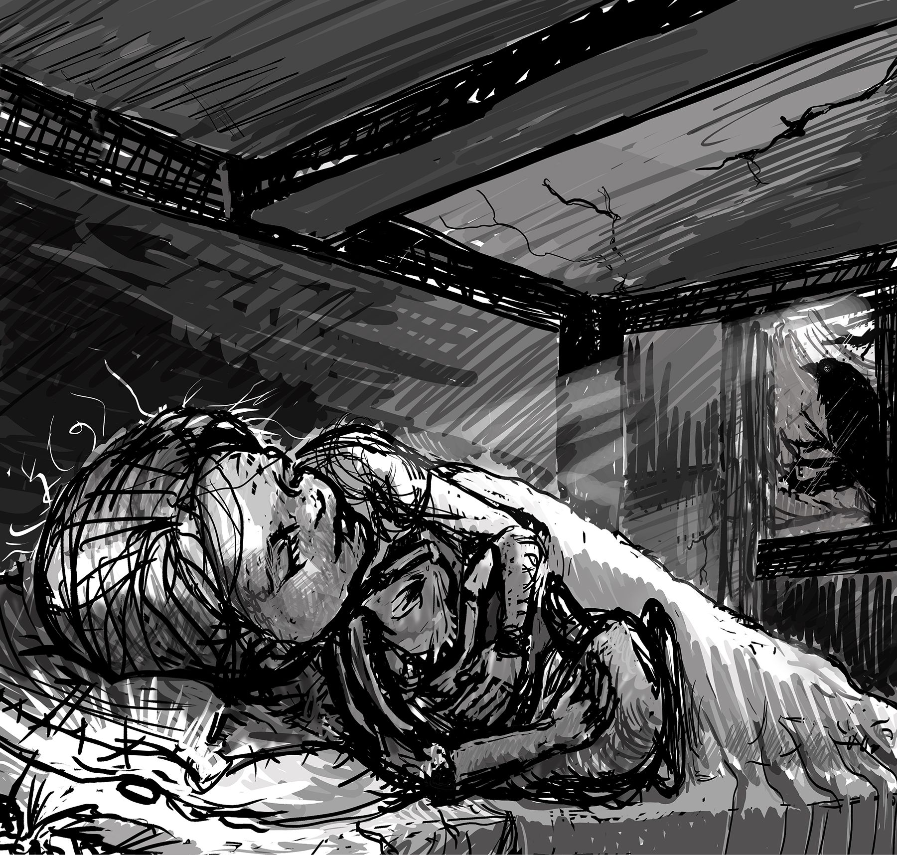
Okie doke! Really awesome feedback! Hopefully I understood correctly. I'm hoping to move on to color study next. Here's where I landed for values...
-
That's looking much more like I thought it was supposed to be.
I think the only thing that's throwing me is more in the drawing itself. She is in her bedroom I take it, but something about the room makes it feel really small and cramped. I thought at first perhaps she was in a bunkbed and the top of the bunkbed was right above her and the beam was what held the mattress above her up. This also might be because I grew up sleeping in a bunkbed just like that. HAHA
 I guess with it being such a lose sketch I can't quite distinguish what is going on there.
EDIT: I see you did make the room a bit taller from the first one. That does certainly help a bit with the issue my eyes were having.One thing I might suggest is trying larger brushes to lay in the value. Especially if its not going to be a part of the finished product. The sketchiness and quickness of it can make it difficult to figure out what's going on and can even muddy the values up a bit.
I am by no means an expert though haha, so if others think differently that is A-Okay!
Gave you a follow on the old instagrams by the way. Cheers!
Draw, Draw, Draw, Draw and Draw Some More!
Instagram: https://www.instagram.com/levisimpson55/ -
@JessicaLinnEvans said in Value Study:
feedback available on this value study
Hey Jessica, the first thing I'd say is when you do a value study, I don't think you want to work this heavily with line...
I can see in this sketch that you're doing most everything with a digital brush whose size setting is relatively low - and for value studies you really want to focus on blocking in color, so you can clearly define which chunks of the piece are high key and which are darker.
Because you've used a mix of black line on top of dark gray line on top of light gray line in multiple areas of the piece this value study doesn't give you much clarity on which parts of the illustration should be dark and which should be light. Rather I think it might even confuse you a bit when you go to lay in color.
Definitely try increasing your brush size by at least 10 points or so, and don't be afraid to block in large swatches of white, grays and blacks. But make sure that an area that is white is only white, and an area that is a range of light grays is only grays.
I hope this helps!! -
-
@Kristen-Lango Very helpful! Thank you!
-
@Blitz55 Awesome! Thank you! This is helpful feedback as I've only done a couple of value studies and am very new at it. I'm trying to be loose with my sketches, because I'm usually very detailed in my rendering, but it looks like it backfired! Ha! Thanks again for the input! I love being on this forum!!
-
Thanks for all your feedback, everyone! I thought I'd upload my final. I hope I have implemented your suggestions effectively. I'm pretty happy with how it turned out!
@Melissa-Bailey @Blitz55 @AngelinaKizz @Kristen-Lango 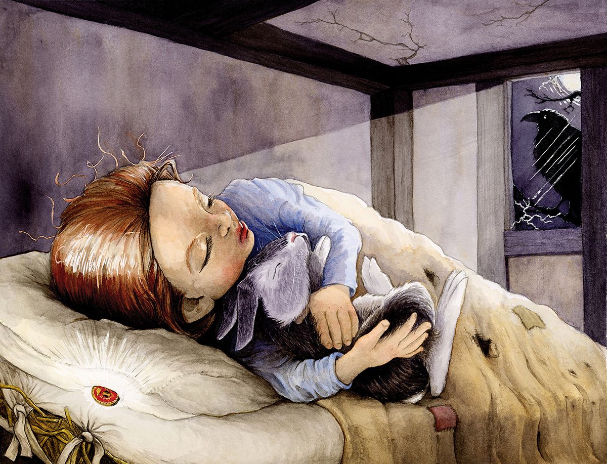
-
Very good improvement in compositional value from the first post. It works very well. The projected light from the window is a very nice trick to tell us that the raven is looking after her.
The thing I would suggest for your next piece is to start with very small thumbnails and a big brush, so you can explore as many light and value solutions as you feel necessary.
In any case, the resulting images is very good!
Find me on Instagram: https://www.instagram.com/nodragem/
Portfolio: https://www.nodragemillustration.com -
@Geoffrey-Mégardon Thank you so much!
-
@JessicaLinnEvans OMG, it looks great!
Nicely done! -
@JessicaLinnEvans Lovely work!