Society of Visual Storytelling

    SVSLearn Forums

    • Register
    • Login
    • Search
    • Recent
    • Tags
    • Popular
    • Users
    • Groups
    • Search

    Portfolio Vote Please

    Questions & Comments
    7
    11
    608
    Loading More Posts
    • Oldest to Newest
    • Newest to Oldest
    • Most Votes
    Reply
    • Reply as topic
    Log in to reply
    This topic has been deleted. Only users with topic management privileges can see it.
    • ksfabian
      ksfabian @Jeremy Ross last edited by

      @Jeremy-Ross option 3 looks best on mobile. I’m sure option 1 or 2 looks best on desktop. I’m not sure how agents look at submissions. Maybe that will play a role in what option you go with.

      ksfabiancreations.com

      Jeremy Ross 1 Reply Last reply Reply Quote 1
      • Larue
        Larue last edited by

        I’m using my iPad and I I like option 2 . Love the big first sample and then being able to click on the thumbnails that pop into full size once I click on it.

        Robyn Hepburn 1 Reply Last reply Reply Quote 2
        • Kevin Longueil
          Kevin Longueil SVS OG @Jeremy Ross last edited by

          @Jeremy-Ross For me it is number one by quite a wide margin….I bet it really depends on how we are viewing your page. I’m on my iPad. 3 is good too but 1 seems to showcase more work more quickly and in a clean manner so you can see with very little time or effort the quality of your work. Beautiful work by the way!

          Portfolio: kevinlongueil.com
          https://www.instagram.com/kevinlongueil/

          1 Reply Last reply Reply Quote 2
          • K
            koricat last edited by

            The projects are impressive, and the feedback has been positive. I would encourage the poster to continue working on their portfolio and to keep seeking feedback.

            1 Reply Last reply Reply Quote 1
            • Robyn Hepburn
              Robyn Hepburn @Larue last edited by

              @Larue Ditto!

              https://www.instagram.com/robynhepburnillustrates/
              www.robynhepburn.com

              1 Reply Last reply Reply Quote 1
              • Jeremy Ross
                Jeremy Ross @ksfabian last edited by

                Thank you for feedback @ksfabian , @Kevin-Longueil , @koricat ,@Larue and @Robyn-Hepburn !

                There’s certainly pros and cons for each depending on what device is being used.

                If I had to weigh the best choice for monitors, phone and iPad, I’m thinking option 3 provides the best bang for your buck. I put a return to top button on that to make it easier for folks to not have to scroll up.

                Loving seeing everyone’s vote!

                https://www.instagram.com/jeremyrayross
                https://www.jeremyrayross.com/
                https://twitter.com/jeremyrayross
                https://jeremyrayross.substack.com/

                Robyn Hepburn 1 Reply Last reply Reply Quote 2
                • Robyn Hepburn
                  Robyn Hepburn @Jeremy Ross last edited by

                  @Jeremy-Ross Sounds like a good plan. I'll check it out on my phone sometime too.

                  https://www.instagram.com/robynhepburnillustrates/
                  www.robynhepburn.com

                  1 Reply Last reply Reply Quote 0
                  • Julia Hegetusch
                    Julia Hegetusch @Jeremy Ross last edited by

                    @Jeremy-Ross Hi Jeremy. I had a portfolio critique with guiseppe castellano and he talked about the portfolio layout. At first I had mine like you in number three ( just one image after the other). His advice was to have a gallery view meaning to or three images next to each other so that art directors can quickly get a good overview of your work without having to scroll back and forth to long. I think this works well on a big screen but not great when viewing on a mobile. I've seen some people have a gallery view when viewed on the laptop and one image after the other when viewed on the phone. This works best in my opinion but know idea how they get it like that🙄

                    https://moanamaureen.com

                    Jeremy Ross 1 Reply Last reply Reply Quote 1
                    • Jeremy Ross
                      Jeremy Ross @Julia Hegetusch last edited by

                      Thanks @Julia-Hegetusch! It’s like a double edged sword!

                      I know why 12 images seems to be the magic number because it’s easier to scroll and see everything quickly.

                      At one point, I had like 40 pieces!!!!

                      https://www.instagram.com/jeremyrayross
                      https://www.jeremyrayross.com/
                      https://twitter.com/jeremyrayross
                      https://jeremyrayross.substack.com/

                      Jeremy Ross 1 Reply Last reply Reply Quote 0
                      • Jeremy Ross
                        Jeremy Ross @Jeremy Ross last edited by

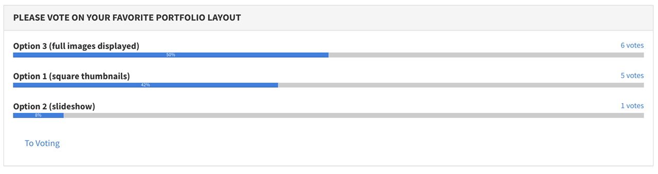
                        Just wanted to say thank you to everyone who voted!

                        Looks like Option 3 wins the popular vote! I also asked random people, colleagues, friends and family and Option 3 kept coming in as a first choice.

                        Interestingly, the author Tim Ferris used popular vote for the name of his Uber-popular book, The 4-Hour Workweek. He used AdWords and slipped dust jacket covers over books at the bookstore to see what grabbed people’s attention the most!

                        I might just do the same on my next Picturebook!

                        IMG_7767.jpeg

                        https://www.instagram.com/jeremyrayross
                        https://www.jeremyrayross.com/
                        https://twitter.com/jeremyrayross
                        https://jeremyrayross.substack.com/

                        1 Reply Last reply Reply Quote 3
                        • First post
                          Last post