Society of Visual Storytelling

    SVSLearn Forums

    • Register
    • Login
    • Search
    • Recent
    • Tags
    • Popular
    • Users
    • Groups
    • Search

    SCBWI prompt yellow

    Projects
    4
    12
    501
    Loading More Posts
    • Oldest to Newest
    • Newest to Oldest
    • Most Votes
    Reply
    • Reply as topic
    Log in to reply
    This topic has been deleted. Only users with topic management privileges can see it.
    • AngelinaKizz
      AngelinaKizz last edited by

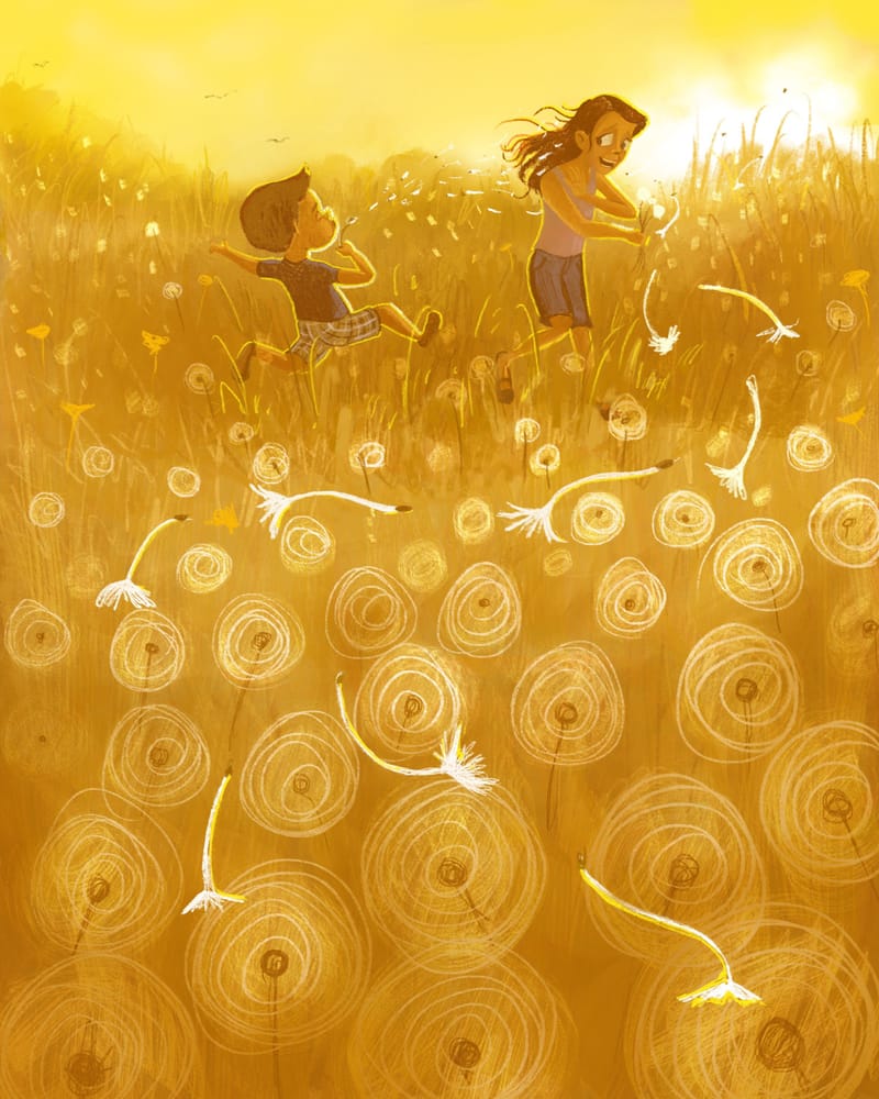
      This is what I’ve been working on this month.
      I’m still working through my jar of illustration prompts, and decided to merge a prompt I pulled which was “blow” with this months SCBWI prompt “yellow”.

      Any thoughts on how I can improve the lighting? Any other issues, feel free to point them out!

      2BE1B9BF-7696-44AE-80D9-CC50A3C5CF10.jpeg

      Kim Rosenlof 1 Reply Last reply Reply Quote 1
      • Kim Rosenlof
        Kim Rosenlof @AngelinaKizz last edited by

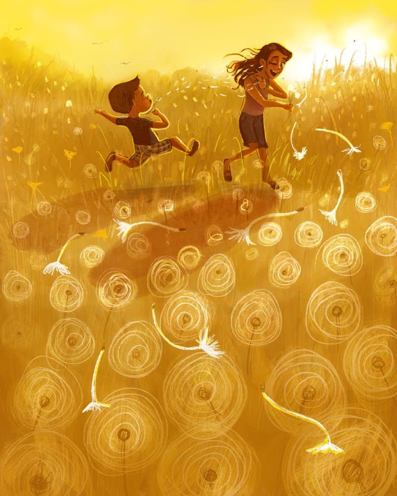
        @AngelinaKizz I love the colors and lighting. Very beautiful. I don’t have much to add, but her face looks like she is scared and not having fun at all. I would also darken the figures (maybe not as dark as I did) and add a bit of shadows. I did a quick draw over. Hopefully that is okay. I changed her expression so she is laughing and closing an eye to show she doesn’t want it in her eye, but she is enjoying herself. I would also make her hand more noticeable; I tried to do it, but not very well. I love the idea you came up with. Such a fun thing to do as a kid.

        IMG_0033.jpeg

        Instagram: https://www.instagram.com/kiminyrose/

        AngelinaKizz 1 Reply Last reply Reply Quote 1
        • AngelinaKizz
          AngelinaKizz @Kim Rosenlof last edited by

          @Kim-Rosenlof ooooooh! I love the one eye closed! And darker shadows! Going to make adjustments now! We have this field behind our house that the dandelions cover the entire field, and my kids absolutely go bonkers with joy running through and making wishes, and it just makes my heart so happy to watch them play in the field!

          1 Reply Last reply Reply Quote 0
          • AngelinaKizz
            AngelinaKizz last edited by

            This post is deleted!
            1 Reply Last reply Reply Quote 0
            • AngelinaKizz
              AngelinaKizz last edited by AngelinaKizz

              D1904E86-5C4E-4EE5-92A9-573E05E1F9F6.jpeg
              How do the adjustments look?

              skeletortoise Kim Rosenlof 3 Replies Last reply Reply Quote 4
              • skeletortoise
                skeletortoise @AngelinaKizz last edited by

                @AngelinaKizz I think it’s an improvement! The way you’ve not only darkened the characters, but also made them more purple, really makes them stand out. Well done 🙂

                1 Reply Last reply Reply Quote 1
                • Kim Rosenlof
                  Kim Rosenlof @AngelinaKizz last edited by

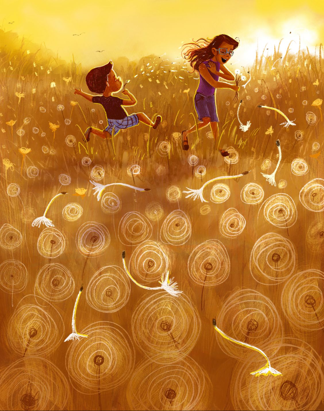
                  @AngelinaKizz It looks really good. I agree with @skeletortoise that adding the purple really works well against the yellow.
                  One thing, but this can be ignored if you want to, I do like the darker yellow of the field, but it is looking more brown now. maybe keep more of the upper part of the field yellow like before and then gradually go darker as you go down. I am just not sure how strict they will be with the prompt “yellow”.

                  Instagram: https://www.instagram.com/kiminyrose/

                  1 Reply Last reply Reply Quote 1
                  • Kim Rosenlof
                    Kim Rosenlof @AngelinaKizz last edited by

                    @AngelinaKizz It’s hard to say what to do because I like how you have changed it so you can see the dandelions more now.

                    Instagram: https://www.instagram.com/kiminyrose/

                    AngelinaKizz 1 Reply Last reply Reply Quote 1
                    • AngelinaKizz
                      AngelinaKizz @Kim Rosenlof last edited by

                      @Kim-Rosenlof I questioned the color too, but I stayed on the yellow portion of the color wheel so I think it would be safe to stay even though there's a stronger brown feel. I may play around a bit more, but if I lean too cool yellow in those values it's more of a muddy green.

                      1 Reply Last reply Reply Quote 0
                      • AngelinaKizz
                        AngelinaKizz last edited by

                        39B4743A-0FFC-4D67-BDEF-CA6EA2CF210A.jpeg
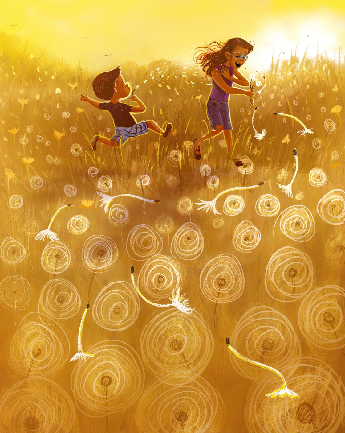
                        I tried some adjustments. Bringing it more into yellow, but I can’t decide which is better.

                        AngelinaKizz Griffin McPherson 2 Replies Last reply Reply Quote 2
                        • AngelinaKizz
                          AngelinaKizz @AngelinaKizz last edited by

                          Does anyone know where the draw this submission gallery gets posted? I’d love to peruse the other entries but I can’t find it. Thanks!

                          1 Reply Last reply Reply Quote 0
                          • Griffin McPherson
                            Griffin McPherson @AngelinaKizz last edited by

                            @AngelinaKizz I think this looks great! It’s at the point where any changes you make are just getting into more subjective things that can go either way

                            1 Reply Last reply Reply Quote 1
                            • First post
                              Last post