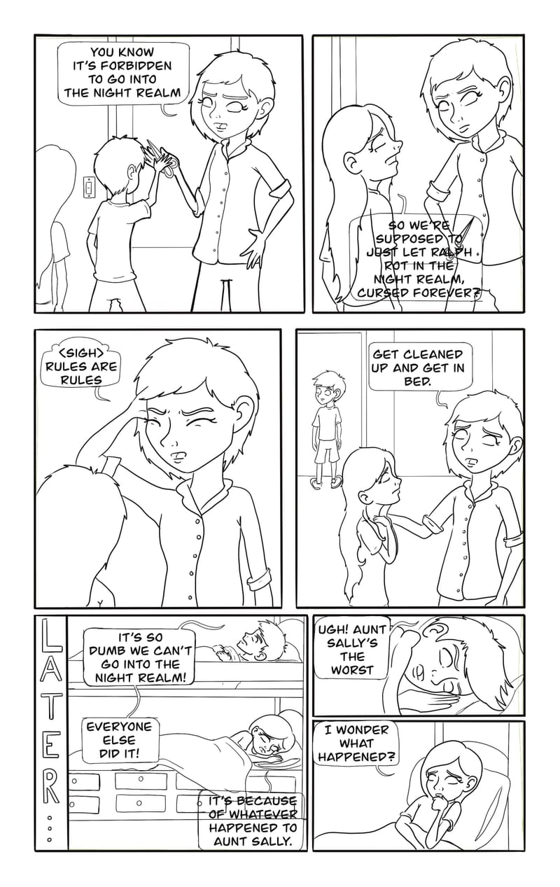
Are my word balloons/bubbles too big?
-
I’m working on my comic and I feel like my text/word balloons take up most of my panels. I want my comic to be readable but maybe I went too big?
-
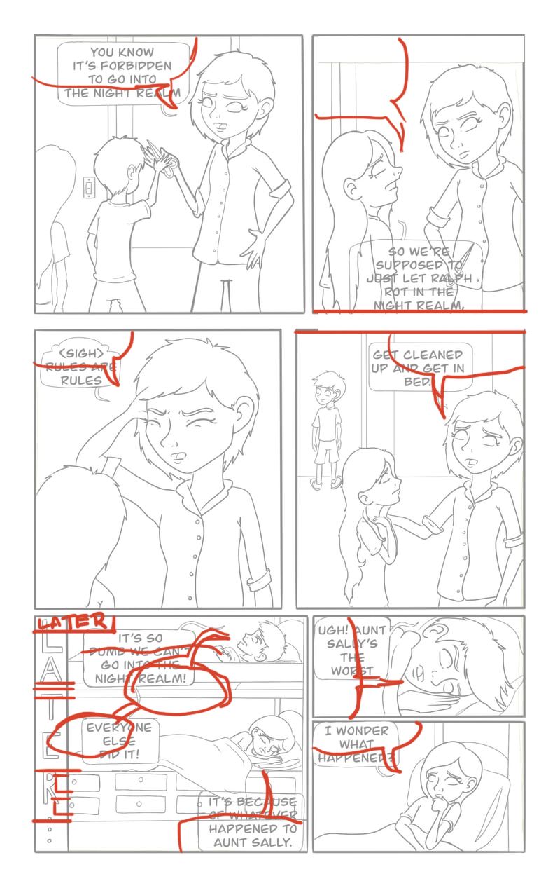
No the writing is a good size I think. maybe just take it down a couple points. It's important thats its legible though. You just have to be more clever about placing the balloons. I like to merge them with the tops of the panels to save space. I don't have my tablet with me unfortunately but i tried to show my suggestions with a mouse. Hope it's helpful.
-
@Mimi-Simon thanks so much!! I was really struggling between readability and space for the image.
-
@ksfabian said in Are my word balloons/bubbles too big?:
I’m working on my comic and I feel like my text/word balloons take up most of my panels. I want my comic to be readable but maybe I went too big?
Balancing text and visuals in your comic is crucial for readability and visual appeal. Consider resizing or repositioning your word balloons to allow more space for artwork. Using concise dialogue can also help maintain the flow without overcrowding the panels.
-
You're on the right track with reducing the font size slightly while maintaining legibility. Merging the balloons with the tops of panels is a smart approach; you could also consider using corners, sides, or even the gutters between panels. Experiment with different balloon shapes and tail directions to fit them into tighter spaces, and try layering or overlapping balloons slightly over characters or backgrounds. Semi-transparent or color-matched balloons can blend better with the artwork, making them less intrusive. Even with just a mouse, your creative problem-solving is clear and effective!
-
Great advice from @Mimi-Simon , and I think she figured out the best placement based on those panels. However, those panels aren't optimally planned with text in mind from the start. With the placement of the art, you kind of have no choice but to push the speech bubbles to the corner to make space. The first 4 panels have the text at the top above the art - which isn't ideal because the reader's eye tend to jump from text to text and if you create a straight line above the art between the bubbles, the reader will end up completely jumping over the art and not looking at it. Basically, I recommend spending more time at the thumbnail stage to plan sufficient space for both your art and speech bubbles! The bubbles are an integral part of the visual and need to be taken into account when planning your layout and composition.
Lastly, while I think your speech bubbles aren't too big, I think the text within could be just a smidge smaller so you have a bit more of a margin between the text and the edge of the bubble. Right now, the text isn't breathing so well inside the bubble because it's so close to the edges.
I hope this helps!