Would you give me some critique?
-
Hello lovely humans!
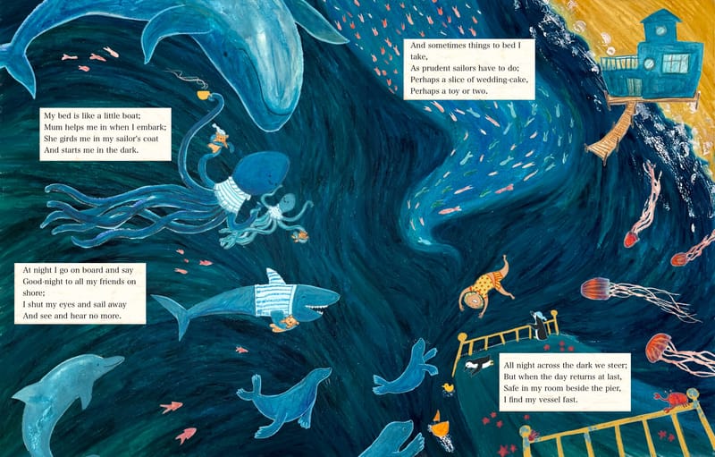
I recently finished this illustration as a pretend-brief: double page spread, in these dimensions, for this poem by Robert Louis Stevenson. Because there was a deadline I just got the thing to a finished state, but before I throw it at my portfolio, I'd love to see it with fresh eyes (through your eyes, perhaps) and get a few pointers for how it could be improved. Any ideas/suggestions etc? I'd greatly appreciate it!
-
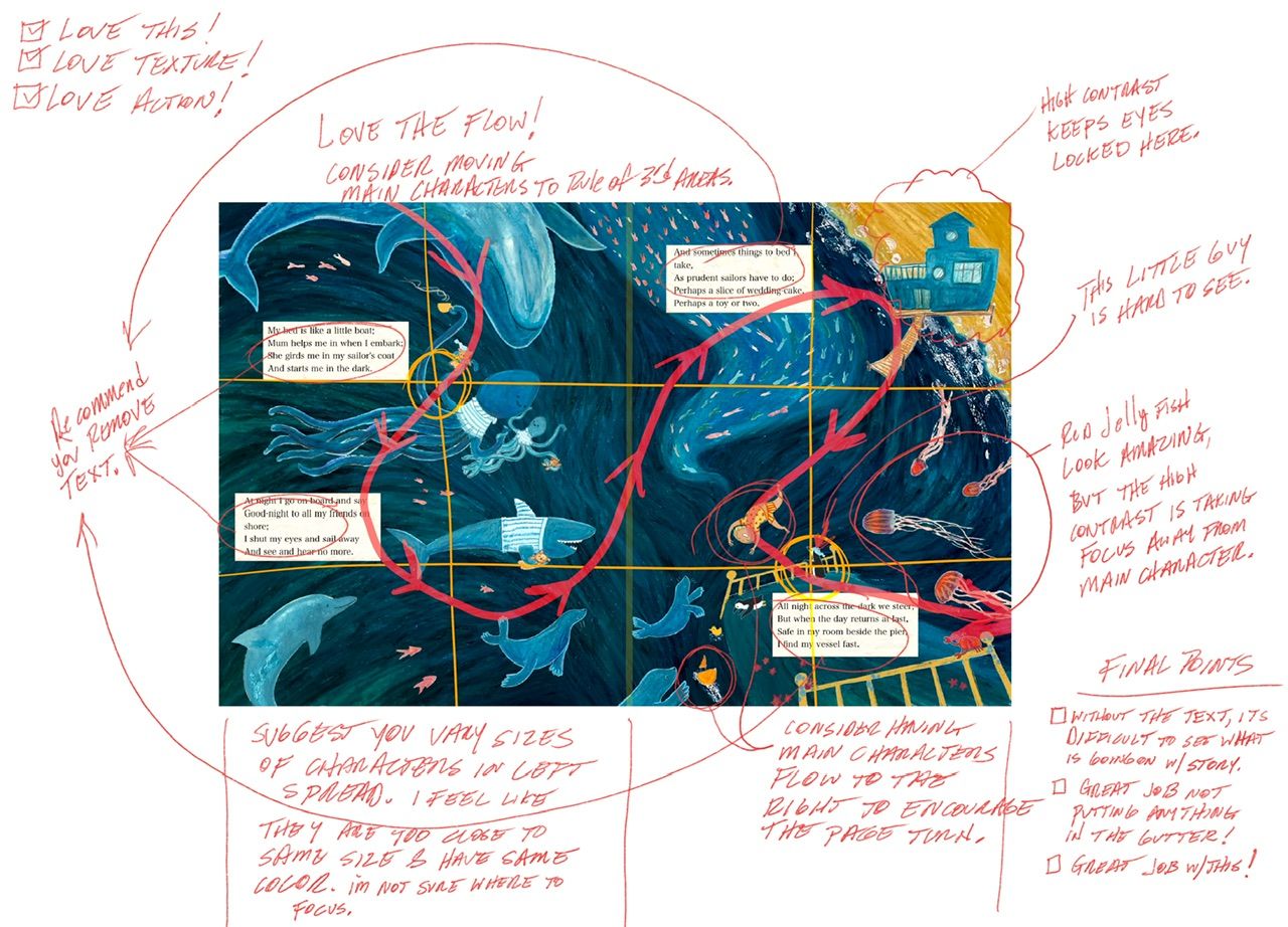
Hi @Robyn-Hepburn This is a wonderful piece, well done!
I hope you don’t mind, but I took the liberty to offer some of the main items I noticed could use some improvement. Keep in mind, this is very subjective; therefore, you can take what you like and ignore everything else.
")
Again, very nicely done!
-
@Jeremy-Ross Thanks Jeremy, that's incredibly helpful! I feel like I have somewhere to start now, and a direction to move in. I shall implement your suggestions right away.

-
@Robyn-Hepburn i think some hand lettered text would really elevate it, even if you didnt change anything else. Making the words a part of your piece instead of feeling pasted on would go a loooong way. You could do that easily by putting the words into a cursive font on the computer, figure out how you would place it (possibly by printing it out and cutting it up? And moving things around till it looked right? ) then take a picture of it and write over it on a new layer digitally (id suggest using something that looks like colored pencil to match the rest of the piece) and then digitally over lay that on your artwork. Almost all text is digitally imposed on artwork so the original is preserved and the text is easily manipulated.
Id love to see what you end up with!
Blog: mamatheartist.blogspot.com
Coloring page newsletter: https://bit.ly/Color-in -
@R-Fey-Realme Thank you! That sounds great! I had planned to type it up (on an old typewriter) then cut it out untidily and stick it in, but forgot to do that earlier on in the process. But your idea sounds way better anyway!
