Style question
-
Hi, so I am working on my own book at the moment. Text has been professionally edited, book dummy is done and I am basically good to go to do the final illustrations. BUT I somewhat feel stuck with the style I envisioned but also the composition of some of the images. What looked good in the dummy, now I feel it is just boring.
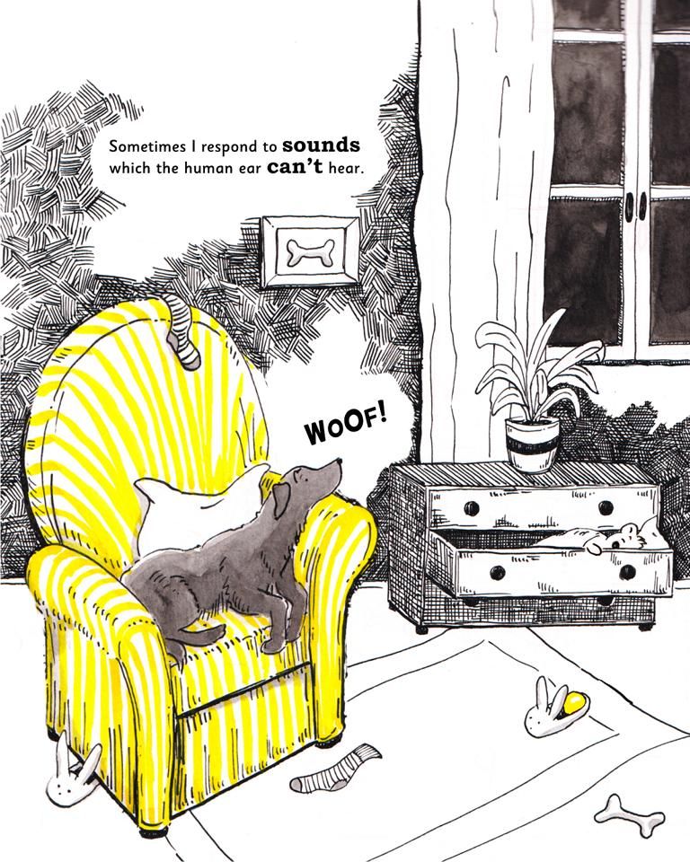
The book is about a Labrador and why she barks at night. I am traditionally illustrating it with ink. The outdoor scenes are dark while the indoor scene idea is to keep it minimal and more bright.... The main colours of the book will be black, white and yellow. Is this in any way appealing or am I just overthinking it as I did not feel creative in the slightest today?
Any feedback/ cc is more than welcome!
Thanks!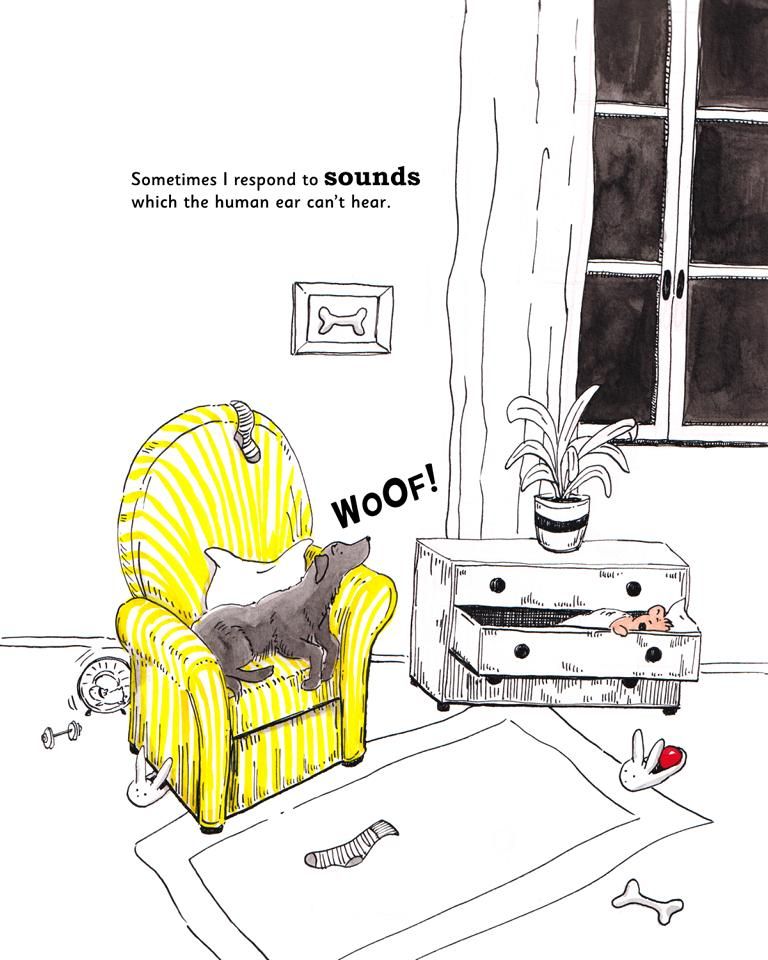
-
@Mel-F Books with just black and one color can be quite striking! This illustration looks really good. The yellow will be a nice contrast against the black.
Without seeing any more of the illustrations, or the dummy, it is hard to offer any advice on your overall style or other compositions, but with this one, I have a few ideas that might make it better.
-
I suggest using only one accent color throughout the whole book. For this illustration, make the ball yellow as well, and maybe even the stripe on the flower pot
-
don't color the teddy. Most kids know teddys are brown, and that will be in keeping with the black and one color (yellow) theme.
-
make the dog's ears raised. usually, if a dog hears something out of the ordinary, their ears go up to hear better.
-
you need to fix the perspective on the chest of drawers to match the chair and rug. Additionally, I would make the baseboard straight across the page.
-
not knowing the whole story, the hamster seems more of a distraction to this scene and might even be missed since he is behind the chair.
You have the beginnings of some wonderful art here. Would love to see more when you are ready to share.

-
-
@tom-barrett Hi Tom! Thank you so much for your feedback! Great points, they are spot on. Actually my original vision was exactly that, to have only yellow as an accent colour, but then somehow I got side tracked! Still need to fix the other issues like perspective and ear, but I already like this page much better. I am just working on a few other pages and see how it goes. Will post them once they are finished.
The idea of the hamster was to have a nocturnal animal in the background as a side story, he basically wakes up when everyone goes to sleep, or is supposed to go to sleep.. Maybe then there are too many stories.... ? I already have the teddy (dogs best friend) who is in the background/side kick. The ball is also moving through the images, as it is her favourite toy.
Thanks again!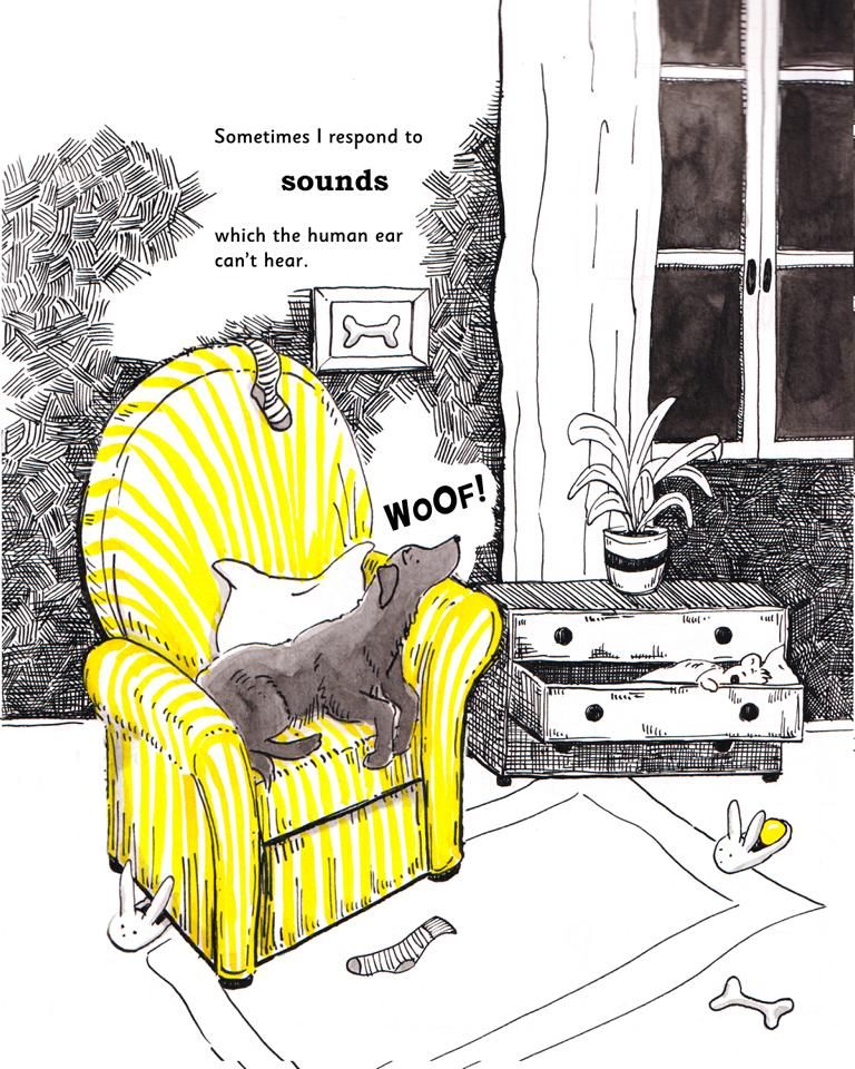
-
@Mel-F This does look much better. I really like the hatching! It makes a big difference in the mood of the piece.
I will say that I like the previous composition a bit more just because this one seems crowded now. In moving everything in, you have also created a few tangents with the photo above the chair and the edge of the chest of drawers. I would pull the chair to the left and down to add some space between those items.
Second, the text needs to be closer together in the stack. Having "sounds" so far away reads like there should be a pause, or emphasis on that word, but in context, it doesn't read that way. The original design worked better.
-
@tom-barrett im not sure about the hatching myself--it makes the dog's value rough to solve because it feels like dark on dark wall, but if it was white it would be light on light... also maybe its the hatching that is making it feel busy for you
-
@R-Fey-Realme perhaps the hatching could be pulled back a bit, especially under the window, but for me it gives the room a more nighttime feel, instead of just relying on the dark in the window.
@Mel-F I assume you are working digitally. Maybe try the hatching with thinner lines, and keep it simple and make all the hatching one layer.
-
@Mel-F I like this one better. Instead of all the crosshatching across the Omni directional line work, try tighter Omni lines and shorter and then loosen them up as you go higher and make your Omni lines longer. If the story is about a dog, I would enjoy seeing color to whatever he is touching. I think that would be highly effective.
-
@tom-barrett Hi Tom! Thank you so much for your very helpful tips! I went offline over the holidays to give the whole thing a break and start with new energy.
I am working traditionally so progress will be slower I haven't gotten comfortable with digital enough to draw in a style I like.
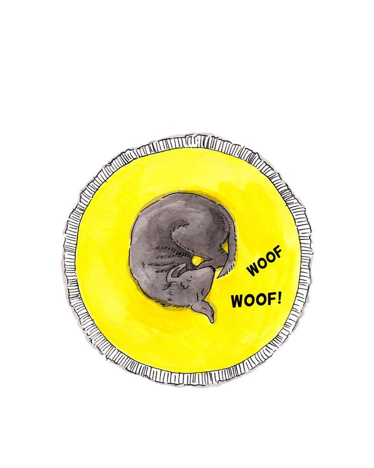
But I realized I need to brush up on my hatching technique. Once I've done that I will redo this image. In the meantime I rendered some other pages to see if I like the overall feel of just using black and yellow and the style I am going for. I guess the more I stare at it the more unsure I am.
Will post the images below.
Thanks again. Happy New Year! -
@Russ-Van-Dine Thanks so much for the feedback! Yes, definitely need to brush up on my hatching technique. Not a 100% sure what you mean but I will try different things, following your suggestion. I am doing it traditionally, so it´s a slower process.
Happy New Year! -
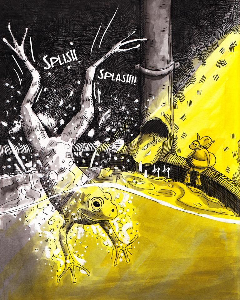
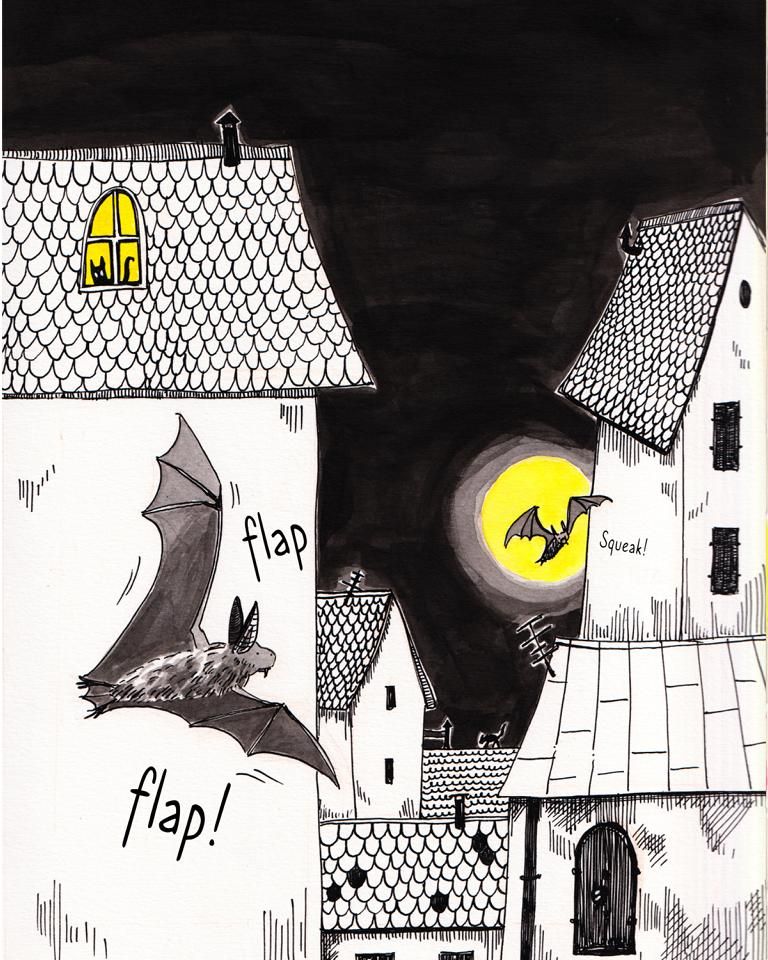
So I got started on some of the other pages, just to get a feel of the overall look. I will just keep it black and yellow as I want to turn it into a series (dog as main character) where then each book has black + 1 accent colour.
-
@Mel-F It's looking great! I love the bats especially.
 Good overlapping while keeping them dark-on-light.
I feel like the frog is a bit of an odd-one-out: he looks a bit more realistic than all the other animals.
I'm looking forward to seeing more of this book!