I'm unsure if my art style is unique or just "undesirable" by the market.
-
I consider my style very unique, and I don’t often see similar ones within published children’s books. Although I get inspiration from other children’s book illustrators who focus on shape and texture, my spin on the style makes it a completely new thing that I haven’t seen before. I believe I have the skill to level up and get professional work, but I’m unsure which publishers/agencies my style would fit in. How do I know which publication is seeking out this kind of work when no one else I see is doing it? Is it because this style is undesirable right now in the kidlit market? Or is it because I have a specific illustration niche that could be desirable if art directors were to see it?
website is chloegreenbergart.com ; feel free to share
-
@ChloeGreenbergArt Hi Chloe, great website. I really like your art! I think a great first step to knowing if your style is interesting to agencies is to find ones you're interested in and inquire. Beforehand, you might consider paring down your website to the pieces that you're most proud of and that showcase the style you want to work in since there is a diversity of work on your site. However, I don't think you should be worried that your style isn't desirable.
I do think your style is unique, but a tremendous amount of library books make their way into my household, and I think your work fits within the genre that I see in quite a few new picture books... a more paper-cut style with a lot of texture and some abstraction. I think you could definitely find an agency to work with if that's your goal! I've seen a lot of people on this forum go through a similar process of seeking representation. It seems to be a pattern that people will have some trouble initially finding an agent. However, usually if they keep making new work, improving and settling into their style, seeking advice, and tweaking their portfolio, they end up being represented by an agency.
Wishing you all the best!!
-
Hi @ChloeGreenbergArt , this is a tough but good question.
Personally, I like your style and character designs. Some of the designs in your portfolio remind me of an amazing author/illustrator (Luke Flowers); you may have heard of him.
My suggestion is to get a detailed portfolio review by one of the amazing SVS teachers. Highly recommended!
I asked this very question to an Art Director and she said the following:
“Make the art which brings you joy and your audience will see your passion come through. However, when you try to adapt your art for commercial purposes, and you’re not 100% happy with it, your audience will also be able to tell.”
I realize this probably doesn’t help, but the SVS Portfolio Review is probably the best advice I can give.
-
@ChloeGreenbergArt i think your textures and paper cutouts work quite well actually, but it's masking some other things in your art that aren't quite up to a professional level. The style is fine, the storytelling, and composition need some work (in my opinion).
if you want a real assessment- here it is: Many of the images seem somewhat bland if you just sketched them out. There isn't a lot of actual story telling going on and the compositions are a bit static. This work should be done in the thumbnail stage and you would see that it just isn't holding up that well.
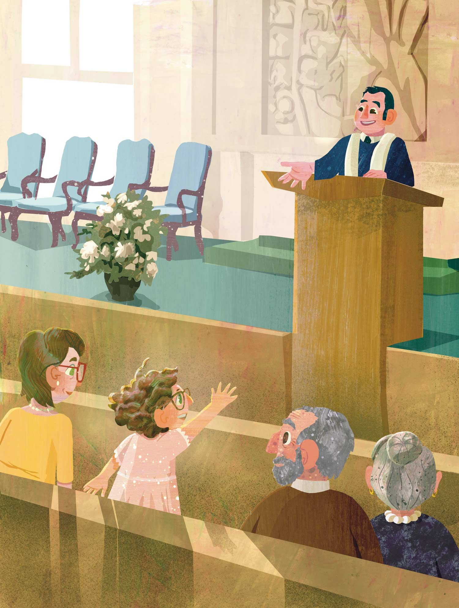
i think the style is actually what makes them look as good as they do.I hope that doesn't sound harsh, but it's something to really look at. lets look at this image for example. Like Will Terry says,- say the concept out loud and see if it's interesting - "hey, there is a girl in church and she is raising her hand". now, does that concept seem like something that is portfolio worthy? It could be, but you really need to lean in on where the tension would be for a scene like that.
.
hope that makes sense. I look forward to seeing how you adjust your storytelling to fit this already cool style you are working on. : )
SVS Faculty Instructor
www.leewhiteillustration.com -
@ChloeGreenbergArt I am reluctant to reply after @Lee-White has posted, but my thoughts on your art are that you need more contrast in your childrens illustrations. I took some of your art and made it grayscale, and a lot of the illustration blends together. Even in color, it is difficult to separate the individual characters from each other or the backgrounds in some illustrations.
I think your strongest piece is the one where the girl is planting the flowers in the woods. The "Youth Medley" cover, and the girl playing guitar with all the hands are quite strong as well. And the one Lee posted is ok on contrast, but could be pushed a bit more.
-
@KathrynAdebayo thank you so much! This is great advice.
-
@Lee-White Thanks, Lee! This gives me a good direction for some stronger portfolio pieces; I appreciate it.