Not really an illustration, but I would still appreciate your opinion!
-
@Katrina-Fowler Thanks! I am definitaly not done with the hair and I'll rework the eyes also
")
@evilrobot Wow! Great comments! I never took an actual painting class, I did some charcoal portrait studies and I am trying to apply this to my painting, but it's not exactly the same haha! I really appreciate this
-
Just wanted to say I had a look at your charcoal studies on your webpage. That's some beautiful work.
-
@evilrobot Thank you so much
I checked your website this morning as well, nice illustrations! ")
noemiegionetlandry.squarespace.com
noemie_illustration on Instagram -
@NoWayMe @NoWayMe Hey Noemie - I really like your painting - i hope you don't mind i did a quick paint over to try and show what i am thinking - i lost some of the quality that is your wife i'm sure but i think a couple of things might have worked that i tried - mainly i wanted to soften the gradients and add some hard edges - i looks like the gradients are built up with a small brush and i wanted to try a large brush at a low opacity to try to smooth the ares like the forehead and cheeks - the very rightmost edge of her left eye (our right) needed to curve sharply back to show the shape of the eyeball too so i tried that - also tried to sneak more saturated color into the shadows to try and warm things up a bit - i remember Nathan Fowkes saying cool shadow will take the life out of a painting and showed also that areas in shadow on skin are almost invariably warm - @evilrobot explained things so well i feel a bit silly doing the paint over but i think i learn a lot when i try to do these - i just started on her left cheek...it looks flat near her mouth now but i thought maybe i was getting carried away.......and my daughter needs lunch
- really nice image....... it is what inspired me to try to paint my Lucy character sketch 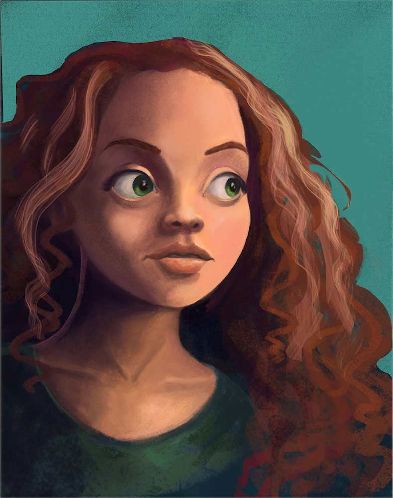
-
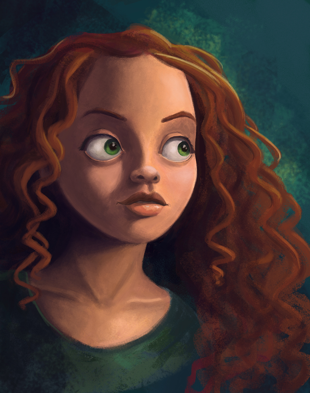
Hello everyone!
Thanks @kevin-longueil for the paint over, great tips!
I still have some work to do, especially the hair and adding more warmth to the shadow side but I wanted to post an update anyway!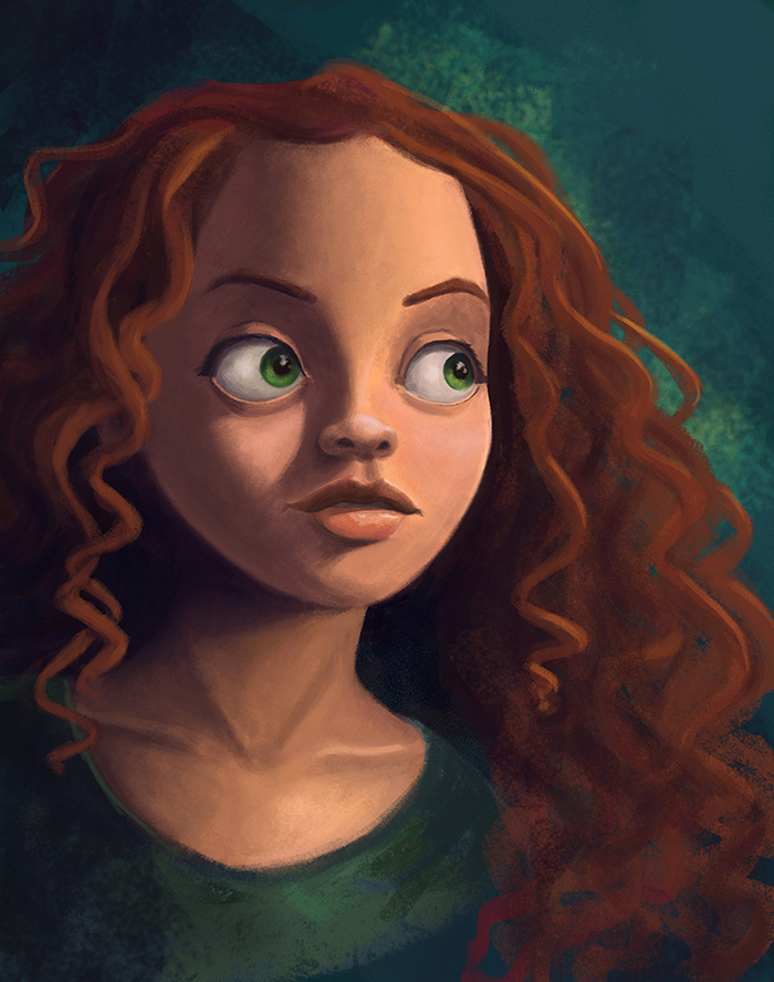
-
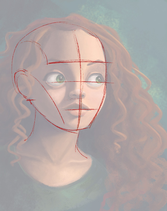
good looking design here! The one thing I wanted to critique is the drawing. It seems your head is drawn sort of from a front view, but has elements that look almost like a slight 3/4 view. So basically you have to figure out your structure.
Based on the head location over the neck, I feel like a slight 3/4 view would work here and your features need to be adjusted to fit it. You could also do a straight on front view, and the features would need to be worked towards that as well. For this crit I did a draw over based on the 3/4 view.
You can see in the basic sketch that some parts work just fine as you have them. However, the nose is drawn too far from the left and off the center line. The nose also needs to be redrawn with that slight angle and not as a straight on view. Same thing for the mouth shapes. Use your center lines as a guide and it will always show you what to do. : )
Here's a quick block in using 3/4 view shapes....
SVS Faculty Instructor
www.leewhiteillustration.com -
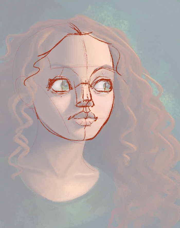
@Lee-White Thanks a lot Lee! I am currently away from home (so away from my Cintiq) but I will get back to this as soon as I get back home. I really appreciate your critique, great point!
-
I love the colors you chose! I really like the portrait.
-
I made the changes @lee-white pointed out about construction, and it made a big difference! (thanks!) I might do a little bit more rendering on it, especially background/shirt, but it's pretty much at the limit of my technical abilities right now haha! Does anyone else has suggestion on how I could improve it further ? Does the structure/construction look OK with the corrections I made ?
Thanks!!
-
It's looking pretty nice I'm digging it. Good work.