Did I fix my art? March prompt
-
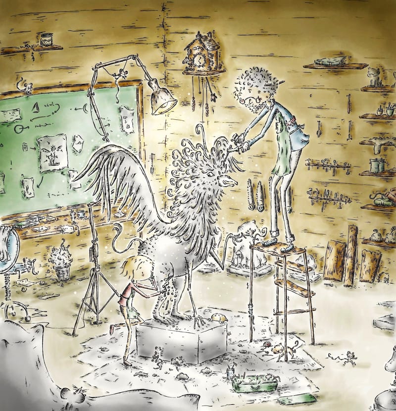
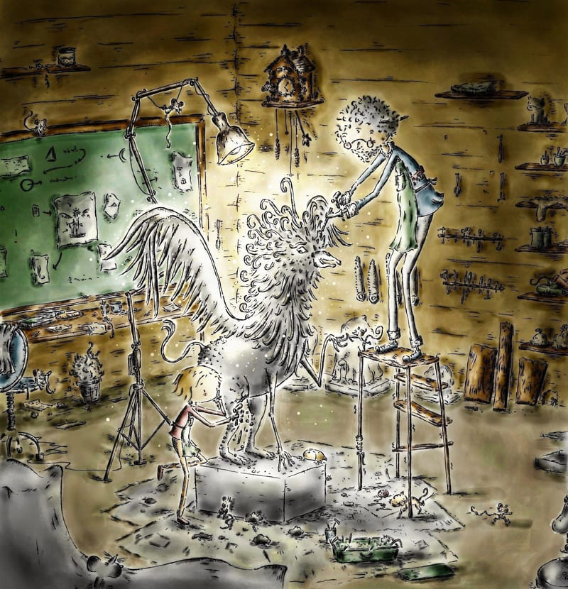
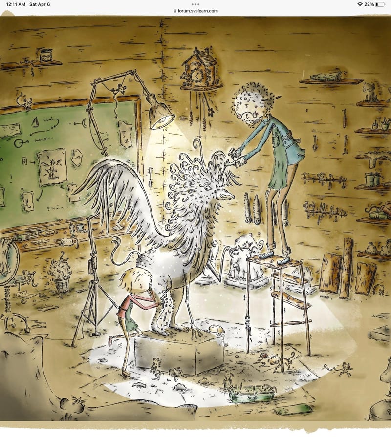
I made a new version based on the (really helpful) feedback for the March prompt. Basically, I tried to fix the value.
What do you think, did I fix this even a little or is it too dark now?
(Note: the resolution is poor unless you download the images)
the old one:
the new one:
I would be grateful for any feedback!

-
@Enni-Heikura Hi. I like your first one better
 . Your new version is getting a bit blotchy and to dark. Maybe try using a blue multiply layer and erasing it in the areas where you want it to be lighter.
 -
@Enni-Heikura Hi! first of all this is a very creative image and I liked it very much when I saw it on the fix your art video. I like the characters, the details and the way it suggest a story. I think you fixed the values by just adjusting it overall, but maybe what is needed is to work the values of the objects. Now, they all seem made from a luminiscent white substance with some colour stains, and increasing the contrasts just added the confusing blotchy effect Julia mentioned. Maybe to this style of detailed line drawing, a smoother coloring would suit better? I really am not sure, is the Griffin made from a luminiscent material that casts light on the characters or is it lit by the lamp? For how to work the values in a scene, Lee White has an excelent course here, it was eye opening for me!
-
@Enni-Heikura Hi Enni! Dang, I love your linework! But I do think the airbrushed look for the color is getting a little out of hand. What if you applied the principle that Lee was talking about with Jake’s drawing where you think about it like working with pieces of different toned paper? For each major shape in your piece, go in with the lasso tool, select it, and fill it in with ONE value/color. That forces you to be more selective and really pick what is going to be light and what is going to be dark. THEN, you can overlay it with a bit of texture if you want.
Do you have a version of your drawing that’s just your linework? If you’d like, I could try a draw-over. I think it would be fun to experiment with.
-
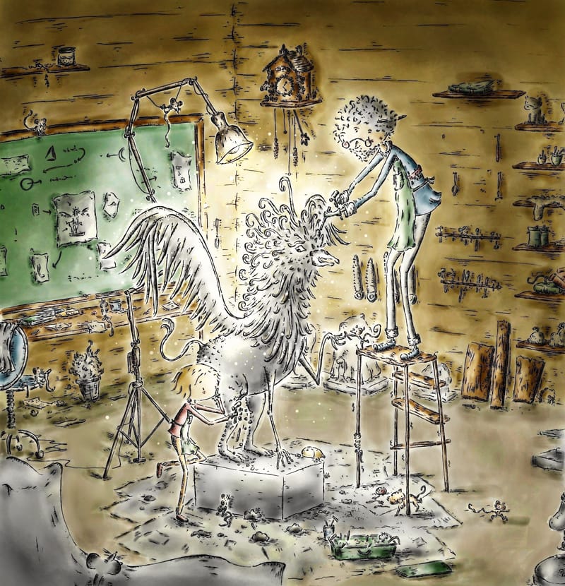
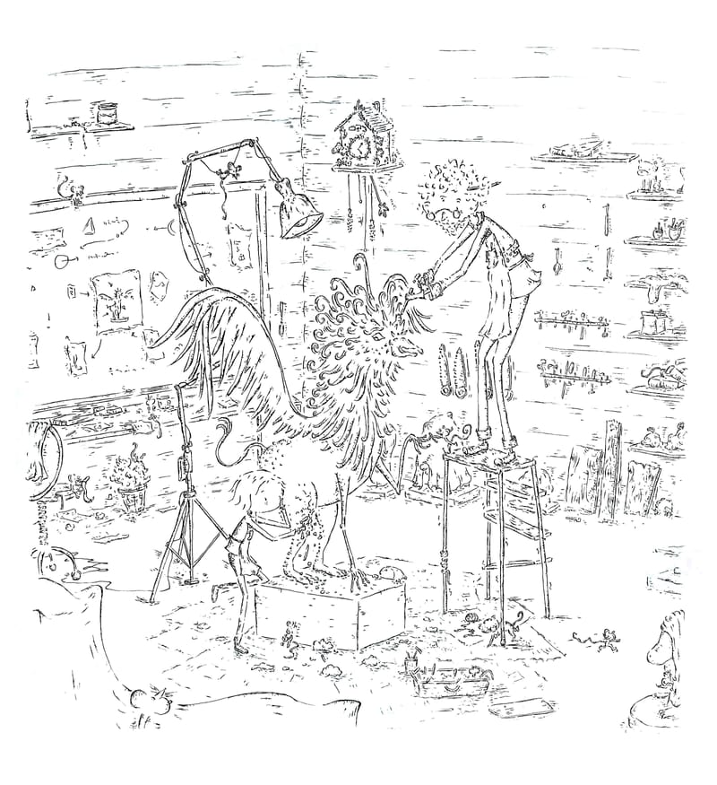
Thank you all @Julia-Hegetusch @Oana and @Sarah-VanDam for your feedback! I completely agree that the new version is somehow too dark and blotchy. I'm not quite sure what to do to make it look better now. I made several versions, so I'll put here another one that's not as dark, and also just the line drawing.
I draw the lines on paper with a pencil and then color digitally using Autodesk Sketchbook, a free program that doesn't have all the fanciest features. Basically, I color as if I were doing it traditionally. So I can't try out those functions you @Sarah-VanDam mentioned earlier

-
Hi! I like the glowy design of the sculpture
 I think the intricate line aspect is really your strength! Keep it up!
(Below are just my personal opinions, if it doesn't sound right for what you are trying to achieve, just ignore them)
If I'm honest I'd say that the highlight/illuminated portion of the image doesn't have a very clear boundary and kinda muddles the lines more.
Since the lines aren't in a solid/continuous style, It didn't really define the boundaries that well, part of the reason might be lack of density differentiation between main elements and the background (from the sketch, the lines are kind of "just a bunch of stuff that forms an image"), and you have to really look to distinguish the boundaries of foreground and background. I believe removing a bunch of stuff adjacent to the foreground visually (like "haloing") would work much better in terms of readability (Take the example of the portion of the blackboard just below the sphinx's wing feather, the lines are really short and random, which seems really confusing). Reducing contrast (or transparency) of the lines in the background would work too.
In terms of the colouring, I believe that's a style that can work but on the image it appears quite "bobbly" hence looks sloppy. One way to check is that you can look at those "bleeding", like light bleeding into the shadow side of the box, or the shadow bleeding outside the shape etc. I guess it's because of airbrush and the relative small radius of it. I'd suggest that you disregard the lines all together when shading them, and only leave very big shadow patches in since you have already drawn in the contact shadows of everything.
I guess the reason you try to use enhanced light in the middle is exactly because you don't have enough visual separation on the sketch in the first place, that's why it still kinda look awkward...
I do think the lines works actually very well if it's just on its own without coloring, maybe only a very slight tint of watercolor-like coloring can work better since it's not gonna clash with the lines (but yeah I'm not actually that experienced in this style, tho I have seen some artworks that uses these kind of "sketchy" lines very well, like some of Jimmy Liao's books)
-
@Enni-Heikura I'm not a great colorist mysel (yet! :P) but I use the same method, even when working on the Ipad in Procreate (which is a great choice if you decide to buy an app) I mostly use the tools as if I was doing it traditionally, feels better to me like that. But I do use layers and I think Autodesk Sketchbook also has layers, so you could try coloring the different elements on different layers, using a plain sharp edge brush, that way you could do what Sarah suggests, like working with paper cutouts, and then each layer can be adjusted individually. On top you can add shadows, and highlights, also wih a clean sharp edge brush?
I also use Medibang on the PC, also a free software, it's ok
-
Thank you @Yiming-Wu and @Oana for your advices!
That's a good point that I could blur the background a bit around the characters so they stand out better, and I could try to make the lighting clearer and sharper. My very first idea was to create daylight lighting for this, but for some reason, I drew that lamp, so then I thought it would be strange if there's a lamp that doesn't emit light  , so I had to make it darker.
Most of the time, when I create darker lighting, I use the same color for most of it, like blue (as I did in January's assignment, for example). It somehow makes it clearer and works better for me... But I'll try to improve this with these instructions
")
-
@Enni-Heikura Keep exploring
you got this!I have a messy website: https://ChengduLittleA.com
-
@Enni-Heikura hi! Your art looks adorable and sweet. I like it. I think you can still push your values but I would not suggest using a soft brush over everything. In my opinion, it makes everything look too busy. Instead, I would suggest just adding flat shadows. It’s good that you have a light on the gryphin. We can use that as our main light source. I don’t have much time to explain but I’ve attached a suggested revised image below. I hope this helps.
Portfolio: nyrrylcadiz.com
Instagram: https://www.instagram.com/nyrryl_cadiz/
YouTube: https://www.youtube.com/channel/UCbJCF1Im8ZO7hpGWTKOJMuA -
@Nyrryl-Cadiz Thank you for this demonstration! I also just tried that myself, having flat light, and it seems to work quite well. I just need to refine it a bit more when I have time
-
@Yiming-Wu Thank you, I will!
-
It’s lovely!
-
@Nyrryl-Cadiz wow that is suddenly a billion times more readable, although im still not sure if they are grooming a griffin or carving one out of stone
Blog: mamatheartist.blogspot.com
Coloring page newsletter: https://bit.ly/Color-in -
@R-Fey-Realme true. This is definitely just a quick fix
-
It is still very hard to see what the kid is doing. I think he should stand out a bit more. One of his arms is blending in like a tangent with the leg of the statue, both arms actually. You have to kind of squint and ignore everything else to notice that an accident happened.
Maybe copy and past the canvas and drop the color completely to a black and white image. Then see where you can add more contrast so the kid is the first or second thing you notice happening. -
@Enni-Heikura I think the values should help you create contrast in important areas to bring the viewer's attention there. Your biggest problem with this image is the lamp pointing at the statue, making the entire middle area very bright. Since your statue is pale too, it doesn't stand out at all against the white, pale yellow background surrounding it.
While the second version does use more of a range of values, it's a bit intense and uses pure black shadows which feels too dark. At the same time, all the dark parts are concentrated in the borders and corners, leaving the center bright and not solving your core issue of lack of contrast on the statue.
You could remove the lamp to have the pale statue stand out against a darker background. OR you could have a pale background like in your old version, and simply make the statue a darker color (like dark wood, or a dark gold color for example).
vanessastoilova.com
instagram.com/vanessa.stoilova/Check out my Youtube channel for tips on how to start your career in illustration! www.youtube.com/c/ArtBusinesswithNess
-
@kayleenartlover Thank you for your feedback! I noticed the tangent now myself
. I agree that the focus isn't clear enough on where to look. I've also done that, looking at the values in black and white It still needs some consideration... -
@NessIllustration Thanks for your advice and feedback!
I did consider that when working on this, that if I include a lamp, the room should be at least somewhat dim, and if the statue is light gray, it might be challenging to bring out the light in it. My initial idea was that the room would be in daylight; perhaps I could also try the approach of making the statue clearly darker and the lamp maybe broken. I have to find some time to refine this -
@Enni-Heikura Hi Enni! I took some time to try and figure out how I would solve this rendering puzzle. I’m curious—what’s your setup for drawing digitally? Do you have a stylus or tablet of some kind? I don’t know how Autodesk works. I’ve been working in Procreate. Here are some of the things I did:
-I knocked back the opacity of everything in the background (I cut out the background with the lasso tool and lowered the opacity to 40%)
-Using a soft watercolor brush as an eraser, I erased out some of the corners of the image to vignette it more.
-Redrew the lamp stand legs slightly.
-Added flat colors to everything mostly using a “multiply” layer and a hard inking brush (clearly, I decided to go with no dramatic lighting and even next to no shadow)
-Added watercolor texture on an “overlay” layer and then reduced the opacity to make it subtler.
-Bumped the character over to the left and tried to make it clearer that the leg got cracked (I’ll admit I think I drew the feet wrong. It should just be the toes on the ground. The way I drew it, it’s like the griffin has two ankles, haha).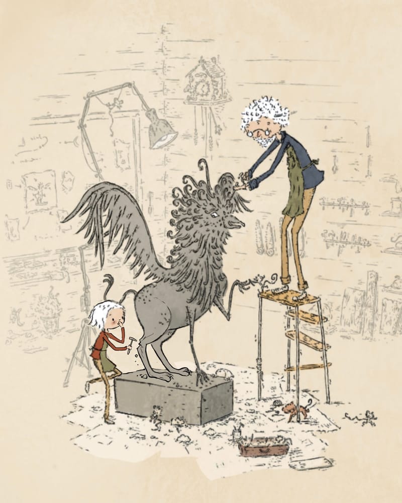
https://sarahvandam.art/
Instagram: @sarahvandam.art and @artistsandbox.etsy