Compositions that represent binaries/dichotomies?
-
Hi!
I'm starting to thumbnail for a book spread where the main character is a girl in an all-boy's choir. She has been told to be quiet by the director, and is having an internal dialogue that's like, "Should I open my mouth or close it? Raise my voice or lower it?" etc. I think what would represent this scene best is some sort of composition that illustrates a dichotomy or binary.I've played around with "split screen" and splitting the figure down the middle showing either situations. But nothing seems to be working! I've also tried looking into film stills or animation stills to find references, but I couldn't find much.
Do any of you have any ideas about how I can illustrate/compose her dealing with this kind of mixed messaging?
Thanks!
-
My best idea so far is having two versions of her. One version is very large in scale , loud, confident, colored with bright, warm, passionate colors. In the shadow of that figure is a small version of her- a version that is isolated, insecure, sorrowful, and confused. And colored with cool colors.
With that, I would like to explore interesting perspectives and play around with scale.I'm very open to more ideas!
-
@ChloeGreenbergArt this sounds like a great challenge, will you be using panels or full page spreads?
-
@ChloeGreenbergArt Since it's a choir, maybe they can be located inside a church with stain glass windows; the light from the window overcasts on the characters differently: blue/angelic colors overcast for boys, pink/warm colors for the one girl.
Or a Peter Pan-like sentient shadow, except the male's shadows are normal and the girl's is singled out by a color.
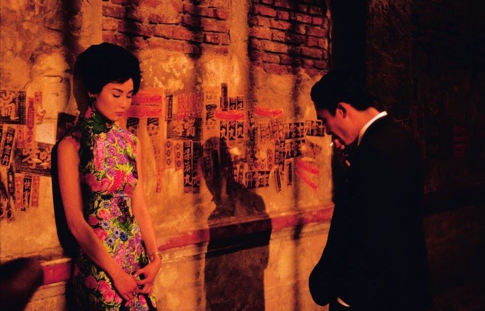
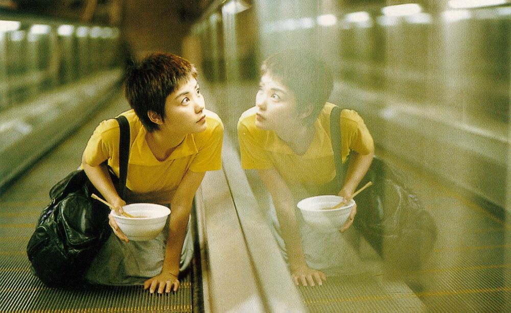
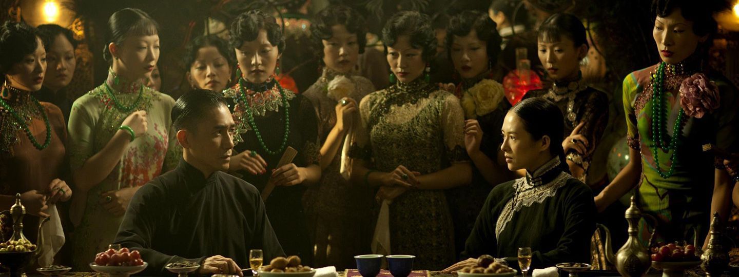
Here's some cinematography from Director Wong Kar-Wai that I think can be helpful.

The shadows create an feeling of imprisonment and oppression on the female character.
General mirror imagery, but because the character is on a conveyer her reflection is ghost-like.
The two foreground characters are equal (same posture, height, etc) but the male character is clearly outnumbered.
-
@makekong it's a half-page spread containing spot illustrations
-
@ChloeGreenbergArt You have three principal abstract options: geometry, light/dark, and hue/chroma. Each option provides contrast structures.
This is the order in which I approach composition development:
1). Geometric contrasts are scale, position offset, rotational orientation (including inversion), and mirrored geometry. I would include textures, patterns, figure poses, and facial expressions within this category. Of course, perspective, POV, and the lens determine the translation to the picture plane.
2). Light/Dark contrasts, the most substantial structure for establishing a visual hierarchy, are universally understood by both color-blind and color-sighted viewers, making them a solid foundation upon which to build.
3). Hue/Chroma contrasts are more subtle and enhance mood and emotion. The expression is enhanced when thoughtfully coupled with a distinct light/dark structure.
-
@thomas-young this is perfect, thank you!!