SVS Studio JUNE 2024
-
@Arthur-Campling Not spamming. Always glad to see pigs dancing

-
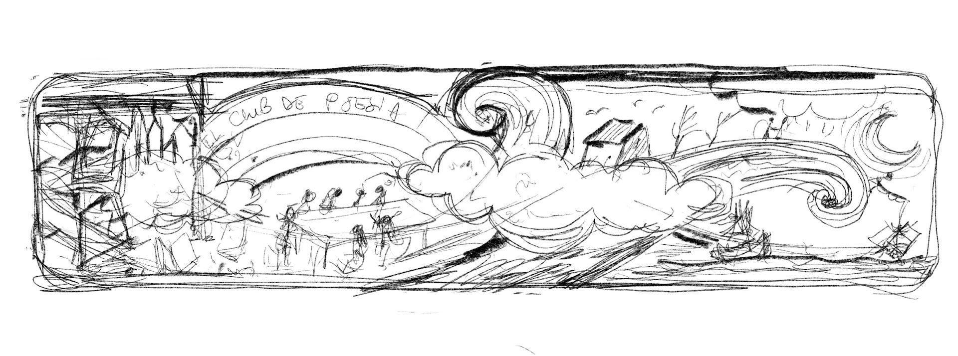
Hi! One fun thing I am trying to finish this month is a "memento" for a spanish poetry club I attended this year. I thought to make a bookmark and surprise my club colleagues, and maybe also a poster. I am a bit behind, not sure I will finish it in time for the hollidays.. and the subject and style I was trying is a bit outside my comfort zone (in wich I happily draw pigs and cartoony cats). I was inspired by the style in this wonderful book by Shaun Tan, Tales from Outer Suburbia. The stories are illustrated in various styles and one of them has this surrealistic landscapes in ink and just some washes of sepia.
Mine are still a far way to go but I thought it would be interesting to share: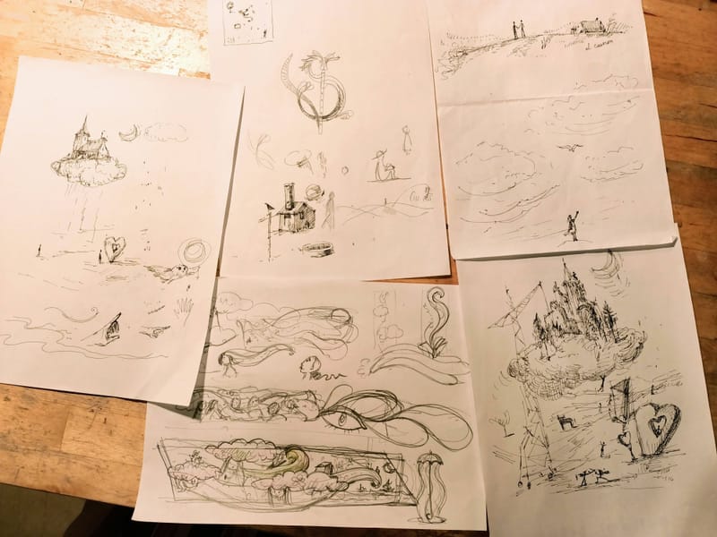
 .
.
I also want to add some verses from the poems we read in the club -
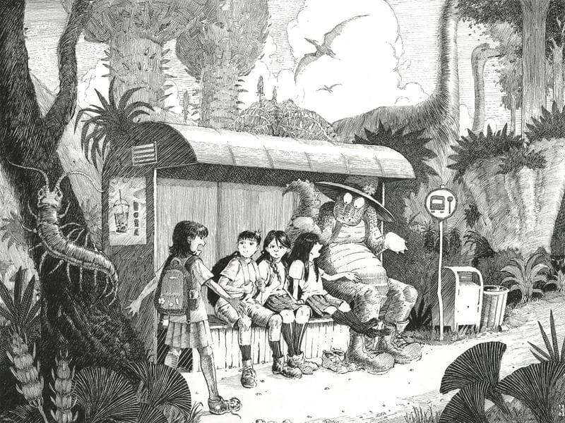
Okay so I already did the July Prompt. But I may or may not use this one and re make another one. I have so many ideas. But I'm posting because I want to ask. I am always indecisive with this. Does my work need to be colored. or will this be elevated when colored. From my experience, I lose something when I color it but I gain something when I color it.
website
instagram -
@Zachary-Schrage I looks really good just in ink! I think this is a case in wich it comes down to wether you feel like using colours
") Do as you are inclined. But I think it has all the "colour" it needs as it is!! Light, contrast and a lot of textures and grayscale... I think I'll zoom in and study it carefully
Do as you are inclined. But I think it has all the "colour" it needs as it is!! Light, contrast and a lot of textures and grayscale... I think I'll zoom in and study it carefully -
@Zachary-Schrage This is so good!! Amazing use of value, such nice texture and detail. It would be interesting to see it in colour, but your style works so well in black & white that I don't think it needs it. But that's just my two cents, I'd go with whatever you enjoy the most!
-
@Zachary-Schrage I’ve always loved the quality of Franklin Booth’s ink hatching especially in the lighter tones. You’ve done a great job in how you’ve integrated that rendering style into your illustrations.
-
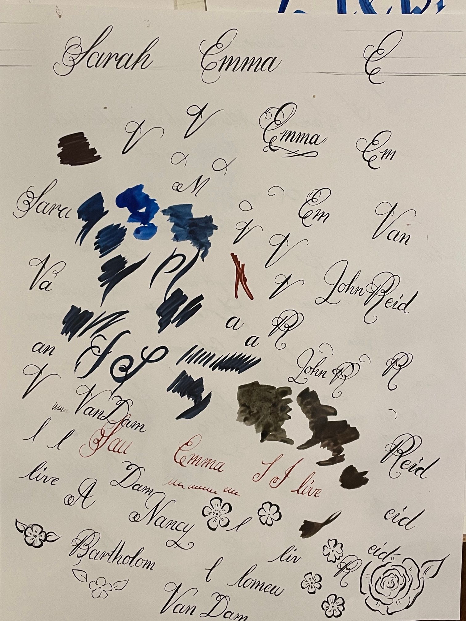
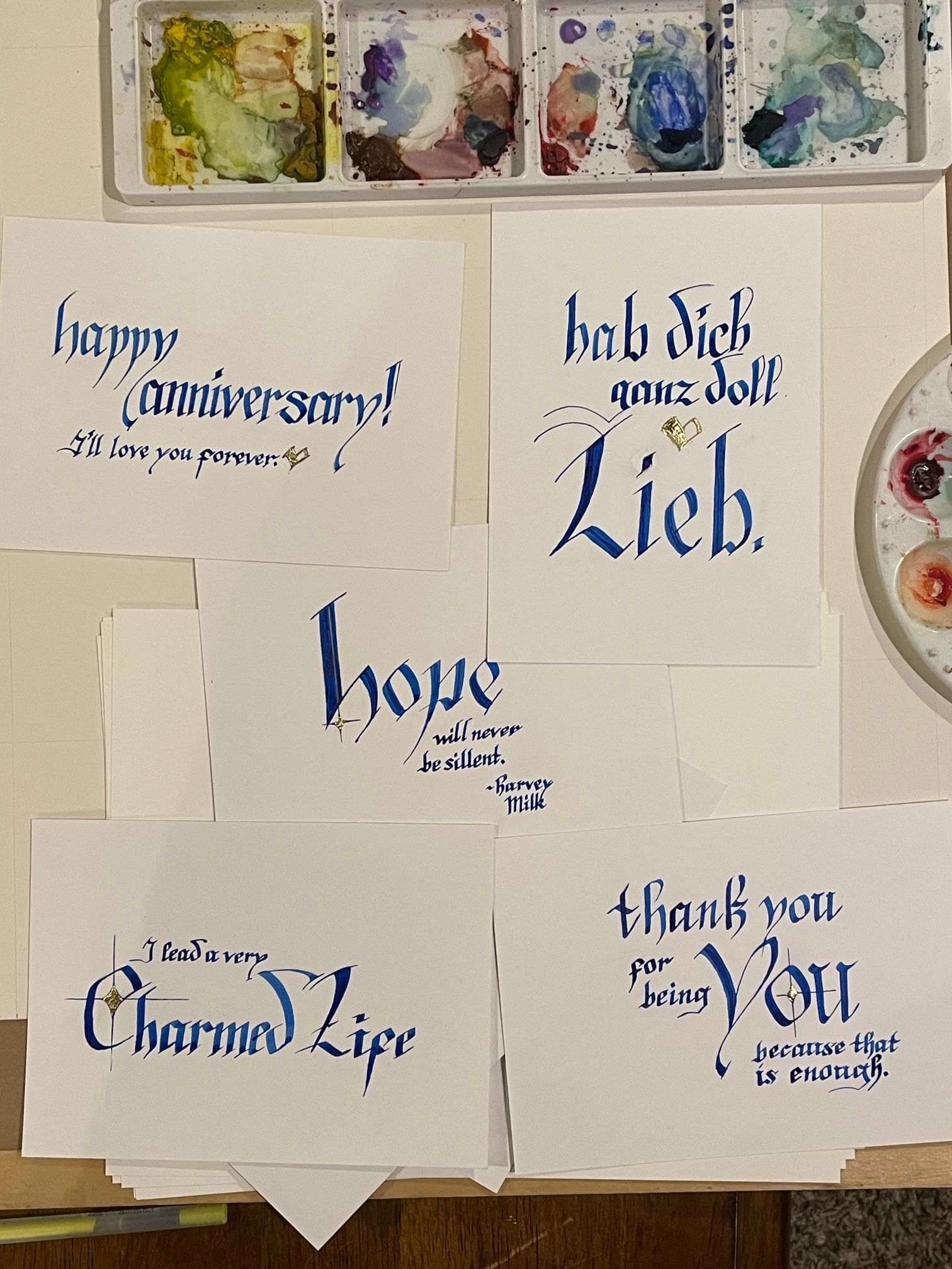
I’m trying to learn calligraphy! Here are some of my efforts. There are a handful of people on my Patreon who I mail something to every month. Because it’s not very many, I really try to do something special for them. This month I asked for quotes that I could write out in calligraphy, and here are the results. I realized right after this photo that I added an extra “l” to “silent.” Oops. I fixed that as best I could afterwards.
I also tried two different styles: A graceful looping style called Janet similar to Copperplate, and another style called Batarde similar to Gothic text. I definitely found Batarde to be easier to pick up, which uses stroke direction rather than pen pressure to vary the stroke. And it’s not as complex. I also struggled to use a dip pen for Janet; It was a lot easier to use a very small brush pen for me.
-
@Zachary-Schrage said in SVS Studio JUNE 2024:
colored.
I really like this black and white approach. I could totally see this in a middle grade novel! I don't think this image needs color. And if your other work is similar to this I feel like that would be a very strong portfolio to submit to agents who are looking for illustrators for middle grade books.
-
@Jeremy-Ross This is really, really beautiful.
the site: katherinetyson.com
instagram: instagram.com/katherinetysonart -
@Katherine thank you very much!