Feedback/critique on a potential portfolio piece?
-
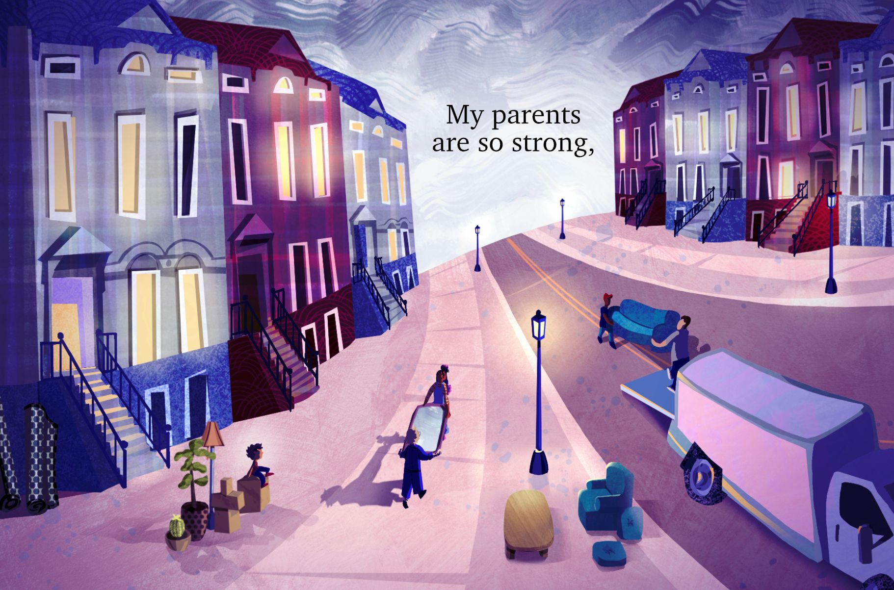
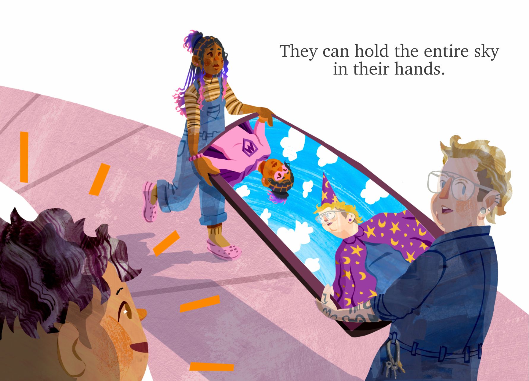
I’ve started to try and develop my children’s book portfolio, and this illustration is one I’ve been thinking about for a long time. I’m unsure whether I should switch out "parents" for "mamas" because it looks kinda weird if "mamas" isn’t capitalized??? But maybe that’s just me.
Also, I’m used to seeing mostly single images on folk’s websites. How would you go about displaying a sequential diptych on your website?
Any feedback on the image and/or text is much appreciated! Thanks
-
Hey Chloe,
I really like what you've done with that second image.
If you want my opinion, I'd redo that first image.
There's something odd going on with your horizon line, which may have been intentional as a way to force the eye toward your characters but I actually think it's more distracting that helpful.
I think what you should do here is redo the first image into more of a spot with a generous amount of white space. The houses are cute and charmingly whimsical, but I don't think you actually need all of them in this first image.
I say, have just enough visual information in that first spot to insinuate the move, so: the moving truck, the boxes on the curb like you have, and the house. But I'd zoom in on all of that so that it's more immediately clear what is happening. Because as it is now, I didn't actually understand what was happening in the first image right away until looking at the second one.
That said, I'd also address some of the inconsistencies with time of day and weather. If these are really sequential, it wouldn't make sense for the first image to be taking place on a dark cloudy evening, and then have the following image be reflecting a blue sky (even if I know that is supposed to be somewhat representational more than anything). I still think that it's confusing on first read.
I think the "parents" versus "mamas" choice is more about what kind of messaging you want to get across. To me, using the word "parents" is an intentional way to say, "yes, these are my parents even if they are both the same gender" and that feels like a really nice way to make a statement more subtly. But that's just my two cents on that. I personally hate kids books with a clear political agenda, even if I very much so support that agenda. I don't like a heavy hand when it comes to those things in kidlit, it can be done in a better way, and I think you're doing just that with these words and the second image, so brava!
Regarding displaying sequential imagery on your site, I think if you make the first one into a spot with white space you can actually organize both of these on a bigger canvas together... I'll use an example of my own to tell you what I mean.
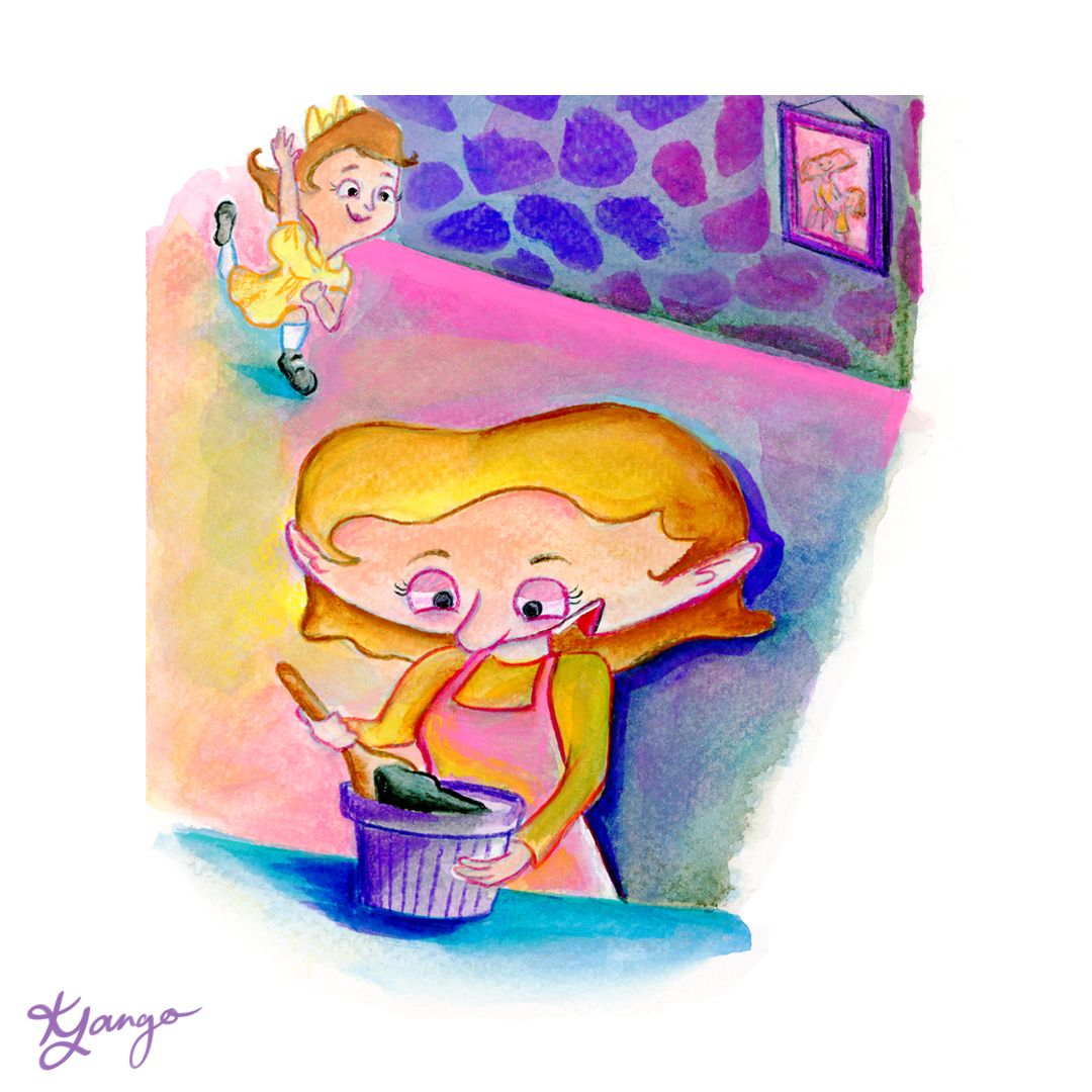
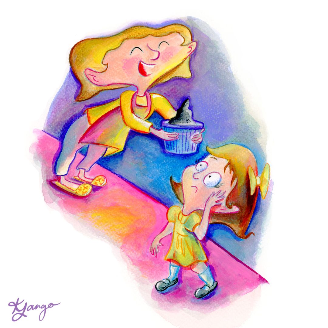
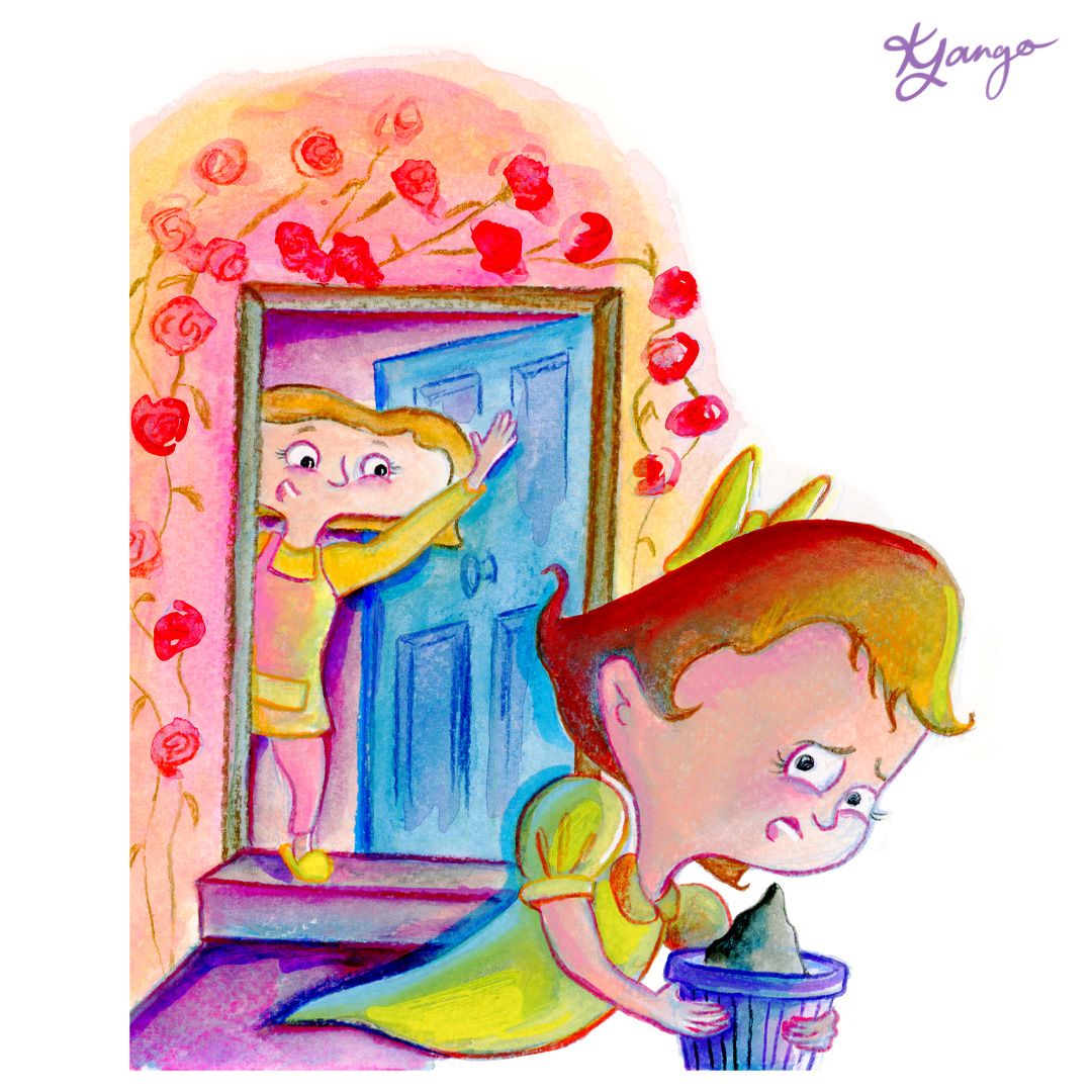
I combined these three images:
Into this image:
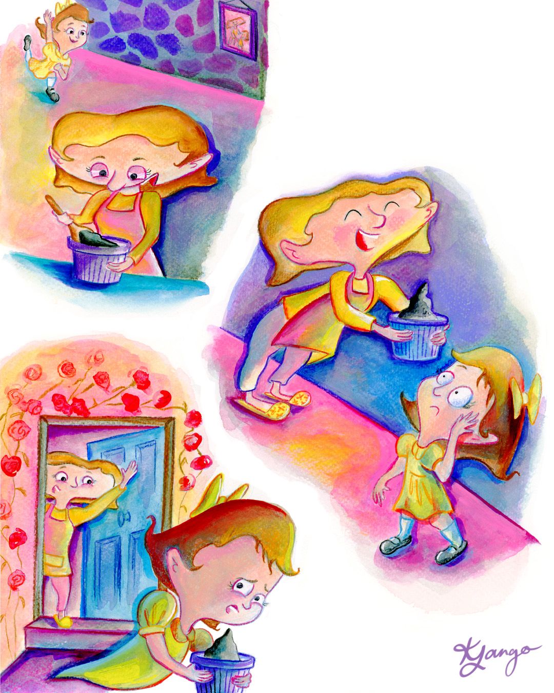
to make it clear that these three things were happening in this order.
I hope this helps! I know this was a lot to throw at you, but keep up the great work and I can't wait to see what you come up with for this story and your portfolio!
-
@Kristen-Lango thanks so much! This feedback is very helpful