Critique please?
-
Hi everybody, I decided to do this piece last week when my kids were memorizing a certain poem for homeschool. (Sometimes I think it would be fun to illustrate my favorite poems).
Also in case you are wondering, the harvest is the seaweed in the basket, like the ones they used to use in Ireland.
I would love some feedback on composition, color, really anything. I definitely think I would do an vignette at the end. And just for reference and understanding, the poem is Commandeered, by LG Moberly
LAST year he drew the harvest home
Along the winding upland lane;
The children twisted marigolds
And clover flowers, to deck his mane.
Last year—he drew the harvest home!To-day—with puzzled, patient face,
With ears a-droop, and weary feet,
He marches to the sound of drums,
And draws the gun along the street.
To-day—he draws the guns of war!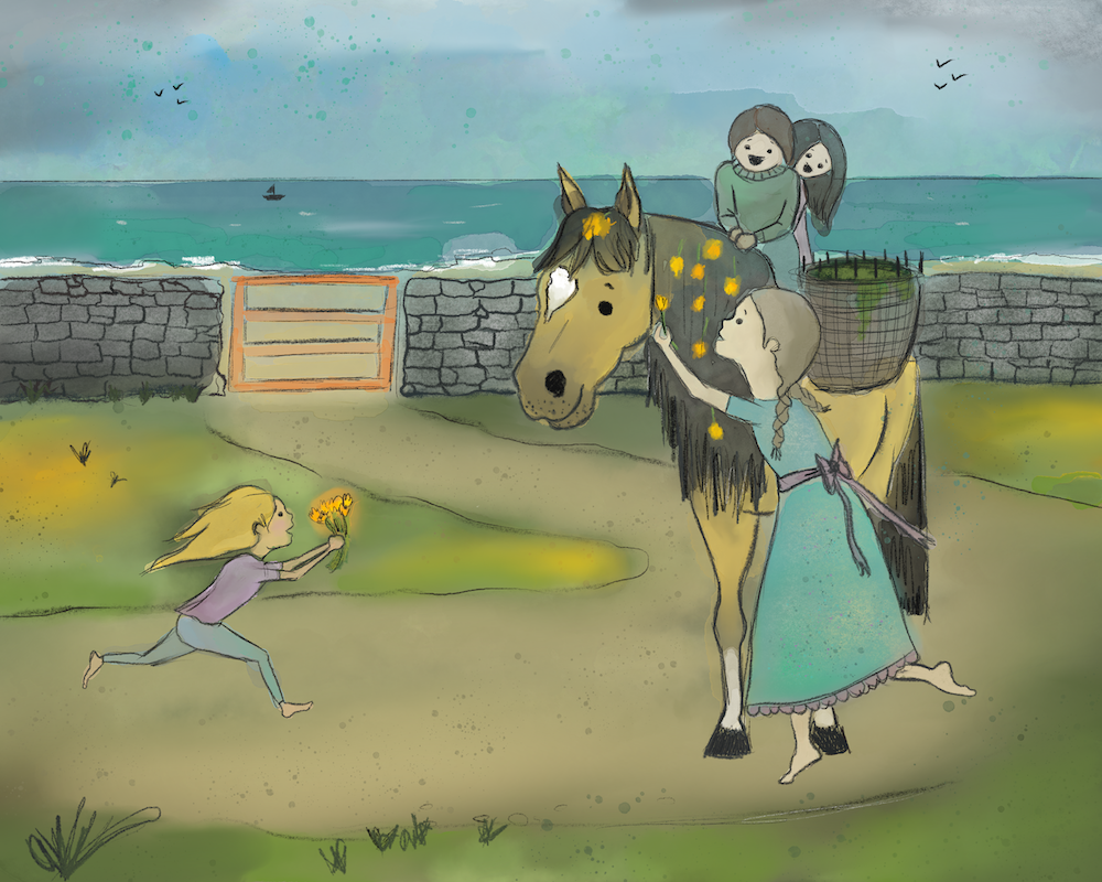
-
@Katt The poem made me feel sad for the horse T_T
I love the idea of illustrating poetry like this, and what a wonderful scene to put the horse in! I LOVE his facial expression and how calmly happy he looks with his life at this time.
I would suggest two main things at this point. FIrst, don't use such a soft brush over the whole piece. You want some of the edges to be harder so it doesn't feel so blurry. The harder-edged lines with the blurred colors also feel a little mismatched.
Second, some of the character bodies look a little off to me. Having unrealistic proportions can be used in a delightful way for a style, but certain things seem too off, like the thickness of the oldest girl's neck compared to the size of her head. I'd want to see a little bit of the back of her neck curve. The size of the heads also seems odd compared to the extreme thinness of the arms. The gesture drawing and character design classes in the SVS roster are really helpful for getting those things locked in.
You're doing well, keep it up!
I was homeschooled back in the day, also, which has nothing to do with this piece but it makes me happy to meet other homeschool students or parents
")
-
@StudioHannah thank you for the feedback!
I think that committing too early to figures and their poses is a weak spot for me. I think that I am anxious to see a finished piece (because honestly sometime I leave so many pieces unfinished).
With the blurry-ness- I am trying to do a watercolor traditional look and have been trying these brushes I bought... but I really have no idea what I am doing. lol. Where should I have hard edges, I'm a little confused over that.Glad to hear your were homeschooled, I hope you enjoyed it.
-
@Katt I did enjoy it. That was back in the early 00's so it's been a while.
Watercolors still have hard edges to them, it's the way the color pools that makes it watercolory.
This piece is by Artiel Designs, and it's done digitally but has a watercolor look. Things like the edges of hard things (the trunk) are not blurry, because they'd look very out of focus if they were. But there is a mix of hard and soft edges in the leaves of the tree to give it kind of an ethereal watercolor look (blurs) as well as a grounding in reality with the trunk (hard edges). You can see in the orange bush to the right that the interior of it is blurry, but the actual silhouette of the bush is hard, so hard that you can even see the detail of the brush and the think sticks at the top of it.
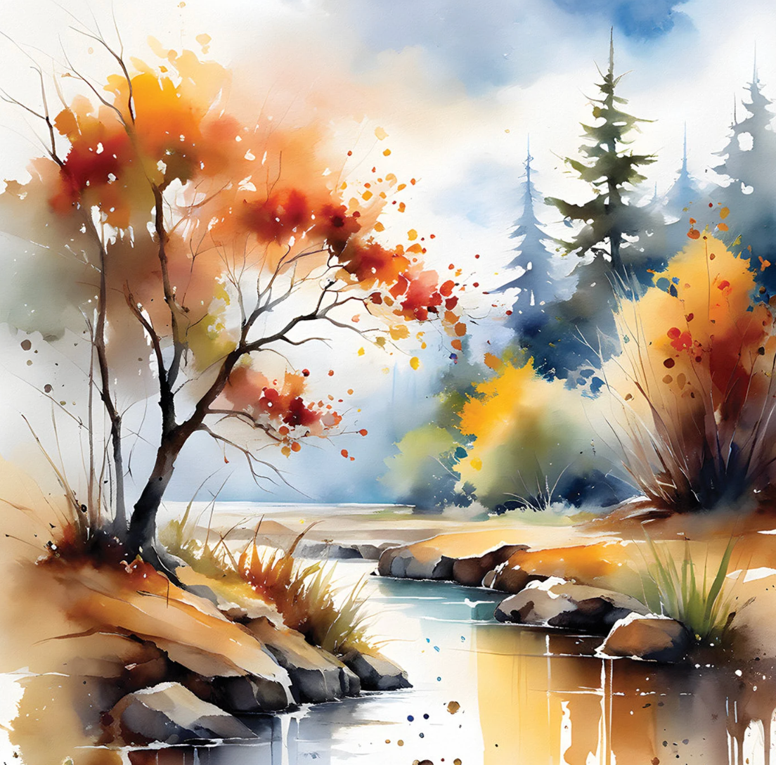
I'd err on the side of making the edges hard, but INSIDE of a shape, feel free to gradient things out a bit and play with that watercolor look. Finding other watercolor references, or digital art made to look like it, will also help you figure out what needs to be sharp versus what can be blurred.
Hope that helps!
-
@StudioHannah Yes that is helpful. Its funny, because before trying digital, all I did was graphite and watercolor (check out my old posts) so I know that the edges are hard, I just can't seem to make my digital look traditional. I will definitely check this person out, and maybe watch some more specific tutorials on that. I really do love working with graphite the most, I just haven't mastered colors in watercolor, and I just got frustrated because with limited time to mess around, one can't undo watercolor...but with digital, you can mess around with no mess, but I still don't really know what I'm doing.
One of my favorite art styles that is Cartoon Saloon, just a mix of ink and watercolor, love it so much, kind of try to put some of that style in.
-
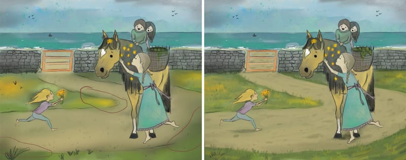
@Katt Your illustration complements the poem beautifully, and I love the overall composition.
Hannah has made some great points about the soft-brush effect and character design. I wanted to add to her note on the soft-brush/blurriness aspect. I thought I’d show you where it feels a bit too prominent- in particular, the colors of the road and grass seem to blend into each other. To illustrate, I made a quick mockup where I kept the edges sharper between these areas.
I also feel like adding more textures could really enhance the piece. I added a bit of texture to the grass, road, seaweed as an example, but you could also consider adding some to the hair, clothing, horse or the rock wall behind. This could be done by using different colors, patterns, or experimenting with different brushes. Also adding shadows will help bring more depth to the piece.
I hope this helps!
Yogita Chawdhary
Portfolio: https://www.yogitachawdhary.com/
Instagram: https://www.instagram.com/yogita_illustrations/ -
@Yogita-Chawdhary that is so helpful! Thank you! It looks so much better with the mock up. With the wall, I wasn't sure if it was considered "too far away" to add detail, but it seems like it's in the close enough realm?
THank you so much! -
@Katt In addition to the excellent advice from @StudioHannah and @Yogita-Chawdhary I will highly recommend watching Lee White in his tutorials for watercolor, the latest 3PP about this in particular was soooo so helpful for me. In fact, I was in his workshop earlier this month where we learned so much. The piece he is showing with the window I actually created. His methods demystified painting! Making sure your focal point is tightest and cleanest lines, most opacity, drama, and so on. And what's even better is how these techniques cross over traditionally and digitally.
Thumbnailing and exploring is the important component here, and the rush to the final art (painting process) usually is where I have found myself spinning my wheels, not loving the result, and feeling like I want to throw it against the wall! Major tripping point for me, and the rushing through the thumbnail/sketch stage indicates my discomfort in things being messy, where I feel like I am wasting time with scribbles. So I have been practicing slowing way down when I am beginning a project, because it's these primary stages that matter when constructing composition. Learning the technical aspects of using digital brushes matters too. But knowing basic fundamentals has truly transformed my work in this past year.
So give yourself space and time to learn, and grow! You have solid ideas going on here. I love your horse! He's gorgeous. And the scene is delightful. You have some nice interaction between your characters.
My point of suggestion is to drop this in black and white, zoom out and see where your silhouettes are. If you can't see what's happening then it's helpful to break things up and create distinct shapes. If everything is relatively the same value then your shapes get lost.
Establishing your light vs. dark values (light on dark or dark on light) sets the stage for a strong piece.I hope this helps!
Erin Richardson
instagram.com/erinrichardsondesigns21
www.erinrichardsondesigns.com -
@ArtistErin Those are some fantastic points. Lately, I've been using a black-and-white technique that’s been a game-changer for checking values and making sure the focal point really stands out. I add a top layer filled with white and set it to "color" blending mode, and I toggle it on and off while I’m adding color, shadows, and highlights. Zooming out also helps to see if the focal point has enough details and contrast. It’s so helpful to spot any value issues right away.
Yogita Chawdhary
Portfolio: https://www.yogitachawdhary.com/
Instagram: https://www.instagram.com/yogita_illustrations/ -
@Yogita-Chawdhary This is sooo good. I was going the harder way by creating an adjustment layer! Thank you for this tip!!!