Bible for todlers
-
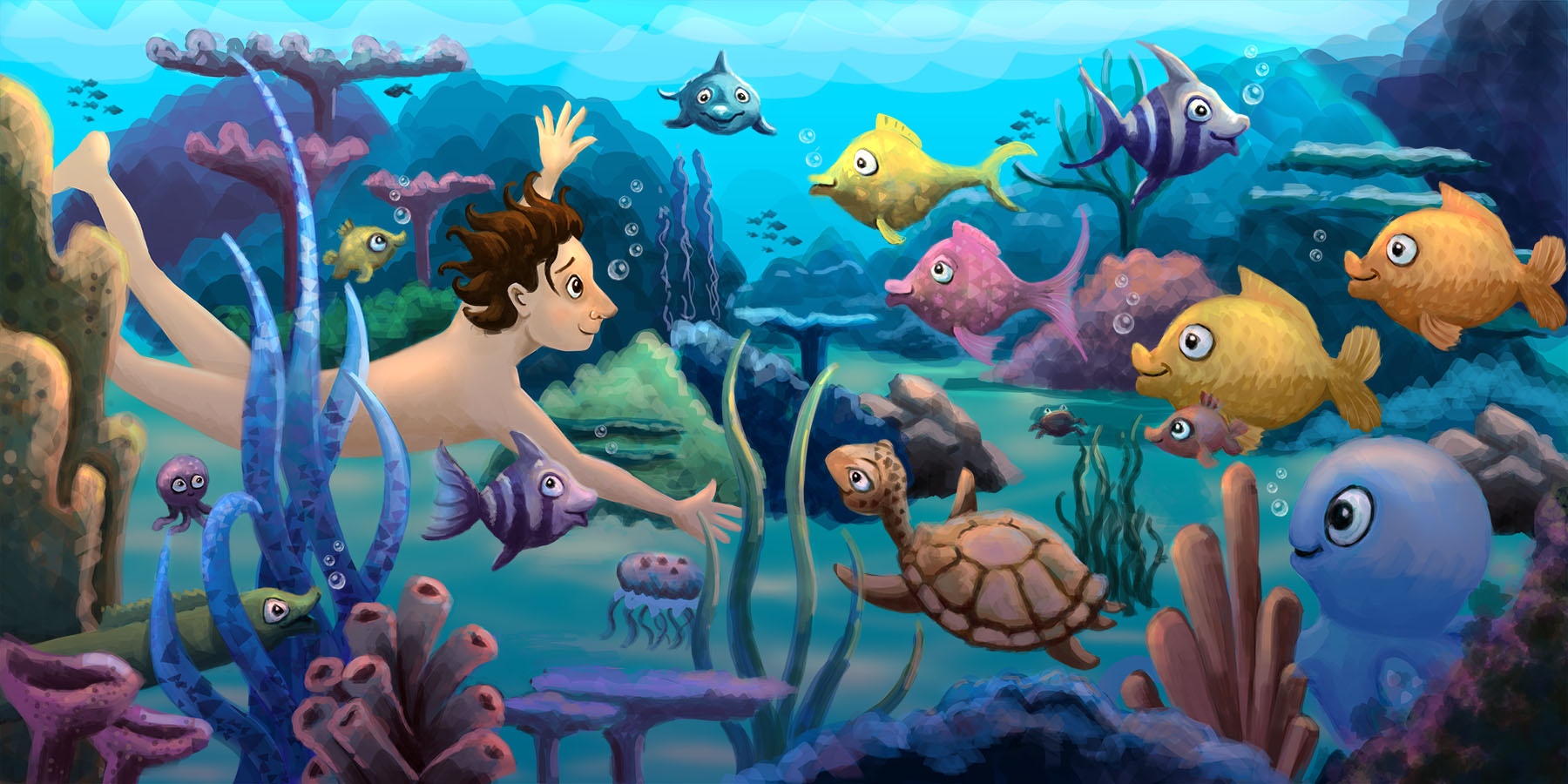
Hi Guys, Working on a bible book for young children. Ten Bible stories in witch animals have a role. There are some spreads that need some work, here's the first one 'Adam giving names to all the animals'. Comments are welcome....

-
Hi Leontine!
Nice work!
There is one thing I think you could improve and it's similar to one of the problem you had with your noah's ark project: I would try to vary the size of your character's more. You have some small fishes in the back, but I would push it even further and make some huge fish and some tiny ones (you have some small one in the back, but they are small mostly because of the distance)Also you could vary the shapes of the fish even more. Right now they all look a little generic. I think Finding Nemo would be a great place to look for inspiration!
Finally, if it is a two page spread, I think the fish (or shark ?) facing us will be right in the gutter...
I hope this will not just create more problems for you since the illustration is already this far along!
Please keep us updated!
-
@NoWayMe Thanks so much for the tips, Ill try and use some of them for improvement!
The dolphin is a little close tho the gutter, Ive placed him a bit towards Adam. I Think a starfish and a seahorse will give some variation? I see your point, some are swimming to the right and some to the left, it makes it a bit dull. I Try and work on that. Maybe make adam a bit bigger? What do you think? He seems a bit small in comparing to the fish. Thanks for thinking along! -
@NoWayMe Yes, I agree that he seems a bit small in comparison the the fish! You can try maybe him bigger, or some of the fish smaller (it would increase variety at the same time!)
-
Really great drawing in this! I do agree with the other comments about size relationships. I don't think making Adam bigger is the fix though.
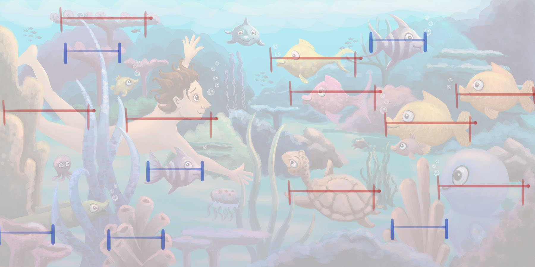
The real problem is there is an underlying "measurement" that you have used for a lot of the composition that you may not have been aware of. I did a quick draw over to show you what I mean. If you look at the red measurements, almost all the important elements are the exact same size. There is another size that is blue that runs through many of the objects as well.
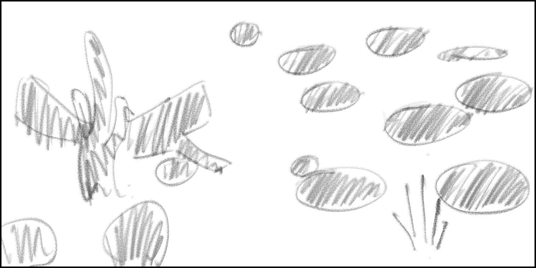
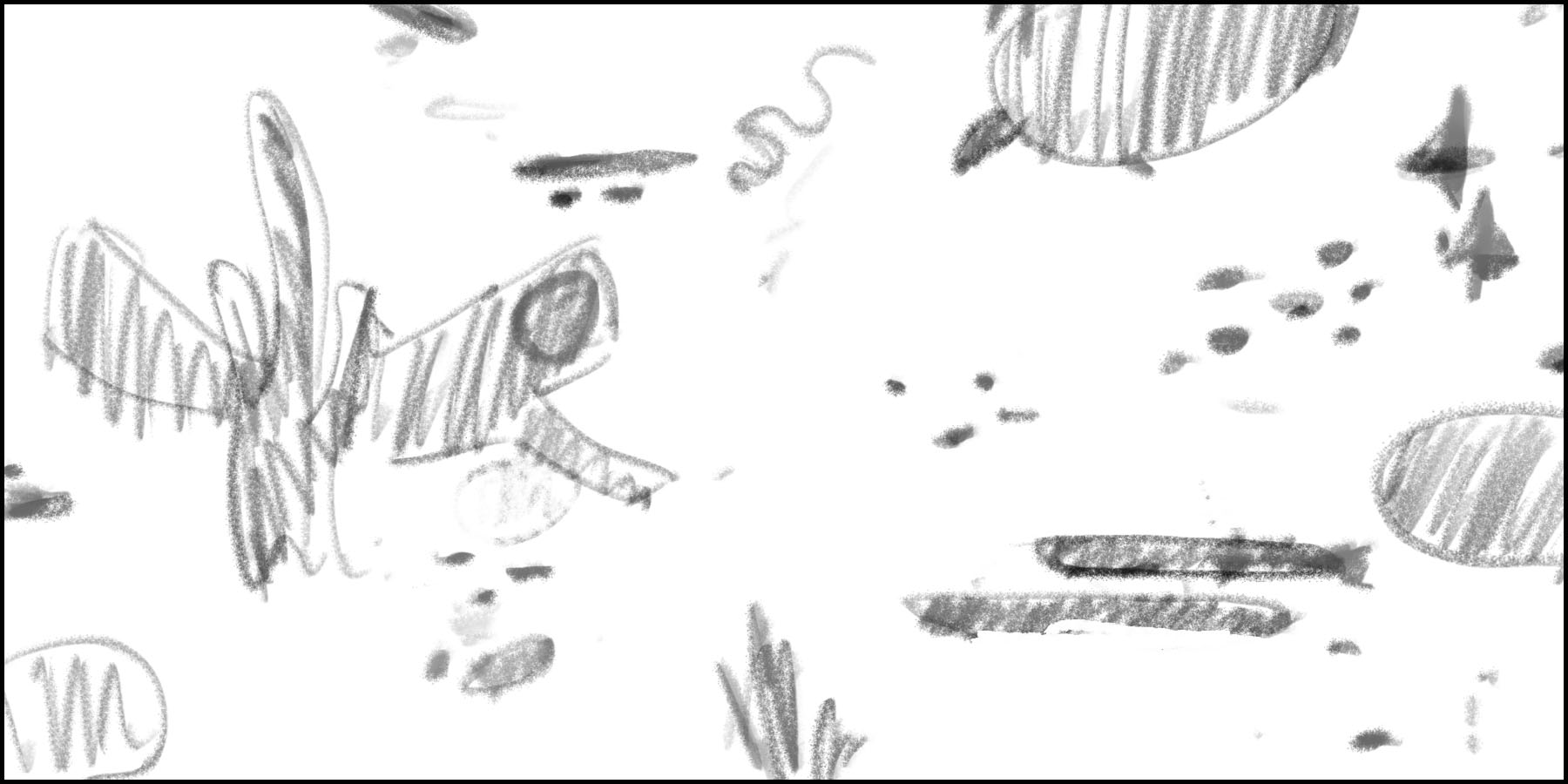
There are a few tricks to avoid this problem in the beginning stages of an image. Once you have a thumbnail you are happy with, Simply do a quick thumbnail that shows the graphic design without representational imagery. Yours might look like the drawing I did in the second drawing. I did a quick change of those shapes so you can see the difference. At this stage, I simply adjust the graphic design until you have good shape variety (shape and size).
The cool part is that this process is extremely easy and quick! AND has a dramatic result on how your final art looks.
Hope this helps some. : )


-
I love underwater scenes because they give SO much opportunity to explore color and different planes of perspective. Your style is very graphic and it comes out nicely here.
I love love love the turtle you created... his pose is excellent and in perspective. He is sort of mimicking adam's pose and that is so fun.
I did a quick paint-over (I hope you don't mind) because I thought you had a great start here. I think that some of the design issues are worth working out.

Here I have them side-by-side so that we can see how things have changed.
Firstly, all of the eyelines of the fish and Adam are all over the place. I sorted them out to help secure the impression that adam is looking at the fish and they are all looking back at him (he is probably the first naked dude they have ever seen!) I also blew away the little shark in the middle that appeared fully frontal to the view pane... he was the only figure in the piece in that pose and it felt super confrontational and a tad distracting (also, he might've been too close to the gutter.)Secondly, I varied the size of the fish somewhat. This gives a little more impression that they are all in different depths in the pane. Also, the octopus (very cute) seemed a bit trapped in the lower right, so I moved him toward the viewer and painted out some more structure to lead into the piece a little more.
Thirdly, I drew over some skeletal reference lines onto Adam to diagnose a little issue that I felt with his hips (hidden) and the length of that far leg... I shortened it a bit and painted away some of the coral to give his toes some breathing room. I felt like there was a start of a distracting tangency there.
Next I addressed the atmospheric perspective in the piece. I desaturated and lightened the distant shapes as well as darkened and saturated the nearer elements. This lends a little more feeling of distance.
Overall, I think this would be a very fun story to tell. Nice work! I can't wait to see more.
-
@Bob-Crum Thank you so much Bob for your time and effort! Ill pick them up, as well as @Lee-White 's comment. Thank you Lee, You guys help me so much!