Dream Themed Illo Sketch
-
Hello!
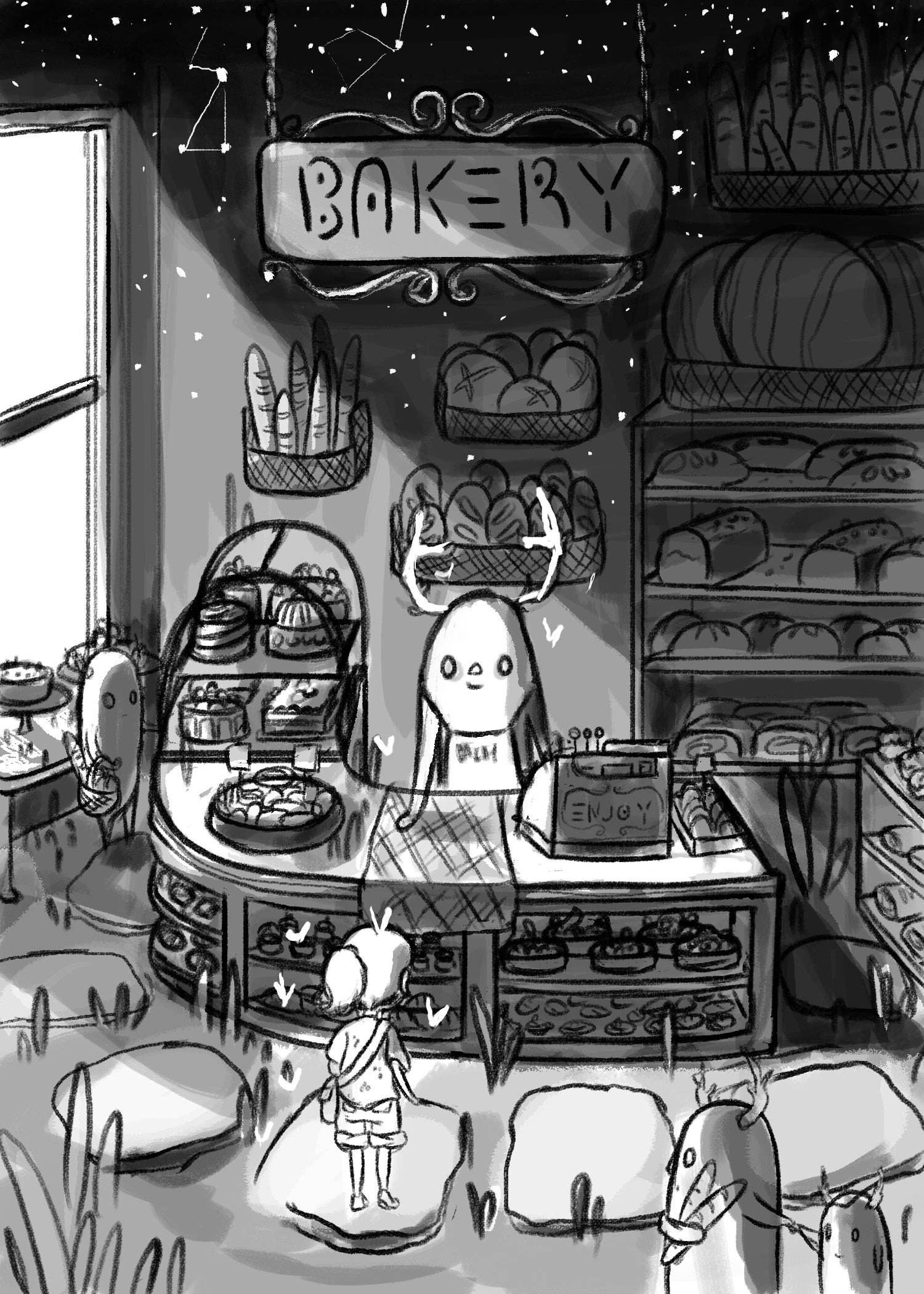
I'm going to be part of an illustration anthology art book. The theme is "dreams" so I decided to illustrate a weird bakery I dreamed about once. I'm going to render in in shades if pink and blue, sounds weird, but I think I can pull it off.
Anyways, I would love some feedback on the composition and lighting. Anything helps!
Thank you!
-
@Sharon-Sordo Hey there. I think this is fantastic! Just love the whole concept! My only critique is that I'm not sure who the 'focus' is supposed to be on. The bakery clerk is front and center while the girl seems to be the one experiencing this dream but is sort of lost in the lower left corner. Perhaps the focus should be on her? I bet a lot of that will clear up when you add the color too. Either way your stuff is amazing and I look forward to see this progress.
-
creative cropping will put your person right on that lower left spot... just thinking... also the thing behind the counter could be looking right at her... pretty neat drawing...
-
@Katrina-Fowler Hey thanks for you input! I want the focus to be the environment, which is why her back is facing the audience. The characters are there to tell a story, but I want the lighting and the bakery to be the star. This is also why I chose an overhead perspective so I can highlight all the pastries and bread. But i will move her around the see if it improves the composition.
-
@Russ-Van-Dine Thanks for your comment, i'll crop it and see how it looks
")
-
I think this looks great! It has a very calm Miyazaki feel to it.
The shelf type thing in the back doesn't quite match the perspective of the rest of the piece. If you were to project the lines of the counter and lower right shelf back, it might make that easier to see/adjust.
I can't wait to see how it turns out! Especially with the coloring style on your Instagram page. -
@Devin-Sailors I am a huge Miyazaki fan, so it's awesome it reminded you of his work! Are you talking about the bookcase type of shelf with the huge circular bread on top? If so, I will try to fix it. Yes, I'm planning to render it in that style
-
@Sharon-Sordo Nice image, I agree with @Katrina-Fowler about the focal points and there's something about the perspective that seems off to me. I'd try to throw some rough perspective guidelines in and your horizon line. I'm assuming it's a slight 3 point perspective. But it could also work well as a dream and the perspective giving you that just off feeling too.
Looking forward to seeing the colors added. -
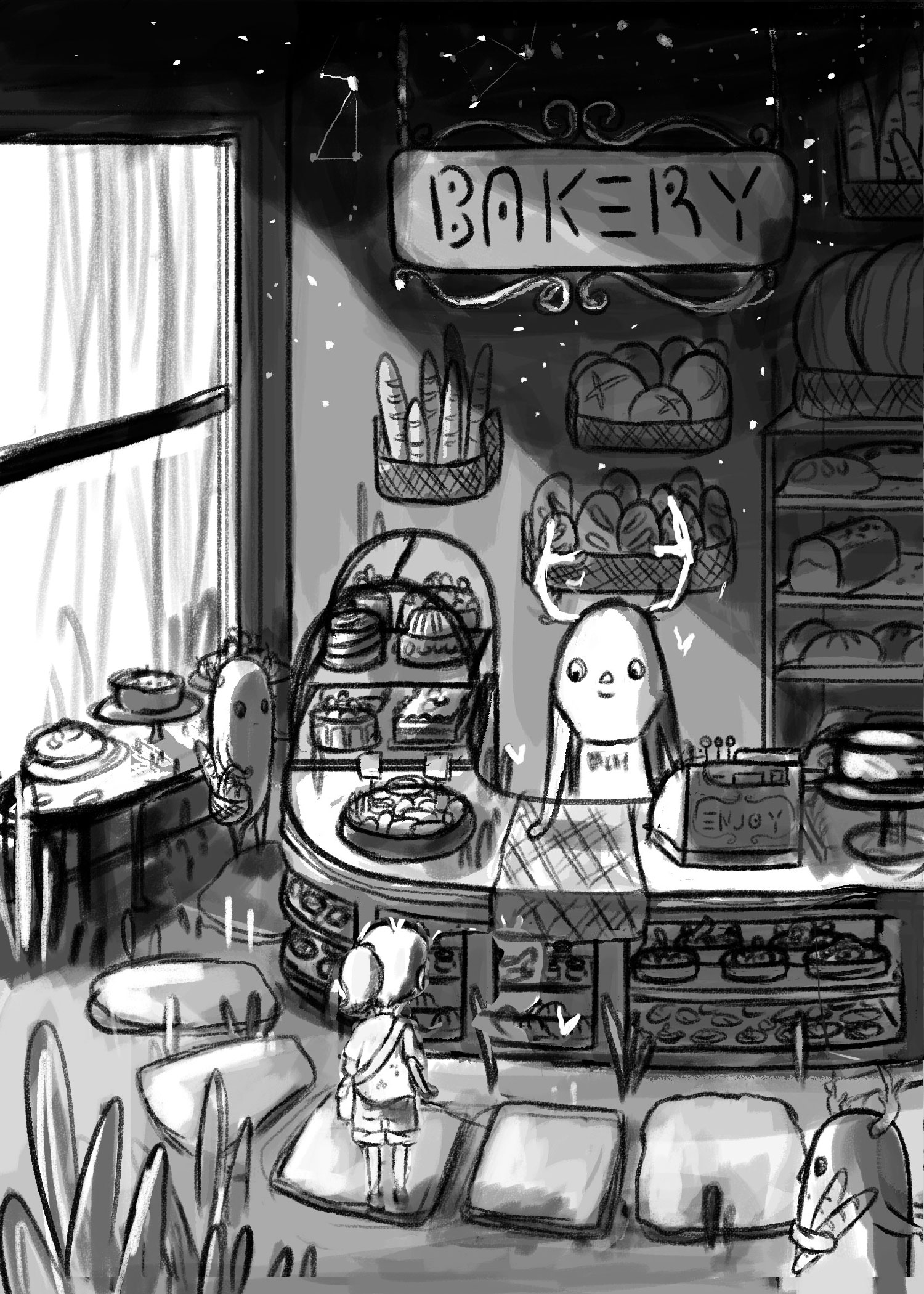 I made the changes suggested in the comments and I feel like it flattened out the image. Also, the depth is gone. However, it made the whole piece brighter because of the larger window. The focal point is all over the place now. I think I might go with the first sketch.
 -
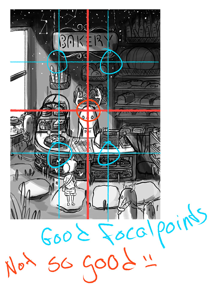
@Sharon-Sordo This is such a nice piece Sharon! - I agree that the first drawing is working better - I feel in this newer composition that my brain is looking for something important in the window area - then it scans over to the rest of the image but I keep coming back to the window area - I tried flipping the image and it helped dramatically with this - I don't know if it is any better than the first drawing that way but maybe horizontal flip and see if you like it - it puts the shopkeeper in a much more important position that way and the composition sends me around the page too which is good - anyways just thoughts - really nice piece - I know it will turn out great
-
I love the row of stones by the check-out counter - makes it so odd and wondrous.
-
@Kevin-Longueil Good idea! I'll flip it and see what happens. And I agree with your window comment, I keep looking at it also! I'm glad you like it
-
@andrewcolinbeck They are suppose to be pastries, it's suppose to be a bakery after all! Haha, I guess they look like stones at the moment because they don't have much detail. Thanks for your comment!
-
@Sharon-Sordo oh yeah, that will be fun when that is recognizable.