The Salamandarin! - My weekly painting
-
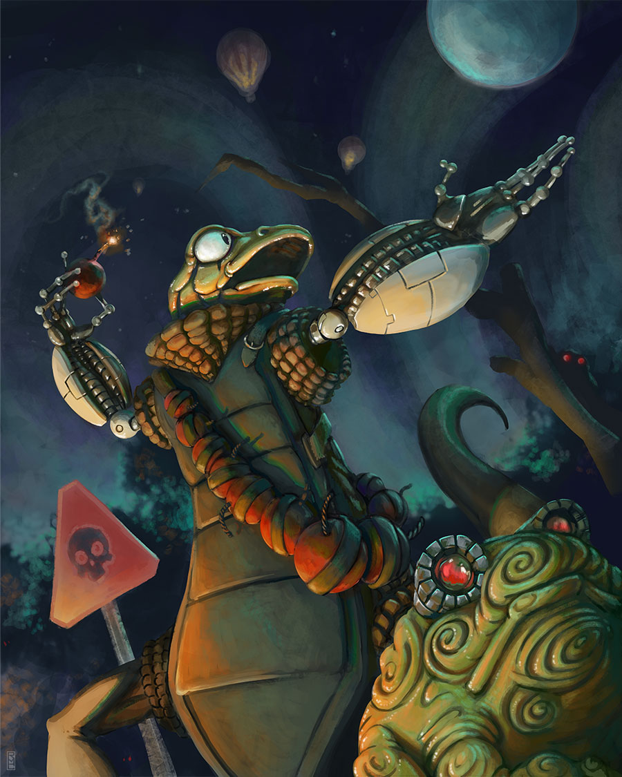
Ok, this is the mighty Salamandarin and his horde of Mini-camphibians. I was contemplating making this evil mastermind the main villain in my book. I am still working through some character design issues. Thoughts? Critiques? Paintovers? All are welcome.
-
@Bob-Crum I think this is really cool. I like how much you've put into the rendering and lighting.
It looks to me that the light on his face is running a little hot. I don't think it would get that much orange/yellow from the bomb. the eye whites would actually be the most orange/yellow.
From a form aspect, something about that left arm (his left) seems a little off to me. Also, his right leg looks a little off as well. Maybe thicken it up and turn it so the knee is facing the camera more? That's kind of a difficult angle but I don't know if the 90 degree angle is working as it is now.
From a character design aspect, I really like the character but I think his front body is a little stiff and boring compared to the rest of him. Could you maybe break up the overall shape a bit or give it more curve? Adding some functional costume designs would probably help too.
From a rendering aspect, you might want to lose some of the details in the darker areas--what is mainly hurting the image is all the "bumpy" design details on his skin, the lower character's googles and skin--it just gets to be "a bit much" and ends up overpowering the image a bit.
I can do a paintover if i'm not really communicating clearly here.
Like I said though, great style, great rendering and I love your use of color!!
-
Really cool image. A couple things. I agree about the left arm. It's out of perspective so it looks like it's bent too far backwards. As far as the leg goes I think the image looks better if you crop most of that leg out. I'd cut the image off right below the bottom character's chin. I love the skull street sign and his hands are really nice. I like the character and the design but I think a little more time fleshing out the different materials would really make the piece pop.
-
@Bob-Crum Nice painting. I agree about the feeling of overloaded with details, makes the eye dart all about and hard to find a specific focus point, That and so much red overall feels to me like the red color and the high details are fighting for attention, give the eyes a few resting places.
The main thing I notice first is the big red danger sign in the corner.
Really cool character design. -
I love this so much! Really the only thing I noticed is that his head seems a bit too bright given the light source. Otherwise, I like it a lot!