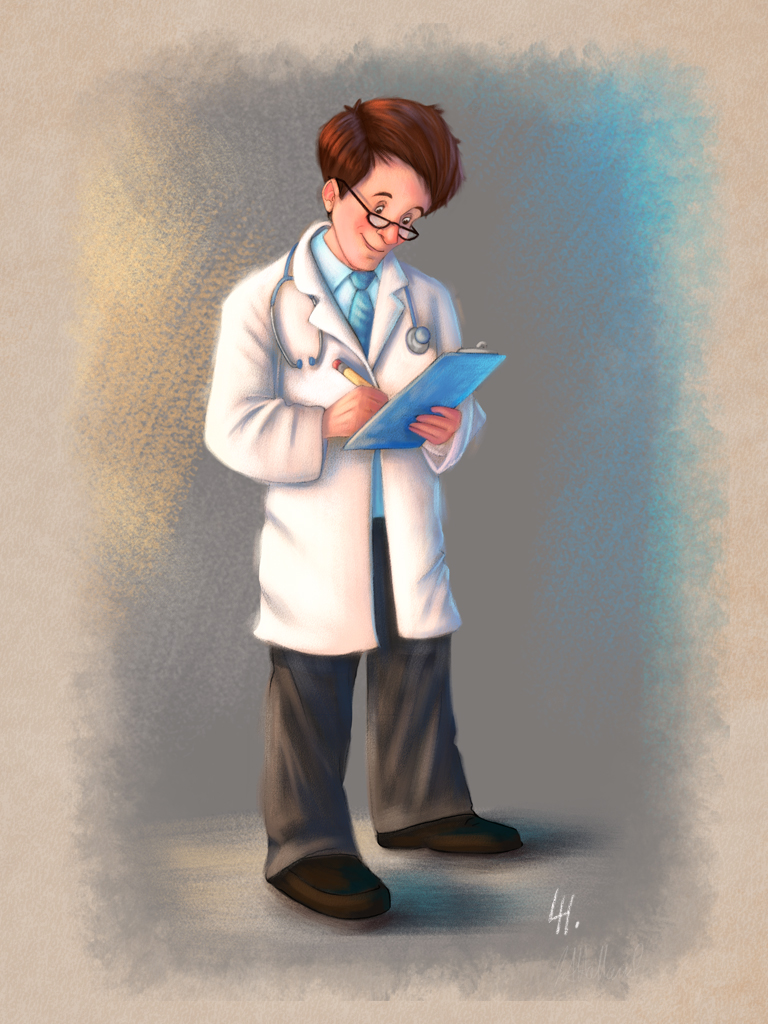
Doctor Character
-
Hi everyone.
I did this today and was wondering what people think. There are some great artist on this forum and l love to get some feed back on art I do. I don't do a lot of people and it is a goal of mine to do as much people work as I can this year as a challenge. Drawing people has always frustrated me.
-
Really nice work. I like the color and the rendering style. The only thing that looks a little off is the head size. His head might be a little small for the body...or it makes it look like he's just wearing really big baggy clothes.
-
I agree with the head size or the feet are to large. From the waist to crotch seems to be long as well. Render style is great.
-
Well done. I don't see the problem with the head or the feed. But for me his left leg seems a tiny bit too short. I understand that you did it because it is further away but if you consider the overall perspective it should not be that short.
I agree that the rendering is really nice, particularly his face.
-
I love your style on this and your other works. I would just suggest you need to watch the balance for your character slightly, he looks like he is leaning back or perhaps off balance in the feet.
-
Thankyou for the feed back everyone i'll have a look at the image and adjust some things.
-
@Lee-Holland This is a really nice piece - beautiful design and rendering style. The texture in the background is lovely too. Is it real pastel or digital pastel?
As for possible improvements - proportions have already been mentioned. I would look into the folds - they look odd, a little stiff and not very natural. Maybe some reference of how a labcoat and trousers fold would be useful. Face and hair look nice, but the hand holding the pencil looks flat - like a piece of cardboard. Also, I cannot nail it, but there is something with the perspective that is disturbing me. Maybe the position of the feet?
It is a nice and appealing character in any case - makes me feel like going back to pastels! -
I think it looks great. For someone who doesn't do people much, I would never know it.
-
Thank you for the feed back. I am using photoshop for all of my work now and use a texture on a brush to create the chalk effect. I do agree with all of what you said. the folds are defiantly something i need to observe more closely.
Do you think that my proportion of the head is off as I don't see it? Other people have said that it should be bigger.
I have had a look on your website and think your work looks brilliant well done. like
all your concepts. -
@Lee-Holland Then great textures with digital brushes - I would have to look into using chalk brushes! I used to love pastels and did a lot of work with that medium. Now I have thrown it all out of my portfolio, because it was mostly portrait and realistic figure work, which is not in line with what I do now....You make me think I should go back and revisit the medium with a different subject matter.
The proportions of head to body really depend on the look you want - there is not a right or wrong. Here is about 1:5, which is still very much in the children/cute range. The more you increase the head-to-body ratio the more childish and cute the characters look - down to 1:2, which is the chibi ratio (you can look that up, it is used very much in Japan). The more you decrease the size of the head, the more you get an adult look - 1:9 is the classic superhero/Marvel ratio. But it is also a matter of how realistic you want to be. An normal-sized adult has a head-to-body ratio of ca. 1:7, so this one is already very much stylized towards childish and cute. I personally think it works like this, but if it is digital you can lasso the head out and play with the proportions until you land on the look you want. There is some excellent books and resources on character design that explain this stuff - you have probably already heard it all! -
Really awesome, like the size of the head, your hands and feet don't match each other in size. One hand is bigger than the other and one foot is bigger than the other. did you make these chalk brushes?
-
have you tried to make it much smaller on your screen? you can see the size issues much better this way.
I too find the head, torso and legs/feet not suited. like a child wearing his daddy's shoes ^_^
I also find that the rendering is much more precise and detailed on the head and less on the body.
I still love your style, I'm sure that you will be able to draw people well quickly with some practice -
I really like your design for this character!
My only qualm would be the pants don't look as rendered as the lab coat. Theres still some apparent digital brushwork that could be softened.
Feel free to disagree, I've only had a few attempts with digital painting.