A little fun tonight...
-
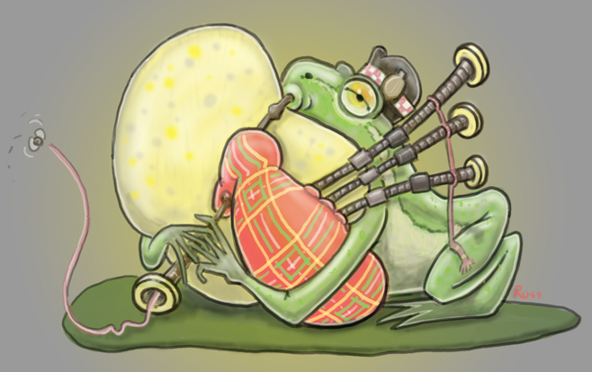
This is what I think of when I see bag pipe players puffing their cheeks out... tried to use a muted palette, no tangents and make it organized and easy to read. Can you guess which class I am taking currently? -
I love this
")
-
This is way fun. Reminds me of a print I just bought of a hedgehog playing bagpipes--because animals playing bagpipes are awesome. The cheek-puffing idea is really fun and clever!
My main critique would just be that the entire picture is very mid-range in value--the background is a middle grey, and nothing on the frog is particularly light or particularly dark--we can only see what is going on because of the outlines. I think deciding to silhouette your image either light-on-dark or dark-on-light would really help it read better--particularly since bagpipes make such a distinct shape. Just a thought.
-
cute idea!
-
@Sarah-LuAnn Thanks for the critique. I actually tried to keep the palette less saturated so the frog or the bagpipes wouldn't stand out and the idea of the frog puffing his huge chin out would be funnier. As everyone else is, I am still learning... any thoughts with color that would still work the idea?
-
I have no problem with the colors or saturation you have chosen, they look quite nice! My comment was solely about the values.
The tricky thing about color and value is that you can use a color that is completely "wrong" or unexpected, BUT if you use your values well the picture will be readable, no matter what colors you have chosen. You have alot of mid-range values going on in your picture, so despite the nice colors you have chosen, the image isn't really popping.
Since we're visual people I'll try making a visual example. I totally just stole one of our instructors drawings for this @Will-Terry :-j
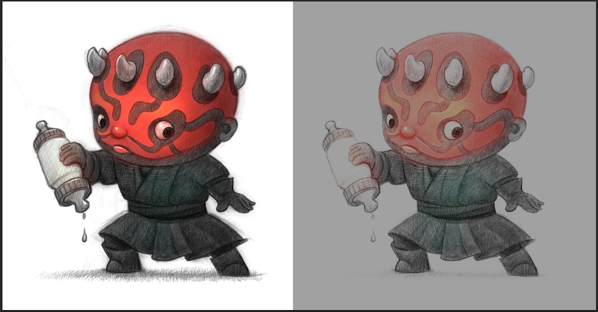
On the left is an image that deliberately uses value to make a strong silhouette. It is easy to understand and you see what is going on very easily. But if I take the values of the entire picture into a middle range--nothing too dark, nothing too light--its harder to see and doesn't have the same impact.
Am I making sense? I didn't mean to suggest anything wrong with your colors, I was just suggesting you think about pushing your values so we can see your fun idea more quickly.
-
Gotcha, i am thankful for this critique. I will mess around with this image in photoshop and see what I come up with using different values in the background...maybe pick a color or two for deeper saturation...