Submitted, but welcoming feedback & critique
-
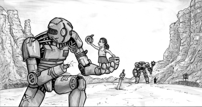
I finished my third thursday for the first time last night, and it was a wonderful experience to work on some personal work!
I'd love to hear any feedback you guys may have! (If you have any ideas of how to color this, that would be awesome. Using color/multiply layers, I didn't have much satisfaction with my own work.)
-
My critique would be to push your values some more. You seem to have the same tones in the foreground as in the background. The things in the background should become lighter and in the foreground darker. Then if you are going to keep the grayscale i would lay a color layer over to add your color. Personally I like to do local color first and then add a saturation layer at 0% on top that I can turn off and on while I start to lay in my shadows and highlights. Going back and forth between the both till I am happy with the value.
-
Your linework is really great, benben8it! And I really like your use of size relationships, values, and perspective to your advantage. Your concept reads really clearly.
As for coloring, that's something I've struggled with, too. (If you haven't seen them already, SVS's classes on color are most helpful!) You might try starting out paint-bucketing a multiplied layer with a warmlike tone throughout, then adding values from that same color to the whole painting. Doing that often inspires me as to which other colors I want to use. Another idea to get you started with color is to google for color palates to find one that fits the mood of what you're trying to create, then sticking with it within the bounds of the values you've already set.
Good luck and great work!
-
@Chip-Valecek
Thanks! You're definitely right about the tones looking the same. I tried fading the background out, but then it made my subjects (robots and sword) look very cut & pasted onto the landscape.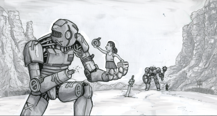
This was my first pass on the background problem. I think I'll take more advantage of masking and make it fade more.
-
@benben8it its working though, things are starting to pop, i would also bring the values of the background robot down some as well.
-
I agree, I like the fade you added. I am still working on adding color the way I want it, but there are several SVS classes in how to use Photoshop to paint that have been invaluable.