Society of Visual Storytelling

    SVSLearn Forums

    • Register
    • Login
    • Search
    • Recent
    • Tags
    • Popular
    • Users
    • Groups
    • Search

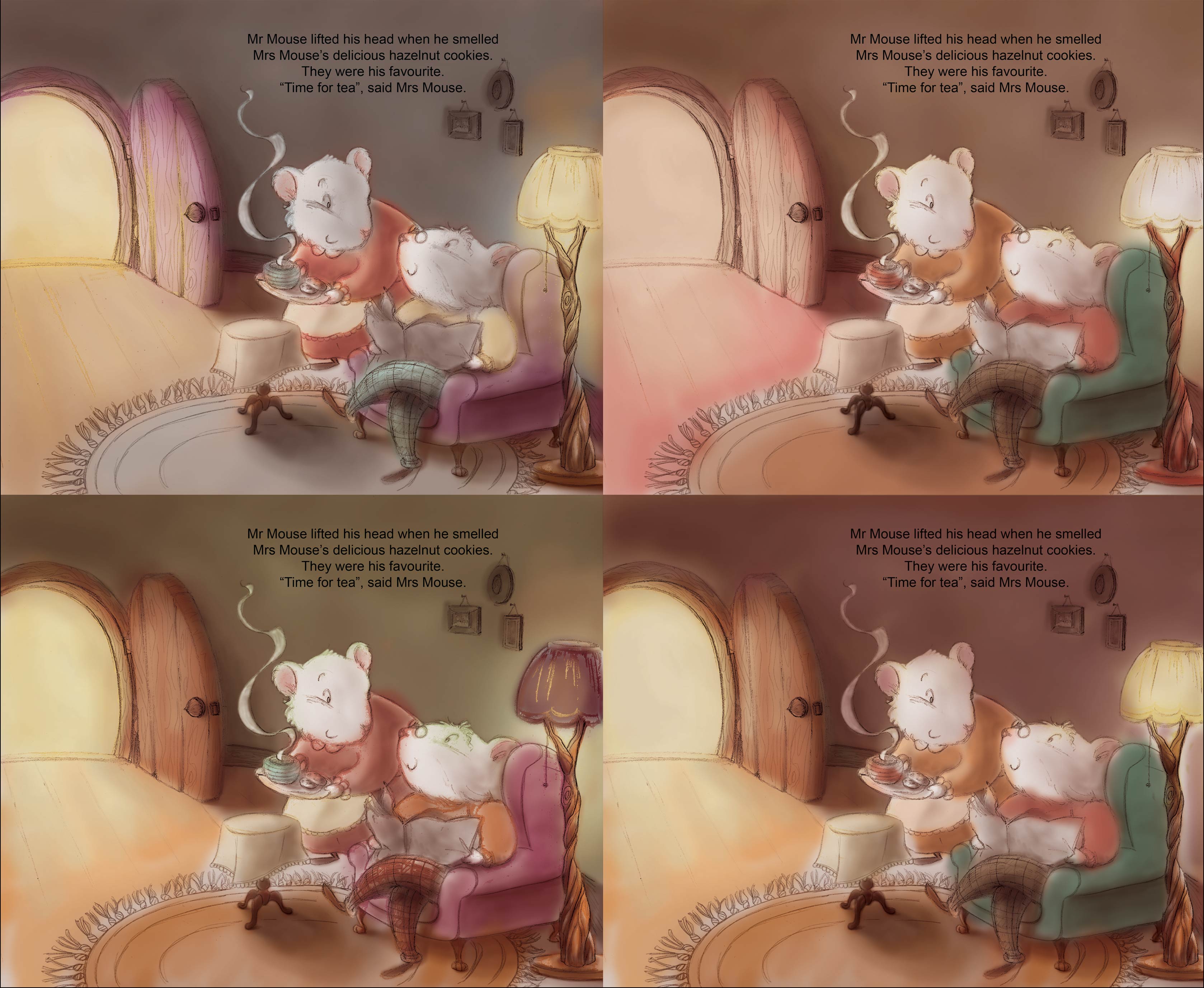
    next step: color studies

    General Discussion
    10
    11
    3078
    Loading More Posts
    • Oldest to Newest
    • Newest to Oldest
    • Most Votes
    Reply
    • Reply as topic
    Log in to reply
    This topic has been deleted. Only users with topic management privileges can see it.
    • audrey dowling
      audrey dowling last edited by

      any thoughts on these please?
      I feel so un-confident when it comes to picking colors... 😕
      0_1461322573194_color-studies.jpg

      website: https://audreydowling.wordpress.com/
      twitter: https://twitter.com/audreydowling
      facebook: https://www.facebook.com/Audrey-Dowling-Artist-Illustrator-498582176906242/timeline/?ref=bookmarks

      Thrace smceccarelli 2 Replies Last reply Reply Quote 1
      • Lynn Larson
        Lynn Larson SVS OG last edited by

        I like the two on the left, but i'm a fan of purple so they draw my eye 🙂 I think they are all very lovely!

        https://instagram.com/lynnlarsonart/
        https://twitter.com/lynnlarsonart

        1 Reply Last reply Reply Quote 0
        • Thrace
          Thrace @audrey dowling last edited by

          @audrey-dowling I think I like the first one best only because it makes the colors of the door, chair and her dress "pop" more. I love this piece it is so sweet!!

          1 Reply Last reply Reply Quote 0
          • evilrobot
            evilrobot SVS OG last edited by

            I like #4 it's a bit darker around the main characters and I think it makes them pop better. And I think the complementary color of the chair draws my attention where it needs to be.

            http://www.palacioillustration.com/

            https://www.scbwi.org/illustrator-gallery/illustrator-detail/?illustrator_id=84142

            https://www.pinterest.com/evilrobot2/pins/

            https://twitter.com/MyEvilRobot

            1 Reply Last reply Reply Quote 2
            • Russ Van Dine
              Russ Van Dine last edited by

              #1 love the purple next to your other colors...

              1 Reply Last reply Reply Quote 0
              • Lee Holland
                Lee Holland last edited by

                Really nice colour comps Audrey. I like 4 the best Because I really like the green chair. I have an idea to make the back door way cool and the light from the lamp warming there faces and that whole area. just a thought because i think the door way is catching my attention a little bit more than needed. I may be wrong. what do you think.0_1461346549710_Audrey 1.jpg

                https://www.facebook.com/pages/Lee-Holland-illustration/285517801577676?
                https://www.instagram.com/lee_holland_illustration/
                http://lholla56.wix.com/lee-holland

                1 Reply Last reply Reply Quote 5
                • Carrie
                  Carrie last edited by

                  I like #4 and what Lee did.

                  1 Reply Last reply Reply Quote 0
                  • lmrush
                    lmrush Pro SVS OG last edited by

                    I like 4, the darker wall behind them makes them stand out

                    Lisa Rush
                    www.lisarushgallery.com
                    www.facebook.com/ArtbyLisaRush/
                    www.instagram.com/lisarush11/

                    1 Reply Last reply Reply Quote 0
                    • smceccarelli
                      smceccarelli Pro SVS OG @audrey dowling last edited by

                      @audrey-dowling I like 4 best too - I like the yellow-green pair. Agree with Lee thought that you may have to tune back the door as attention point.

                      1 Reply Last reply Reply Quote 0
                      • audrey dowling
                        audrey dowling last edited by

                        thanks for your comments!
                        it's a very good idea, Lee, I hadn't thought of that. It would give interesting colours on the characters
                        I'll try that and see if I can get to something I'm satisfied with

                        website: https://audreydowling.wordpress.com/
                        twitter: https://twitter.com/audreydowling
                        facebook: https://www.facebook.com/Audrey-Dowling-Artist-Illustrator-498582176906242/timeline/?ref=bookmarks

                        1 Reply Last reply Reply Quote 1
                        • NoWayMe
                          NoWayMe last edited by

                          #4 here as well! I know you've worked a lot on this, and I really think it was worth it! Great work!

                          noemiegionetlandry.squarespace.com
                          noemie_illustration on Instagram

                          1 Reply Last reply Reply Quote 0
                          • First post
                            Last post