May Third Thursday - bouncing ideas
-
@smceccarelli wonderful! I love the color balance and the balance in comp! its fun and there's so much to see! Well done!
-
It looks fantastic @smceccarelli, love it! I agree with @Kevin-Longueil about cropping the Grim Reaper, I did notice it in the original version too and thought that was just right...in the latest version it tilts the focus towards 'he's about to die!'...nevertheless I think it's a fantastic piece, it looked great from the sketch and beautifully finished...I like the way you've got the old man as focal point through the use of colour with the warmth hitting him, very nice
")
-
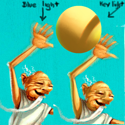
Very nice;) Also agree about the reaper. There might be just a touch too much saturation. I think if you have all the blue light coming down from the sky your shadows would be on the blue side. I did a quick test ball to see what it would look like. I love what you did with the fortune. Overall it's a super great concept...might be a winner, great job.
-
@smceccarelli This is awesome. There is a tangent though. The motorbike and the wheelchair in front connect making me look twice to see if there separate. Just thought I'd let you know. Great job though.
-
Thank you everyone for the great and very spot-on feedback! I have re-cropped to exclude Death again, changed the clouds to guide the composition better, reduced contrast and saturation and cooled the shadows.
@Jason-Bowen, you are right with the tangent. It bugged me throughout painting, but changing it would have cost too much time. It will have to stay as a fault on this one. I have added a touch of rim-light to the chair, in an attempt to pull them apart, but with more time it would need a re-draw.

-
That's AMAZING! I love the roller-coaster idea, and the colors are beautiful! I think the cropping is great, it all looks pretty good!
 I think you may have this one in the bag. Great work!
 -
@smceccarelli man what an ambitious illustration! Vehicles of all kinds and people of all ages...on a rollercoaster?! My hat's off to you!
-
That's incredible! So cool!
-
I love it too. And I am in complete awe of your amazing talent. However, the death guy is a little confusing. How would it look if you only had death's scythe showing perhaps? (moved it closer to old guy and cropped it a little closer?)
-
Mmmh, maybe Death was not a good idea after all.... I am also noticing a bad tangent with the wheel of the wheelchair and the border of the image. Well, now it is done and closed - next one is already in my mind and this one needs to rest!
Thank you everyone, for the positive encouragement as well as the useful critical feedback. I really feel like pieces posted here in the forum are the result of a collaborative creative act - it is a really nice feeling!