Society of Visual Storytelling

    SVSLearn Forums

    • Register
    • Login
    • Search
    • Recent
    • Tags
    • Popular
    • Users
    • Groups
    • Search

    May 3rd thursday thumbnails

    General Discussion
    7
    11
    2523
    Loading More Posts
    • Oldest to Newest
    • Newest to Oldest
    • Most Votes
    Reply
    • Reply as topic
    Log in to reply
    This topic has been deleted. Only users with topic management privileges can see it.
    • Jason Bowen
      Jason Bowen SVS OG last edited by Jason Bowen

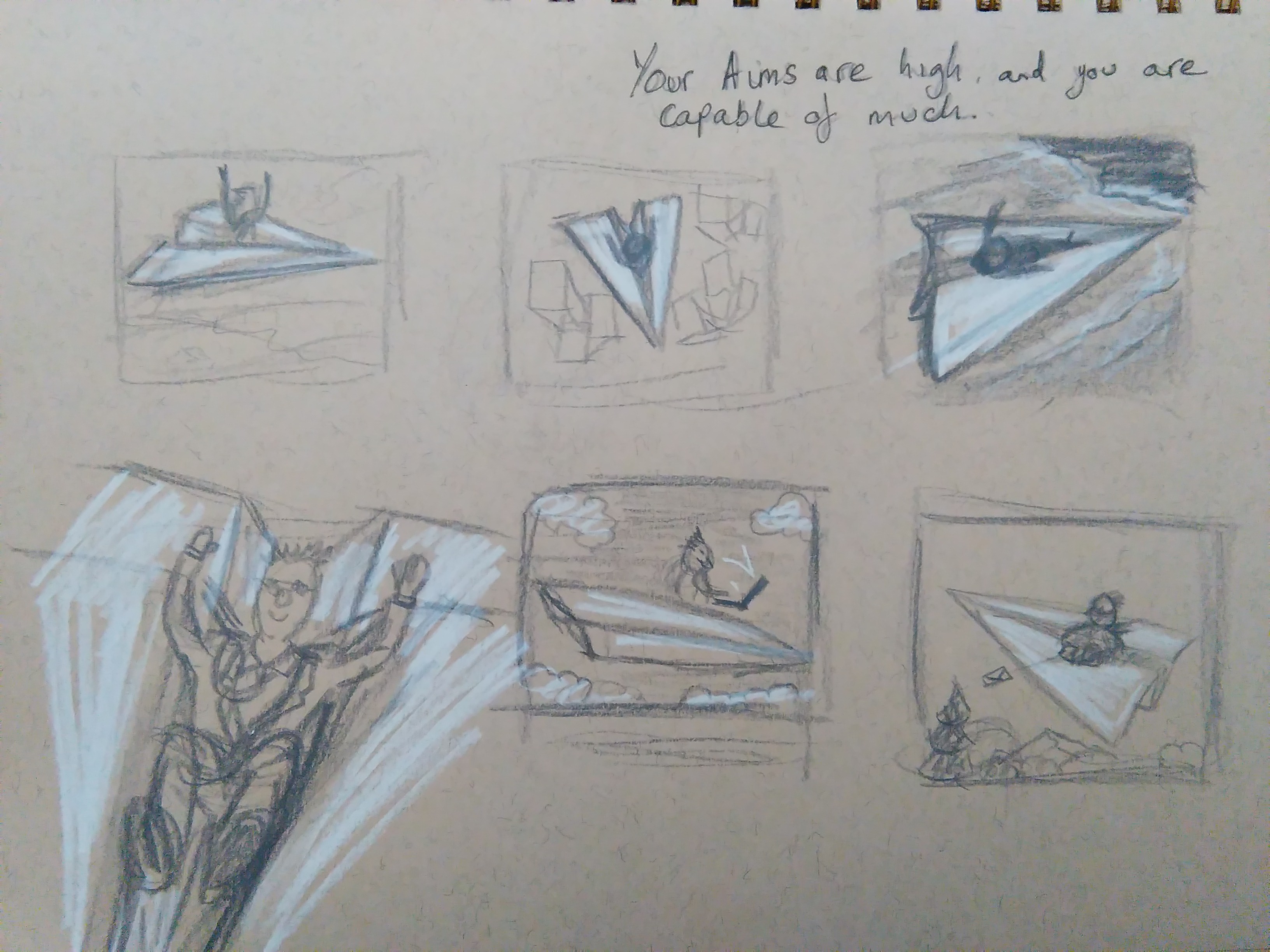
      I'm working on my idea. The Cracker I got is: Your aims are high and you are capable of much. So I thought I would do a man in a paper airplane. I was thinking the paper airplane is his CV (resume) so I was just doing some tests for a interesting angle. I think I will do buildings below him to represent the high flying job he wants. what do you think? Any suggestions welcome 🙂0_1461689044468_IMG_20160426_164846 (1).jpg

      https://www.instagram.com/jasonbowenoils/

      B 1 Reply Last reply Reply Quote 2
      • B
        bashby45 @Jason Bowen last edited by

        @Jason-Bowen Personally I like the angle of the last one. I love how creative your idea is.

        1 Reply Last reply Reply Quote 0
        • smceccarelli
          smceccarelli Pro SVS OG last edited by

          I love your idea, I think it really conveys the message! Compositionally, I would probably try to include the horizon - it seems to go along with the idea of aims. Maybe also putting a particularly high building or a tower that stands out from the rest of the "city" and is the "aim" of the resume-surfing guy.

          Jason Bowen 1 Reply Last reply Reply Quote 0
          • bharris
            bharris last edited by

            Great idea! I can see it being really beautiful! I love the last one, the angling upward fits the "high" aims more to me.

            www.brittanyharrisillustration.com/
            www.instagram.com/britillustration/

            1 Reply Last reply Reply Quote 0
            • evilrobot
              evilrobot SVS OG last edited by

              I like the 2nd thumbnail. Nice idea.

              http://www.palacioillustration.com/

              https://www.scbwi.org/illustrator-gallery/illustrator-detail/?illustrator_id=84142

              https://www.pinterest.com/evilrobot2/pins/

              https://twitter.com/MyEvilRobot

              1 Reply Last reply Reply Quote 0
              • Jason Bowen
                Jason Bowen SVS OG @smceccarelli last edited by

                @smceccarelli thanks I will think about that when I do a few more sketches. 🙂

                https://www.instagram.com/jasonbowenoils/

                1 Reply Last reply Reply Quote 0
                • BlackErmine
                  BlackErmine last edited by

                  I love paperplane idea, it's so cool:)
                  The woohoo-roller-coaster expression of the first guy, is really funny. I like the presence of a city on the second thumbnail, for me it really connects with CV and job hunting, but at this angle image seems really static and calm. And the last thumbnail also catched my eye, mostly because that angle of paper plane is really nice.
                  Good luck.

                  https://twitter.com/BlackErmine

                  1 Reply Last reply Reply Quote 0
                  • Jason Bowen
                    Jason Bowen SVS OG last edited by

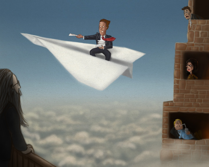
                    Here is the udated version of the Paper airplane idea, any thoughts? 0_1462049185385_Paper airplane.jpg

                    https://www.instagram.com/jasonbowenoils/

                    1 Reply Last reply Reply Quote 1
                    • smceccarelli
                      smceccarelli Pro SVS OG last edited by

                      I like how you brought this idea forward - it is a really nice concept. I think your rendering style is not consistent throughout the image at this point: you have strong linework on the characters, while the plane, building and clouds have no line and soft edges. My impression is that the image would be stronger with a consistent render style. Maybe even only line and cell shading?
                      Maybe you already planned to do this, but in the Western world the direction of movement is usually to the right, because we are so used to reading anything from left to right.
                      I love the character with the drink!

                      Jason Bowen 1 Reply Last reply Reply Quote 1
                      • Russ Van Dine
                        Russ Van Dine last edited by

                        great responses, and neat start here, I have never seen a building like this with open windows that people look out of... the best guy is the guy at the left with the long hair...

                        1 Reply Last reply Reply Quote 0
                        • Jason Bowen
                          Jason Bowen SVS OG @smceccarelli last edited by

                          @smceccarelli Thanks for the tips I will try to improve things 🙂

                          https://www.instagram.com/jasonbowenoils/

                          1 Reply Last reply Reply Quote 0
                          • First post
                            Last post