Print Ninja sent me some pictures of my book
-
I went with PrintNinja for a book I recently illustrated (thank you @Lee-White for mentioning them, they've been great to work with) and they sent me some of the photos they snapped of one of the physical copies--the other ones are being shipped.
I did not select the hard copy proof option but they are sending me one anyway which is really nice (technically it is not a "proof" since I had previously signed off on the electronic proof and they've already been printed).
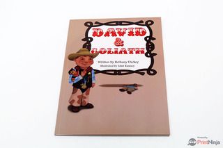
The cover does seem to be much more blown-out/high contrast than I wanted but I'm hoping that is due to the angle/quality of the photo. We will see.


I'm excited to finally get this in my hands. It's been over a year project!
If you have any questions on the process of working with PrintNinja just let me know!
-
Congrats!!!! So happy for you to see all your hard work come together.
-
Thats great! So exciting to see something come together like that. How many prints are you going with?
-
@Chip-Valecek We figured we should be able to sell 500 copies between the two of us and our contacts. We could have purchased more at very reasonable rates but I didn't really want to be sitting on hundreds of extra copies.
-
Its always different to see your stuff printed, especially when its created digitally. I hope the physical copy looks the way you want it to! And Congrats!
-
@mattramsey best of luck!
-
Congrats! How awesome. Love to see a project come to fruition.
-
Good luck Matt, let us know how the finished book looks!
-
So I got the actual copy in the mail, here are my impressions:
-
Thankfully, the cover wasn't as blown out as the picture they had sent me (it seriously looked like someone had gone crazy with the dodge/burn tool). That said, it was fairly different than the image I sent them. I think I remember them saying that the glossy pages tend to darken images (due to the printing/coating process). I guess I don't really know how to plan for that other than just guess at the levels and hope for the best.
I'd assume that going with a traditional publisher there would be people who would test all that out and we could tweak it until it was perfect. -
There was some kind of dark spot right on the illustration on page 1. Maybe it was just on this copy. Even if it is on every copy it's pretty minor.
-
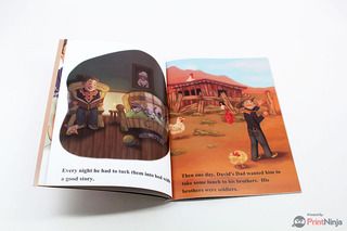
On a couple of pages (I noticed it most prominently on one particular page) there was some "fuzziness" to the image. I'm reasonably sure this was due to the printing process and not the actual file I sent them (I had 300dpi files) but maybe it was on my end. Pretty minor but I think it further serves to put this in the "self-published" category. In other words, I don't think anyone reading it would be "surprised" to find out that it wasn't put out by a major publisher.
-
Very good quality paper and binding. I'm very happy about it.
Things I learned/wish I would have done differently:
-
I wish I would have chosen a different color for the acknowledgment page--it's the same color as the cover and it ends up being a lot of tan/brown when you turn those initial pages. Kinda looks yucky. I'm sure someone at a traditional publisher would have caught that.
-
On a couple of pages (specifically the spot illustrations) I wish I would have made the images slightly smaller. That might sound weird and I was definitely thinking when I set up the pages: "well of course I'm going to blow this up as big as I can to fit the page." But it turns out that it's almost overwhelming--if that makes sense. Holding it my hand versus looking at it on a screen was a TOTALLY different experience. Again, an art director probably would have caught that.
-
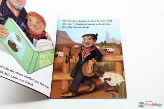
I wish I wouldn't have made the font size so large. I was thinking I didn't want something tiny or unreadable but I ended going with something like 30-pt font. Pretty much: way too large. At the end of the day though, it is a book for younger children so maybe the very large lettering isn't as bad as it would be if it were for older readers.
Anyway, I'm busy working on the next thing that I might try shopping around this time but I'd be fine with printing through PrintNinja again.
Thanks again @Lee-White for suggesting them!
-
-
Good luck selling your books - exciting stuff! Interesting to hear your thoughts on the screen vs print. I'm guessing they don't offer proofs then, to check the colours etc before you go the whole way? I get proofs of our paper packs before going to print - really helpful eg for checking how the colour balance looks, or if it's coming out too dark.
I know what you mean about things looking bigger in print than on screen - I've had similar thoughts when we've had our catalogue back from the printers, thinking 'oh I could have made these pictures smaller' - on screen you think it's only just big enough, but somehow in your hand it looks huge. I also home print pages to check the sizing..how big/small everything comes across etc....usually I end up downsizing things afterwards.
Glad you had a good experience with PrintNinja, hopefully it will all help for the next book!
-
I think they do offer proofs but it costs an extra $250.00 so, some choose not to do it. I've been looking at Print Ninja for my book.
-
@mattramsey I have been looking at Print Ninja. Tried to do a calulation for my book but somehow it didn't work. Did you talk to them directly as you set up your project? It's really awesome that you have finished your project. Congratulations!
-
Great feedback Matt. One thing I can add based on your comments is that you ALWAYS have to print out your book at home at 100% of size. Even if the print quality isn't great, you will get a sense of how the book will look. You can send a pdf to kinkos and they will print a color copy for you. Again, it's just to see the big stuff like type size, image size, basic color schemes, etc.
They can typically have it done in a day and it's a great way of proofing it yourself before sending it to the printer. The next thing is getting a hard copy proof from the printer. It's sort of expensive I know, but it's worth it to be able to fix little things you know are wrong.
That stuff aside, sounds like you have a great book Matt. I can't wait to see more of it! : )
-
@mattramsey First of all, congratulations on finishing a project of this scope!
I have some experience with print design and printing, both on large professional runs with offset machines as well as print-on-demand kind of suppliers, probably similar to PrintNinja.
One important thing for color consistency is to get information on the color profiles they print with. When you export the pdf for print (assuming you have done it yourself), you have to chose the same color profile used by the printers, so that your pdf looks approximately the same as in print (on a calibrated monitor). These are in the settings that you have to select when you export the pdf. They are called things like "Europe Coated V2" or "Coated GRACoL 2006".
For judging sizes and look of pages you do not need necessarily to pay for a digital proof. You can print on your home machine or in a print shop, at the same size as the final book and cut the extra paper, so that you see exactly what a page looks like. You can even take the time to glue the pages together to build a dummy book, so that you get a feel for the flow of pages. It takes some time, but very little money, and allows you to see a lot of the things that work or do not work, like size of pictures and text.
Of course a publisher would have print designers to look over the layout of a book - but you can do that too! You can hire a layout designer to look over your pdf and just give suggestions (no actual work). With 1-2 hours worth of his/her time you get a professional opinion and suggestions on how to improve the layout.
This is however a powerful experience, and gives you insight to make your next project even better! -
@mattramsey Congrats Matt! This is a great accomplishment and I wish you much success in sales of the books!
-
@Dulcie Like @Marsha-Kay-Ottum-Owen mentioned, they DO offer hard proofs but we have a zero budget at this point. Hopefully we end up in the black and I can pour that money back into the next book and the Kwik program to turn this book into an app.
@Marsha-Kay-Ottum-Owen The calculation worked for me. It is an awesome feature that helped me figure out a lot of the details. I must have went back to that thing like 4-5 times just trying out different combos.
The only "hiccups" I had was figuring out how to send them the files they needed in the way they needed them but eventually it worked out.
I did have some good communication with one of their reps. Once I called in (due to a question I had on the file submission) and I ended up talking to someone other than who I had been emailing and that guy was very helpful too. So basically, everyone (both of them) I've worked with at PrintNinja has been great.@smceccarelli You are right on the color profile thing. They use Japan 2 or something and they walk you through the process of converting everything from RGB to their CMYK profile. Interestingly, I noticed almost ZERO difference between my colors in RGB and the CMYK coversion (on my screen). The actual colors in the book are very close as well.
The problem I had was the contrast on the cover. Really, the only way to have gotten that right was to have purchased a hardcopy proof. They state something like: due to the gloss printing process colors can come out darker. All of my interior pages were matte and I didn't have any problems.Of course, I was already frustrated with fighting weird contrast issues, I made a video about one of the pages here: https://www.youtube.com/watch?v=ZBSLYXRW2C4 (still not 100% sure what the issue was but I wasn't really able to fix it perfectly).
You are right: a layout designer would have probably really helped, right after s/he got done snickering at the attempt I made.
-
@Lee-White It's funny because your advice of simply printing off the pages on my own to get a feel of the book seems so obvious but it never occurred to me. Maybe Will/Jake mention it in that course they taught but I must have missed it.
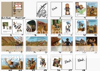
If you'd like to see more of the book I'll post the dummy I made myself--I'd refer to this every so often and fill in the squares with completed pages as I went.
I DID learn a lot and overall, I'm happy with my first book attempt. As I've mentioned before, I don't think this would have been picked up by a major company--or if it would have, they would have had a lot of revisions. After the year mark of working on this I constantly wrestled with: should I go back and keep tweaking/fixing all the little mistakes I find or do I just power through and try to make it the best I can but JUST FINISH IT.
Ultimately, I decided to finish it and use it as a springboard into greater stuff. Obviously, any overall impressions/crits are more than welcome. Maybe I'll have already seen it but more than likely I'll learn something NOT to do for next time.
One of the main changes, stylistically, is that I'd like to get "less tight" and more painterly with my illustrations.
Here is the dummy (sometimes it doesn't show up for some reason):

-
@mattramsey Thanks so much for sharing your experience. I think I'm in the same boat about just finishing! I also could add a link to an audio if I could figure out how to. I will need my son to help.
-
@mattramsey Hi Matt - just wanted to follow up and see how things have been going with your book? Would love to hear what your experience has been since the books were printed and sales have begun etc.
Thanks! Rich
-
@Rich-Green sales are kinda "meh". We are pretty much in the black but we didn't sell as many as we thought at the big event. I do not have them up on Amazon so maybe that would be an idea. I just sent in a copy to a publishing house that is tied in with my church organization and when their board meets they will review it and see if they want to carry it in their store.
In the meantime we are selling a copy here, a copy there to various contacts around the country (word of mouth type sales).
All that said, it was pretty much a vanity project from the beginning meaning that the idea was more: let's make a book that we can hold in our hands versus let's have a huge commercial success (of course, a huge commercial success would be great).
I learned a lot in the process and I'm definitely planing on making more books.