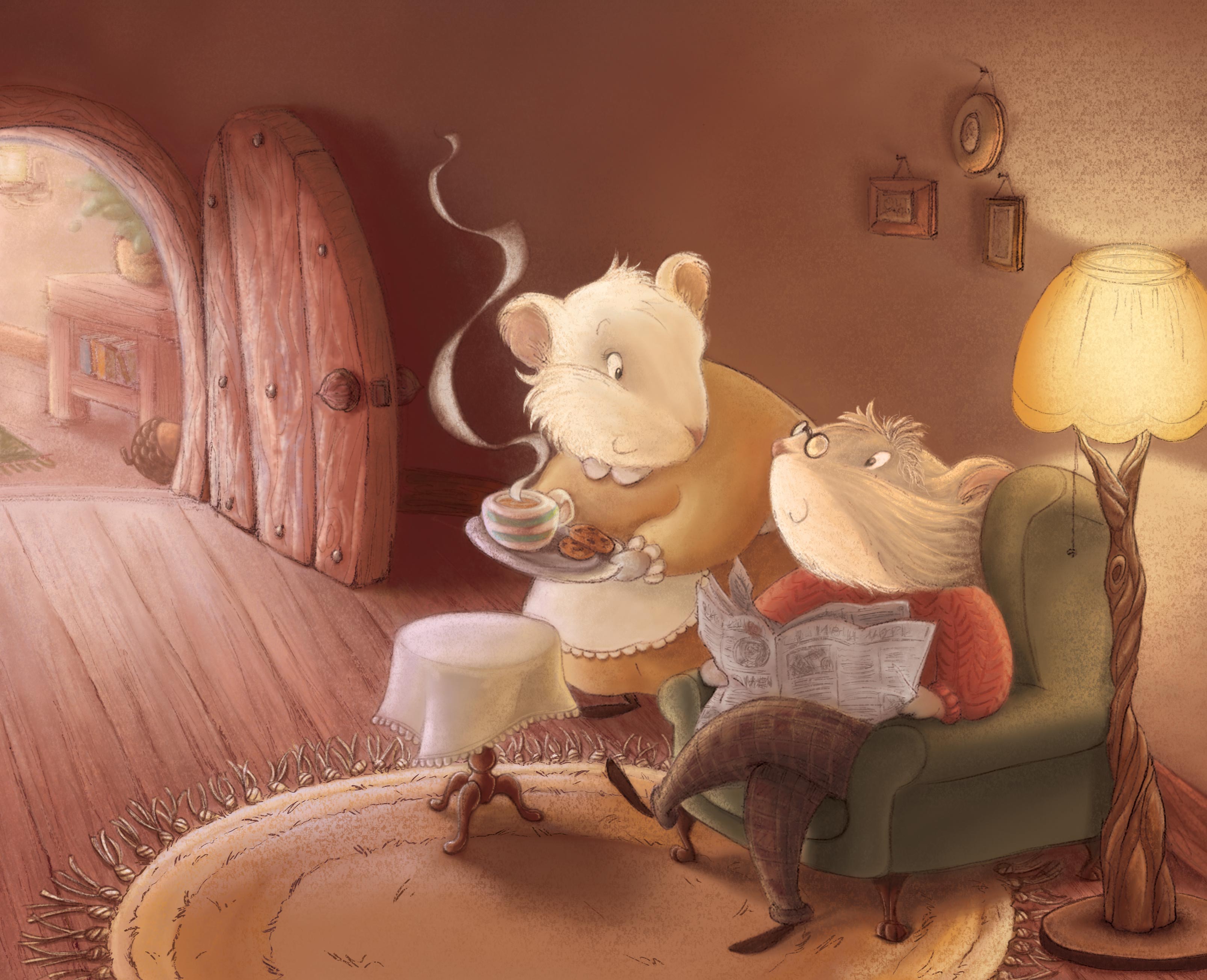
Critic on my 'Cup of tea' illustration please?
-
@audrey-dowling I have heard of books being written from a piece of artwork. I think you might have something here if you do a couple more illustrations of the mice interacting, maybe in the garden, at the pond she is walking up with flowers while he is fishing, maybe being pulled in a coach by a rabbit...
-
I think it's lovely! Well done.
-
Really beautiful work.
-
I love it! I know you worked really hard on that one, and I think it was 100 % worth it! The only suggestion I can think of is maybe turning the saturation even lower in the room on the other side of the door... I think maybe having that part almost monochromatic would look good... and it wouldn't distract as much (right now my eye tend to go there a little too much, and I think it is mainly because of the green and yellow)
Also, everything else in your illustration is rounded and curvy, except the table in that other room... I think maybe having it more rounded might help ? You could even repeat the style of the lamp in the table, maybe something like this :
It would also create more unity in your piece, tying everything together!
But these are just suggestion, I think your piece is already absolutely beautiful!! Your characters are so charming! Love it
")
-
@audrey-dowling Hey Audrey - this piece really looks great! I don't think you really need to do anything different but i was messing around a bit with this in Procreate app and thought i would share the results - i made a second layer of the identical image and set it to multiply - then turned down opacity to 47% - this really made some things pop for me - i then went back in with a textured eraser and erased most of the new layer leaving some of the multiply on top of the couple's faces and a few occlusion shadows - subtle difference but i liked the slight saturation change on the faces especially - only other thing worth mentioning is that i was thinking the opposite of Noemie on the lamp
the lamp to the right really pulls my attention and i think a very simple lamp post that does not have the darkest darks on it would be worth a look - i am very late chiming in on this - hope you don't mind - it is a really nice image! -
I think a simpler lamp, like @Kevin-Longueil suggested would work also! But I would still try to use the same style for the lamp and table, and make the table "softer". By the way, @Kevin-Longueil, I don't know if it is just me but I don't see what you did! Maybe you didn't include the image ?
noemiegionetlandry.squarespace.com
noemie_illustration on Instagram -
@NoWayMe You're right - i did not include an image .. i did not save my work i- t seemed like a cool and easy way of adjusting the image to get a little more contrast and saturation in the main areas - here is one i just did though - my lamp is not good - just showing that it does not pull attention when it it simple and does not have the darkest darks in it - i think that is the main thing with the lamp for me
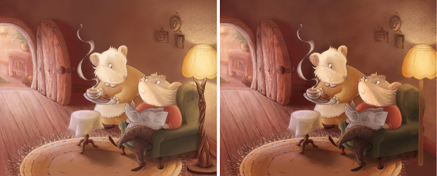 - i like your idea too of making an organic lamp but maybe keeping dark shadows out of the creases would be good so it is not the point of highest contrast... not sure though - always feel weird posting a paint over
 -
Thanks for your advice @Kevin-Longueil and @NoWayMe
I applied a few things: I toned down the contrasts slightly on the lamp, but I don't want to change the style of it, I think it really brings something to the mood and the settings. Just like I don't want to change the style of the coffee table, to avoid a "total look"
I also added a multiply layer of the faces, some of the clothes and the door, but turned it down to 20% so the whole image still has that softness to it
it definitely works better now thanks!
-
Firstly this is a beautiful picture. When I look at it though I wonder why the door is open? If we are to look at the happy cosy mice which I do, I then look at the doorway and expect to see something that creates some sort of story... maybe if this was a book that would be revealed on the next page? I still love the picture though, that is just my view.
-
So lovely, your color choices are perfect, beautiful harmony!