Campfire! (the scouts project)
-
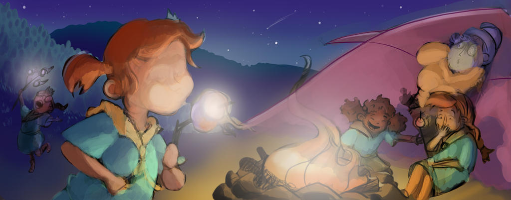
@Christina-Taylor-Brown I'm not sure if its just me, the black and white one feels like I want to see juuust a little bit more on the bottom right corner? Or I am just dyslexic that way

Overall your work is really bright and vibrant, but I feel like every part of the image has the same vibrancy/contrast which makes it a bit harder for the eye to focus. I would love to hear what you think about it.
All the best!PS: where are you posting these pieces? personal portfolio website or something like behance?
-
I love your first piece with the girls in the pool. I think it's brilliantly done- composition, painting, color. Fabulous.
For the composition of the b/w double page spread, consider bringing the tent further back in the background behind the camper on the right and bringing- only to increase the depth of the perspective in the piece. Just an idea.
And what if you moved the girl in the foreground a little more to the left so her stick isn't in the gutter. She could also be enlarged just a bit too.
I really like what you've got and look forward to seeing the finished composition. Cheers! -
Thank you all so much for your input. I've made a few changes and am now laying down some color. This is my third step in a 8 part process so don't get too attached to anything. The fuzzy glow will disappear and I put in my details half-way though. Thanks for all the suggestions. If anything is sticking out, or you want to do a paint over on any of these images, feel free! I am here to be the best me I possibly can.
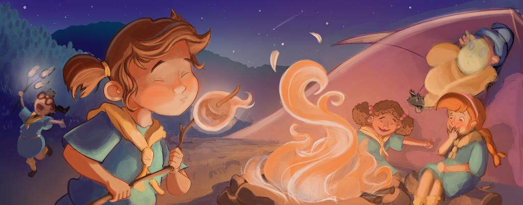
@Nazuba I see what you mean, How would you fix that? I did feel the same about the corner. I put a little more action going on. Is it working now?
Follow me on Instagram and twitter! @christinabdraws
Facebook: https://www.facebook.com/cbrownillustration/ -
Oh! These are just for my own practice. I will put the best ones in my portfolio to display that I am able to be consistent with a character in different settings.
You can see all of my work here:
https://www.facebook.com/cbrownillustration/ (add me as your friend! I love being social!)and I'm @christinabdraws on twitter and instagram
-
@Christina-Taylor-Brown Yes the tension of wanting to see more over there has gone away
 How I would solve the problem would depend on the story, of which I know very little.
What is happening to the girl in the left corner there? Also the space you kept for gutter, doesn't it feel a bi too on purpose? I feel like since there are two parts of people on both the left and right, the space and the gutter would make it look disconnected.
-
@Nazuba I fixed it a bit. Here's My latest version. Still Hours to go before I finish, but feel free to give me your thoughts. Oh and the girl in the background is just dancing around with her marshmallows on fire.
-
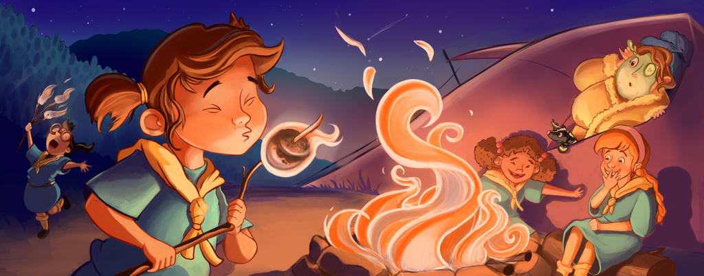
I think I'm finished. I'm getting tired of working on it, but I'd like to give it my best effort. Do you have any suggestions for me @Will-Terry @Lee-White @Jake-Parker ?
-
It turned out great. The only thing is the leader, would kids know she is wearing a mud mask? I think just the surprised look on her face would have been enough. A kid might think she is a zombie.
-
Brilliant work, its great fun to look at. The characters have personality and presence, thanks so much for sharing.

-
@Christina-Brown it turned out so cute! I love it. The fire is nice and alive. I love the counselors mud mask and cucumbers (totally not a zombie- any mom would understand that). Great expression and pose. Lighting is great, colors are rich. Characters read well and are interesting. Congrats!