(WIP) Book Jacket Redesign: The Little Prince
-
Wonderful drawing, The only minor thing i can see is not seeing the princes face, but not seeing is also very enchanting.
-
Thanks guys!
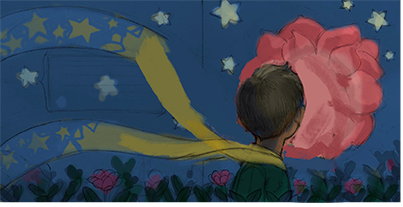
Here is a quick value study. This is the general direction:
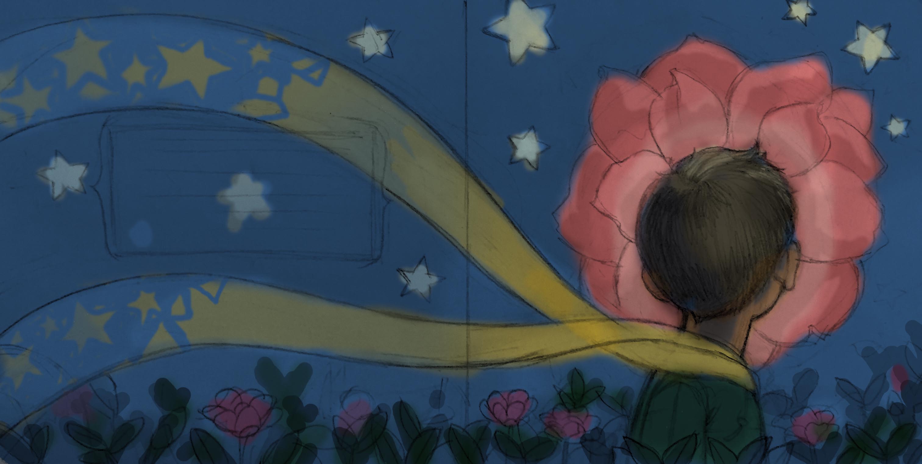
I then took it to a color study and thought it'd be cool to break the scarf into stars because (SPOILER ALERT) he disappears:
Please let me know what you guys think and, as always, thank you for any feedback!
-Thinh
-
Really love the feel of this, Great color palette! I can't wait to see where it goes

-
@thinhnguyenart I love where you're going with this. The flowing scarf really captures the mood, especially with the stars you added in the color study.
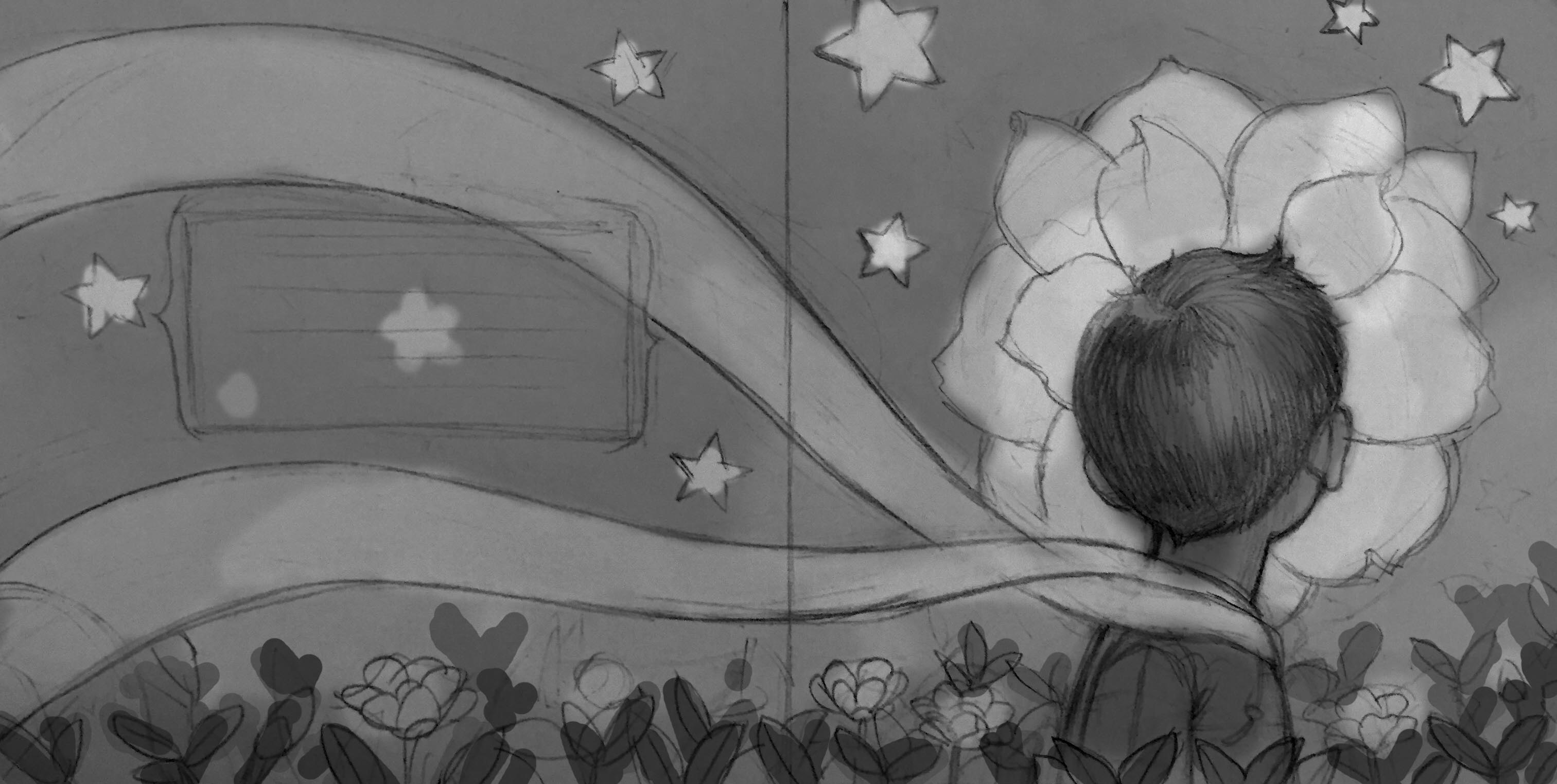
The only thing that stands out to me is the way his head is centered on the big flower. There are not tangents, but I get the same kind of feeling from it. It's almost like the flower is stuck to his head. I think a subtle offset could break this illusion. I did a quick draw-over to show what I mean.
-
Really well done!
-
I really like this image! mysterious yet beautiful. Maile's got a really good point there, by making the flower not right into his face is a better composition, and let the entire illustration breaths better. Good job! keep them coming
-
I kind of liked his head centered in the flower. It is an integral part of the story, isn't it? I like the way it is glowing and lighting him, even though we see the shadow side
-
Thank you for all the feedback everyone! And thanks for the painter-over Maile! Re-evalulating the composition and its intended usage, I'm going to stick to the original design (with the prince's head being in the middle) since it's going to a book jacket--I think shifting won't be effective when it's folded in half (it'll turn to a square). Plus, the gestalt design won't be present with the head shifted away from the flower.
Looking forward to starting the final.
-
Really nice image. I like the head in the middle. Love the hair and colors. Wonder if you need room for the front cover type.
I'm not sure, but I feel like both sides of the scaf are on the side facing the viewer rather than wrapping around the head and coming back from the other side. Just a small adjustment would fix that. I also wonder if he would be wearing the long scarf the whole book,.
-
I also like the head in the middle better. It has a very surreal feeling, reminds me a bit of the Oryx and Crake book cover. I would suggest brightening your image up a bit. Right now everything is really dark, even the stars. They should be glowing, right? Play with the levels and colors a little to see what you like. I also really like the scarf dissolving into stars, it's a nice touch.
I guess the only other thing I would consider is who your audience is. I really like the image, but it has a fine-arts feel to it that seems more for adults. I think children tend to identify more with faces. I'm not an expert on children's books though, so take it with a grain of salt.