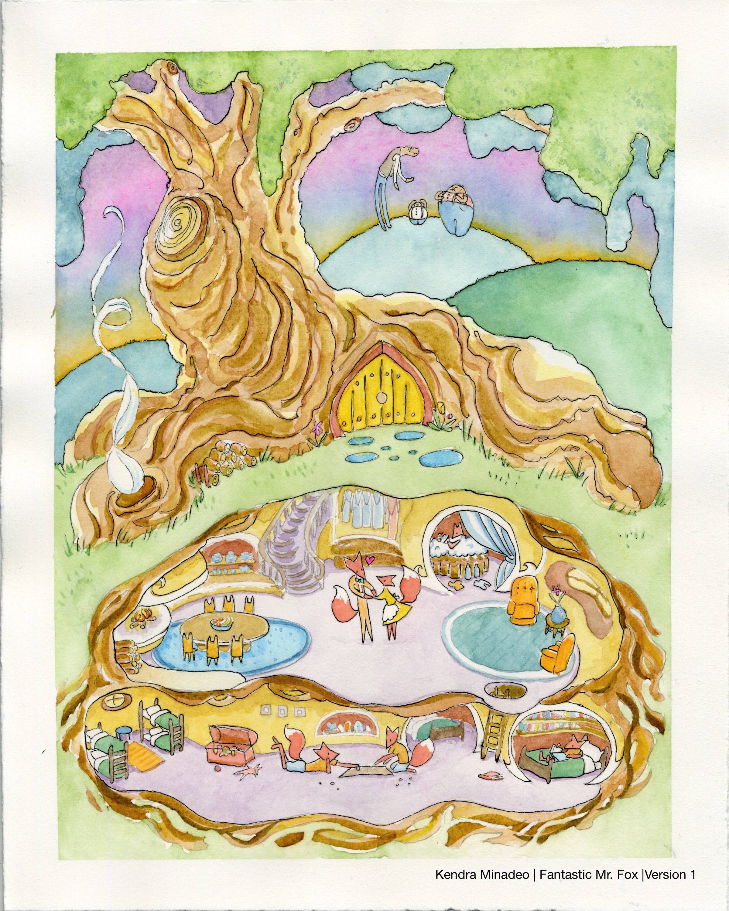
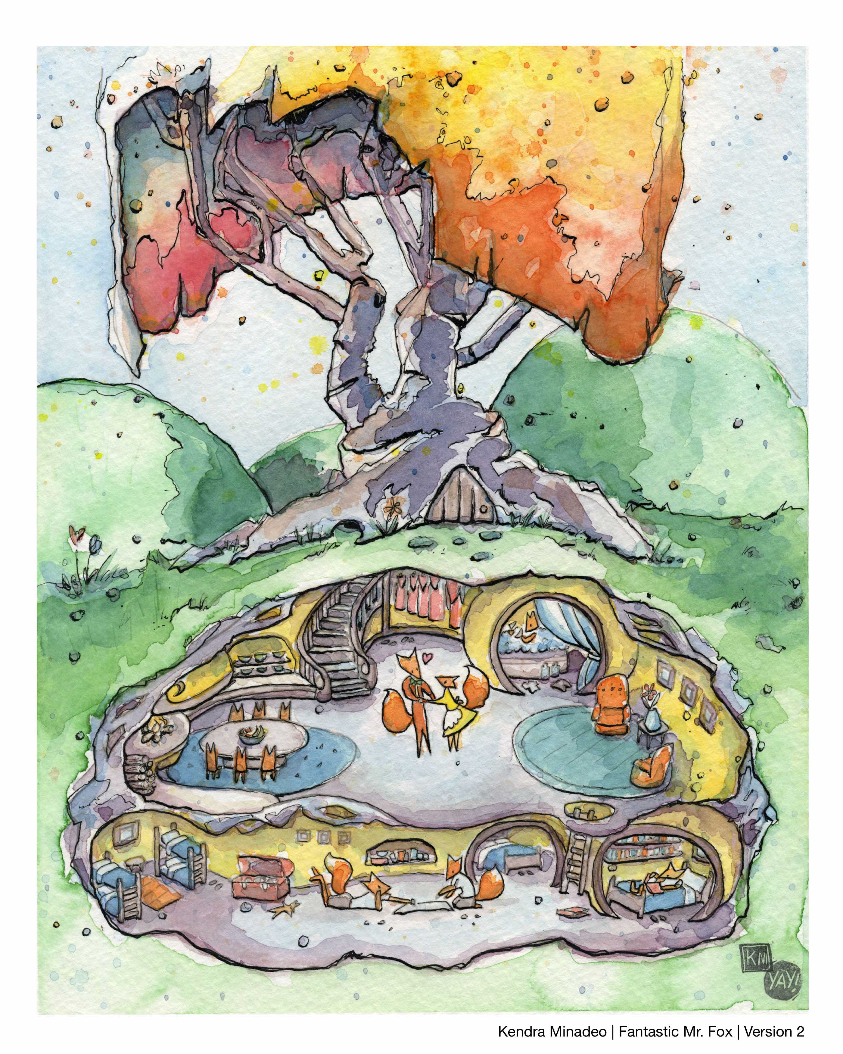
Fantastic Mr. Fox Watercolor piece | Version 1 & Version 2 | KM
-
This piece is for a tribute gallery show.
I wanted to show the fox family in their cozy home with the bad farmers outside discussing their doom. I started the painting on Arches 190lb watercolor paper that really struggled with being painted on. It warped a lot and couldn't handle being reworked or layered at all. I also was having trouble with the tree the and the sky. Things weren't going well.
I decided to restart . Changed the tree design, lost the bad guys and went back to my regular Strathmore 190lb cold pressed paper. Tho its always sad to scrap and restart, (which I have to do almost every time I paint) I'm much happier with the result.
I'd be interested to hear how I might have tweaked version 2 as well.
It's hard to know when your deep in things. Thanks!")
-
Hey Kendra, I hope I am not upsetting you with what I'm about to say. I really like the first one for many reasons. First of all I thought the use of color is very nice, there are so many beautiful shapes that talk to each other. For example, the shapes of the hills compared to those farmers, the tree gesture compared to the taller farmer pose. All of those relationships above can relate the foxes home as well. I personally think the first version reads so well while the 2nd version has thick and thin lines which is really nice but some are a bit thicker; especially the outline of the foxes home compared to the tree. I would open up the tree a bit, and let it flows and put a bit less weight just like what you did to the first one. 1st version tree to me is like a top part of a frame that locks viewers into the scene. The color of the 1st version is nice but it's a bit close to each other, maybe add a bit value to differ them. Value would help this piece to pops more. They are very lovely scenes.
-
I think you made the right decision, I really like the second one. Regarding scrapping your images, thats why computers are so useful.
Never give up, always push yourself two steps further than you believe you can go.
-
Eek. I hate to say this, but I really prefer #1 as well.
There's lot I like in #2. It certainly feels more finished. I like the vibrant colors and the way the texture of the paper really shows up in your scan. The story you tell inside the tree is lovely. Lots of sweet moments happening.
But dang, I love the bad guys. I love the way they relate to each other and to the rest of the image. And I really like the off-set tree. The more centered tree of #2 just doesn't feel as engaging to me.
Either way, there's lots of great stuff going on in both images. I look forward to seeing more of your work.
-
@Kendra Minadeo maybe you can update nr two by adding the bad guys from no 1?
-
I like number 1 as well yet there are items in version number 2 that are great as well. The coloring/palette in number 1 is terrific. I feel like there is more of a story in number 1.
-
Thank you everyone! All very valid and helpful points! Since the show is tomorrow and the prints are done no changes can be made. Each piece is a lesson learned.
Once again, REALLY appreciate the feedback and will post WIPs sooner to in order to incorporate notes before the paint hits the paper.
-
@Steve-Young Glad you like the piece. I'm getting some positive responses on social media so I think it might do well. No one else has really seen the first one so they won't know its "missing" the bad guys.
")
In terms of the usefulness of computers - I'm moving towards a workflow of:
- Doing my concept sketches and color tests digitally
- Then printing the finished drawing on watercolor paper
- and finally, painting and inking
This alone would save me TONS of time while I hash out all the important points of the drawing and color palette before I introduce the actual paint and ink. Can't wait.
-
both are really nice, the colors seem a bit more bold in the second version, but I love the movement of the tree in the first!
They are lovely! I am a sucker for ink and watercolors!
-
Once you start painting completely digital, you be able to work x5 quick at least. Its worth the effort to try it.
Never give up, always push yourself two steps further than you believe you can go.
-
@Steve-Young I am a bit attached to having an "original painting" for my gallery work, and making prints from that. Though I think I'm game to move to digital for book illustration and painting. But who knows, perhaps I'll get the digital bug and throw out all my paints.
-
I went digital for several years and now I have gone back to traditional. The process is more rewarding for me when I work traditionaly but I think knowing how to paint digitally is invaluable these days!
But it is very nice to have an original and at least for me working in water colors is far quicker. but every one is different.
-
I agree, I love traditional, though digital is so much more productive.
-
@Kendra-Minadeo said:
In terms of the usefulness of computers - I'm moving towards a workflow of:
- Doing my concept sketches and color tests digitally
- Then printing the finished drawing on watercolor paper
- and finally, painting and inking
YES! I've been looking into this, too! I just don't know which printer to get - I know it has to have pigment-based ink to be waterproof, and have a straight-feed to handle heavy paper. I would also want to get one that is wide-format. The issue I'm running into, though, is that if I invest in a nice printer, it should also be able to make prints... and so I keep researching and researching because they are so expensive! This fantastic artist always prints her line work, which does save a lot of time.
Back on topic, though: I love your illustration(s)! What size paper do you use? You have so many great details that show up really nicely. I have a hard time getting detailed on cold-press sometimes.
-
@Kendra-Minadeo said:
I am a bit attached to having an "original painting" for my gallery work, and making prints from that. Though I think I'm game to move to digital for book illustration and painting. But who knows, perhaps I'll get the digital bug and throw out all my paints.
Do you have access to the SVS classes? There's a really great section in the Painting in Photoshop class with Brooke Boynton. She paints almost entirely traditionally then tweaks things a bit in photoshop. I really enjoyed hearing her perspective, as she paints digitally with a very traditional mindset.
I think you might appreciate her perspective if you ever do decide to move to digital for your illustration work.
Twitter @MaileMcCarthy
www.mailemccarthyillustration.com -
Totally agree with Maile about taking the photoshop class. There are several classes that help from beginner to advanced.
-
@Carey-Bowden I bought this printer not long ago on the recommendation from a friend who also does his own prints. I use Epson's Hot Press archival paper for prints and cut down Strathmore 190lb watercolor paper for the originals (OGs). http://www.amazon.com/Epson-Stylus-Inkjet-Printer-CA61201-VM/dp/B002PLQ7LI It was $1100 when I got it. Which turns out to be around .80c a print if I'm doing 5x5s, and $1 for 8x10s. (both are printed on 8.5x11 then cut down)
In terms of details on the OG's I think the crow quill pen and ink really brings them out. I do a lot of little splatters that show up as small dots of color all over the page and that seems to give the piece an organic feel with lots of little details. Give it a try. It's fun.
I tend to work on 5x5s alot but I've been expanding into larger pieces like 8x10s and 11x17 or 11x14.
Hope that helps! -
@Maile-McCarthy Thanks I look forward to her class!