Society of Visual Storytelling

    SVSLearn Forums

    • Register
    • Login
    • Search
    • Recent
    • Tags
    • Popular
    • Users
    • Groups
    • Search

    Circus WIP

    Illustration
    14
    35
    13068
    Loading More Posts
    • Oldest to Newest
    • Newest to Oldest
    • Most Votes
    Reply
    • Reply as topic
    Log in to reply
    This topic has been deleted. Only users with topic management privileges can see it.
    • Lynn Larson
      Lynn Larson SVS OG last edited by

      This is one of those pieces that makes me grin every time i look at it! I would suggest putting a bench under the people for the audience? Or maybe a short wall in front of them? I thought they were waiting in line to climb up! That would be cool too, showing a line of people and critters waiting hehe.

      https://instagram.com/lynnlarsonart/
      https://twitter.com/lynnlarsonart

      1 Reply Last reply Reply Quote 0
      • Vicky Vicky
        Vicky Vicky last edited by

        That is great! Only thing I would say is the giraffe is maybe a bit too rounded in body and the neck would be more tapered, and I am not sure what the shape coming off the cheek is. Love the image! Fun!

        1 Reply Last reply Reply Quote 0
        • Maile McCarthy
          Maile McCarthy @Spencer Hale last edited by

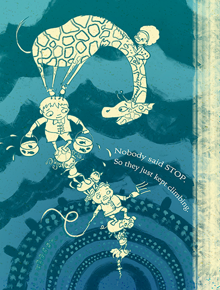
          Hi everyone. Thanks for all the feedback. I played around with color, and it only seemed to make it worse. So I guess this will be the finished style after all.

          upload-43b8a2bb-3403-4def-801d-2a8422a68fb0

          @Lynn-Larson and others. How does this read to you now, especially the audience? I spent a couple of hours yesterday drawing in all the detail of the audience as well as more circus people in the ring, and it was just too much.

          @Spencer-Hale Your gesture line really helped. I think it flows much better now.

          @Vicky-Vicky Thank you! I reworked the giraffe a bunch, though I didn't change the face. I think the confusing shape you're talking about is the ear. Is it any clearer now, with the neck changed and spots added?

          Twitter @MaileMcCarthy
          www.mailemccarthyillustration.com

          Rich Green 1 Reply Last reply Reply Quote 1
          • Lynn Larson
            Lynn Larson SVS OG last edited by

            Oooh! Flows so much better now! the audience definitely reads spectators now, and that change in the curve of the giraffe's neck really eases the eye along! I think the color is great, and the mice still make me laugh! Excellent job!

            https://instagram.com/lynnlarsonart/
            https://twitter.com/lynnlarsonart

            1 Reply Last reply Reply Quote 0
            • Rich Green
              Rich Green SVS OG @Maile McCarthy last edited by

              @Maile-McCarthy this update is absolutely fantastic. I love the minimal markings for the audience. It reads perfectly without distracting the eye from the towering attraction. And it also really adds to the just how far up they are towering too. Love it!!!

              www.richgreenart.com instagram.com/richgreenart/

              1 Reply Last reply Reply Quote 0
              • Vicky Vicky
                Vicky Vicky last edited by

                Hi Maile,

                Great revision. The giraffe looks a lot better and that curve really makes for a nice composition for the whole piece. To me, the ear still doesn't really have the shape of a giraffe's ear, those curvy lines wouldn't be there. I would just make it simpler and maybe make the little "antennae" thicker to be more giraffe-like. Not a big issue.

                Maile McCarthy 1 Reply Last reply Reply Quote 0
                • Naroth Kean
                  Naroth Kean last edited by

                  Good luck! it has turned out very lovely. So much fun, I love those characters and their swag haha.

                  http://narothkean.com
                  https://twitter.com/narothkean
                  https://www.instagram.com/narothkean

                  Maile McCarthy 1 Reply Last reply Reply Quote 0
                  • J
                    Jeszika Lee last edited by

                    just peeked in on this thread - and the improvements you made are fantastic! You really refined this and brought it all together so well! And I am glad you stuck with this color scheme - it has a great design quality to it!

                    1 Reply Last reply Reply Quote 0
                    • Maile McCarthy
                      Maile McCarthy @Vicky Vicky last edited by

                      @Vicky-Vicky said:

                      Hi Maile,

                      Great revision. The giraffe looks a lot better and that curve really makes for a nice composition for the whole piece. To me, the ear still doesn't really have the shape of a giraffe's ear, those curvy lines wouldn't be there. I would just make it simpler and maybe make the little "antennae" thicker to be more giraffe-like. Not a big issue.

                      Thanks Vicky. This kind of feedback is really helpful to me. It's a good reminder of how important it is to understand the anatomically correct way of drawing something before making an abstract departure. I didn't do that here, and I guess it shows!

                      Twitter @MaileMcCarthy
                      www.mailemccarthyillustration.com

                      1 Reply Last reply Reply Quote 0
                      • Maile McCarthy
                        Maile McCarthy @Naroth Kean last edited by

                        @Naroth-Cow said:

                        Good luck! it has turned out very lovely. So much fun, I love those characters and their swag haha.

                        Thank you 🙂

                        Twitter @MaileMcCarthy
                        www.mailemccarthyillustration.com

                        1 Reply Last reply Reply Quote 0
                        • Lee White
                          Lee White SVS Team SVS Instructor Pro SVS OG last edited by

                          Really nice! Love your color and design.

                          Only thing off for me is the character design of the giraffe. SInce he's gonna be a main focus, he needs to be perfect. IT's mainly his chin and ears that need work. The way they are now give him a sort of "dragon" look. I'd make the chin smaller/thinnner and look at some reference to do a stylized ear that is correct.

                          Great piece. I'd like to see more from this story. ; )

                          SVS Faculty Instructor
                          www.leewhiteillustration.com

                          Maile McCarthy 2 Replies Last reply Reply Quote 0
                          • Maile McCarthy
                            Maile McCarthy @Lee White last edited by

                            @Lee-White Thanks Lee (and everyone). It's so helpful to have fresh eyes on my work.

                            Off to study giraffes...

                            Twitter @MaileMcCarthy
                            www.mailemccarthyillustration.com

                            1 Reply Last reply Reply Quote 0
                            • Maile McCarthy
                              Maile McCarthy @Lee White last edited by

                              @Lee-White @Vicky-Vicky

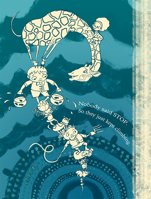
                              Here it is with a giraffe-ier head. I'm wondering if I might have gone too far toward realism, so that the head doesn't seem to fit the body or the boy's face. What do you think?

                              upload-1400bb0e-5861-47fb-a7c1-3694ee5c3b3c

                              Twitter @MaileMcCarthy
                              www.mailemccarthyillustration.com

                              1 Reply Last reply Reply Quote 0
                              • Lynn Larson
                                Lynn Larson SVS OG last edited by

                                I think the new head is good! just darken the outlines on the spots to be consistent with the rest of him 🙂

                                https://instagram.com/lynnlarsonart/
                                https://twitter.com/lynnlarsonart

                                Maile McCarthy 1 Reply Last reply Reply Quote 0
                                • Javier Diaz
                                  Javier Diaz last edited by

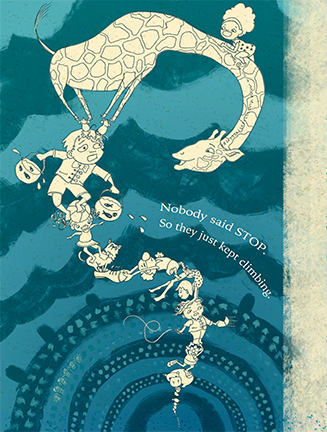
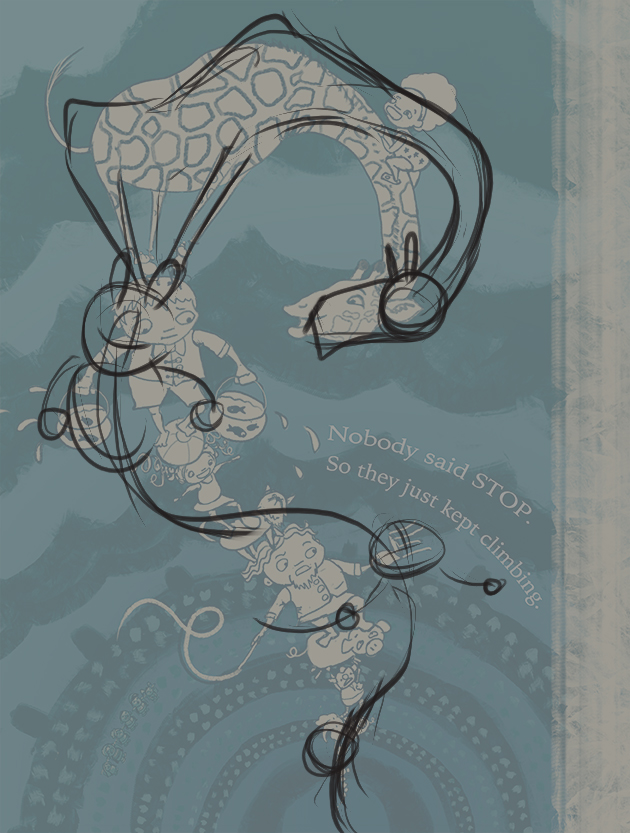
                                  It's looking good. I would just push the curve the people are on right now. Maybe make it a bit more twisty.
                                  Just a quick paintover.
                                  circuswip.jpg

                                  http://wwww.imaginejavier.com | http://www.instagram.com/bejavi/

                                  Maile McCarthy 1 Reply Last reply Reply Quote 0
                                  • Maile McCarthy
                                    Maile McCarthy @Lynn Larson last edited by

                                    @Lynn-Larson Thanks Lynn.

                                    Twitter @MaileMcCarthy
                                    www.mailemccarthyillustration.com

                                    1 Reply Last reply Reply Quote 0
                                    • Maile McCarthy
                                      Maile McCarthy @Javier Diaz last edited by

                                      @Javier-Diaz Ooh thank you! I love the feel of your curve. I'm going to go work on this now and see how it goes.

                                      Twitter @MaileMcCarthy
                                      www.mailemccarthyillustration.com

                                      Maile McCarthy 1 Reply Last reply Reply Quote 1
                                      • Maile McCarthy
                                        Maile McCarthy @Maile McCarthy last edited by Maile McCarthy

                                        @Javier-Diaz Whew! Okay, here's the update. It was not easy for me to push things this much (and even looking at it now, I can see places where I could have pushed more, especially at the girl/cat section). But I think the result is quite an improvement over the original.

                                        upload-6a3ff808-4dda-4e89-9c1a-a367c9323c5b

                                        Twitter @MaileMcCarthy
                                        www.mailemccarthyillustration.com

                                        Javier Diaz 1 Reply Last reply Reply Quote 3
                                        • Lynn Larson
                                          Lynn Larson SVS OG last edited by

                                          hehe, love it!!

                                          https://instagram.com/lynnlarsonart/
                                          https://twitter.com/lynnlarsonart

                                          Maile McCarthy 1 Reply Last reply Reply Quote 0
                                          • Maile McCarthy
                                            Maile McCarthy @Lynn Larson last edited by

                                            @Lynn-Larson Thanks 🙂

                                            Twitter @MaileMcCarthy
                                            www.mailemccarthyillustration.com

                                            1 Reply Last reply Reply Quote 0
                                            • First post
                                              Last post